User experience is a broad discipline. Anyone who practices UX design should have skills in many different fields. While it’s impossible to summarize all the information that’s helpful in a single article, it is still possible to highlight the most important rules every UX designer should follow to create an excellent experiences for people.
Here are the 15 essential rules that every designer should be familiar with.
1. UX is not (only) UI
User Interface is a part of User Experience
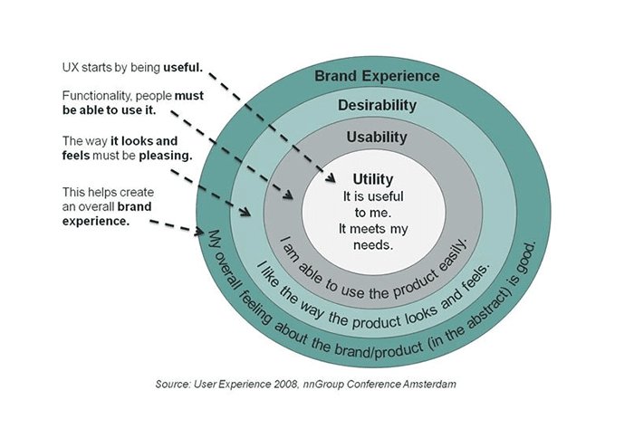
Swapping UX with UI design, as if the two are the same, is a common mistake among many designers. It’s essential to understand the difference between the two disciplines, and we’ve covered the topic of UX design in detail in the article What You Should Know About User Experience. In short, User Interface the space where interactions between humans and a product occur, while User Experience is an emotional outcome after interactions with a product.
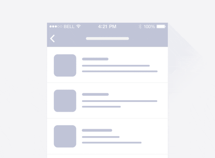
 The feed layout of an iPhone’s social network app is a user interface. The user’s satisfaction with the smooth pull-to-refresh action is the user experience. Image by Ramotion.
2. Know your audience
User research is a natural first step in the design process
It should come as no surprise that one of the most important factors you should consider when designing a product is the audience. If you plan to design a product your users will love, you must have an idea of what your audience actually wants and needs. And this means user research should be an essential part of the UX design process. It’s critical to keep your users top of mind before you start designing! This will allow you to provide value for people who’ll use your product and focus on benefits instead of features.
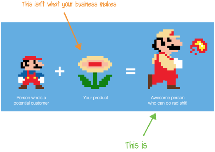
 “People don’t buy products, they buy better versions of themselves.” Designers should be able to recognize when to stop adding features and keep constant what people love about an experience. Image by useronboard.
3. You are not the user
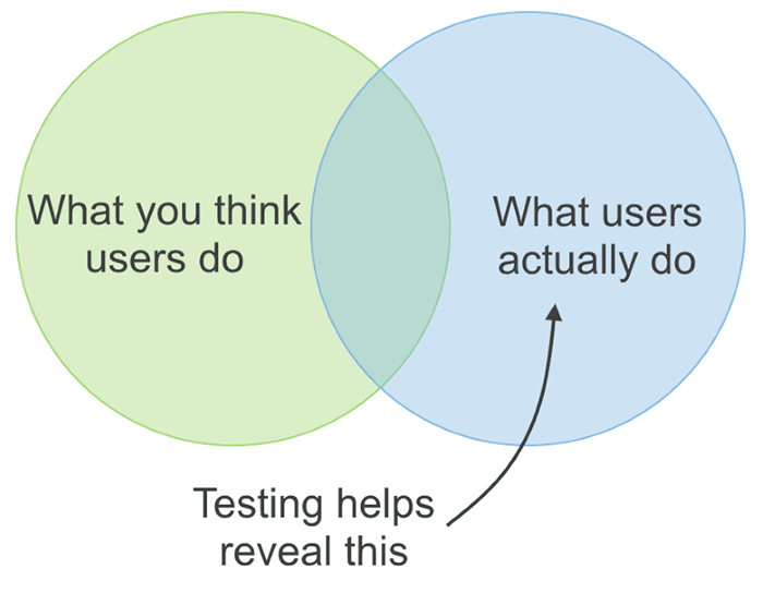
Testing with real users is an essential part of the design process
Designers often assume that people who will use their interfaces are like them. As a result, designers project their behaviors and reactions onto users. But thinking that you are your user is a fallacy. This effect in psychology is called the false-consensus — a tendency to assume that others share our beliefs and will behave similarly in a given context.
Most probable, the people who’ll use your product have different backgrounds, different mindsets, different mental models, and different goals. In other words, they are not you.
There is a technique the helps designers overcome false-consensus bias, called usability testing. If you want to build products that users love, then you have to focus on testing. Testing with real users (not your teammates, friends, or family) allows designers to learn how to create products that are right for those who will use them. This may be time-consuming, but it’s the only way to be sure that you’re moving in the right direction.
 UX design is about making assumptions and then validating them through testing.
4. Adapt design for short attention spans
Don’t overwhelm users with too much information
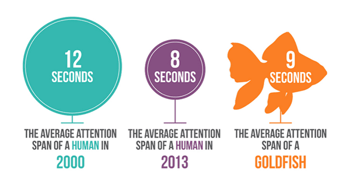
An attention span is defined as the amount of time someone concentrates on a task without becoming distracted. A 2015 study conducted by Microsoft found that the average human attention span has declined from 12 seconds to 8 seconds. This means that we now have a shorter attention span than goldfish. Designers need to adjust to cope with this behavior, with the goal of getting people the information they need as quickly as possible.
 Modern apps and websites need to provide meaningful content that users can digest. Image by safertech.
Designers should simplify interfaces by removing unnecessary elements or content that does not support user tasks. One technique that allows designers to achieve that is functional minimalism. At the same time, this doesn’t mean that experiences should be limited. All information should be valuable and relevant.
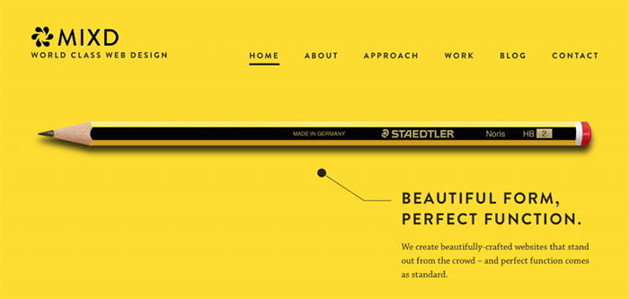
 With less visual information, text will be more noticeable and will heighten the impact on the user. Image by Mixd.
5. The UX process isn’t set in stone
Adapt your design process for the product you design
UX process is a make-it-or-break-it aspect of UX design. Without a solid UX process, a designer could be completely moving in the dark. A clear and concise ux development process, on the other hand, makes it possible to craft amazing experiences for users.
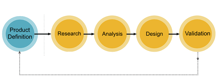
 General UX design flow. The UX process depends heavily on the project.
Many designers believe that there’s one universal UX process that can be applied to all projects. Unfortunately, there’s no such thing as one-size-fits-all UX design. While it’s possible to define individual steps for each project, a precise UX process should always be selected based on project requirements — each project is unique and has its own needs. This means that to create the best possible user experience a designer should be ready to adapt their design process based on project specifics. For example, if you are designing a new product you might need to spend more time on user research and requirement clarification. But if you’re redesigning an existing product then you might need to spend more time on design validation (conducting usability and A/B testing, or working with analytics reports).
6. Prototype before you build a real product
The design phase for digital products should include a prototyping stage
Skipping prototyping and putting a lot of effort into building an actual product is another common (and dangerous) mistake among many design teams. When we put a lot of effort into creating something that we believe is great, it can be really stressful to realize that our solution doesn’t work as expected when we release it into the wild.
Prototyping is creating a model of a product so that it can be tested. Prototyping tools allows you to test your hypothesis before spending time with an engineering team building the actual product. Designers can use different design techniques for prototyping. One useful prototyping technique is called rapid prototyping. It’s a popular way of quickly creating the future state of a product, be it a website or an app, and validating it with a group of users.

 Designers creating website and mobile app prototype. Image by Adobe.
7. Use real content when designing
Avoid Lorem Ipsum and dummy placeholders
Almost every product is based around content, whether that’s text, images, or videos. It can be said that design is an enhancement to the content. Yet many designers don’t take content into account during the design phase — they use Lorem Ipsum instead of real copy and placeholders instead of real images. While such design might look great on a designer’s artboard, the picture might be completely different when the same design is filled with actual data.
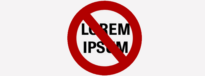
 Using Lorem Ipsum removes meaningful parts of the text and reduces text-based content to a visual design element. Image by Smashing Magazine.
Our goal as designers is to get as close to the real customer experience as possible. Thus, we shouldn’t abstract ourselves from the real experience.
8. Keep things simple and consistent
The hallmark of a great user interface is simplicity and consistency
In the context of digital products, simplicity means that’s it’s easy to understand and interact with a product. Your users shouldn’t need to read instructions to understand how to use an app or have a map to navigate through it. It’s part of your job as an interface designer to make things clear and subtly guide them from where they are to where they need to go.
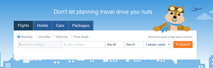
 The most important elements on Hipmunk’s homepage are highlighted to get users to focus on them. This makes it clear to the user what to do next.
Interfaces must also be kept consistent throughout a design. In an attempt to make designs appear more creative and memorable many designers intentionally add inconsistencies in style. For example, different color schemes can be used on different pages on a website. Such design decisions often cause confusion and frustration in users. Thus, it’s always important to keep design element familiar, reinforcing the most important facets of your design at every turn. Remember to apply the Principle of Least Astonishment to your product design.
9. Recognition over recall
Showing users elements they can recognize improves usability versus needing to recall items from scratch
Due to the limitations of human memory, designers should ensure users can automatically recognize how to use certain features of their product instead of making them recall this information. Strive to minimize cognitive load by making information and interface functions visible and easily accessible.
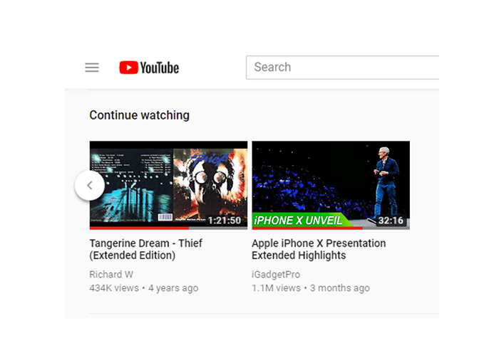
 YouTube uses recognition instead of recall by showing users lists of items they recently watched. These lists help users remember to watch a video they may have started a few days ago.
10. Make design usable and accessible
Design for a diverse set of users that will interact with your products
When it comes to design, designers often obsess over look and appeal instead of functionality and accessibility. Most of us try to make things look beautiful. Quite often this leads to a situation where aesthetics become more important for designers than usability. Of course aesthetics are important and we definitely should try to make our designs appealing, but only after we have usable products. The most important job of digital products and services is to perform a function.
 People don’t use digital products because they have delightful animations or are visually exciting. They use them because they provide tangible value. Image by neospot.
Accessible interaction design allows users of all abilities navigate, understand, and use digital products successfully. A well-designed product is accessible to users of all abilities, including those with low vision, blindness, hearing impairments, cognitive impairments, or motor impairments. It’s true that accessibility introduces a set of constraints to incorporate as you consider your design, but improving your product’s accessibility enhances usability for all users. You can find a lot of helpful information on how to make interfaces more accessible in WCAG 2.0 and Material Design guidelines.

 A visually impaired person browsing the web. Image by UXMag.
11. Don’t try to solve a problem yourself
Design is team sport — don’t work in isolation
As Lyndon Johnson once said, “There are no problems we cannot solve together, and very few that we can solve by ourselves.” Great user experiences are a result of collaboration between designers and developers, stakeholders, and users. There’s no such thing as a “solo genius.” When designing, you need to work with as many people as possible to get their ideas, insights, and thoughts on your work.
12. Don’t try to solve everything at once
Design is an iterative process
It’s important to understand that UX design isn’t a linear process. The phases of the UX process (ideation, prototyping, testing) often have considerable overlap, and usually, there’s a lot of back-and-forth. As you learn more about the problem, the users, and the project details (especially any constraints), it may be necessary to revisit some of the research undertaken or try out new design ideas. Don’t think that it’s possible to make your design perfect right after just one iteration. Instead, refine ideas to the point where you can test them with real users, collect valuable feedback, and iterate based on this feedback.
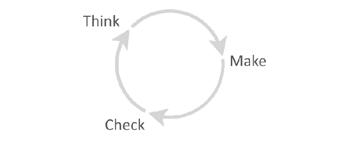
 UX design isn’t a linear process. To make great products, you need to make lots of changes and test them. The key is to define assumptions, test them, refine, and repeat.
13. Preventing errors is better than fixing them
Whenever possible, design products to keep potential errors to a minimum
To err is human. Errors often occur when people engage with user interfaces. Sometimes, they happen because users make mistakes, and other times they happen because an app fails. Whatever the cause, these errors and how they are handled have a huge impact on the user experience. Users hate errors and hate the feeling that they triggered such behavior even more. Thus, you should strive to either eliminate error-prone conditions altogether or check for them and notify users before they commit to the action.
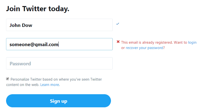
 Twitter prevents users from entering a wrong email. The service suggests the action — you can either login to your account or reset the password.
14. Offer informative feedback
An app or website should always keep users informed about what is going on
As one of the original 10 of Jakob Nielsen’s heuristics for usability, visibility of system status remains among the most important principles in user-interface design. Users want to know their current context in a system at any given time and apps shouldn’t keep them guessing — they should tell the user what’s happening via appropriate visual feedback. Providing instant visual feedback, such as an animated indicator when a user initiates an operation, is a great way to inform users that an interface is working.

 You can use a simple animation, such as a loading spinner, as a feedback message to inform your users that the system is processing a request. Image by Tumblr.
15. Avoid dramatic redesigns
Remember Weber’s Law of Just Noticeable Differences
Research shows that users dislike a massive change in their existing products, even if those changes will benefit them. If you do a significant redesign there’s a huge probability that users won’t be happy with that. This phenomenon even has a scientific name — Weber’s Law of Just Noticeable Differences, which states that the slightest change in things won’t result in a noticeable difference.
eBay is one of the companies that learned the hard way that their users don’t like dramatic changes. Overnight, they decided to change the bright yellow background on many of their pages to a white background. Instantly, they started receiving complaints from customers, arguing against the change. A significant number of complaints forced eBay to change the design back. After that, the team followed a different strategy. Over the period of several months, they modified the background color one shade of yellow at a time until, finally, all the yellow was gone, leaving only white. Predictably, almost nobody noticed the change this time.
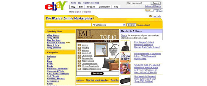
 eBay before the redesign (the yellow color dominates in design). Image by eBay.
Thus, the best way to approach a redesign is doing it slowly, changing a little here and a little there gradually. By doing this, most users won’t even know you’re doing a redesign until you’ve completely revamped the redesign.
Conclusion – don’t be afraid to make mistakes
Everyone makes mistakes — it’s the only way to learn something
You only really learn when you make mistakes. If you’re fearful of making mistakes and try to get everything perfect, you’ll miss out on learning. Follow the rules above, but above all, keep trying new UX design techniques and approaches to find the one that work the best for you and your clients.