Illustration by Erica Fasoli
“Make it pop.”
The phrase is so ubiquitous in design meetings that it’s become an industry meme.
But consider a more empathetic lens: with these words, a client is trying to connect with you. Similarly to when my immigrant family says “Close the lights” (i.e. “turn them off”), clients may not necessarily have the right vocabulary to articulate their design needs. As a result, we receive generic talking points disguised as design requests. Then add the complication of client teams misaligned on their own brand and you’ve got a recipe for excessive revisions, budget churn, and frustration on both sides.
So, how do we mitigate those conversations? Try a Design Spectrum exercise that takes intangible concepts and shapes them in a way that everyone understands! It’s what my team and I at 10up have used successfully with government, higher-ed, and Fortune 500 teams — and now you can, too!
Review extremes for better understanding
A Design Spectrum exercise creates a framework of shared understanding of the client’s team, goals, and brand that is specific to them. We can hone in on that specificity by seeing where they fall in the spectrum of design preferences.

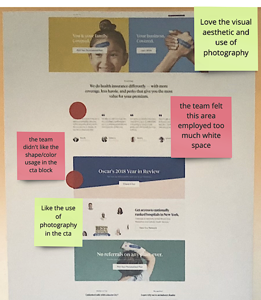
 An example of a filled Design Spectrum board on the wall during an on-site.
At an on-site, post the above chart on a board or draw it out, but this could also be repurposed for a group activity using Miro and Zoom breakout rooms.

 An example of a Design Spectrum board filled in via Miro.
If you think, “Lea, this looks like brand positioning exercises,” in which you see a Toyota logo on one end and a Mercedes logo on the other — you’d be right! This revised exercise assumes the client already has their brand sorted out. Now, we’re in the thick of breaking down the interpretation of that brand visually.
In this case, how exactly do you “make it pop?”
Unlike the brand spectrum exercises, this type of breakdown is rarely discussed at this level with clients. We incorrectly think that such a level of detail doesn’t need to be discussed. Designers often have these ideas in their head but it isn’t documented or articulated externally.
Documenting creates additional accountability for the client themselves. This is especially important when you have rotating stakeholders. It can also provide a reference for everyone to use. If you’re like many designers that have had to go through the slog of endless revision rounds, there’s room to button up assumptions.
The design spectrum exercise!
To address assumptions, we need to review and gauge the client’s reactions to “design extremes.” To run this exercise you need:
- Ideally, a curated client team of four to five people (any more, I’d break into separate groups of four to five).
- The spectrum chart (printed, drawn, or virtual board) — the spectrum lines here can be customized to the language you want to use or that resonates more with the client.
- Stickers (physical or virtual!) — there is value in anonymizing it, so assign colors (or not) based on the context or the team.
- At least one hour to run the workshop; ideally, another half hour to allow for discussion.
But wait — does the client understand terms like “monochromatic?” The biggest mistake is assuming your client knows what they’re voting on! Or frankly, that you understand what these terms mean! This is another way to listen beyond surface statements, to get to the heart of the client.
Test assumptions: Round one
So let’s test their understanding by letting them do a first round of voting. Each team member gets a vote per row and when they do, have them explain what they think these terms mean. This gives you a starting point on where their current design understanding is.
Once they’re done, hide the board — take it down if in person, or copy it out of Miro into a private board to review later.
Test assumptions: Round two
With the first vote out of the way, set the tone and tell them it actually doesn’t matter what you, as the designer, think these terms mean. That’s right — your opinion doesn’t matter. Let your client define what the extreme ends mean to them!
Here’s why: one team’s “extreme” is another team’s “mild.” That’s why we’re having this conversation. And the best way to gauge their extremes is to share website examples. Competitor sites, inspirational sites, and challenging sites — choose ones that are both closely aligned and unrelated to your client’s vertical. Choosing these sites should not be done casually, and it’s recommended that your design team thoroughly vet examples that support the client’s goals.
 We call this “Design Shopping” at 10up — a live version with post-workshop notes.
While sharing sites:
- Share as many sites as you can to articulate each design term you want to dive into within the time constraints.
- Walk through your example sites one by one, and ask the client to explain where they think each site falls in the spectrum chart while discussing their preferences.
- Encourage the entire team to add their two cents — make it a conversation and not a lecture!
- Fill in the blanks if the client is unsure.
By the time you’ve walked through your site examples, your client has had many chances to discuss these design terms. You have also had opportunities to bring up how these design choices do or do not fit with their specific business and brand.
Test assumptions: Round three
Only when you’ve completed walking the client through the site examples and the entire team is on board, do you take out a fresh Design Spectrum board.
Facilitate a re-vote with their new understanding. If time permits, it’s best to do this privately, in separate print or virtual boards. However, they can vote visibly as a team if time-crunched.
This final round of voting gets the client to see the spectrum with new eyes. This allows them a chance to change their mind once they have a better understanding of what they want and the terms everyone is using.
When complete, reveal the original board and place the new board(s) around it. Have the entire team discuss and review where similarities and divergences are. Discuss and gain consensus on areas of divergence.
Validate, using phrases like:
- “What I’m understanding here is…”
- “What I’m hearing is…”
Reframing client feedback is a valuable tool as it provides more ways for clients to articulate what they need. Reframing gives a safe space for clients to correct and change their mind — and in our experience, they often do!
In fact, you should expect it: like many language learners, there are missteps when learning to converse. This workshop is essentially a vocabulary lesson — you wouldn’t expect clients to write essays on design right after.

 An example of the final voting board next to the original voting board.
By the time this process is all said and done, you will have a final design direction the client can refer to throughout the rest of the design process.
Your client is your design partner
When done right, this workshop leaves the client energized. You’ve not only gained alignment with their team, but trust that you can translate their brand and business goals into design — because you’ve already completed the first step in helping translate it for them.
In the end, a Design Spectrum exercise gives you a strong base for the rest of your design deliverables to be built on. Look forward to faster approvals and lower requests for revisions due to understanding their needs from the start. Go ahead, try it!