iPhone X was the most significant step up since the original iPhone, and it set a new bar for mobile app designers and developers. iPhone XS and XR series that were released after iPhone X were both based on the same concept of bezel-less phones. Before diving into details on how to design for any of those devices, we recommend you download the Apple UI Design Resources for your favorite design tool, which includes templates, along with comprehensive UI resources that depict the full range of controls and views using the iOS SDK. These resources help you design apps that match the iOS design language. After that, you’ll be ready to design your first app for the bezel-less iPhones. The good news is that best practices for mobile app design are still applicable for bezel-less phones, so you already have a solid foundation for your design. Since the range of bezel-less iPhones includes model X, XS, and XR, for the purpose of this article we will provide examples for the iPhone X.
Below you will find the four most important design considerations that should be considered when designing mobile apps for bezel-less iPhones:
- Adjusting designs for the new screen
- Putting more focus on gestures
- Using Face ID in apps
- Creating new types of apps (AR)
1. Screen
Use the correct size artboard
The
Apple iPhone X has a 5.8” screen. In portrait orientation, the width of the
display on the iPhone X matches the width of the 4.7″ displays on the iPhone 6,
iPhone 7, and iPhone 8. However, the
iPhone X display has a different height; the iPhone X screen is 145 points
taller (approximately 20 percent more space available for content).
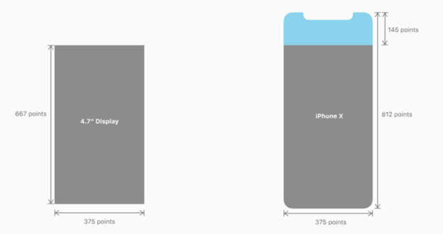
 iPhone X display dimensions are 375 points wide by 812 points tall.
Consider aspect ratio differences when reusing artworks
The iPhone X has a different aspect ratio than 4.7” displays. While all existing images will be scaled to fit iPhone X automatically, iOS might letterbox or crop them. Both options can create a bad UX. Therefore, it’s smart to create separate X-specific images occupying 375-point by 812 points at 3x.
Tip: Try to compose images so that critical
visual information remains visible regardless of the display’s aspect ratio.
Test images on both the 4.7” and iPhone X screens to make sure that important
visual content remains in view on both display sizes.
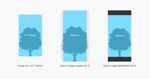
 Cropping and letterboxing images on iPhone X.
Adapt for the new form factor
The most
notable feature of the iPhone X display is its shape. The screen is no longer
rectangular — instead, it has rounded corners and a notch on top of the screen
(the area where all sensors are located).
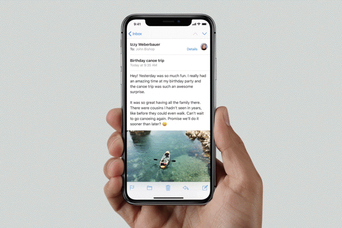
Provide a full-screen experience
According
to Apple’s Human Interface Guidelines, it’s crucial to extend backgrounds to
the edges of the display.
 Image of an iPhone’s X’s full screen experience.
It is
very important to make the UI experiences full-screen, allowing them to bleed
to the edges uninterrupted. Vertically scrollable layouts such as tables and
collections should be continued all the way to the bottom of the display.
 Vertically scrollable layout showing a collection.
Place elements in a safe area to prevent
clipping
Any
element that’s positioned too close to viewport edges or corners can be clipped
by the display’s rounded corners. It’s important to prevent all critical
information from getting clipped in the corners or covered by the sensor
housing.
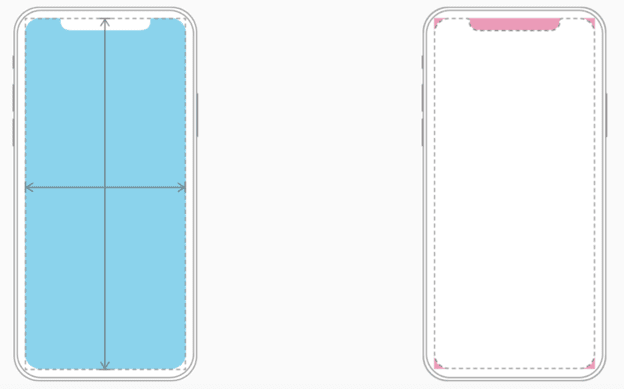
 Image of iPhone X Design.
When
designing for iPhone X, you must ensure that elements in your layout aren’t
obscured by the device’s rounded corners or its sensor housing. Such places are
marked in pink in the image above.
To
guarantee that UI elements won’t be clipped or covered, place them in a safe
area. The safe area ensures appropriate insetting based on the context — and
helps you keep UI elements within the always-visible portion of the screen.
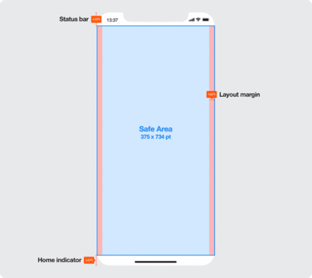
 Image of iPhone X layout. Image by Daniel Adams/Microsoft.
The safe
area also prevents content from underlapping the status bar, navigation bar,
toolbar, and tab bar.
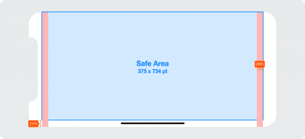
 Safe area for landscape mode.
Image by Daniel Adams/Microsoft.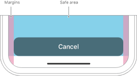
 Inset essential content to prevent clipping.
Center visual information and controls
Most
apps look and work best when controls and visual elements are centered. Let’s
consider how this works in a layout when in landscape orientation. In the first
case, the layout shifts around based on how a device is being rotated and this
leads to an inconsistent user experience. Users can’t rely on muscle memory to
interact with controls.
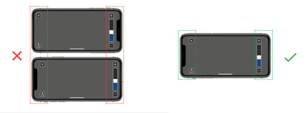
 Image of iPhone X layout. Image by Mike Stern/Apple
An
asymmetrical layout at left (UI controls have different inset from the left and
right edges of the screen) vs. a symmetrical layout (UI controls are inset by
the same amount).
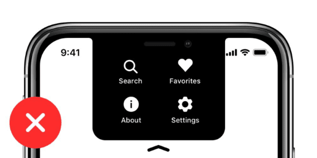
Don’t mask the notch
The
notch is the cut-out at the top of the screen where you can find the front
camera, speaker, and sensors. It’s one of the things that makes apps look quite
unusual on the iPhone X. In an attempt to create a more familiar look, some
designers have tried to hide the sensor housing by placing a black bar at the
top of the screen. However, placing a black bar at the top of the screen makes
your app layout feel small and inconsistent with other apps on the iPhone X.
 Hidden notch area creates inconsistency with other apps.
The
notch area (marked by a red rectangle in this picture) is hidden. When you hide
the sensor housing — for example by placing a black bar at the top of the
screen — this makes your app look inconsistent with other apps on the iPhone X.
Don’t
attempt to hide the sensor housing — instead, extend the navigation bar’s color
into the background of the status bar.
 Unhidden notch area is a consistent user experience.
By
making the notch visible, you create a more consistent experience for your
users.
Don’t use the notch as a functional
element
The
notch is a hardware element and shouldn’t be used as an element of the user
interface.
 Don’t use the notch as a functional element in your UI. Image by Max Rudberg
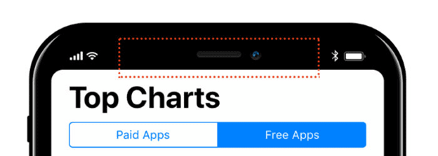
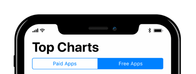
Don’t hide the status bar
The
status bar displays useful information about the device’s current state, such
as the time, network status, battery level, etc. Because of the notch, the
status bar has gone through a significant change on iPhone X: it’s taller than
it is on all other iOS devices and split into two parts.

 iPhone X status bar is now 44-points tall.
It’s
recommended that you avoid hiding the status bar in regular apps. Users might
be interested in knowing whether or not they are connected to Wi-Fi when the
app regularly downloads content from the internet. When the status bar isn’t
hidden it creates a more consistent look.
The only
reason to hide the status bar is when you want to remove all distractions and
focus the user’s entire attention on a single item — for example, displaying
full-screen images or videos.

 Image by Apple
2. Gestures
With the
release of the iPhone X, Apple removed one of the most notable elements of the
previous models: the home button. Since the physical home button is now gone,
users rely on gestures to interact with their iPhone.
 GIF by Apple
Swiping
upwards from the bottom edge of the display becomes the basic gesture for
iPhone X users — by doing that, users can access the app switcher and the home
screen. The element that tells users that this interaction is possible is
called the home indicator. This indicator is located at the bottom of the
screen and should be considered when designing your app.
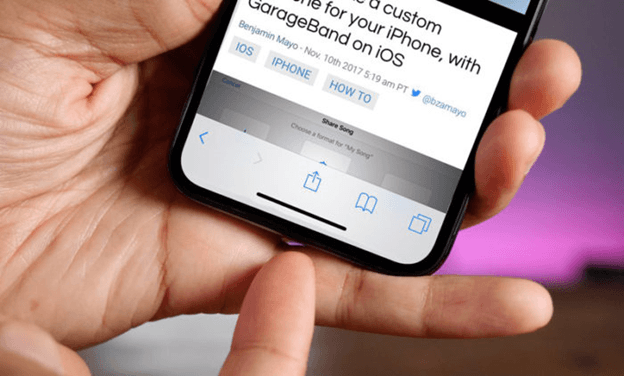
 Image by 9to5Mac
The
hardware home button was replaced by a virtual home indicator — a horizontal
line at the bottom of the screen that serves as a visual reminder to users that
they can swipe upward to go back home.
Try to avoid using custom gestures
The iPhone X is an attempt to use gestures to maximize content space on the mobile screen. With it, Apple has changed the meaning of some of the existing iOS swipe gestures and created new ones. Since gestures are hidden elements, users will have a hard time finding, remembering, and using them. When users switch from an older iPhone to an iPhone X, they will have to learn new gesture interactions and create new associations. This is likely to cause problems in the beginning because people will need time to adapt to the new interaction patterns. To help users transition to the iPhone X more smoothly, designers should avoid creating custom gestures and gestures that block or interfere with system-wide gestures.
Avoid placing any interactive elements in
the home indicator area
Avoid
placing non-scrollable interface elements in close proximity to the home
indicator. The space around the home indicator is allocated for the swipe-up
gesture, which is used to go home or to access the app switcher. If you place
buttons near the home indicator, users might accidentally use the home gesture.
 An example of too little negative space on the left and adequate space on the right.
Leave
negative space around the indicator by putting interactive elements in the safe
area. Safe area dimensions are 375 by 734 points for portrait mode, and 734 by
352 points for landscape mode.
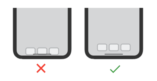
Don’t draw special attention to the home
indicator
In an
attempt to add more visual weight to the home indicator, some designers use
different styling for this functional element — but there’s really no need to
do it. iOS 11 is designed to give the home indicator sufficient contrast
against each background so users likely won’t have any problem noticing it.
 Avoid visual adornments, such as bezels, to highlight the indicator. Image by Mike Stern/Apple
Don’t block system-wide screen-edge
gestures
People
rely on system-wide screen-edge gestures to work in every app. When you block
them, it makes it harder for people to access the system-level actions,
increases cognitive load, and makes the experience inconsistent with other
apps.
Edge protection for swipe-upward gestures
If your
app requires custom upward gestures from the bottom edge of a display, you can
use edge protection to take priority
over the system’s gesture. Edge protection requires two swipes to exit your
app. Because edge protection leads to inconsistent user experience, it should
be used only when necessary.
3. Face ID
All
iPhones, starting with the iPhone 5s, have a great feature called Touch ID.
This allows users to unlock their device or perform password-protected actions
inside apps by scanning their fingerprints. This sensor was hidden inside the
home button. With the iPhone X, Apple replaced Touch ID with a more advanced
and even more secure technology: Face ID. iPhone X is the first-ever smartphone
that uses face recognition technology to discern your face from millions of
others. Machine learning enables Face ID to adapt to the physical changes in
your appearance over time. Face ID allows you to log in with zero interaction
cost, which means there’s no need to type or touch anything — you simply unlock
your phone by holding it up to your face.
Sign in with Face ID
It’s
possible to use Face ID to sign-in to certain apps and autofill usernames and
passwords for websites in the browser. If your app uses Touch ID for
verification, make sure that Face ID is also supported (users who use Touch ID
can expect to use Face ID instead when they switch to iPhone X).
Tip: If you use Touch ID in your app, update
text strings to refer to Face ID when running on iPhone X (e.g. “Sign in using
Face ID,” not “Sign in using Touch ID”).
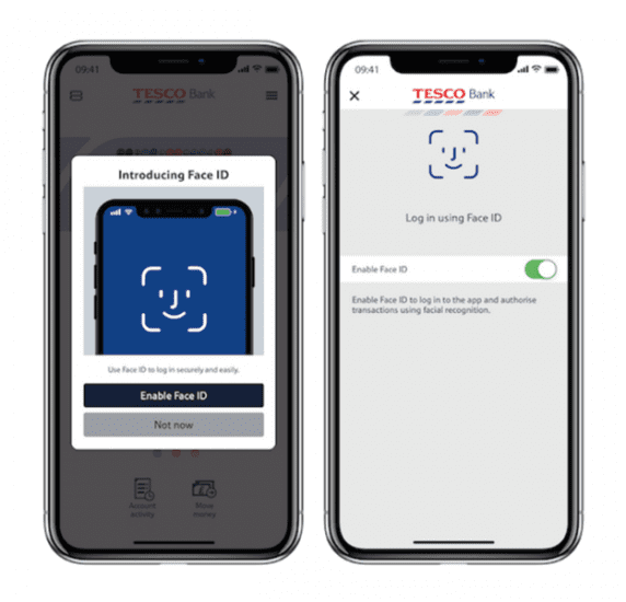
 Use Face ID during sign-in for the iPhone X (as a replacement for password). Image by Tesco.
Make purchases with Face ID
Apple
Pay is a secure, easy way to make payments for physical goods and services.
Previous iPhone generations use Touch ID as a way to authenticate a
transaction.
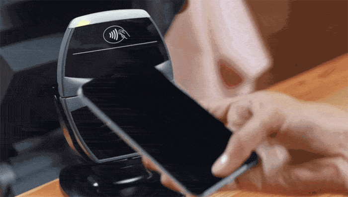
 Transactions authenticated using Touch ID on iPhone 6. GIF by Apple.
iPhone X uses Face ID for this purpose. That means that contactless payments, which use NFC technology to communicate transactions to payment terminals, are now even more effortless.
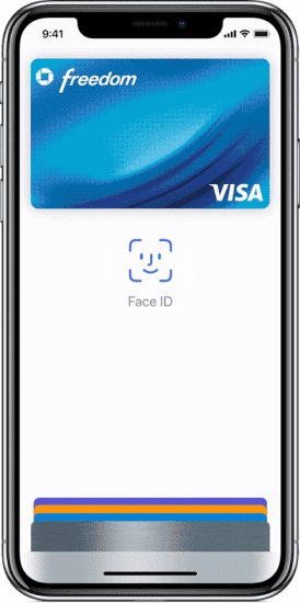
 iPhone X uses Face ID to make purchases. Image by Apple.
4. Augmented reality
Before
iOS 11, designers and developers who wanted to use AR usually had to build AR
capabilities into the apps themselves. The lack of a shared AR engine made the
experience expensive and non-standard — interaction patterns varied from one
app to another.
With iOS 11, AR hit the mainstream because AR technology was baked right into the OS. A new framework called Apple’s ARKit makes AR more attractive and accessible to developers. And since iOS 11 is already rolled out across hundreds of millions of Apple devices, it means a huge AR-ready customer base is ready to try AR experiences.
Designers will focus on building both apps for entertainment and functionality. One great example of a company that has already taken advantage of the explosion of AR is IKEA. The app created by IKEA allows users to place furniture in rooms by using a phone’s camera.
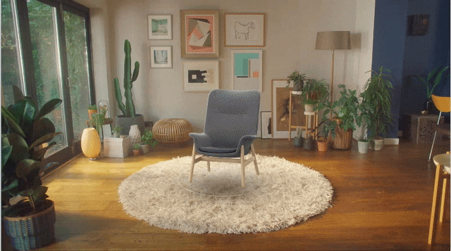
 Ikea let’s shopper sample furniture using augmented reality. Video by Dribbble.
In 2019, designers should be ready to embrace the world of AR. Apple’s Augmented Reality section of its Human Interface Guidelines is a great place to start this journey.
Resources
Conclusion
With the
release of iPhone X, Apple set a high bar for future mobile experiences. To
design great apps for the bezel-less iPhone, it’s essential to embrace all the
constraints of the device and focus on the new opportunities it brings. As
designers, we should use the power of new technologies to make our users’ lives
better.