Illustration by Rouba Shabou
Most designers know that it’s not enough to just create a great design; it’s also important to implement that design in the final product. Many problems can occur during the development phase as you adapt your design to multiple platforms and devices. Product teams rely on design systems to minimize potential front-end design problems.
In this article, we will discuss one particular part of a design system—design tokens. Here, you will learn what design tokens are and how designers use them.
What are design tokens?
Design system tokens are the style values of UI elements such as color, typography, spacing, shadows, etc., that are used across products and capable of being converted to a format for any platform (web, mobile, desktop). Tokens are building blocks of the design system—think of them as sub atoms, the smallest pieces of style values that allow designers to create styles for a product.
The concept of design tokens was initially introduced by Jina Bolton and Jon Levine in their talk Using Design Tokens with the Lightning Design System. Image credit YouTube.Differences between regular variables and tokens
Visual design properties like color can be stored as regular variables:
$blue-400 = #2680EB;
The variable $blue-400 can be used in a CSS preprocessor like SASS. While this approach will help you structure the design options, it has one important downside—variables don’t necessarily bridge the gap between naming and use. Designers need to know what options they should apply in a particular context, and that’s where tokens come into play:
$button-cta-background-color = $blue-400;
The name of this token—$button-cta-background-color—makes it clear that the color $blue-400 serves as a background color for the call-to-action button.
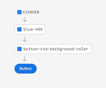
 Illustrating the difference between a variable (blue-400) and a token (button-cta-background-color). Image credit Adobe.
How tokens aid the design process
There are two ways designers can work with style values—either hardcode them in the design or use tokens. Design language changes and evolves over time, and when a product team relies on hard-coded values, it has to manually adjust the values every time it modifies a design.
Updating a single style value in the design is not time consuming. However, for real projects, attributes like brand color or typography are used in dozens of different places, and it takes a lot of time to adjust the values manually. Plus, it’s relatively easy to forget to change a particular value for some element (or elements) and introduce inconsistencies in the design. In contrast to these drawbacks of hard-coded values, tokens offer various benefits to the design process.
Tokens allow for flexible design
Tokens are used in place of hard-coded values and allow designers to create more flexible design solutions. Design tokens provide a way for designers to maintain complete control over the values in their design system. Designers update the value centrally (in one place), and the new change applies automatically to all designs on every platform.
Tokens create a unified look
The ability to create a unified look across different platforms is another benefit of design tokens. Tokens help keep your design system values in sync across all projects, and you can format them to meet the needs of any platform. For example, when you design a web version of your product, you can use HEX color value from CSS, but when you design iOS applications, you can use RGBA color format.
Tokens simplify the development process
Last but not least, design tokens simplify the development process. Developers have access to the latest design attributes via design system software. They can use design tokens in code like npm package and receive design updates without changing code.
 How to use design tokens in code. Image credit Designtokens.
Tips for managing tokens
Now that you have answers to the questions “What is a design token?” and “How are they used?” it’s time to explore practices that will help you streamline the process of creating tokens. The tips mentioned in this section are based on recommendations from top design systems advocates such as Brad Frost and Nathan Curtis.
Conduct interface inventory
To create tokens, you need to deconstruct pages down to their atomic level, and interface inventory will help you do that. Interface inventory is the process of categorizing the components that make up your product. At the end of this process, you will have a comprehensive collection of the large and small pieces that make up your interface, and this information will help you create tokens.
To make inventory easier, you can rely on the CSS Stats tool to see how many style properties you have in your style sheets. It will help you identify areas that require optimization. For example, by analyzing the colors you use in your project, you can tell which colors look almost identical and opt to replace them with a single color.
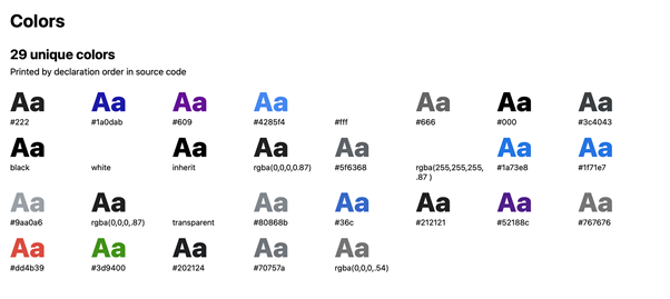
 Image of the many unique colors Google.com has. Image credit CSS Stats.
Define criteria for creating tokens
When does a style option become a token? Having clear criteria for when to create tokens is helpful. “X times used” criteria is a simple yet effective way to decide which options should be tokenized. If a style is used in only one place, you probably don’t need to create a token.
Define naming conventions
A design system’s strength comes from knowing how to apply options to context. It’s essential to ensure the correct token is used on the correct property. Different teams will indeed name things differently. That’s why it’s crucial to define clear naming conventions before you start working on tokens.
Here is a recommended approach for naming: [Category]-[Type]-[Item]-[State]. If you follow this approach, you will have something like this: color-background-ctabutton-active
When a designer needs a color for an active call-to-action button, they should be able to look through a collection of tokens and select one that matches their needs.
Adopt meaningful scales
Scales like t-shirt sizing (XS, S, M, L, XL, XXL) or progressions (2, 4, 8, 16, 32) can be very helpful when you need to apply tokens for different scenarios. For example, you might have a default font size for body text and rely on t-shirt sizing when you need to adjust it to different screen sizes.
Use JSON format to make token data reusable
JSON is an excellent format for encoding value pairs. With tokens in JSON, you can adjust design options for multiple preprocessors—SASS, LESS, or Stylus.
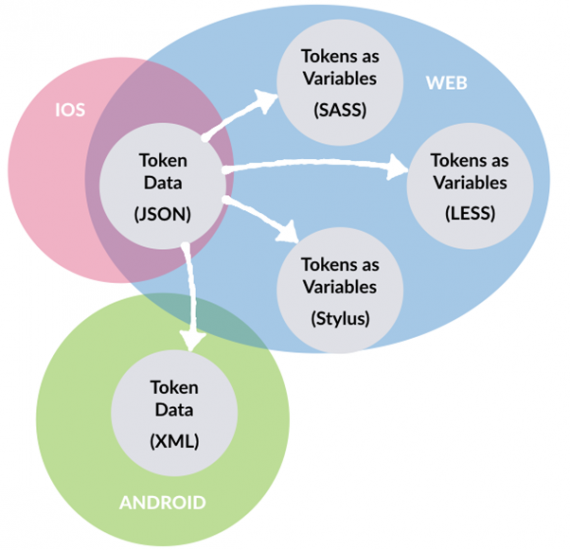
 JSON format creates a bridge to different platforms. Image credit Nathan Curtis.
Have a gatekeeper role on your team
Who should review and accept tokens? It’s tempting to assign this responsibility to all team members, but it’s better to resist this temptation because not everyone cares enough or has time to keep tokens clean. It’s much better to select a person who will curate the tokens suggested by all team members.
At the end of a day, you will have a flow in which anyone on a product team can propose tokens, but a single person (gatekeeper) will review propositions and accept/decline them. This person should strive to keep tokens clean—scan style and token files, evaluate nominees, and use design collaboration tools to provide feedback.
Enforce accessibility
Designs you create should be accessible to all users. When you work on tokens, you should not forget to test them for accessibility. Contrast is one of the foundational principles of design. When you choose colors, you need to validate contrast according to WCAG 2.0 recommendations. WCAG recommends a threshold ratio of 4:5:1 for standard or small text and 3:1 for larger text.
Product teams should run automated accessibility tests regularly. This will help you ensure that designs are always accessible. a11y is an excellent tool that will help you conduct accessibility audits and integrates into your build system.
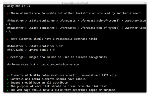
 Example of accessibility audit created by a11y tool. Image credit Github.
It’s also worth highlighting contrast values right in the design documentation since it becomes a single source of truth for anyone who works on a project.
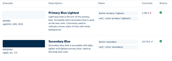
 Color contrast value in Duet design system. Image credit Duet.
Create better design systems with tokens
When design tokens are managed effectively, they simplify the process of creating a unified look across different platforms. Design tokens help product teams apply design decisions swiftly and with confidence. They become a single source of truth for designers and developers so both can rely on tokens to achieve consistency and scalability in UI design while collaborating effectively within the same design system software.