Why do people really visit websites? In most
cases, the primary reason behind each visit is content. Content is of paramount importance and every designer
wants to present it in the most useful and intuitive way on their website. It’s
not surprising, then, that selecting a layout for your content is one of the
first things designers do when they start a new project.
Many designers believe
the web layout for every site they work on should be completely unique to
satisfy the goals of the project — this is far from the truth. If you visit
popular websites, you’ll notice that many of them use similar layouts. This
isn’t a coincidence or done out of laziness, it’s because these layouts have
three significant advantages:
- They’re usable. Common website layouts have become common because they’ve proven that users can work with them.
- They’re familiar. A good user experience is created by building a sense of familiarity with users. Visitors feel a pleasurable sense of deja-vu when they see familiar features laid out as they would expect. As a result, people will spend time digesting the content rather than focusing on the page’s unique design.
- They save money. Reusing existing web layouts is a time-saver. Designers will spend less time experimenting with the layout and will focus more on visual hierarchy and other aspects of design that have a direct impact on user experience.
While each project is unique and requires an individual approach, it’s helpful to be familiar with what wireframing is and some common site layouts. In this article, we’ll take a look at the top website layouts you can find on countless sites today.
1. Single column
Single column layouts
present the main content in a single, vertical column. This type of layout is
perhaps the simplest from this list and is the easiest for users to navigate.
Visitors simply scroll down to see more content.
Despite its simplicity,
single column layouts are quite popular among many websites. The mobile
revolution also had its impact on the popularity of this type of layout —
single column layouts fit mobile screens perfectly.
When to use it
This layout finds
application in many personal blogs based on minimalistic design principles.
This is a common layout for microblogs such as Tumblr.
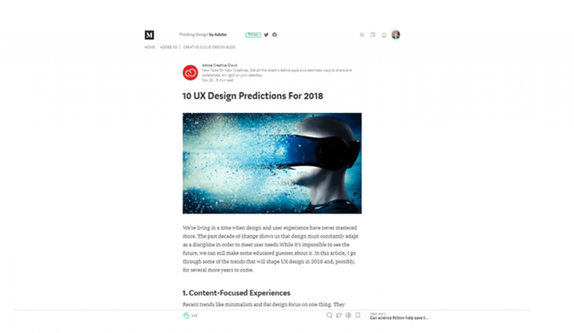
 Medium, a blogging platform, uses single column
Design tip
- Consider ‘sticky’ menus for long pages. Since the single column layout is often used for long-scroll pages, it’s essential to keep navigation always in sight. ‘Sticky navigation’ helps you avoid visitors needing to scroll all the way back to the top of the page to navigate.
 Image by CodeMyUI
2. Split screen
A split screen (or one
screen divided in two) web layout is perfect for a page that has two main
pieces of content of equal importance. It allows designers to display both
items simultaneously while giving them equal consideration.
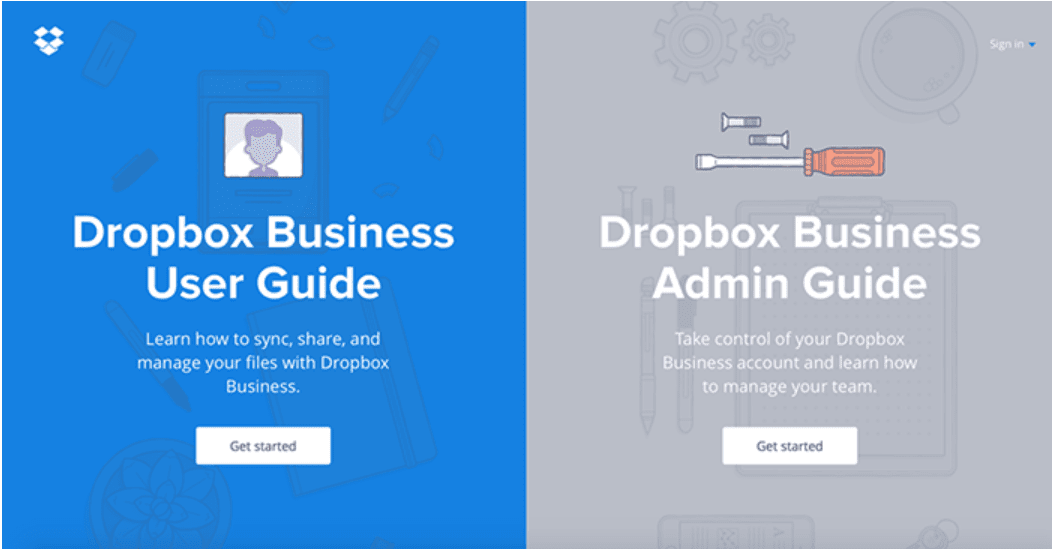
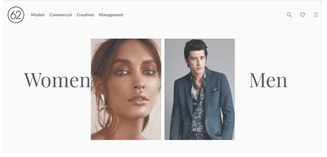 Image by 62 Models
When to use it
Split screen layouts
are perfect when your site offers two drastically different variations of the
user journey, such as two different types of instructions as we see in the
Dropbox example below.
 Use contrasting screens for different use cases.
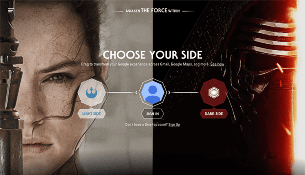 Image by Google Star Wars Customizations
Design tips
- Avoid using too much content in split sections. Split screen designs do not expand well as content grows, so it’s better to avoid choosing this type of web layout if you need to provide a lot of textual or visual information in split sections.
- Consider adding UX animation. You can create a more dynamic experience by incorporating animated details.
3. Asymmetrical layout
Asymmetry is the lack
of equality between two sides of the layout. Asymmetry is a long-time favorite
technique in the art world and has recently become popular among designers when
creating website layouts.
Many people confuse
asymmetry with imbalance but, in fact, the goal of asymmetry is to create a
balance when it’s either impossible or not desirable to use equal weight for
two sections. Using asymmetry makes it possible to create tension and dynamism,
and asymmetry facilitates better scanning behavior by focusing a user’s
attention on individual objects (focal points).
By changing the width,
scale, and color of each asymmetrical piece of content the designer urges the
visitor to stay visually engaged.
When to use it
This type of web layout
can be used when designers want to create interesting and unexpected layouts,
while still providing directional emphasis. Appropriately applied, asymmetry
can create active space that guides the eye from one element to another, even
across emptiness. Consider how Dropbox clearly shows points of focus in the
example below.
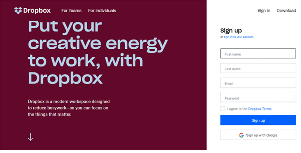 Asymmetry makes the Dropbox page dynamic.
This type of website
layout works best for landing pages to directly engage the user from the moment
they encounter your webpage. It also works well with websites that are have
less than 25 pages.
Design tips
- Make sure your content can be presented in an asymmetrical layout. An asymmetrical website layout is not practical for every site. It likely works the best for minimalist layouts.
- Add focus with color. Asymmetry is rooted in the idea that an object with more visual weight will draw attention to it first. You can use elements with high color contrast to add visual weight to specific parts of the design.
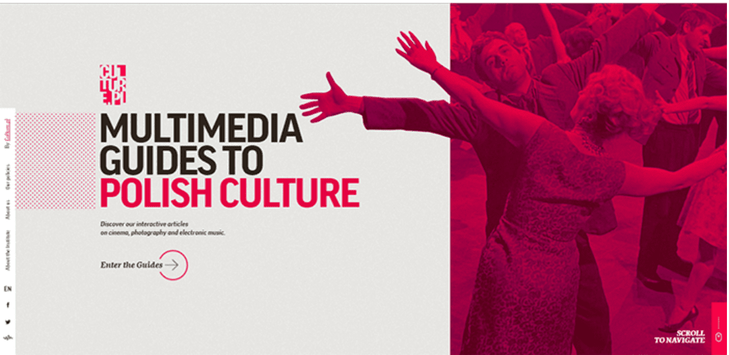 Color contrast adds visual weight. Image by Culture PL.
 4. A grid of cards
Cards are great
containers for clickable information —- they allow designers to present a heavy
dose of information in a digestible manner. Bite-sized previews (usually an
image and a short description) help visitors find the content they like and
dive into details by clicking or tapping the card.
The most important thing about a grid of cards is almost infinitely manipulatable. Grids can vary in size, spacing, and the number of columns, and the style of cards can vary based on screen size (cards can be rearranged to fit any screen). That’s why cards work so well in a responsive grid layout.
When to use it
A grid of cards layout
is good for content-heavy sites that display a lot of items with equal
hierarchy.
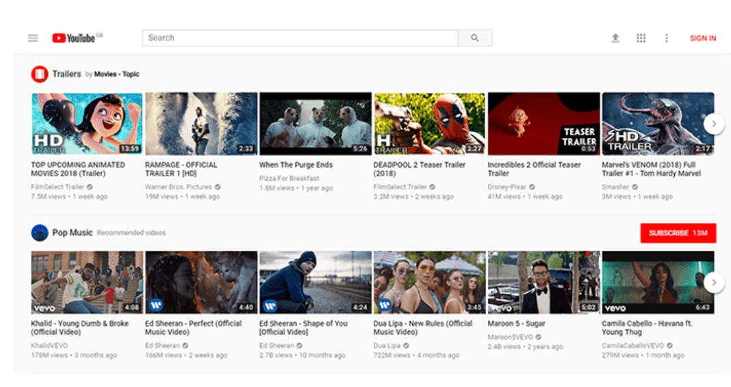 YouTube’s grid of cards
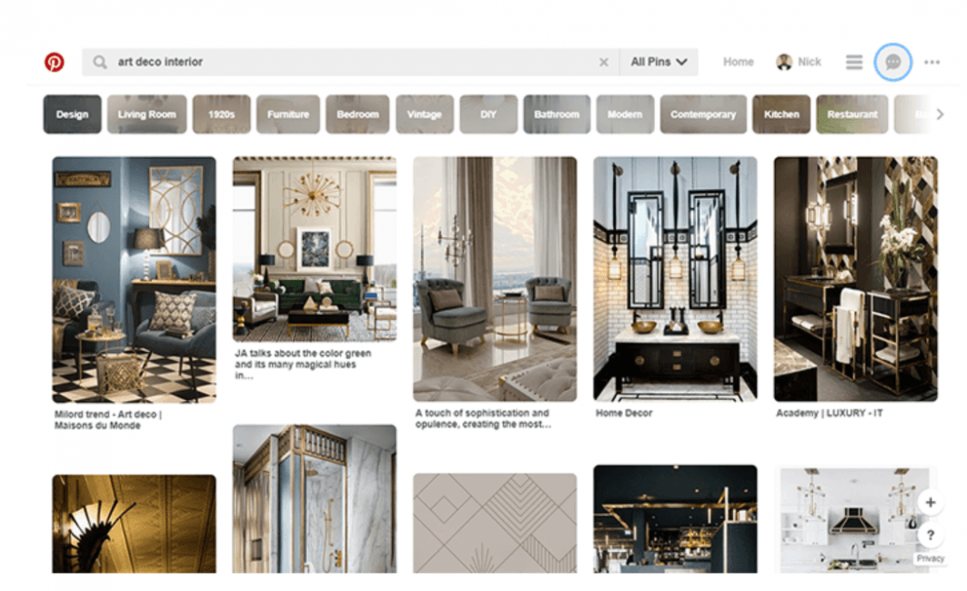 Pinterest’s grid of cards
Design tips
- Make the entire card clickable, not just
specific parts. User
interaction with a card is much more comfortable when users don’t have to click
precisely on a card’s headline or image to access content details.
- If your card contains an image, consider how it
will look like on a smaller screen. An image that doesn’t scale well and becomes illegible on small
screens creates a bad user experience.
- Pay attention to white space between cards
because it influences how visitors browse. More space between cards makes browsing slower, but visitors will pay
more attention to each card. Minimal space allows for fast scanning but also
increases the risks that visitors might overlook some content.
- It’s possible to incorporate animated feedback. The card will appear as a clickable element.
 Smashing Magazine‘s animated feedback on its cards.
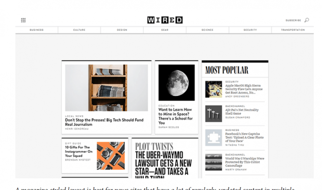
5. Magazine
This is perhaps the
most complex website layout mentioned in this post. As the name suggests, this
style of web layout was initially popularized by newspapers and magazines,
which had a problem presenting huge amounts of information to the reader in an
easy-to-follow manner. Print designers used the grid system for this purpose.
The layout is built using a modular grid that allows flexibility — a
multi-column layout uses different visual weight to prioritize information.
 Magazine-style layouts encourage scanning.
Similar to paper
magazines, digital magazines use a multicolumn grid that allows you to create a
complex hierarchy and integrate text and illustrations. The primary goal is the
same — visitors need to be able to scan, read, and understand a page quickly.
Designers strive to create a visual rhythm for this style of website layout.
They try to make it easier for the eye to scan the sections on the page and
allow the eye to travel naturally from one block to another. At the same time,
the designer tries to stop the different blocks from competing for attention.
When to use it
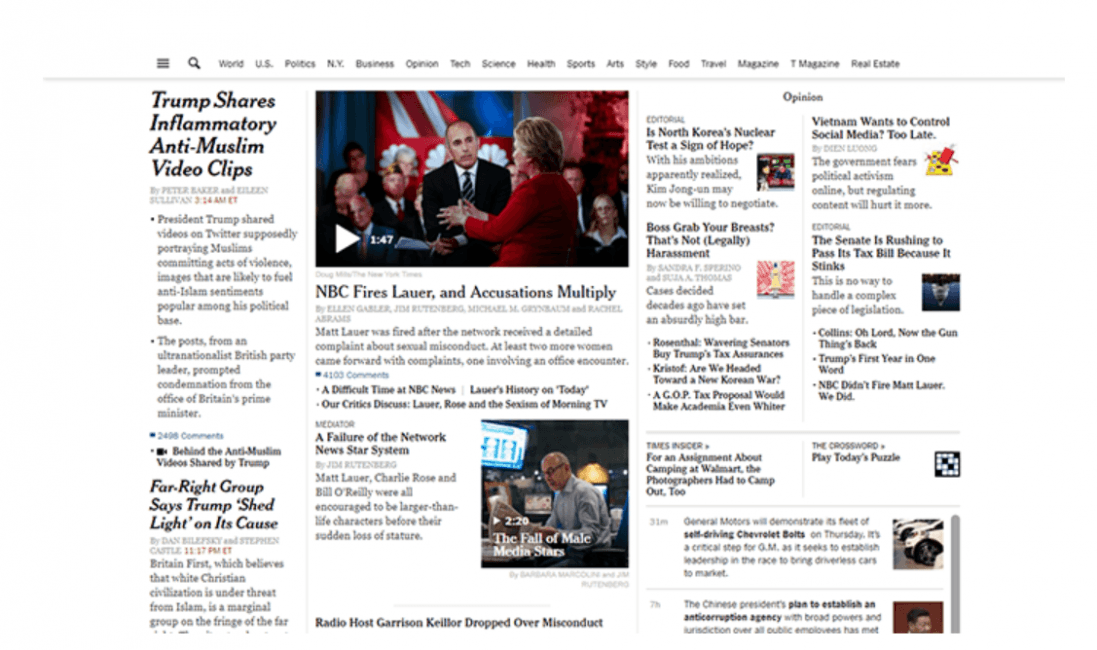
The magazine layout is a good choice for publications that have a complex hierarchy with large amounts of content on a page. Without the effective use of a grid layout design, it’s likely that all the content on the homepage would appear more cluttered and less organized.
 Magazine layouts work well for news sites.
Design tips
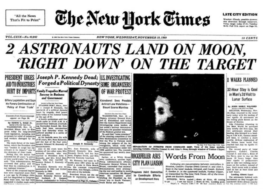
- This web layout emphasizes headlines and images. The size of the headline/image is directly related to the attention it commands. More prominent elements draw a user’s focus faster than the less prominent one. Take the New York Times, for example — the most important content on the page has bigger thumbnails, larger headlines, and more detailed text.
The New York Times uses
a different size for text to create a sense of importance–text sizes vary to
create a visual hierarchy.
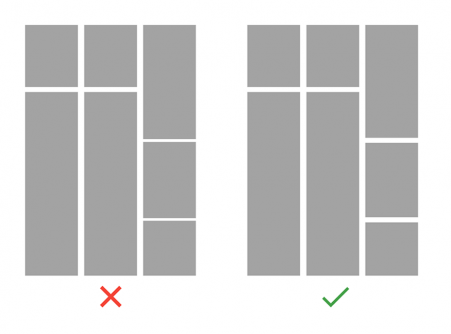
- Laying out
a grid requires attention to both the horizontal and the vertical rhythms, and
they are equally important if you want to create a good layout. Consider the
difference between the following examples. In the first example, the grid is
consistent with column width and horizontal spacing, but the varied vertical
spacing creates visual noise. In the second case, the horizontal column spacing
and the vertical element spacing are consistent, and this makes the overall
structure of the web layout seem cleaner and more comfortable for the user
who’s visually consuming the content.
6. Boxes
This layout has a large
header-width box, and a few smaller boxes that each take up a portion of the
larger box’s screen real estate. The number of smaller boxes can range from two
to five. Each of the boxes can be a link that leads to a larger, more complex
page.
When to use it
This is quite a
versatile layout that can be used for both individual portfolio-like sites and
for corporate/e-commerce websites.
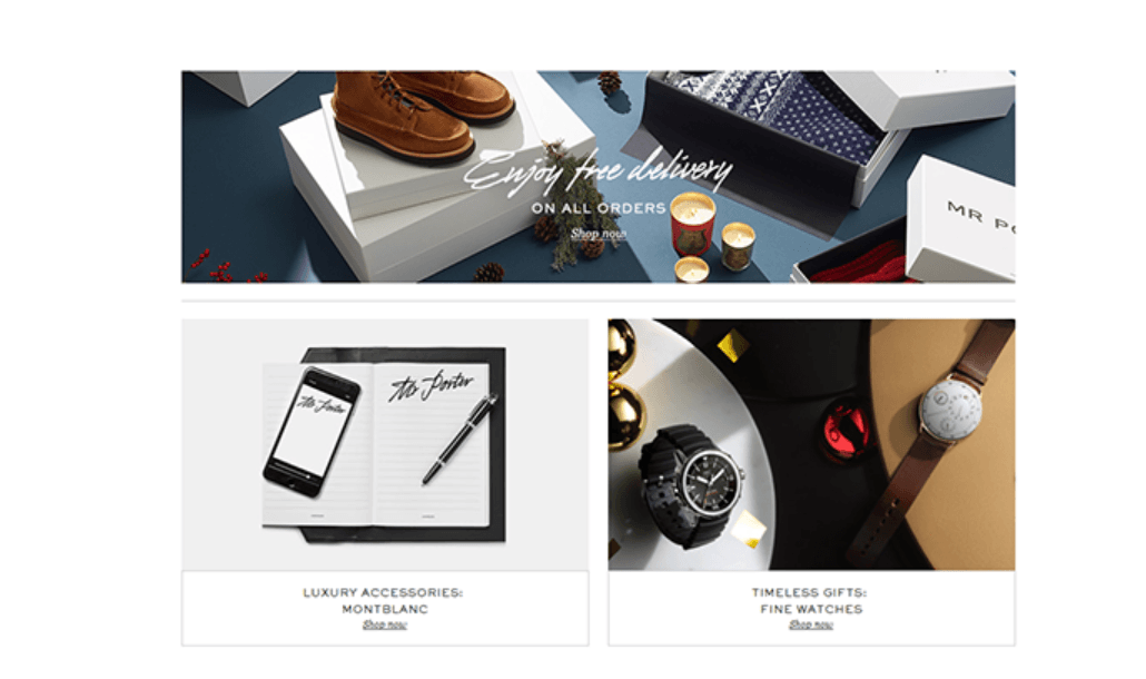 Image by mrporter
Design tips
Connect boxes to tell a story. The large box can be used to showcase products while the smaller boxes can offer further information on the product.
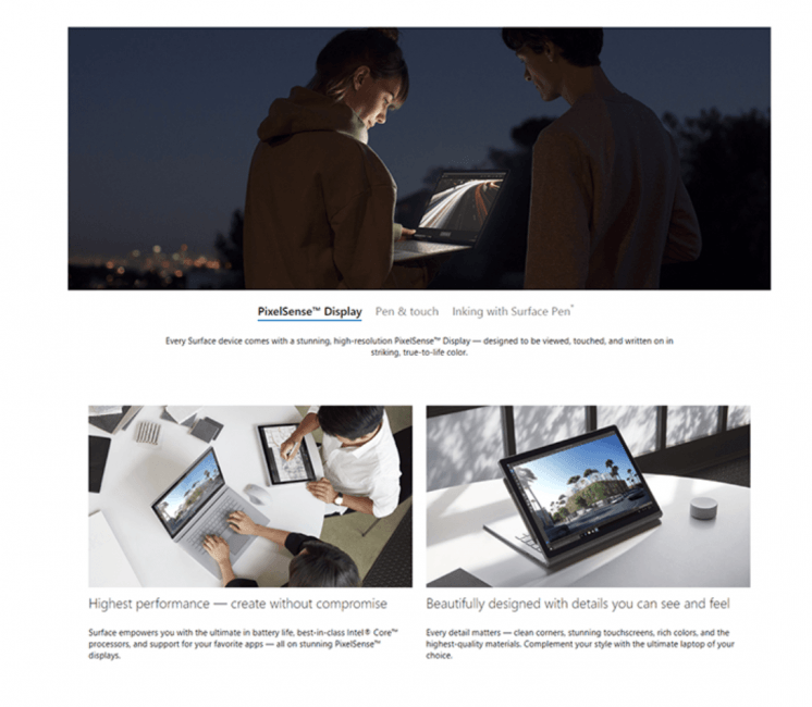 Image by Microsoft Surface
 7. Fixed sidebar
Navigation is a
critical part of any website — the main menu is the first thing most users look
for when they want to navigate. Along with top-side horizontal navigation, it’s
possible to keep menu options in sight by placing it in a fixed sidebar. The
sidebar is a vertical column on the left or right part of the page. For this
web layout, the sidebar stays stationary and always remains visible while the
rest of page changes as users scroll the page down. This way navigation remains
accessible.
When to use it
This layout works well
for websites with a relatively limited number of navigation options. It’s
preferable that all options will be in-sight when a user enters the page.
 Image by measponte
Design tips
- Sidebars
can also contain content other than or in addition to a menu, such as social
media links, contact information, or anything else you want to visitors to find
easily.
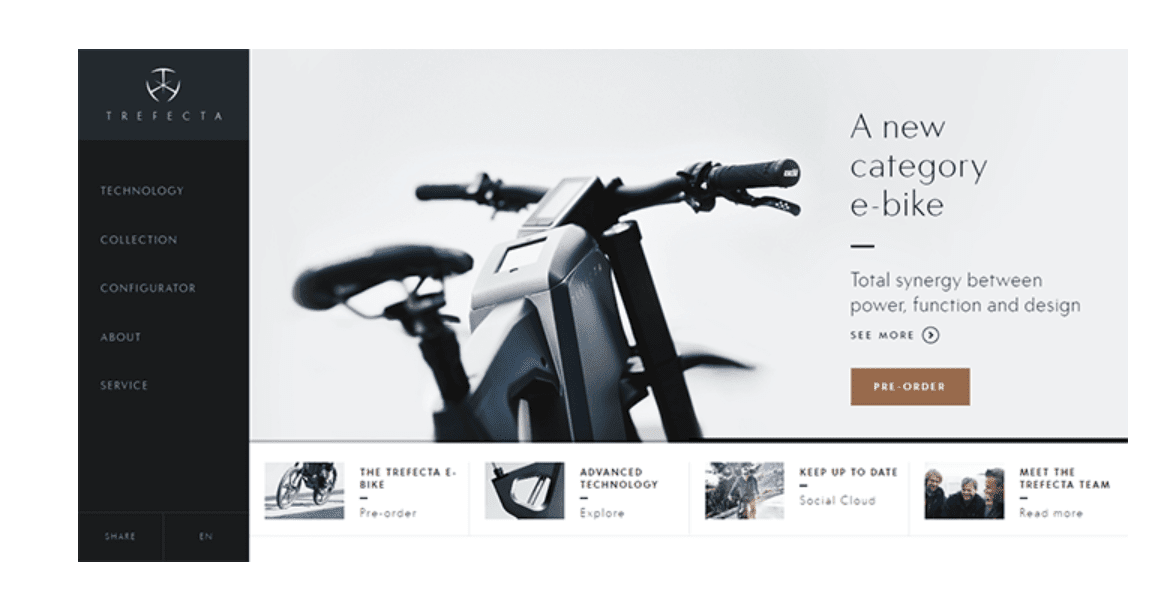 Trefecta provides customization and sharing options in sidebar.
8. Featured image
The website layout is
based on the idea that using images in design is the fastest way to sell a
product. Featured images create an emotional connection with visitors — a big,
bold photograph or illustration of an object makes a strong statement and
creates a stunning first impression.
When to use it
This web layout is
great when you need to demonstrate only one product/service and focus a user’s
entire attention on it.
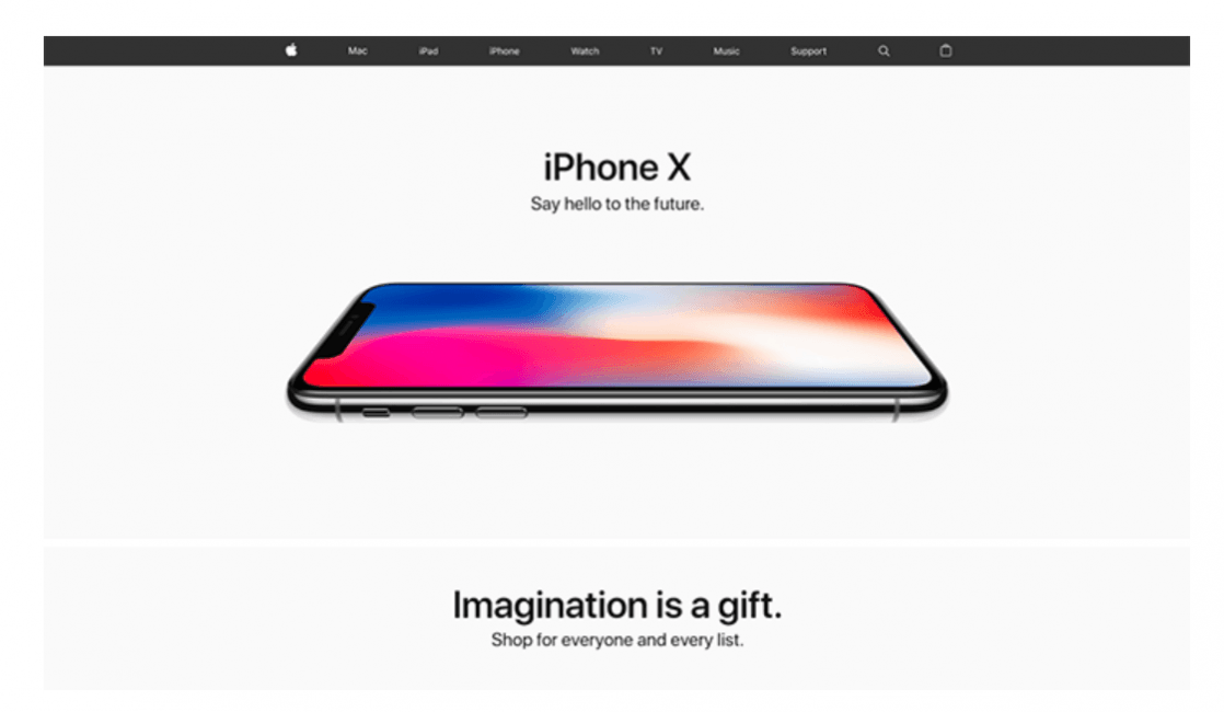 The lack of other elements in this layout focuses user attention.
Using this type of layout, it’s possible to build a truly immersive, emotional experience. One great example is Species in Pieces, which offers a rich experience and raises awareness for endangered species.
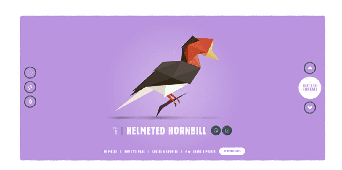 Image by Species in Pieces
Design tips
- Make sure your graphic is good enough to be featured prominently. The image, photo, or illustration should be both relevant to the message you want to deliver and high-quality.
- Consider typography. Typography accompanies the image. Size, typeface weight, and color are all properties of a typeface that need to be used to reinforce the design.
9. F-shape layout
This type of website layout was created based on the way users read content on the web. The F-shaped scanning pattern, originally defined by NNGroup, states that users typically scan heavy blocks of content in a pattern that looks like the letter F or E. Our eyes start at the top-right corner of the page, scan horizontally, then drop down to the next line and do the same again and again until we find something that catches our attention (interesting content). This scanning pattern is relevant not only for desktop users but also for mobile users.
When to use it
This layout is good for
pages that need to present a lot of different options and allow users to scan
them fast. Visitors will respond better to the F-pattern layout, which mimics
the natural scanning pattern. This is useful for a news site homepage or page
that contains search results.
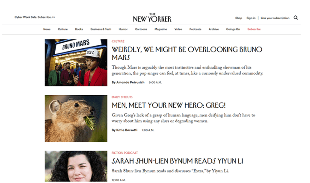 The New Yorker’s homepage is F-shaped.
Design tips
- Adjust content according to scanning behavior. It’s worth placing the most important content on the left and right sides of the page, where the user begins and ends their horizontal scan. When visitors reach the end of the row, they pause for a split second before moving to the next row, and this pause gives you an opportunity to present content.
- Use visual cues to guide the visitor. It’s possible to focus user attention on a specific element by putting more visual weight on it. For example, you can highlight keywords within a text to focus user attention.
10. Z-shape layout
Similar
to F-shape layout, the Z-shape layout also mimics natural scanning habits. Site visitors (from Western cultures) start in
the top-left corner. They scan from the top left to the top right, forming a
horizontal line. The next step, however, is a bit different — instead of
dropping down directly, as in the F-shaped pattern, their eyes wander down and
to the left side of the page, creating a diagonal line. Lastly, the glance back
across to the right again, forming a second horizontal line.
When to use it
While the F-pattern is
better for scanning a lot of content, the Z-pattern is better suited for sites
with a singular goal and less content. This pattern is effective at directing
user attention to specific points by using well-placed visuals, text, and CTAs.
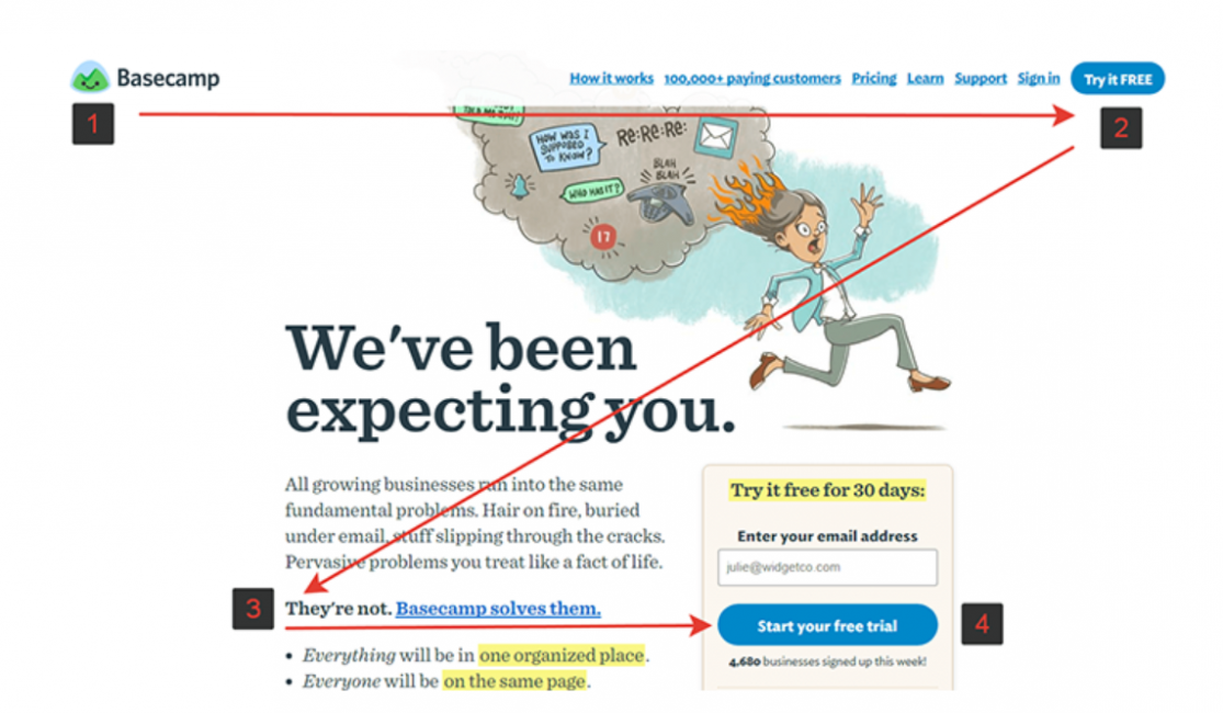 The Z-pattern works when a site has a specific call-to-action.
Design tips
- Engage
users with a zigzag (or continued Z-pattern). It’s possible to engage users in
scanning by alternating text and images a few times to create a zigzag.
 Zigzags create rhythm on Evernote’s webpage.
 11. Curated Visuals
This website layout can
be beneficial when your company’s employees are stuck trying to decide between
what visuals to show the customers. Curated visuals are authentic illustrations
that are unique to your specific company to easily connect with your audience.
Curated visuals help
showcase the message or emotion your company wants the customer to feel when
interacting with their products or services.
When to use it
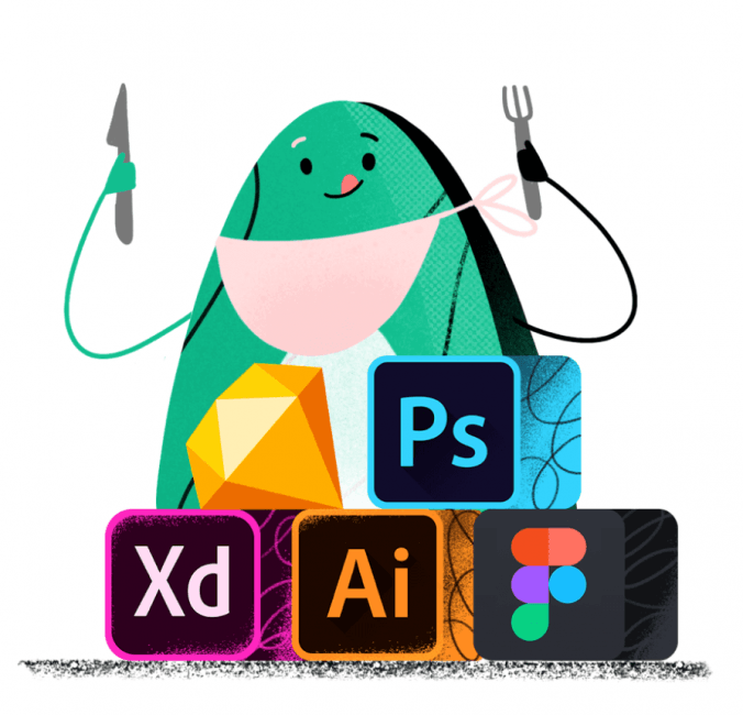
The web layout can be used to decorate and enhance your company webpage. An example of this would be Avocode’s use of illustrations throughout their company website.
Design tips
- Make the visual inclusive. This website layout can be helpful when appealing to the masses. Using illustrations for your company visuals allows you to reduce gender and race association to attract a broader range of customers.
- Stick to your brand. If your brand has a specific color palette, make sure to utilize it. This will help enhance the messaging your brand is conveying in the visual by sticking to the core aspects of your company.
Conclusion
When designing a site,
it’s important to remember that content is always king. The primary purpose of
the website remains the publication of easily digestible content. No matter what website layout you choose to use, it’s
essential to select the one that makes your content shine.