A few words can make all the difference when it comes to user experience. In just a few micro words, a user can establish enough trust with you to make a purchase, for example, or they could be driven away from your interface entirely, leaving their cart empty or abandoned.
Though it isn’t a new term, the role microcopy plays in a user experience is something many UX designers need to become more aware of — whether it is you writing the copy, a marketing team, or otherwise. These tips will help you write better microcopy that enhances your UX and provides a more authentic experience.
What is microcopy?
The term “microcopy” refers to the tiny tidbits of copy found on
websites, applications, and products. These short sentences tell a user what to
do, address user concerns, provide context to a situation, and help tell the
greater story about your brand, product, and the way you do business.
Microcopy is everywhere — from the words that comprise a call to
action, to the disclaimers that assure users that their email address won’t be
shared or stored. While this may sound like the responsibility of marketers and
content
managers, these works mark a vital part of UX that cannot be
underestimated.
Microcopy as poetry
All too often it’s an oversight, when in fact writing good
microcopy is an art, one that Amy Thibodeau, a senior UX lead at Shopify,
likens to poetry.
“With poetry, there is a form, and there’s usually a length of a
line and a way that rhyming works. There are all these constraints. You’ve got
to communicate something that is important and moving and clear, but within the
constraints of the form. I feel like that’s very much true for UX writing,” Amy
said in an interview with Adobe.
“You really have to communicate something that is often really
important to a person. [At Shopify, that’s to help them] grow and manage their
business, but you have the constraints of the interface. You have to be really
creative within the set of constraints. I think that’s the thing that I
continually find the most fun and inspiring. It’s almost like a puzzle.”
If writing microcopy is a puzzle, the four corner pieces are:
- Brevity
- Context
- Action
- Authenticity
Let’s take a look at these in more detail.
Cornerstone 1: Brevity
When it comes to microcopy, less is more. Keep it simple and
straight to the point. Micro words
should guide users so intuitively that they barely
even notice it’s there. You want it to be concise and intuitive, as this
brevity is the foundation of your microcopy.
Airbnb is a good example of microcopy done well. The search bar
prompts users to “Try Berlin.” It is
short (brevity), provides an example (context), encourages a search (action).

 Image by Airbnb
Building on brevity, this microcopy provides a concrete example of
what the user should be entering in order to achieve the desired results. It
cycles through several different examples to highlight other features, such as
to try “concerts in Los Angeles” or “restaurants in London,” while also showing
the user the different experiences that are available.
Cornerstone 2: Context
Context helps users figure out exactly what they’re supposed to
do, while empowering them to establish trust with the product/brand. Context
isn’t reserved for just search bars and forms, but a fundamental part of all
microcopy. Well-crafted microcopy also makes your product more
accessible—it is very helpful for your users who may use screen readers to
assist them with navigating websites and applications. Regardless of
whether your constraints allow for a few words or a few sentences, context is
your opportunity to give your user more insight into what comes next. It can be
short (like the Airbnb example), or slightly longer to provide more details.
This example from ClassPass shows how a few sentences can not only
provide context into what you’re offering, but also prompt action with a
special offer and call to action.
 Image by ClassPass
Cornerstone 3: Action
Microcopy can also motivate users to take a step. Whether it’s to
get the user to click a button, to provide you with information such as an
email address, or to simply keep them engaged and on the page, each word has a
purpose.
The action component of microcopy is strategic. You don’t want the copy to be too sales-driven, but rather it should feel natural for the user to read and absorb. Let’s take a look at Etsy, for example.
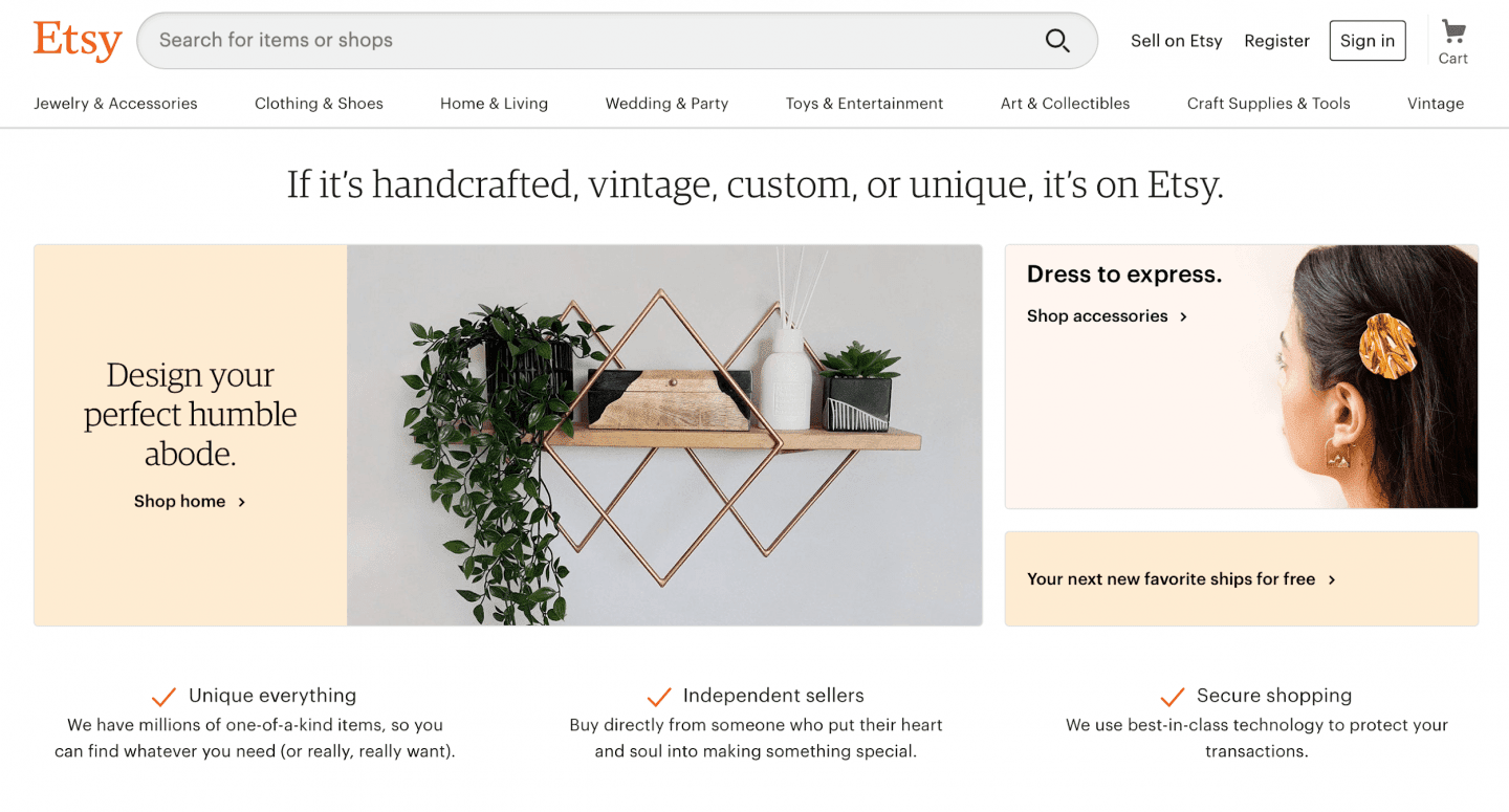 Image by Etsy
There is a lot of microcopy going on here. We’ve got:
- Brevity: the search bar, which
includes an example.
- Action: Three featured boxes, each with its own microcopy and call
to action (shop home & living, shop jewelry & accessories, and your
next new favorite ships for free).
- Context: A set of three examples
of microcopy designed to foster trust with the user and their privacy, while
providing insight into what Etsy is all about.
The user has numerous options here, but each one has been
carefully thought about and strategically implemented with language that speaks
to both Etsy as a brand and the user. It is friendly, informative, and it
brings us to our final cornerstone: authenticity.
Cornerstone 4: Authenticity (and the risk of dark UX)
Of all the cornerstones of UX microcopy, authenticity might be the
most important one. We have entered a time where certain brands have
acknowledged the power of microcopy and have used it in ways that can damage a
user experience by misleading users, among other things.
A study conducted by Sigma found that some online retailers are embracing what’s called “dark UX patterns” to intentionally manipulate users. One of the examples the study provided included this screenshot from Amazon.
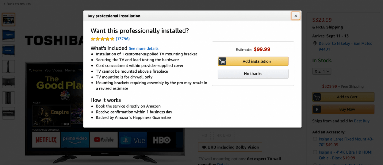 Image by Amazon
After adding a television to their basket, the researchers at
Sigma were prompted to “professional installation” of our TV. By taking advantage of color theory, the user’s
eye is drawn first to “Add to Basket” rather than to “No thanks.”
“Microcopy is so important in reassuring users and making them
aware of exactly what they are signing up for,” Sigma said in the report.
The study also highlighted examples of microcopy that is designed
to confuse or mislead users, as well as microcopy that scares users into making
a purchase. While we commended Etsy above for using microcopy in concise and
contextual ways, the Sigma study reveals their using a scare tactic that many
organizations use to increase conversions.
Under the “buy it now” action, the copy says, “Almost gone. There’s only 3
left,”
with an image of an hourglass with time running out.
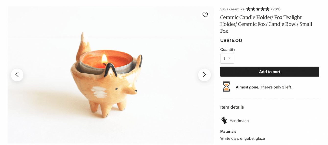 Image by Etsy
After discovering this study, I was tempted to remove the Etsy
example from before, but ultimately decided to keep it to demonstrate that
microcopy is something that needs to be considered across the board in order to
be truly authentic. You can be doing it well in one area, but it really needs
to be factored into all areas of the user experience.
To summarize
When writing microcopy, really think about the elements you want
to include in your UX poem and the user who will be reading it.
- They don’t have a lot of time, so be concise (brevity).
- They want to know exactly what they’re/you’re doing and why, so be transparent (context).
- They are there for a reason, whether it’s to learn more or buy something, so help them do it (action).
- They want to engage with brands that they trust and that they feel understand them, so show them how you do this (authenticity).
With these four corners of the puzzle in place, you’ll be well on
your way to writing UX microcopy as beautiful as poetry.