Many designers have hands-on experience with desktop and mobile app design, but smartwatches are still a completely new and unfamiliar territory for many designers. Both the size of the device and the way people interact with them require different design approaches.
The best apps for
smartwatches support fast interactions and focus on the content that users care
about most. In this article, I’ll provide a list of practical recommendations
that will help you create excellent smartwatch designs.
Glanceable
Watch faces have a
limited amount of space available for information. It’s important to understand
that interactions with watches are measured in seconds, so the app must quickly
provide the user with all the essential information and actions. You can
achieve this goal by keeping interfaces uncluttered and creating a clear
hierarchy for information:
- Avoid displaying too much
information on screen at once. Show only essential
details that users need to see.
- Emphasize important information
using different font weight, size, color, and whitespace.
- Create visual groupings to help
users find the information they want. Use negative space to place related
elements and information into distinct areas.
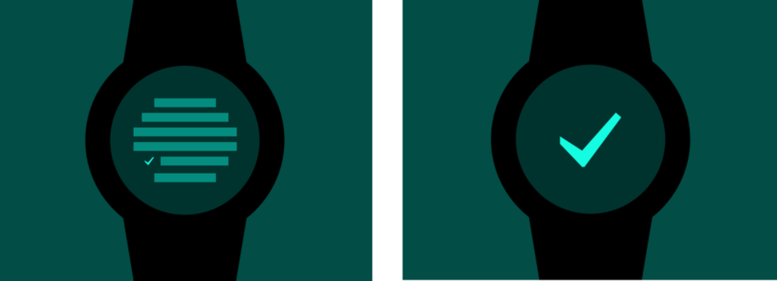
 The screen on the left makes users squint to read the UI.
Focus on core functionality
Designing a great smartwatch UX requires a focused approach.
“People don’t want to buy a quarter-inch drill. They want a quarter-inch hole!”
This foundational principle of product design is applicable for all types of
products, including smartwatches. Smartwatch designs should be built to respond to the specific
needs of the user. User experience design for smartwatches
should always revolve around getting to the core purpose of your app.
Don’t include unnecessary features,
actions, or content in your app’s watch UI. Focus on primary operations. For
example, if you design an email app for a smartwatch, focus on creating an
excellent experience of reading messages and sending quick replies, and skip
options for adding attachments or editing recipients because users rarely need
them.
Responsive
Smartwatch apps should be highly performant. The response to user actions needs
to be immediate. Conduct performance benchmarks and identify places in your app
that make users wait. Optimize content that causes slow loading time (usually,
slow loading time is caused by media content such as images and videos).
Protip: There is a simple rule of a two-second interaction.
Nothing in your smartwatch
designs should take more than 2 seconds to respond.
Predictable navigation
Reduce the total number of pages
Including too many pages of content in your
smartwatch UX will
make in-app navigation time-consuming and frustrating.
When users need more information or features, they can switch to different
mediums such as mobile or desktop. Focus on essential content and design your
app for quick and convenient interactions.
Select proper navigation model
If your app has more than one screen, you need to select an appropriate navigation model. Choose the navigation model that best meets your needs. Apple recommends using page-based or hierarchical models:
- Page-based. In page-based navigation, users swipe horizontally to navigate from page to page. Page-based navigation is a great way to present a flat collection of information in which all items are peers.
Page-based navigation. Image by Apple.- Hierarchical. When users tap an item in a hierarchy, a new screen appears that displays details about that item. This type of navigation is well suited for parent-child interfaces (i.e., a category and items in this category).
Hierarchical navigation. Image by Apple.Remember that as
soon as you decide what navigation model you want to use, you need to use it consistently
in your app. You can’t use both models in the same app.
Protip: Avoid creating
hierarchies deeper than 2-3 levels. Including more than 2 or 3 levels of
information easily create conditions when the user loses their place during
navigation.
Don’t redefine the meaning of gestures
Gestures are a standard way of interacting with mobile devices and smartwatches. Users expect to have familiar gestural interactions with your products. That’s why you should avoid using standard gestures to perform nonstandard actions. For example, it’s better not to redefine the meaning of swipe or pinch to zoom. Unless your app is a game, redefining the meaning of standard gestures makes smartwatch UX confusing and complex.
Reduce interaction cost
Interaction cost is the sum of efforts (both mental and physical) that the users must invest in interacting with an app in order to reach their goal. No matter what action the user does, it shouldn’t take them much time. Reduce the number of screens the user has to see in order to achieve the goal.
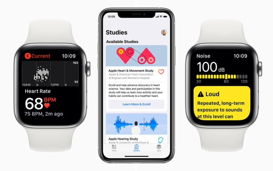
Utilize device sensors
Many smartwatches available on the market
today have built-in accelerometer and gyroscope. The data from the sensors can
be used for fitness and health-related activities or for games. Device sensors are not only able to reduce the data input efforts,
they also provide a few great benefits for the user. For example, fitness apps
can use the data to provide feedback about the user’s general health.
Timely and relevant notifications
Smartwatches are
great for delivering actionable live data. They should provide the right
information (high-value for users) at the right time (when users expect to see
it or need to see it).
Here are two
things to remember when working on smartwatch designs:
- Notifications should be easy to dismiss. Smart watch designs should be comfortable for users and not interfere with what the users are doing.
- Use haptic feedback only for important notifications. Haptic feedback tells the user that something significant has happened and requires the user’s attention.
- Keep privacy in mind. Avoid displaying potentially sensitive content in the notifications.
Optimize media content
Optimize all images
Optimized images take less space on disk and load more quickly. It’s recommended to use JPEG for photography because its compression algorithm usually produces smaller sizes. The great thing about JPEG compression is that it’s easy to usually find a balance between quality of imagery and it’s size. JPEG format offers the ability to choose how compressed an image should be from 0 percent (heavy compression) to 100 percent (no compression). But remember that the file format is lossy, meaning that it loses some of its data each time it is compressed. Lack of transparency is another con of this format.
Keep video clips short
The media clips in your app’s interface
should be no more than 30 seconds. The shorter you make them, the better. Long
clips not only consume more disk space, but they also require users to keep
their wrists raised for longer periods of time, which can cause fatigue.
Visual design
Typography
Typography must honor content. It’s
essential to make text readable, understandable, and legible.
Here are a few
practical recommendations to follow when working on smartwatch UX:
- Try to use system fonts. San Francisco (SF) is the system font in Apple watchOS (it’s available in two variants-SF Compact Text and SF Compact Display). Roboto Condensed is the primary font used in Google Wear OS.
- Avoid using thin weights at small sizes. Thin fonts are not legible at smaller sizes.
- Be careful with custom fonts. Custom fonts let product teams communicate their brand. However, it’s recommended to use no more than one additional typeface in your app. While both watchOS and Wear OS supports custom typefaces, using too many can make the interface feel disorderly.
- Make sure custom fonts are legible. Custom fonts may not be as legible at smaller font sizes (they rarely support features like Apple’s Dynamic Type that adjust the font size per screen). Thus, it’s better to use custom fonts for larger text elements such as headlines.
Text alignment and the UI elements alignment
The F-shape pattern works for all types of
devices, including smartwatches. Left-aligned text is easier to read. For
functional elements like buttons, it’s recommended to show them as a vertical
stack with text labels. This design decision makes the button more scannable.
 Left-aligned text on Apple Watch. Image by engadget.
Colors
Color is a powerful tool that can aid in communication with users. The properly selected color scheme not only supports your branding, but it also creates a visual continuity between different screens.
Here are a few
things to remember when working with colors:
- Consider context. Make sure the colors you choose sends the appropriate message. For example, it would be jarring if an app for mindfulness used a vibrant red color as a background color during meditation.
- Consider contrast. Apple recommends using light colors for text because it’s easier to achieve proper contrast and legibility with such colors.
- Consider color blindness. Many colorblind people find it difficult to distinguish red from green. Do not use these color combinations as the only way to deliver the message.
 Light colors suggested by Apple Human Interface Guidelines.
Animation
Well-crafted animated effects can create a truly memorable experience for users. Creating animations for tiny screens can be challenging even when designers have previous experience with creating animations for mobile apps. Thus, it’s recommended to follow a few simple rules to create great smartwatch UX:
- Keep animations short. Short animations convey the needed information and don’t make the user wait.
- Create animations that have a specific purpose. Never create animations just because you can. Animations should always serve a functional purpose – establish context and draw attention to a specific part of your interface.
- Minimize the number of concurrent animations. Running many animations at the same time not only will affect the responsiveness of your app, but it also makes it hard for the user to comprehend the animations.
- Make animations optional. When the option to reduce motion is enabled in accessibility preferences, your app should minimize or eliminate application animations.
An example of good animation. Apple Watch’s Activity animation. Image by Feng ZHU.Don’t think about watches in isolation
Smartwatches help users access information quickly, but sometimes users may want to switch to different mediums to dive deeper into the content. It’s important to understand that the watch shouldn’t isolate information; instead, that information should travel naturally across all digital touchpoints that users have. When you work on mobile design, you need to consider the cases when mobile and smartwatches work together. Synchronize user progress and make it easier for the user to switch to the different medium and continue the journey right from the same step.
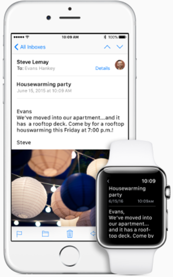
 Hand off tasks from Apple Watch. Users can continue the task that was initiated on Apple Watch on iPhone. Image by Apple.
Conclusion
When you design an app for a smartwatch, your ultimate goal is to blur the boundaries between the device and software. Similar to classic watches, the interactions with the smartwatch should be lightweight and fast. Smartwatch UX is all about the speed and comfort of interaction. Users shouldn’t feel like they are interacting with a computer but rather a personal device that makes their life more comfortable.