Wearable devices might just be the hottest tech since the iPhone. Roughly a quarter of US adults use a wearable device at least once a month in 2019. There are millions of wearable devices in the market today (including watches, wristbands, glasses, earphones, and rings) and even more are coming. If you haven’t designed for these devices, chances are you’ll have to soon. But wearables present a unique set of challenges when it comes to design. The devices have limitations (smaller screen space, less information density, limited battery life) and present different use cases (people using wearables are regularly in motion) which means they require a different app design approach.
 Wearables have a unique set of design constraints. Image by Forbes.
These are the 11 things that you should
keep in mind when designing for
wearables.
1. Design For Glanceability
No word has been thrown around in wearable
design quite as much as “glanceable.” Glanceability refers to information being
designed for short moments of interaction. At the
dawn of wearable technology, we were first introduced to the concept
through screenless fitness trackers, which rely on lights to explain to the
user what’s going on.
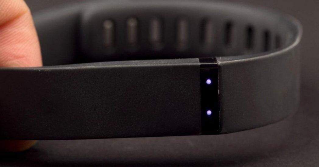
 Lights on fitness trackers convey information to users. Image by Digitaltrends.
The term is used differently in the context of the wearables that have screens such
as smartwatches. Making UI glanceable
is less about reducing the interface down to its most
basic visual feedback, and more about figuring out what exactly the user needs
to see at any given moment of time.
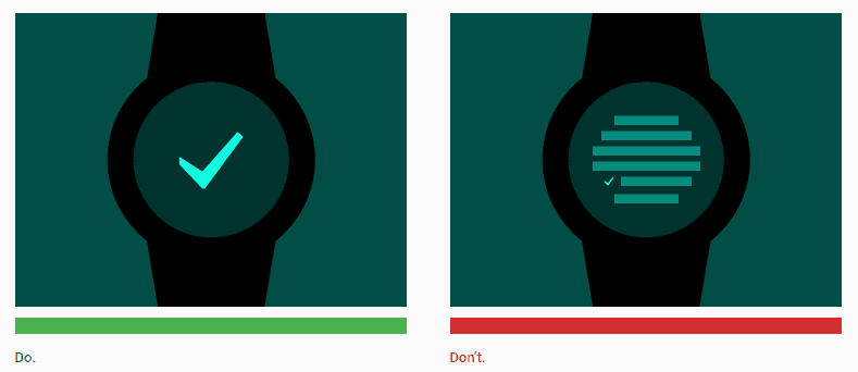
 Keep interfaces uncluttered. Image by Google.
For wearables’ limited screen real estate, designers must focus on displaying only the most
critical information. A user should be able to consume content made for
a smartwatch in less than 5 seconds.
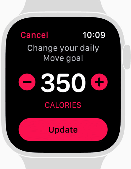
 Smarwatches must convey information that can be consumed in a glance. Image by Apple.
2. Design for Context
Context is the backbone of your design and
you should use it to provide specific information at a glance. Designing for wearables is designing for context. Smart
devices are full of sensors and it’s possible to utilize built-in device
sensors to determine user context. For example, be
aware when the user is using Geolocation services, and help enhance the user’s experience by making the context-relevant
information glanceable.

 Timely information is what makes wearable UI valuable. Image by Google Now for Android Wear.
3. Design Lightweight Interactions
While desktop and mobile apps might consider a user session measured in minutes or even hours, wearable experiences are completely different. They should be as short as possible. If a user interaction takes more than 10 seconds, it’s time to go back to the drawing board and redesign your interface. Minimize interactions and keep interfaces simple by only showing what’s essential for a user to complete a task. For example, when users have to reply to a message using a smartwatch, don’t show a text input form. Offer quick pre-defined responses and provide a voice input option in wearable UI if a longer response is required.
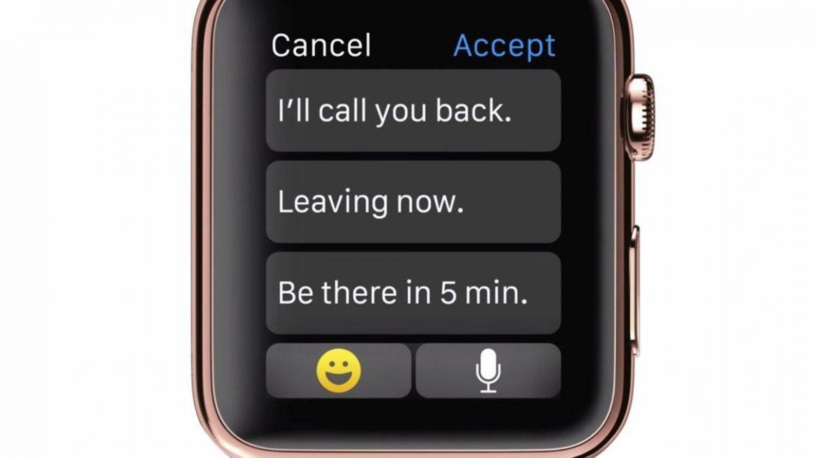
 Smartwatches work best with a tap or swipe gesture. Image by Apple .
4. Keep It Simple
The well-known KISS Principle is perhaps even more relevant in the domain of wearables than in desktop or mobile user interfaces. When working on wearable UX, avoid the temptation to put as many features and information in the wearable. Follow simple rules:
- Don’t put more actions or information than the user needs, otherwise, it will disrupt the experience. Instead, focus on single-use cases and cover it by creating an efficient flow that helps users’ complete tasks quickly. It will also help make the information glanceable.
- Make interactions as easy as possible. Design singular, focused tasks: users should be able to do and see just one thing at a time.
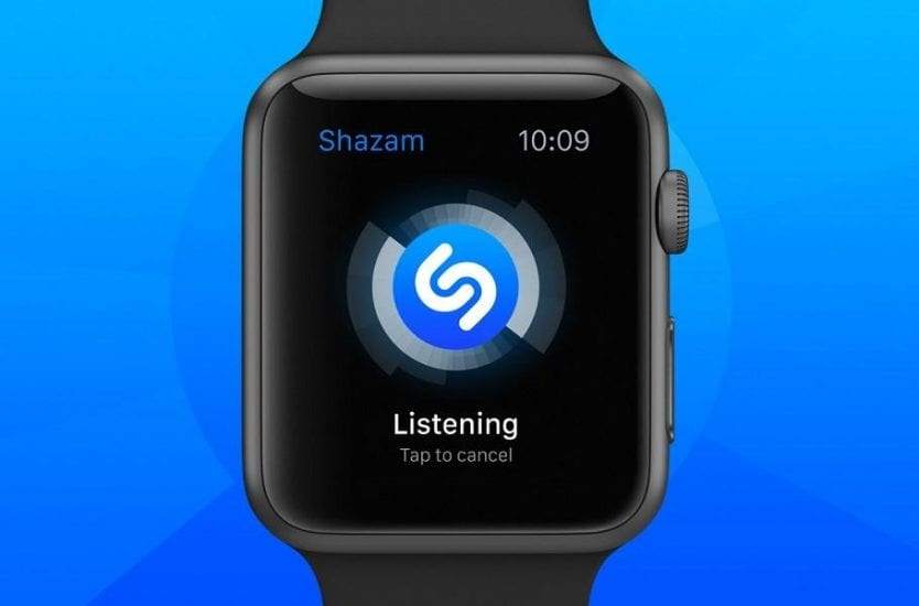
 Shazam focuses on a single-use case, which reduces steps needed to complete a task. Image by Apple.
5. Design a Clear Minimalistic Interface
Users must be able to read whatever you put on the screen, and easily interact with it while moving. Minimalist design is ideal for smartwatches and wearables. Everything from color to typography in wearable UI should be simple and straightforward:
- Sharp contrast. Contrast is
very important on small screens, as it makes elements easy to see and read at a
glance. Test your UI in real-world environments.
- Simple typography. When it
comes to typeface on wearable devices, a simple Sans Serif is one of the most
readable options.
- Enough space between elements.
Space can make or break a design on a small screen: if you put too much space
between elements there won’t be room for any other content, but if you put too
little space between them, it will be hard to see or read. Thus, you have to
find a proper balance that will help you to provide function and make wearable UI more glanceable.
Designing for wearables is
always about making something
that looks (and hopefully works) great on a tiny
screen.
 Runtastic contrasts bright hues against a dark background. Image by Apple.
6. Minimize Interruption
Even on large-screen smartphones, incoming notifications
and alerts are often disruptive. But when wearable devices require a lot of
attention, this can make people abandon them. It is one thing to have a mobile
device buzz in your pocket, but it’s a completely different thing to have
something buzzing that is right up against your skin.

 Wearables are worn all day; keep notifications in check. Image by niemanlab.
A few simple rules to follow when designing
notifications for wearables:
- Reduce the number of notifications. The information pushed to a user via a wearable should be filtered. The frequency of notifications should be minimal so the device doesn’t constantly nag and irritate the person who is wearing it.
- Push value. When you do need to notify a user, you should make sure the notification is valuable for the user. Positive interruption can create great user experience, but it requires an understanding of what a user actually needs. Pushing relevant information at the right point of time is key to a great wearable app.
- Customization settings. It’s possible to design better wearable UX by allowing the user to configure the timing and types of notifications they receive and allow them to easily disable them when needed. Also make it possible for users to select how they would like to be notified (some will prefer a vibration and a screen glow, while others will select just a screen glow).
7. Opt For More Privacy
Wearable devices can display extremely
personal information such as private conversations or health data and unlike
smartphones, which are usually concealed in a pocket, wearables are in plain
sight. Given a choice, designers should always opt for more privacy in wearable UI. A few practical recommendations:
- Be aware of which way the
device is facing and display content accordingly. Inward allows for more
personal content to be displayed, outward should default to a blank screen.
- The same applies to
notifications: vibrate first, display second.
8. Leverage Non-Visual User Interface
The saying that “the best interface is no interface” especially holds true when wearables are involved. When designing wearable UX, try to utilize not only touch, but also sound and vibrational communication. Consider voice input to compose text messages or to schedule activities; notify users with vibrations and sounds.
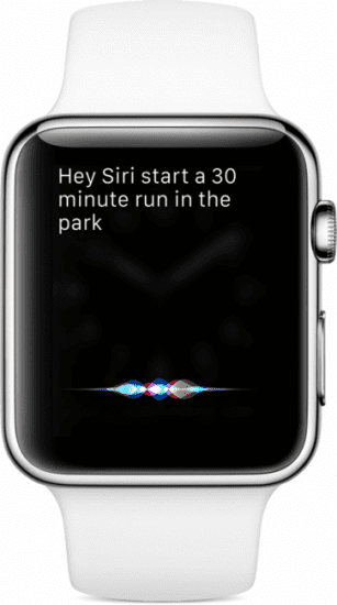
 Siri on Apple watch
9. Interaction With Other Devices Is Important
When designing for wearables you shouldn’t think of those devices in isolation. It’s important to integrate a wearable with the existing devices in
a user’s digital ecosystem and use the strengths of a wearable to make the ecosystem better. For example, a blood
pressure monitor and heart health companion app for a smartwatch might be used
to collect the data, but the review and analysis of the data collected can be
done using a smartphone.
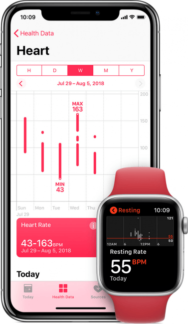 Apple health app on Apple watch.
Apple Health gathers health information from both the user’s iPhone and Watch. The larger display of the Apple iPhone is better suited for displaying health data.
10. Design for Offline Usage
Like any other digital devices, wearables
will experience connectivity problems. When you design wearable UI, always try to provide core functionality in offline mode. If it’s
impossible to do, then you should at least explain to the user what’s
happening.
 View of Apple map having technical issues.
Apple Watch can’t load the map because there’s no internet connection, but the Watch tells this to the user.
11. Check What’s Viable
It’s important to consider both the
capabilities and limitations of the platform when designing apps for wearables.
Research what is possible with the software development kit (SDK) and what
physical capabilities are available on the device. Without researching first,
you can end up with unfeasible design ideas.
Conclusion
The principles of wearable UI listed in this article
might come off almost boring in their simplicity. But regardless of device size
or scale, you can use them to create a design that works. Remember, whether you’re designing for desktop, mobile
or wearables, every interface should be designed to empower a user to perform a
desired activity more quickly and easily. Although this is true for
every interface platform, not just wearables.