Design is
communication. Just like writers use words to communicate with their readers,
designers use visual language to deliver the right experience.
Designers have a lot of different tools to create a proper visual language, and
color is one of the most powerful in their toolbox.
Great color palettes can create the right
mood and motivate visitors to take an
action. But when designing a new product, it’s often hard to decide on the
color scheme because there are so many possible color combinations. In this
article, I will cover the basics on what to
take into account when choosing a color palette for your product.
Before diving into details on how to choose a color palette for your next project, it’s important to understand the basics of UX color theory.
Hue
Hue is one of the main properties of a color. It means
both a color and a shade of a color (a color mixed with black). For example,
blue, green, orange, and yellow — each of these is a hue.
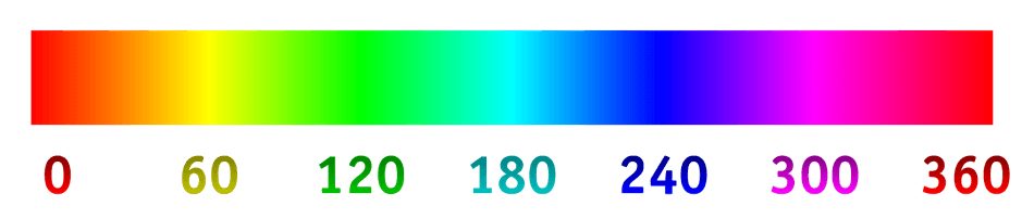
 Color hue scale
Saturation
Color saturation is the intensity of color.
As saturation increases, the colors appear to be purer.
 Color saturation
Tone
A tone is produced by mixing a color with
grey.
 Color tone example. Image by color-hex.
Tint
A tint is a mixture of a color with white,
which reduces darkness.
 Color tint example
Here is how all
elements work together:
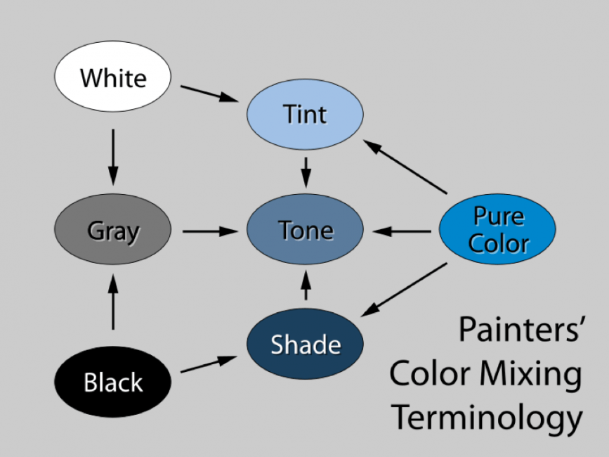 Painter’s color mixing terminology graph
Main color scheme
A color wheel is a must-have tool for
creating color palettes. Anyone who wants to create their color scheme should
use the color wheel.
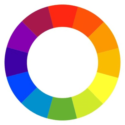 Color wheel
Below are three main color scheme standards
that make creating new schemes easier, especially for beginners:
Monochromatic
Monochromatic color scheme is the simplest
to create because it’s created from different shades of a single hue. Colors in
this scheme go well together, producing a soothing effect. But despite its
simplicity, it’s easy to create a boring UI using monochromatic scheme so be
careful!
 A monochromatic color scheme
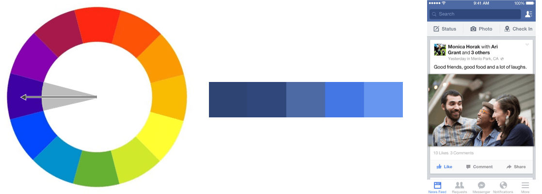
Analogous
Analogous colors are groups of three colors
that are next to each other on the color wheel. As the name suggests, analogous
color palettes are created using analogous colors. Usually, one color is used
as a dominant color while others are used to enrich the scheme.
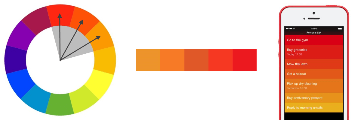 An analogous color scheme
Complementary
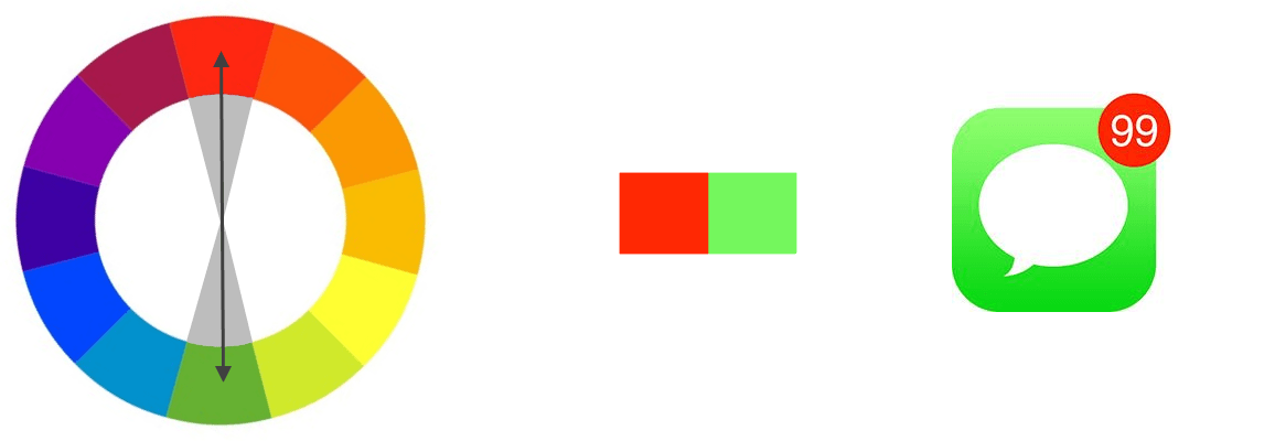
Complementary colors are opposite of each
other on the color wheel. The high contrast of complementary colors creates a
vibrant look. In their most basic form, complementary color schemes consist of
only two colors that contrast strongly. This scheme is used to attract the
viewer’s attention.
 Complementary color scheme
6 things to remember when creating a color palette for your UI
Many designers
match colors based on their intuition. While this approach is not bad per se,
the outcome depends on your personal taste as well as intuition, which can be hard to standardize. In this
section, I want to share a more systematic approach for selecting and using
colors. Here are some fundamental rules that you need to remember when working
with color.
1. Always start with greyscale
Сhoosing colors is fun, and that’s why
designers invest a significant amount of time on this activity. But before
trying various color combinations for your UI, it’s vital to remember the state
of your user interface. If you’re only at the beginning of the design process,
it’s better to start with black & whites or grayscale. Why? Because it will
help you maintain focus. Your attention will be on creating great visual
hierarchy for your layout, and not on selecting the color for call-to-action
buttons.
2. Keep it simple
Applying color to design has a lot to do
with balance, and the more colors you use, the harder it is to achieve balance.
Using too many colors is a common design mistake. It’s a common pitfall for
non-experienced designers because they often select colors randomly and end-up
creating a rainbow effect (when products have so many colors, so they become
extremely distracting).
Generally, it’s recommended to stick to a maximum of 3 primary colors in your color scheme. According to a University of Toronto study on how people used Adobe Color, most people said they preferred simple color combinations that rely on only two or three colors.
3. 60-30-10 rule
Now we know that our color scheme should
have a maximum of three colors, it’s time to know how to choose those three
colors. A well-known decorating rule can help us to do it. 60-30-10 is a rule
of interior design. It says that to create a visually stable composition, you
need to use 60% for your dominant hue, 30% for your secondary color, and 10%
for an accent color. The key idea of this rule is that the secondary color
supports the primary color, but is different enough to set them apart. And
accent color is used to create focal points. In UI design, accent colors are
used to highlight the key message or functional element (such as a call to
action button).
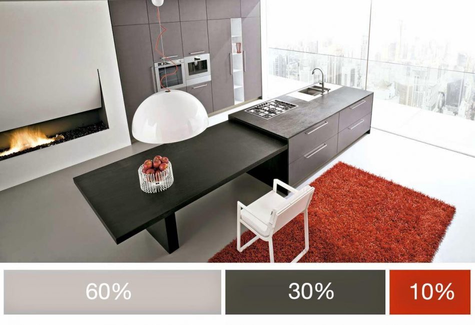 Photo showing 60/30/10 scale. Image by UxPlanet.
4. Consider the emotional impact of colors
It’s a well-known fact that colors can
provoke emotions. The emotions that colors evoke determine how users perceive
your product. That’s why when you’re choosing a color palette for your product,
it’s vital not only to think about how things look but also think about how
they feel too.
Here is how colors generally perceived in
the Western world:
- Red. Power, passion, danger, importance
- Orange. Playful, energetic, cheap
- Yellow. Cheerful, friendly, attention-seeking
- Green. Natural, safe, fresh
- Blue. Calm, reliable, trustworthy
- Purple. Luxury, romantic, spiritually
- Pink. Feminine, youth, innocence
- Black. Sophisticated, edgy, mysterious
- White. Cleanliness, purity, health
- Gray. Neutral, formal, sophistication
It’s worth mentioning that those are general associations, and the exact meaning can vary depending on the context. The meaning of colors also vary significantly depending on the culture. If you want to learn more about color meaning in different parts of the world, check out the article Symbolism Of Colors And Color Meanings Around The World.
4. Find inspiration
Creating a color scheme can be hard,
especially if you’re trying to do it from scratch. To make things simple,
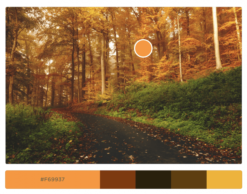
search for inspiration. Try to browse imagery to find the one that you like:
- Photographs of nature. It’s a
well-known fact that nature is the best inspiration. So you can take your
favorite shot and get color scheme out of it using one of this tool.
- Videos. Music videos and movies
are excellent sources of inspiration for visual designers.
After you find the relevant imagery, you can use a tool called Coolors to pick colors from it.
 Choosing color from a picture
Alternatively, you can visit Dribbble Colors where you can filter designer’s work by color.
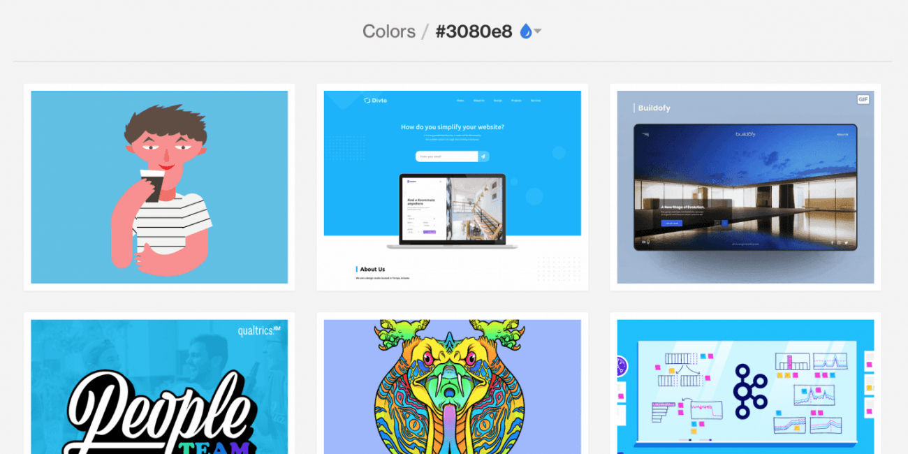 Dribble makes it easy to search and filter by color. Image by Dribble.
5. Use ready-made color palettes
What to do when you know what colors you
need to have in your color scheme but not sure how to select those colors? You
can search for ready-made color palettes.
Adobe Color is an excellent tool for both creating and finding color schemes.
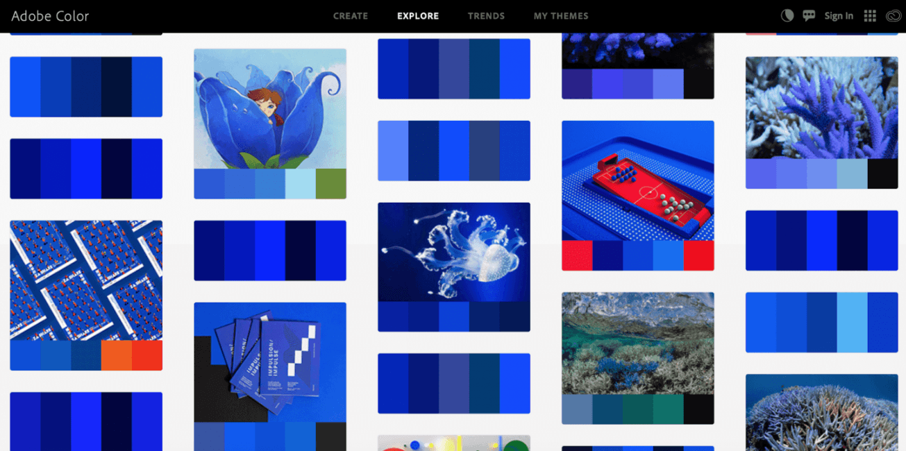 Adobe Color will help you find the color scheme in a few clicks.
You can also visit Material Design guidelines.
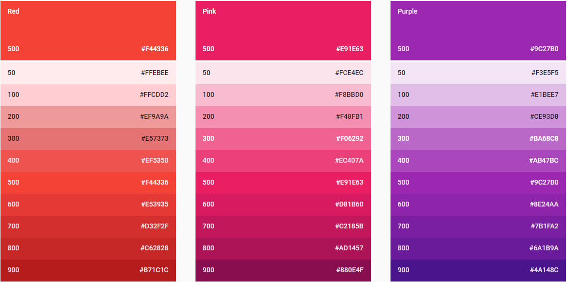 Material design color swatches
5. Consider accessibility
Approximately 8% of men and 0.5% of women are affected by some form of color blindness. That’s 1 in 12 men and 1 in 200 women. While there are multiple forms of the condition, red/green color blindness is the most common. A person suffering from this form of color blindness will generally have trouble seeing variations of both red and green.
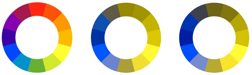 Color wheel for red-green deficiency
Make sure that the scheme you choose will
meet the needs of users with color blindness or color vision deficiency (CVD).
Colorblindness takes different forms (including red-green, blue-yellow, and
monochromatic), and that’s why it’s important to use multiple visual cues to
communicate important states in your product. In addition to color, use
elements such as strokes, indicators, patterns, texture, or text to describe
actions and content.
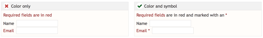 Avoid using red and green colors alone to convey information because this can cause
a bad experience for people who can’t distinguish the red/green characters.To prevent accessibility issues in design, it’s recommended to experience color blindness yourself while designing. NoCoffee Vision Simulator for Chrome can be used to simulate color-vision deficiencies and low-vision conditions. For example, using the “Color Deficiency” setting “Deuteranopia,” you can view web pages in grayscale. This will help you make your design accessible for users with visual impairments.
 Screenshot of nocoffee vision
Having a sufficient color contrast is another thing you need to remember when working on your UI. When you’re using colors in text, be aware that placing two colors with low-value contrast next to each other can make your copy very difficult to read.
 Color contrast in text
Form a habit of checking contrasts to ensure that background and foreground colors appear with enough contrast to a color-blind person, or someone with low vision. It’s not that hard, all you need to do is to check the contrast ratio. Contrast ratios represent how different color is from another color (commonly written as 1:1 or 21:1). The higher the difference between the two numbers in the ratio, the greater the difference in relative luminance between the colors. The W3C recommends the following contrast ratios for body text and image text:
- Small text should have a
contrast ratio of at least 4.5:1 against its background.
- Large text (at 14 pt bold/18 pt
regular and up) should have a contrast ratio of at least 3:1 against its
background.
And the great news is that you don’t have to check the contrast ratio manually. You can use the tool like Color Contrast Checker to check your color combinations in just a few clicks.
Conclusion
Color is an extremely powerful tool in a designer’s toolbox, but it’s also a tricky tool to master. I hope the rules mentioned above will help you find the right color scheme. Now it’s time to try those rules on practice. Remember that the best way to become great at color schemes is to actually create them.
Illustration courtesy of Avalon Hu.