Great design is critical to the success of
your mobile app. The better the design, the more
chances users will feel engaged with your app. Great design is not
(only) about great aesthetics; it’s more about matching with user expectations.
And to match user expectations, it’s vital to understand what happens in mobile
today.
In this article, you will see modern design
techniques and product design trends that help product teams create an
excellent user experience.
Decluttering
Clutter is one of the worst enemies of good
design. The more elements we place on the screen, the more complicated it
becomes for the end-user. Clutter is terrible on desktop, but it’s far worse on
mobile simply because we have much less real estate on mobile devices. By
reducing clutter, we improve comprehension.
If you take a look at popular mobile apps
today, you will see that many of them have fairly minimalist layouts. They keep
content and functional elements to a minimum—the user sees only essential information
or interactive objects.
When the app developers need to provide
more content or features, they chunk content and use a technique of progressive
disclosure to reveal more content/options after the interaction. The technique
of progressive disclosure is often used in eCommerce apps. App developers
separate a checkout process in a series of steps; each
of them requiring user action.
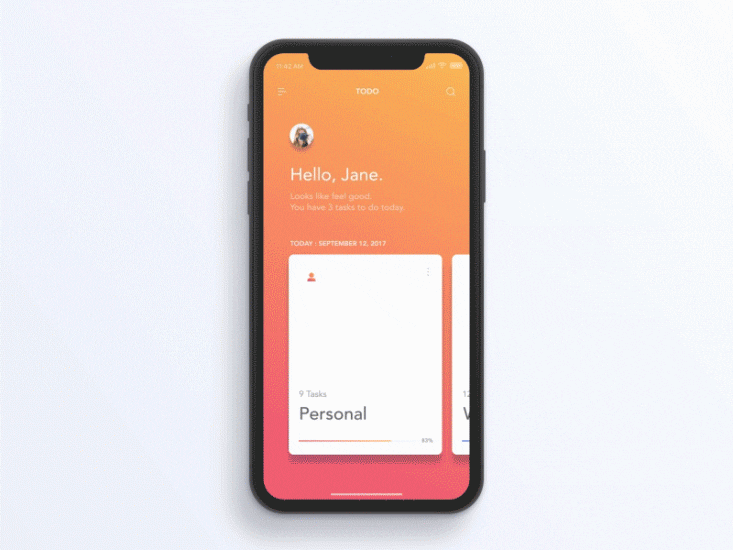
Strong focus on good aesthetics
Aesthetics matter. In the book, The Design of Everyday Things, Don Norman demonstrates why attractive things work better. When designers focus on polishing details, this gives a clear signal to the users that people behind the product really care about it. As a result, many products available in the AppStore and Google Play feature well-crafted layouts with nicely choreographed animation effects.
Organic OS interface by Gleb Kuznetsov✈Bottom navigation wins
There was a long debate in the UX design
community about what navigation patterns should be
used for mobile apps. The two competitors were top navigation (hamburger
menu and top navigation bar) and bottom navigation bar (tab bar and bottom
navigation sheet). As mobile screens became larger, it was evident that bottom
navigation creates a better experience for users because all navigation options
are located in the thumb-friendly zone.
There are two commonly used patterns for
bottom navigation—tab bar and bottom sheet.
The first pattern is a de-facto standard for iOS apps. The second pattern can
be found in mobile apps that mix two different types of content. For example,
Apple Maps uses a map at the top area of the screen, and bottom sheet at the
bottom area, so the user can swipe it up to see it in full-screen mode.
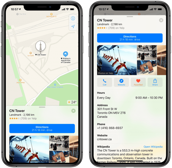
 View of Apple map overlay. Image by thesweetsetup.
Both patterns have a significant benefit for users—they reduce the cost of interaction. Mobile app design is about ease of use, and it’s great when all-important elements can be reached with a single tap and single swipe.
Voice input and multi-modal interfaces in the spotlight
The recent progress in the natural language process made it possible to create voice-based interactions. Today 40% of adults use voice search daily. Industry giants like Apple and Google bake voice input into the core of the products they create. According to Google, Google Assistant is now available on more than 400 million devices. What does it mean for mobile designers? It means that when we design a new app, we should give users the freedom to choose what medium they want to use for interactions.
Voice input is particularly valuable in
user interaction when the user’s hands are busy. Common examples include
cooking and driving. The second example is especially important because taking
your hands off the wheel in order to complete a certain operation is distracting and dangerous.
By using voice, it’s also possible to reduce the user effort. Voice input
paired with AI can create a magical user experience. Imagine a situation when
you need to find a particular file in your folder with dozens of different
files. Instead of scrolling through a lot of files, you say, “Find my message to Tim that I sent last week.” The
system searches for the message and returns it to you. Isn’t that what we refer
to as effortless user interactions?
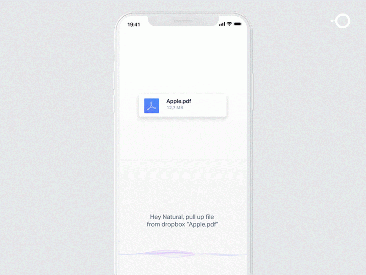
 The next logical step in VUI will be multimodal interfaces. Interfaces that allow using both voice and touch during interactions. Image by Gleb Kuznetsov✈
Localization as a natural part of the design process
Mobile app design is about clarity. And when it comes to clarity, nothing can compare with the impact of in-app text concept. For a long time, design and localization were two different (and independent) processes. But the growing need to release products that can be used by people in different parts of the globe makes mobile designers reconsider the way they create products. As a result, localization becomes a natural part of the design process. The product team not only adapts the visual design to support many different languages but also makes sure that the meaning of text copy and visuals will be clear to anyone who will use the product.
Here are a few techniques that have
recently become popular in mobile development:
- Pseudo localization is a testing method used for testing internationalization aspects of a product. Instead of translating the text of the product into a foreign language, the textual elements of an app are replaced with an altered version of the original language. For example, ‘Account Settings’ becomes [!!! Àççôûñţ Šéţţîñĝš !!!]. Product team members use UI that has such translations when they work on a product. Pseudo localization helps to detect issues with UI earlier in the development cycle.
- UX writing. Many companies strive to adapt copy and visuals to the global audience. It means that every sentence in the product is carefully checked for meaning. UX writers make the copy completely jargon-free.
The rise of design systems
Many product teams introduce design systems to simplify the mobile development process. Design systems allow teams to create a unified visual language that can be used not only for mobile apps but in all products the team work on (desktop software, websites, etc). Most companies follow a relatively simple strategy when they create design systems. Usually, the interface inventory is the first step in the process of creating a design system. As soon as the team finishes the design inventory process, they know what design debt they have. The next logical step is planning the process of solving this debt by unifying design decisions and using components, patterns and style guides in the design process
Design accessible interfaces
Good accessibility becomes a top priority for mobile app design. 4.5% of the global population experience color-blindness (that’s 1 in 12 men and 1 in 200 women), 4% suffer from low vision (1 in 30 people), and 0.6% are blind (1 in 188 people). It’s easy to forget that we’re designing for this group of users because the majority of the population doesn’t experience such problems. That’s the reason why success and error messages in mobile forms are often colored green and red, respectively. But red and green are the colors most affected by color-vision deficiency (these colors can be difficult to distinguish for people with deuteranopia or protanopia).
“The fields marked in red are required.” I
bet you’ve seen such an error message when filling out a form. While it might
not seem like a big thing, this error message combined with the form in the
example below can be an extremely frustrating experience for people who have
color-vision deficiency.
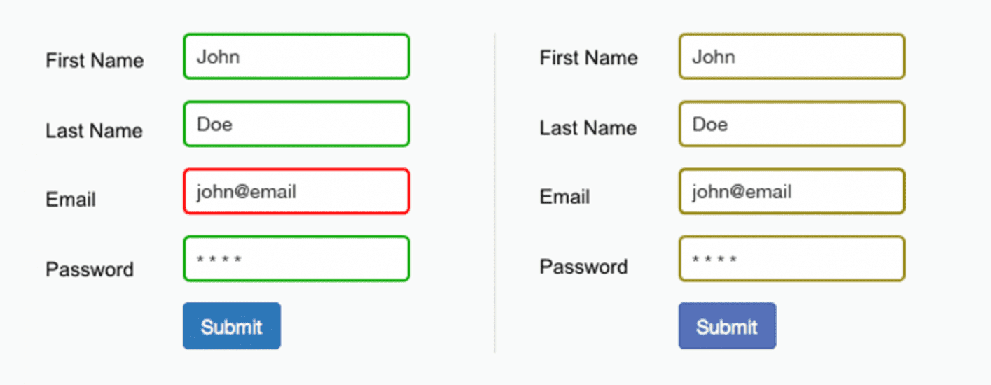
 The form field’s design relies only on red and green to indicate fields with and without an error. Color-blind users cannot differentiate the fields highlighted in red.
As the W3C’s guidelines state, color shouldn’t be used as the only visual means of conveying information, indicating an action, prompting a response or distinguishing a visual element. It’s important to use other visual signifiers to ensure that users will be able to interact with an interface.
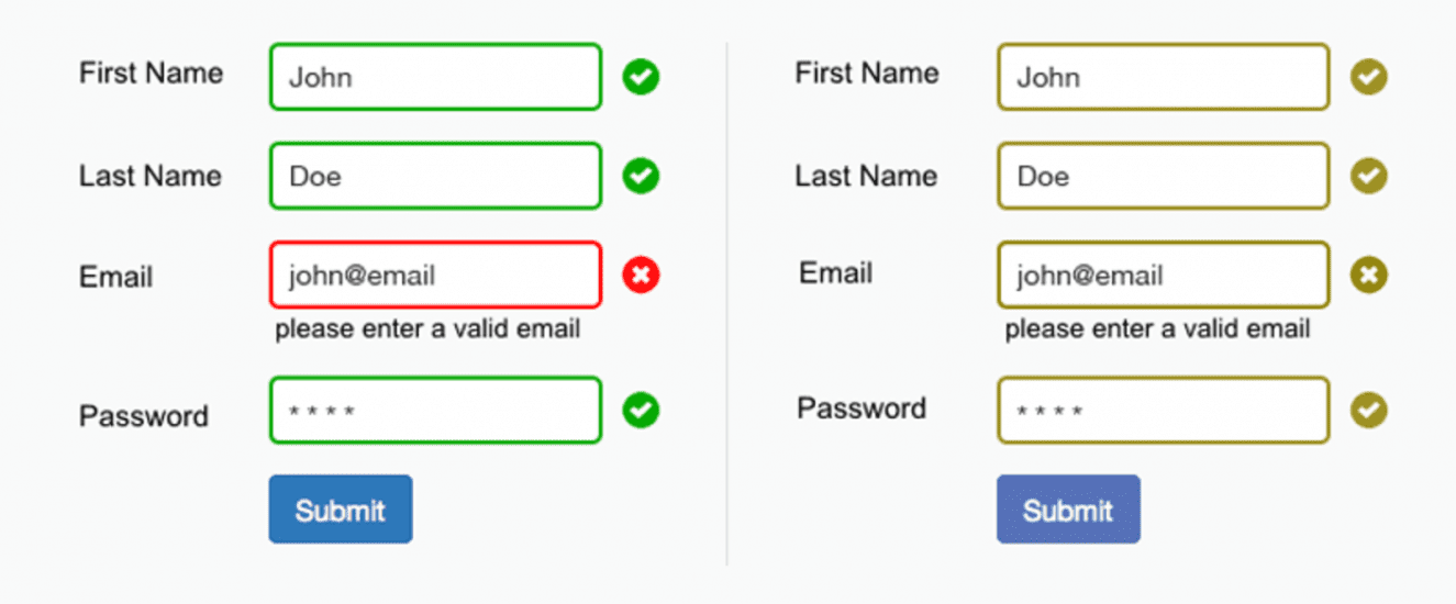
 The use of icons and labels to show which fields are invalid better communicates the information to a color-blind user.
Functional animation is an essential part of mobile design
Mobile app design can have dozens of
different screens. When users navigate, they should understand state
transitions; otherwise, they will wonder, “What happened?”. Animation is the
best tool to describe state transitions. It helps users comprehend a state
change in the page’s layout, what has triggered the change, and how to initiate
the change again when needed. Animation helps
mobile designers ensure users understand state transitions.
 Functional animation can efficiently guide the user’s attention and make complex transitions easy to understand. Image by Jae-seong, Jeong
Create multichannel experience
Mobile app design doesn’t exist in
isolation. People use a lot of different devices daily, and one of them is a
smartphone. One of the typical scenarios is when a mobile user browses an
e-commerce website on mobile, then switch to desktop to purchase. That transition
needs to feel seamless. That’s why one of
the goals that mobile designers have is making the transition to another medium
easier for the user.
Consider Spotify. It allows for a seamless
multichannel experience. You can set up a playlist on your Mac, and it’ll be
instantly available on your iPhone. When you switch between devices, the app
remembers where you stop.
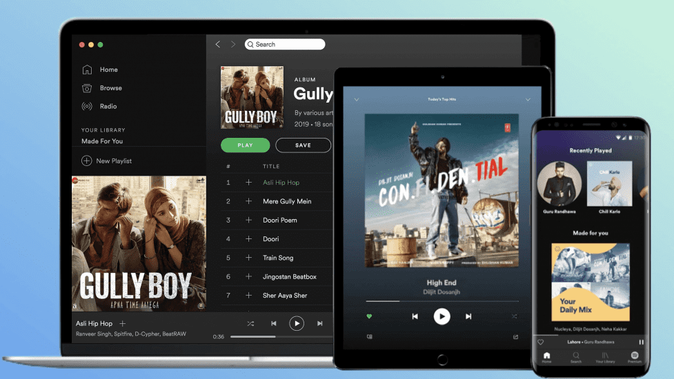
 Spotify multi-channel experience.
Conclusion
Today, mobile users expect a lot from the app – fast loading time, ease of use, and delight during the interaction. According to Fortune, more than 75% of users open an app once and never come back. To increase your chances of success, you need to focus on creating the best possible experience for your users. Mobile app design should always prioritize clarity, efficiency, and aesthetics.