There’s a word for user experiences that aren’t user-friendly for all users, and that word is “SUX.”
The acronym stands for “some user experience” and refers to user experiences that suit the larger population overall, but do not go the extra step to ensure they’re usable and accessible for all users.
“When we’re talking design and usability, if your whole job is to design a user experience, why wouldn’t you want that first word ‘users’ to be more? Why wouldn’t you want more people to be able to use your work?” said Billy Gregory, a public speaker on web accessibility, development, and design who spearheaded the ‘SUX’ concept.
Gregory works at an accessibility consultancy firm called the Paciello Group as the director of training. A couple years ago, his role involved auditing code and checking it for things like how accessible the user experience was and how usable it was in general.
“I started noticing more and more that there were so many designs that got so close to being fully accessible and then stopped just short of being usable by everyone,” Gregory said. “Over time, it turned into ‘some user experience,’ or SUX. It was really just something I would use in my head whenever I was labelling something that needed to be fixed by somebody, and I started thinking about all the different user groups that could use it if they just spent maybe another 10 minutes, or another hour, just planning it a little bit better for that one user group that couldn’t use it.”
He took his thoughts to the Internet and tweeted, “When UX doesn’t consider ALL users, shouldn’t it be known as “SOME User Experience” or… SUX? #a11y.”
Initially, the post garnered a couple retweets and some response, but six months later it got a second wave of traction.
“The next thing I knew, people were asking me to do a talk on it and I’m like ‘geez, this is something I tweeted from a bathroom at 9 a.m., how do I create something out of this?’” Gregory said. He’s a funny guy with a big personality, so naturally, he figured it out.
“I put a bunch of examples together and people seemed to really get behind it. I think I struck a nerve with a lot of developers and summarized a lot of their feelings,” he said.
What UX designers are getting right about accessibility
As someone who spends a great deal of time speaking on these topics and training other organizations to be more accessible in their approach to design, Gregory has noticed some things that designers are getting right — and some things that, to be frank, ‘suck.’
“I think anybody that works in the industry has probably become more aware of the word ‘accessibility’ in general,” he said. “When I took my first job in 2008, I had no idea what that word meant, or what it meant to be accessible. I think we’re all sort of past the point of needing to explain what this is. I think UX designers, just because they’re designing for people and interaction and all of that, they’re a lot quicker to grasp that.”
Gregory disclaims that this isn’t a blanket statement, but that for the most part he’s noticed that designers are also more aware now of the role things like color, headings, structure, navigation, and consistency play in creating designs that are more accessible for all users.
“That stuff we’ve got,” he said.
However, there is obviously room for improvement.
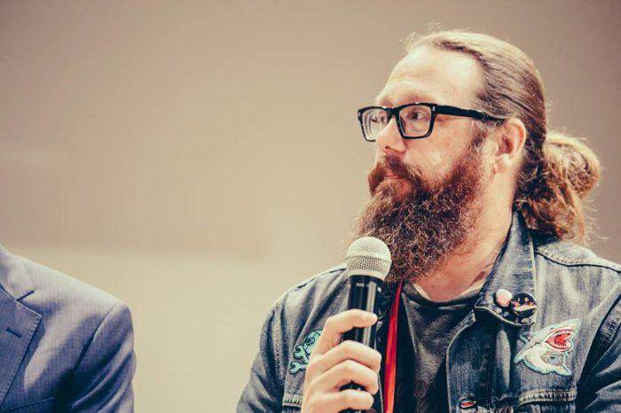
 Billy Gregory at the MCE conference in Poland in 2017. Image by MCE.
What UX designers are getting wrong about accessibility
“I think where we were failing more of these days is with the more elegant solutions, like when we’re talking about custom controls or constantly updating the layouts — things like that we still struggle with. I guess when you think about it, we’ve kind of always struggled with how to show info, or which info to show and when,” Gregory said.
He says that figuring out where to put things on a page has always been a challenge for designers, but overall “we’ve gotten better about that.” Gregory cautions, however, that more modern solutions such as carousels have had the opposite effect when it comes to accessibility.
“The purpose of a carousel is to show a little bit of information for a short amount of time and then move on — so how does that work with a user who might be using assisted technology like a screen reader? Say it’s somebody who doesn’t use a screen reader, but can’t read as fast? What about the person who is just using a keyboard and has to tab to every single thing — how does our site work with a keyboard? I think that’s the stuff we’re still struggling with. I think that’s the stuff we’re not doing right yet.”
Gregory likes to tell the story about the time he took his parents, who are of an older demographic, out for dinner.
“When the menus came and it was time to order, my mom pulled out a magnifying glass and my dad pulled out a flashlight. These are two people that have no idea what accessibility is, but they’re both using forms of assistive technology,” Gregory said. “Things like when I taught my dad how to increase the font size on his iPad, that was huge because suddenly he didn’t have to hold it out as far away from his face to be able to read it.”
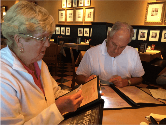
 Billy Gregory’s parents make menus more accessible using magnifying glasses and flashlights. What can this teach designers about uX? Image by Billy Gregory.
It’s a UX designer’s job to think of all users, not some Users
The story of Gregory’s parents shows that not everyone is as savvy to accessibility, but UX designers need to think of this for them if they want their websites, apps, or experiences to appeal to a wider audience.
“I think we just need to remember that we don’t always have control over who’s accessing our work, or how they’re accessing it,” Gregory said. “When we look at designs, what we think are really elegant, cool solutions like drag-and-drop, these things that we tend to think are great, for someone that doesn’t have the same dexterity or motor control, you know, that SUX.”