In the design process, things get bogged down far too often due to design-component clutter. Add to that the possibility that designers and developers aren’t on the same page when it comes to working with UI principles, and the end result can be a process that takes much longer than it should. It can even compromise the chances of a successful product launch.
Interaction designer Ole Fredrik thinks about design problems like this and their practical solutions quite often. His latest thoughts resulted in the Semantic UI Kit. It addresses team and organizational issues he discovered in his real-life role as the design director and co-founder of Justify, a legal-tech startup aiming to make legal services accessible to everyone.
“My philosophy is that we will have a greater chance of achieving success if our designers and developers work together as one team and speak the same language and adhere to the same UI principles,” Ole said.
Here’s an in-depth look at his UI kit, how designers can quickly get the most out of it, his motivation for creating it, and its relationship to the Semantic front-end framework.
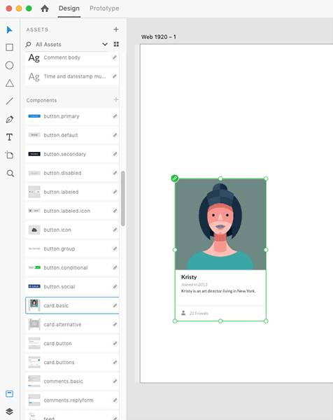
Get started with the Semantic UI Kit
You can begin prototyping with Ole’s kit right away. Here’s a quick, step-by-step walkthrough of how to get started:
1. Download the latest version of Adobe XD.
2. Download the Semantic UI Kit.
3. Make any modifications to the appearance of the components—such as the colors, typography, etc.— in the Master Component artboard.

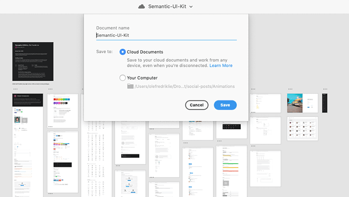
4. Save the Semantic UI Kit as a cloud document.

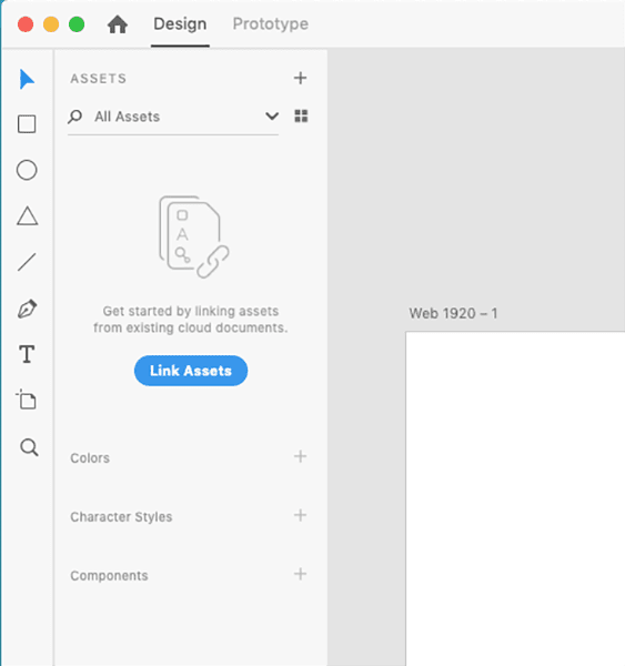
5. Open a new XD project and click the “Link Assets” button.

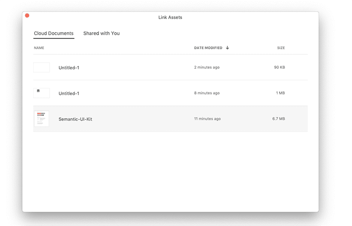
6. Choose the Semantic UI kit in the Cloud Documents tab.

7. Now that all the assets from the kit are available in your UI project, click and drag any component to your canvas to begin creating your design.
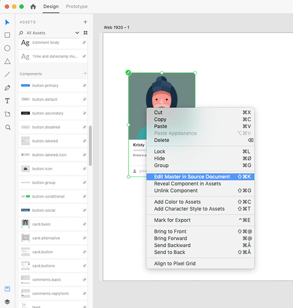
8. Right-click on a component to reveal the possible actions. (Note: To make global changes to a specific component, choose “Edit Master in Source Document.” Changes in the source document are reflected to all the instances of your component across the documents.)

9. From the share button, select “Invite to Edit” to share this kit with your team.
10. Experiment with the kit and have fun!
United design makes for good design
In general, there are two schools of thought that designers adhere to when tackling the design process. One, building a complete design system from scratch, using front-end code to develop it from the ground up. Or two, getting buy-in from your colleagues about which specific framework to use at your organization, so that the entire team is on the same page.
In Ole’s case, his philosophy is firmly rooted in the latter.
“We agreed to use the components of the Semantic UI as a starting point and then adapt these components to match our visual identity. This is basically my motivation for making the UI kit. It will fuel our UI design process and minimize the time from idea to production,” he revealed.
“I strongly believe that having a design system is valuable, but I also believe that there is a lot to gain from getting a common consensus and anchoring the system in the organization that will use it. In our case, it makes sense to use Semantic as a starting point, instead of reinventing the wheel when it comes to things like buttons, checkboxes, and radio buttons.”
To be clear, you can use the Semantic UI kit just fine without having to build on the Semantic framework. As a standalone product, this kit is ready to use and is not subject to any technical dependencies on Semantic.

 Image by Mimi Thian
That said, Ole’s point is that teams and organizations can benefit tremendously from building on just one framework like Semantic, which this kit is designed for.
“I have found that projects with cross-functional teams have greater success rates than projects with silos and constant handoffs. Collaboration across disciplines has proven to be incredibly effective. This is also one of the reasons why I created the Semantic UI Kit for Adobe XD,” he explained.
“Semantic UI is one of the most popular development frameworks that helps create beautiful, responsive layouts using human-friendly HTML. It comes with a comprehensive set of UI components out of the box. These components can very easily be adapted to suit different clients’ needs in terms of form, expression, and color.” All this results in a design process where the time spent from mockup to production-ready code will be significantly shortened.
Creative problem solving and bad web-design trends
Ole’s philosophy for approaching design challenges is rooted in his appreciation for creative problem solving. Since he graduated from design school more than a decade ago, he’s hit the ground running for an assortment of clients, applying this philosophy.
“I have always had an interest in creative problem solving. Since I completed my design degree in 2007, I have worked full-time as a designer for various clients, big and small. I get my inspiration in the users’ challenges and needs. I spend most of my time finding good and creative ways to meet their needs and solve their problems through great design.”

 Image by Green Chameleon
From his kit alone, it’s also apparent that Ole is a devotee of minimalism. After all, why complicate the design process when it can be simplified, which often leads to better results? This belief system is reflected in his take on various web-design trends.
“I have seen many trends come and go over the years, but the one that stands out as the worst for me is the excessive use of effects. I’m thinking of parallax scrolling, slide-in, move-out, pop, bounce, and fade, all at the expense of readability and general ease of use. That said, animations and effects can be incredibly tasteful and add a lot to a design if done right, but it requires great attention to detail and a bit of cleverness to make it work,” he said.
If you’re looking for a UI kit based on one framework that makes life easier for designers, give Ole’s Semantic UI Kit a try and watch it speed up the time you spend from ideation to production.