British airline Virgin Atlantic is on an ambitious journey to optimize its entire digital experience to match — or even exceed — customer expectations. Martyn Reding, head of digital experience, built up a new team of product designers, product managers, and content specialists from scratch when he joined Virgin Atlantic a couple of years ago. The team is now building a new design language, crafting a new content strategy and developing product roadmaps.
Here Martyn gives us an exclusive insight into the evolution of Virgin Atlantic’s UX, which needs to adapt to a wide range of user needs while blurring the lines between digital and physical.
What was the airline’s digital user experience like at the beginning?
Martyn: Virgin Atlantic was launched in 1984, so like any company of its age it has adopted digital services, rather than launching with them.
If I look back through the archives, the first web presence was (like most) an amazing combination of system typefaces, compressed logos, and colored backgrounds. But the one thing that was true at that point, which is still true today, is that the design and content was structured to communicate the unique experience of traveling with Virgin Atlantic.
Back in those days, the digital experience was simply a website. It was before the days of airport kiosks and apps. At the time inflight entertainment was a lot less digital and probably running off tapes. There was also nothing in the way of onboard wifi, so overall it was simpler and less about enriching the travel experience. I think it’s fair to say that in the very beginning it was detached from the physical experience of traveling.
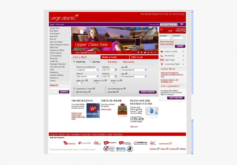
 An early design for Virgin Atlantic’s website.
How has the UX changed over the years, specifically since you joined to build a user experience team?
Martyn: Technically speaking, there wasn’t a UX team before I joined at the end of 2017. So before that we didn’t have a dedicated group whose focus was on improving the user experience. It was more of a dispersed responsibility model. Without my role, it was tricky to determine accountability, which lead to a fair dose of inconsistency across our touchpoints. Now we have a totally different structure, with new roles and clearer lines of responsibility. My intention was to bring the focus back to the end-to-end journey and focus much more on the seams between our platforms. In order to tackle that I created four product teams. Each team is responsible for different stages in the journey. From exploring to searching, managing to travel, and then returning and ultimately becoming advocates of our brand.
In terms of how the new team has moved our UX forward; our first focus was on how customers search for flights. We found that there is a high proportion of customers who arrive on our digital estate who know exactly where and when they want to travel, so we have done lots of work to make that as frictionless as possible.
From there we’ve taken an incremental approach wherever possible. I’m not a fan of ‘big bang’ releases. I think they’re rarely a good idea. Instead, we’ve introduced sprint cycles that keep the focus on delivering marginal gains that move us towards our goals.
I would also say that consistency has become even more important to us now that our services are available through browsers, native apps, kiosks, shared screens, etc. One of the first stages in building the team has been to create repeatable, scalable processes and systems. Our pattern library, our product roadmaps, our optimization process, our content strategy have all been overhauled to make us work smarter, and the Virgin Atlantic user experience feels like it’s all from the same stable.

What are the main challenges in creating a digital product that crosses over with lots of physical touchpoints?
Martyn: For us, there have been two main challenges. Firstly, it’s been a case of figuring out how we design UI and content that is consistent, but appropriate to the touchpoint. This means that ideas, which work well on an app, may not be appropriate for a touch screen kiosk in a busy airport. So how do we create an experience that differs in its execution, whilst upholding the brand? The second is connecting the technology and data. Customers expect to be able to tap their screens and see a response, even if it’s on another screen — so technology plays a vital role.
The biggest challenge that we’re still facing is how we combine two different design disciplines. Virgin Atlantic has a well established industrial design practice, and we’re trying to figure out how we bring digital product design into the fold. Whilst there are obvious parallels, the practicalities and timelines are very, very different. It’s something I’m very keen to explore more of.
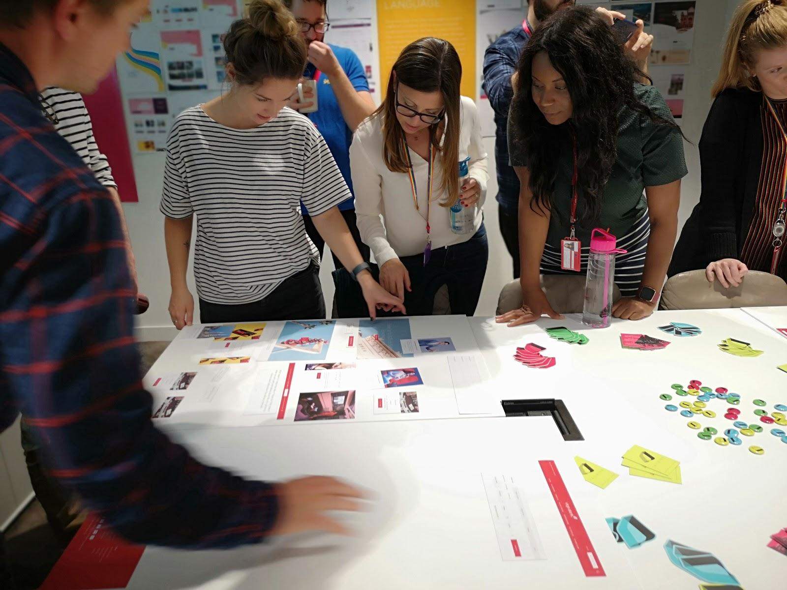
 A multidisciplinary design showcase.
 How do you conduct user research and analyze the data you collect?
Martyn: Right now we have remote testing, lab testing, split testing, and contextual surveys. Our product teams use mixtures of these to either get quick reactions that allow them to course correct, delve deeper into motivations and feelings of customers, or simply observe behaviors. We also have a pretty awesome data team that provides us with real-time quantitative data.
I’m not a fan of ‘big bang’ releases. I think they’re rarely a good idea. Instead, we’ve introduced sprint cycles that keep the focus on delivering marginal gains that move us towards our goals.
Martyn Reding, Head of User Experience
Each of our product teams routinely reviews the data available to them and uses it to guide current projects or add/remove items from their roadmaps.
Our biggest research opportunity is in the gaps between interactions. For lots of people, the act of booking their travel plans, getting to the airport and getting on a plane can be stressful. For others, it can be seen as an adventure, and then there are the folks for whom it’s just another day at work. All of these different contexts create different mental models and needs, so the type of traveler becomes more important to us. Even the smallest way in which we can personalize our users’ experience can have a huge impact.
What was the key to building the new design language?
Martyn: We talk a lot about dials. For us a design language isn’t about matching luggage (I love airline puns), it’s more about having a system that can be dialled up and down depending on the context. The number of flourishes on a sale page wouldn’t be appropriate when a customer is paying for a flight, so finding those levels whilst keeping on-brand is the trick.
The other key for us has been understanding what the brand is and more importantly what it isn’t. Some of the approaches we (as a company) took in the past are not as relevant or appropriate today, so each of us has adjusted our own perception of what Virgin Atlantic means now and the near future.
What tools do you use?
Martyn: Our dot com site is on the Adobe stack. We use Adobe Experience Manager as our content management tool. It houses our component library and also acts as our content repository. We publish everything through it. On top of that, we have Test & Target running all of our optimization tests. We’re continually experimenting, exploring and refining our experiences through it. Underneath we have Audience Manager which we use to serve up personalization data and of course Adobe Analytics tracking and reporting to user activity.
We also have more than our fair share of post-it notes, pens, and sketch paper.
How do you optimize the UX?
Martyn: Carefully, but relentlessly. We have a growing optimization plan which marries A/B or multivariate testing experiments with revenue data. Our product teams are continually developing ideas to smooth any edges off our experiences. We have very few ‘project teams’ now, so there is much more emphasis on continual improvements.
What’s next for Virgin Atlantic’s UX?
Martyn: More red. More delight. More connectivity and a more loving approach to crafting our experiences. We’ve got a batch of projects that I’m super excited about. Right now our fleet is changing and we’ve got some new routes opening, which creates lots of new opportunities for my team. But most of all, the next challenge for the UX team is refining how we work as a unit. The setup, the relationships, the dynamics, and our toolset have evolved dramatically, so we’ve got some edges to smooth out.
Read more UX evolutions for Etsy, Netflix, Medium, Dropbox, Firefox and charity: water.