Ricardo Vazquez is a product designer on Shopify’s Retail Team. Throughout his career, he has garnered significant experience designing for mobile at companies such as Mozilla, Freshbook, and 500px, and building products like Mozilla’s Webmaker. I sat down with Ricardo to talk about the challenges and joys of designing for mobile, the power of emotion and delight in design, and advice for people getting into UX design.
Tell us about your current role at Shopify?
I am a product designer on the Retail team, where I work on empowering merchants to sell products through physical spaces such as brick-and-mortar stores or pop-up shops. It’s a really exciting time to be part of Shopify. We are working on solving some of commerce’s toughest challenges, like reimagining the retail industry. By focusing on delivering Shopify’s intuitive interface, anchored by our mission of enabling merchants to deliver rich experiences to their customers, we’re confident that we will make commerce better for everyone.
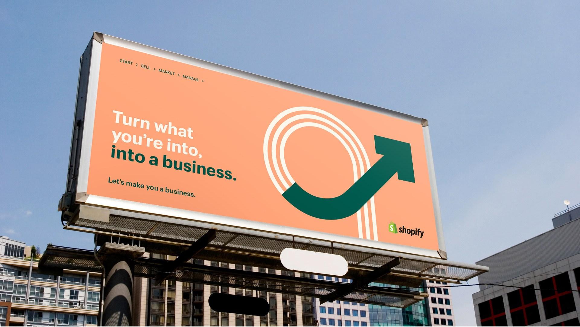
 Shopify billboard
How did you get interested in designing for mobile?
The first thing that attracted me to designing for mobile was the permanent design element it possesses: constraint. Early on in my career, I became fascinated by the challenges of designing for mobile devices, since they require the designer to think in austere ways — to show only the right things at the right time.
What do you see as some of the key differentiators about designing for mobile versus other platforms?
Web experiences can afford a more behavioral approach,
but mobile design needs to be emotional and visceral too. We compete with so
many factors in mobile design (screen size, ever-changing contexts,
mobile-specific design patterns, a wide range of demography) that viscerally
and emotionally charging these experiences have become table stakes in all
mobile apps.
The constraint of space is what got me interested in designing for this platform. I still love being challenged in providing a cohesive and beautiful experience with a limited amount of digital space.
Ricardo Vasquez, Product Designer at Shopify
Mobile design needs to accommodate for a person’s
switch in context. Apps that we design are not just competing with other
similar apps and companies, but they also compete with a person’s attention
being divided. Our UX flows need to be simple, visually appealing, and
cognitively easy to perform. Because we are fighting for our users’ attention,
a cognitively hard task will be abandoned. By designing experiences that are
short but meaningful, we’re able to design apps that are usable and effective.
Foursquare combines clean design, usability, and social features to enhance human interactions and help people find great places to eat.
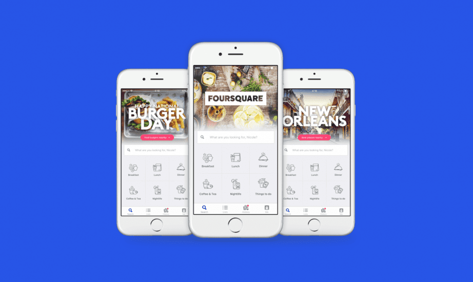
 Foursquare Mobile App
Who’s doing a fantastic job in mobile design right now?
Foursquare City Guide and
Foursquare Swarm are both examples of apps constantly redefining what it
means to enhance human interaction. At its core, Foursquare does something
pretty simple: it allows you to find great places to eat. Keep peeling the
layers, and you will find an app full of wonderful interactions, deep
commitment to designing a usable app, and constant iterative attention. Swarm
is similar. Swarm allows you to create a personalized history of all the places
you’ve been in the world. It acts as your personal travel log. These two apps
are emotional, meaningful, and fulfill a human interaction.
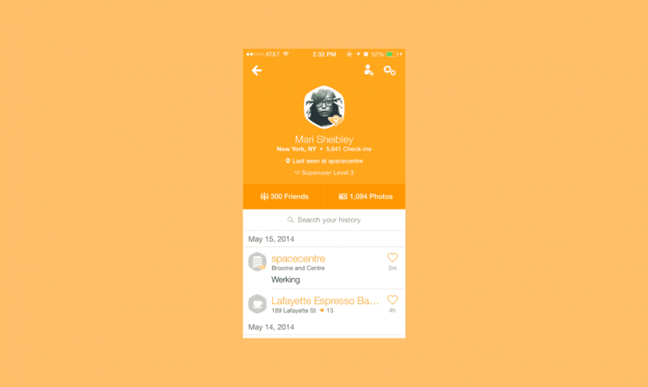 Swarm incorporates delightful details such as illustrations in their travel log experience.
What do you think the future of designing for mobile holds?
It’s clear that the apps we’re designing are having a clear effect on the quality of our lives. We need to have a thorough understanding of this and begin designing for the invisible, the interactions that we are causing as a result of people using our apps. Although the industry is not at a mature enough point in the evolution of mobile design to begin tackling this wicked problem, I think this is where our design-thinking efforts will lead us in the future.
You focus a lot on the power of emotion and delight in design. Will you tell us more about that?
Emotion and delight are the reason why I chose this
industry. As a young kid, I drew a lot of inspiration from my grandfather, who
was a professional musician, 1st trombone, in the National Symphony Orchestra
where I was born. When he played for me, that was the first time I realized the
power of emotion. Music allowed me to feel happy, tragic, euphoric, confused,
joyful, all in a two-minute time span.
I would love to see us flow into a future where we place an equal emphasis on the interactions that occur outside of the confines of the app itself.
Ricardo Vasquez, Product Design at Shopify
Nowadays, as a professional designer, I seek to charge my designs with the same feelings my grandfather gave me. It’s not easy, and most times I fail. That is okay with me. I’m interested in the effort and I’m interested in the happiness of pursuing that emotional experience – That is what motivates me to continue designing.
What are some great examples of emotion and delight in design?
Carbonmade, a portfolio creation tool, places a big
emphasis on making a user’s experience delightful and emotional. By focusing on visual polish and purposeful transitions, Carbonmade
has established themselves apart from their competitors by bringing delight and
emotion to their platform. This, in turn, makes people want to use their
service, and the experiences of delight they offer.
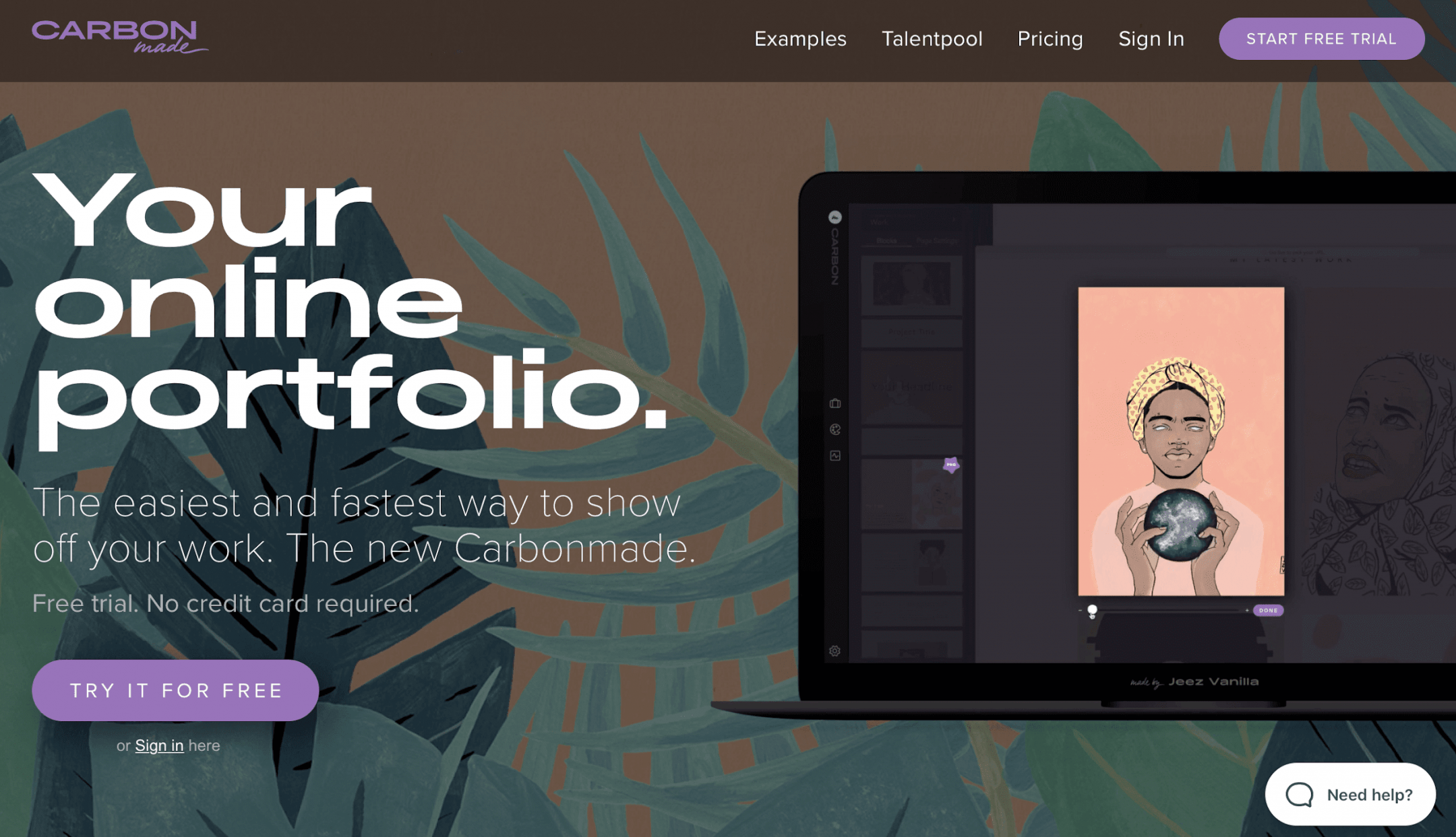
 Carbonmade uses beautiful illustrations to connect their users to a sense of emotion and delight.
How can designers start to incorporate these elements into their work?
Observation is always the first step, and where the
magic begins. Take a look at life around you: What do you find emotional? What
do you find meaningful? What do you regard as beautiful? What surprises you?
Can you use this as inspiration?
How did it make you feel? Does it give you goosebumps?
The second step I always mention to designers is to
take a moment to bring themselves back to their first happy memory. How did it
make you feel? Does it give you goosebumps? Does this memory define you, like
the memory of my grandfather defines me? It defines me not just to honor a man
who taught me how it felt to feel alive through music, but the values that I
seek when I design experiences today. Find your memory, and never let that
feeling go. Use it as a guide to designing the most beautiful interactions and
emotional experiences we’ve seen yet.
What advice do you have for people starting out in the field of UX?
If you want to be a great designer, invest in becoming a great writer as well. When we design, we’re communicating an idea. I always say to people starting out that design is 80 percent communication and 20 percent actually designing. Our practice requires us to defend design rationales, think of our design challenges as a story, and protect and inspire our users. Writing as a tool for creative inspiration is understated and, quite frankly, underrated as well. If you invest in creative writing, you will become a better designer.
What about advice for people who want to get into designing for mobile?
When approaching mobile design, don’t reinvent the wheel. Use the mobile patterns that exist so that people can transfer knowledge from one app to the next. And, of course, there’s always creative freedom in improving mobile patterns in unique ways. Because our designs are in constant tension with a user’s time and attention, we need to ensure that the patterns we use are straightforward and intuitive. Luckily for us, there are many design patterns that have been established by the iOS Human Interface Guidelines and Android Material Design.
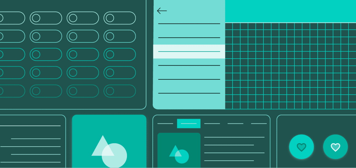
 Material Design by Google
What are some key resources you would recommend?
The first thing is to download apps. I always recommend people starting their design careers to get inspiration from other apps. Observation is a key principle for all designers. Observe the UX flows in action, examine the use of UI patterns such as text fields, navigation, and buttons. Build a visual library for continual reference as your career progresses. I also like the Interaction Design Foundation, they have some courses exploring core UX flows for mobile. The Shopify UX blog and UXdesign.cc have a lot of very tactical advice and content. Coupling more tactical content with podcasts that explore higher-level thinking, like Hidden Brain, is a great way to round-out your UX design skills. Finding podcasts that allow you to think in different ways and take inspiration from everywhere is perfect for a designer.
What do you wish you knew starting out?
The best designers in the industry are the ones telling
optimistic, hopeful, emotionally charged stories. Storytelling opens up a
beautiful world for design. Embrace this in your journey with design. When I
started out, I naïvely thought design was about aesthetics. And it is, to an
extent. What design really is, however, is storytelling. Design is a collection
of stories, and we’ve been tasked with being the visual narrators of this
story. We need to see the story through. When I meet a student or a person
starting out in this field, I always ask them the same question: What stories
do you want to be remembered by?