Designing a service for more than 130 million customers in more than 190 countries is no easy feat. It’s an even bigger challenge when you consider that Netflix started out as an old-school DVD rental business in 1997. The user experience has had to constantly adapt, as people all over the world watch on all kinds of devices under all kinds of network conditions. And then there are the extensive personalization features that Netflix offers to show users more content that they might want to watch.
We caught up with Navin Iyengar, lead product designer for interactive original content at Netflix, who recently led product design on Bandersnatch, the landmark choose-your-own-adventure episode of Black Mirror. Here he gives us an exclusive insight into how the user experience of Netflix has and continues to evolve, how the team conducts user research, and how prototypes are being created at Netflix.
What was the user experience of Netflix like in the very beginning?
When we started the streaming service, the user experience was based on the existing Netflix DVD-by-mail service that had been around for the previous 10 years.
Back then, the Netflix UX was purposely very transactional: the website was an ecommerce platform where people could add DVDs to a shopping cart (their DVD Queue) and receive them in the mail within a few days, so they could watch them in their DVD players. The design was focused on efficiency and getting people to spend as little time on the site as possible.
In 2007 we added Play buttons beneath the titles that could be watched immediately — this was only a small set of movies to start. Clicking Play on a title would open a separate window, which required the installation of a browser plugin to begin playing video. You could only stream on our website back then, but it was revolutionary in that you didn’t have to wait for your movie to arrive in the mail!
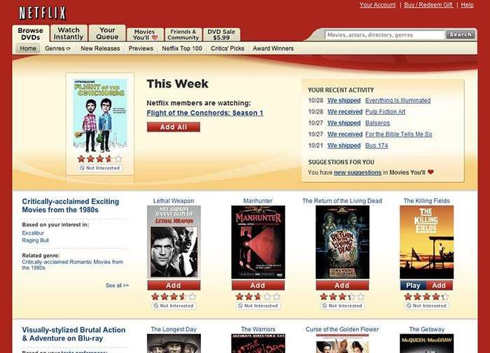
 Netflix.com in 2008.
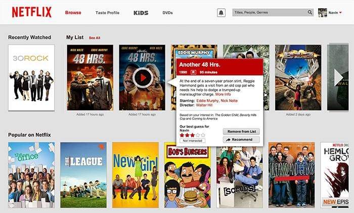
 Netflix.com in 2012.
How has the UX changed over the years?
When people used to order a DVD, we didn’t know whether they watched it or enjoyed it before sending it back. But with streaming, we had much more insight into how people used the service, which in turn gave us ideas on how to make the experience better and more personalized.
As streaming became the primary function of the Netflix website, the UX evolved to support the consumption of video content. We created interfaces to support playback on phones, tablets, and TVs, and experimented with ways to help people discover and enjoy content they would like. For example, the ability to go directly from one episode to the next was only added once we observed that many people were already engaging in this behavior.
After we moved away from that original ecommerce experience, we also made great efforts to immerse users directly in the content, in order to make it feel as if there is no extra interface on top of it. I think the resulting UI feels so obvious that people often don’t realize how deliberately we’ve designed the details. At its core, Netflix takes something extremely complex and makes it seem very simple.
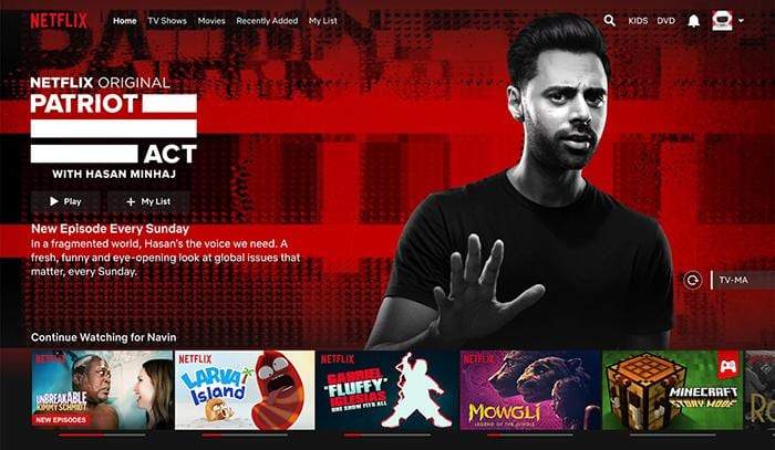
 The Netflix website in 2018.
What are the main considerations in evolving the UX of the service?
Netflix is a subscription service, and so we have the luxury of having a really good signal from our members of whether they are satisfied — they continue to pay for their membership! As a result, everything we do as a design team and as a business is well aligned with what is best for our global customer base.
A lot of the UX ideas we have are A/B tested, so we can understand what effect they have on member acquisition or satisfaction around the world. The results of those experiments help keep us focused on the most important things to work on. We often test ideas on a small scale first to understand the impact before we spend the time and effort to roll them out to our over 130 million members.
At the end of the day, we believe A/B testing yields the most reliable information for us to understand what people want out of our service.
How do you conduct research and analyze all the data you collect?
In general, we use qualitative research methods to generate and refine product ideas and then A/B test those ideas with real customers to help decide what should be rolled out. The qualitative and quantitative methods complement each other and help validate ideas at different stages of design.
On the qualitative side we’re continually running surveys as well as focus groups and ethnographic research. In the latter case, these more in-depth conversations with people help us understand their wants, needs, and the motivations behind their behavior. The things we learn may not always be representative of the larger population, but they give us insights into new ideas we may want to test in the future.
And on the more quantitative side, we’re looking at trends in data to understand behavior in aggregate and find correlations. As a simple example, we may be able to say that overall people watch Netflix on TVs more than on phones. We have teams of analysts that are always looking for interesting patterns to better understand customer behavior and help us prioritize where to focus our UX improvements.
What’s next for Netflix’s UX?
One big shift over the last 10 years has been how we have shifted from a regional U.S. company to a global service. We are constantly learning and thinking about how to create the best experience for everyone in every country, regardless of their background, language or culture. That will be a big focus of our UX over the coming years as well.
Of course the other big shift has been our content itself. We went from shipping DVDs to streaming licensed content, and then to producing and developing our own content. The core Netflix UX problem has always been how to make such a large catalog of content navigable and to connect people to stories that they’ll love. As we produce more new content that people may not have heard of before, the Netflix UX will need to do a better job of explaining what that content is and why you might want to watch it. We’ve still got a lot of work to do, and we’re up to the challenge!