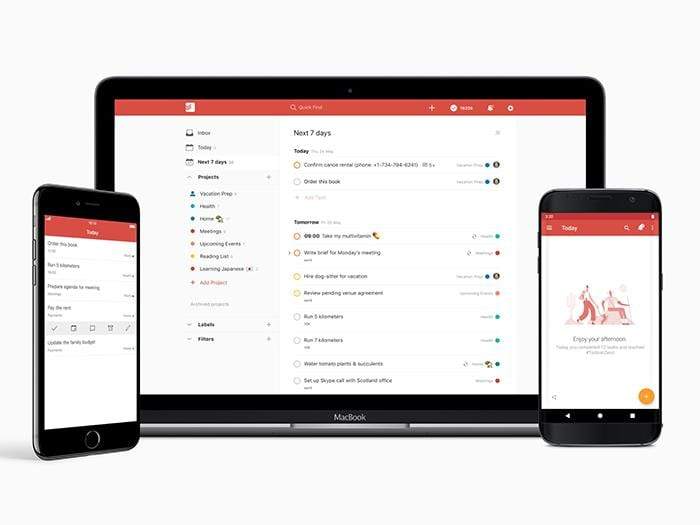
Todoist is one of the most popular productivity and task-management apps on the market. Available on both desktop and mobile, it uses a hierarchical system of projects to allow users to add and complete tasks as they go through their days and weeks.
In its 11 years of existence, it’s undergone various design changes, but none so profound as the series of redesigns Doist, the company behind Todoist, is rolling out this year.
We sat down with Doist’s head of design, Ana Ferreira, to understand how she approaches redesigns, and how Todoist is working to ensure better user experience (UX).
How are you updating the UX of Todoist this year?
The last big Todoist redesign was in September 2015, when we launched a new Todoist logo, new web app, and color themes. Since then, we’ve updated our apps in smaller ways to clean up “design debt” and better align all the platforms — a redesigned settings menu, for example — but we haven’t done any big changes.
This year, we’re doing design explorations to give Todoist a totally fresh and updated look. But the redesign will go much deeper than that. We’re rethinking some of Todoist’s core foundations with pretty much everything on the table.
Todoist was born in 2007. As with any 11-year-old project, it has a lot of unnecessary complexity and things we would do differently now that we have the benefit of hindsight and user feedback. It’s one of those situations where, to update the UX, we have to do major changes to the back end. It’s all interconnected, and a huge undertaking. In the end, these core changes will allow us to simplify the UX, making our applications simpler and faster to use. It will also allow us to consider completely new features that wouldn’t have been technically possible before.
What specific elements are changing up in this redesign?
On a concrete level, this year we already introduced a new favorites feature to help people better focus on what’s most important to them. This redesign also included a highly controversial change in the menu from tabs to collapsible navigation. We expected most of our users would “favorite” their most important projects and views, and then be able to collapse the menus for less visual clutter and better focus. But we received some pretty harsh feedback from our users that it actually made navigation more difficult. We’re currently studying ways to improve the new interface to make navigation easier, but also maintain the clean focus that the collapsable menu provides.
We also released a revamped search to make finding the right view, task, or comment much easier across all platforms, and new “karma screens” to help people stay motivated in a fun way. These were already the first steps on this bigger redesign project — internally, we call it Todoist Foundations (TDF) — allowing Todoist to better adapt to the user needs and workflows.
The next TDF project we’re working on is a revamped scheduler interface. Rescheduling is extremely important for people to be able to stay on top of their to-do lists. It’s human nature to bite off more than we can chew in a day. At the moment, the rescheduling experience isn’t coherent across platforms, and the options provided don’t always fulfill users’ needs. The new scheduler will fix both of these issues.

We also noticed that, for the most part, we’ve let new users figure out Todoist on their own. That means there are useful features that they miss. With that in mind, we’re redesigning our “empty screens” — not just to make the app more delightful to use, but also to provide helpful, contextual tips to users that lead them to the next step in getting more organized and in control of their tasks.
What insights about users have you discovered that led you to this year’s redesign?
We are always in touch with users through our support team — they do an amazing job compiling not just bugs, but also requests and suggestions. And we always have these in mind when considering new features or improvements.
During the first two months of Todoist Foundations, we also contacted some of our most active users, both premium and free, scheduling user interviews and sending out surveys. That feedback has given us a better idea of how people actually use Todoist, and what common problems they face. Lastly, we use analytic tools and (completely anonymous) usage data to understand which features are used most, and which are barely used at all.
Some specific examples of insights we discovered talking to users include: many don’t know how to create sections within projects and subtasks, and the people who do often feel a lack of context in tasks and subtasks. People are also concerned about losing information in shared projects since it’s easy for someone to inadvertently complete something or completely rearrange a task hierarchy. These are three of the usability problems we’ll be tackling in the upcoming months.
Will the changes roll out all at once in a radical redesign, or will they be steady updates over the following months?
In the past, we used to do big cross-platform releases, and they were always stressful. It led to burnout, and features that weren’t properly tested. We decided the PR bump we may get from a big release isn’t worth the bad experience for our team and our users.

 Ana Ferreira, head of design at Doist.
Now we work on steady updates that deliver new features and/or improvements every couple of months. This approach fits our six-week work cycles well, and makes it easier to get early feedback on changes and iterate — or even reconsider their value altogether. It also means our users never have to wait a long time to get new updates.
This doesn’t work for every release. Some features may be dependent on other features, or bigger design changes may need to be released together. In those cases we may do bigger releases, but we won’t have just one massive update like we’ve done in the past.
I don’t think there is an optimal way for doing releases. It depends on the company, the business model, the specific changes being made, etc. For example, if a product only gets a paid upgrade every couple of years, the upgrade needs to justify the cost. A big release, with big marketing promotion, makes more sense in this case.
Todoist is a subscription service and our company’s objective is steady growth (as opposed to a huge valuation or an acquisition), so making sure our users know that we’re constantly improving our apps — and put trust in us to do stable releases — is more valuable to us in the long run than a one-off media blitz.
Todoist allows you to add a task by using the microphone on your smartphone. Are you looking at expanding the use of the voice-enabled UI on Todoist?
The fundamental actions of Todoist are adding tasks and completing tasks, and no matter what other features we add, we always need to be thinking about ways to make the fundamentals more seamless. It’s easy to lose sight of that. The time between thinking about a task and adding it to Todoist should be mere seconds. That’s the only way people will make it a habit. Voice interfaces (and conversational messaging interfaces) are becoming more and more popular and have a lot of potential for minimizing the ‘thought-to-task’ time if done well.
That said, at the moment we don’t have concrete plans to dramatically change the way we use voice-enabled UI on Todoist yet, but our roadmap is never fixed in stone.