If you’re like many of us, you rely on Gmail as your primary email service, both for work and personal use. In the 14 years since its launch, Gmail has taken a lot of market share from the once-popular Yahoos and Hotmails of the last decade. According to business-stats resource DMR, Gmail’s share of the worldwide email-client market is about 20 percent today. To say that it’s quite popular would be an understatement.
Gmail has now redesigned certain parts of its user interface, with new features cropping up in unexpected places. It’s all part of an ambitious and broad redesign project that Google will roll out in the coming months to its premier email service.
Here’s are some of the user experience (UX) design considerations that went into these new changes.
The biggest design changes and their effects on the UX
Google is aiming this redesign to be a gradual rollout, so users can expect to see incremental changes in their Gmail experience as the months wear on.
For starters, you’ll see the new iteration of Google’s design language, Material Design. It’s all part of an effort by Google to enforce uniform branding across all of its web properties. Designers should take note — effective email design is rooted in clearly communicating to users that they’ll get the same great UX from all products.
As Jeroen Jillissen, Gmail’s UX design lead, points out:
“Gmail is the first G Suite product to roll out with the new version of Material Design, called the Google Material Theme. This new approach helps us to align the look and feel across the company, making it all feel distinctively Google.”


Besides the visual refresh, they have also introduced the following new features:
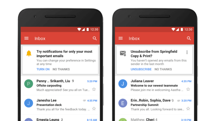
- New density settings that show attachments right in the inbox.
- Snooze.
- Collapsible left navigation and right-side panel.
- Improved security banners.
- Gmail confidential mode.
- AI-powered features like “Smart Compose” and “Smart Reply.”
The company’s new features seem geared toward making things more convenient and productive for users as they go about their usual tasks within Gmail. For example, collapsible navigation empowers users to only interact with screen elements when they’re actually using them, and Smart Compose intelligently suggests sentence completers while you’re typing.
UX changes based on user feedback
The mark of any good brand is how closely it listens to its users — its all-important customers. Google has spent the last few years collecting data from what users have been telling the company. Now, this feedback shows up in new features meant to have a positive UX impact.
“G Suite, and, with that, Gmail, has been focusing more and more on the business/enterprise user. Gmail is a very popular product, but hasn’t had a real update in a while. We believe we can really help businesses transform the way they work, and, based on the user feedback and our research, we defined three pillars for investment,” says Jeroen.
The three areas break down like this, according to Jeroen:
Security: Keep your data secure.
“This led to features like Confidential mode, the security redesign, and improved phishing controls.”
Google realizes that strong security is tantamount to its user base expanding. As a result, these features give peace of mind to its users, assuring them that Gmail’s UI gives them the tools to protect themselves online.
Smart: Google AI helps you stay on top of your email.
“This led to features like Nudging, Smart Reply, High-priority Notifications, Assistive Unsubscribe, and Smart Compose.”
Google’s new AI changes are based on empowering users to work smarter and get through their workloads more efficiently. Nudging is when Gmail reminds users to reply to high-priority emails and follow up on sent ones, while Smart Reply suggests ready-made responses to emails for faster replies. This is a good reminder to designers to take their users’ objectives into account when designing UIs and help them accomplish their tasks with less friction.
Easy to use: Help users accomplish more from their inbox.
“This led to features like Offline, Side Panel with the improved Tasks app, the new Google Material Theme, and Snooze.”
Convenience seems to be a big theme in this redesign because Offline lets you read and respond to your emails even without an internet connection, while Snooze temporarily takes away emails from your inbox and only surfaces them to the top when you need them. From this, we can glean that Google’s aim was to give its users more freedom and control, boosting the overall UX.
“When we design features, we don’t necessarily design for one or the other, but rather for solving certain problems. One example is how we help the user work offline better or how we help the user feel more confident sending sensitive data via email,” says Jeroen.
Great UX is a continuous process
One thing about Google is it loves to be dynamic with its design since it understands that — to ensure great UX — design has to be a living, breathing process that applies new ideas, feedback, and possibilities.
While this redesign is expanding across all aspects of Gmail, at the moment it’s still mostly found on Gmail’s web version. The company has plans to roll out this latest version of Material Design on mobile, too — eventually.
“The visual redesign has been focused mainly on the web. However, we introduced new features on both web and mobile at the same time. We are currently exploring what it means to apply the new Google Material Theme to mobile as well,” says Jeroen.
It’ll be exciting to see how Google takes these new design features and makes them work for stellar UX on mobile devices as well.