It all started with a little girl who was just trying to program a VCR. She couldn’t get it to work.
“I remember it being so, so difficult to do. It just didn’t make sense to me. I think that’s the first time that I really thought about usability, its importance, the difference between clever engineers designing the things and the end user who has to use it, and there being some kind of disjointedness there,” said Lisa Marie Ortega, who was that little girl but is now “Usability Gal.” She runs the successful Manchester-based user experience (UX) agency Keep It Usable.
“When I first started, UX didn’t exist, so it was all about usability. It wasn’t seen as a small scale. It was seen as a major scale where you had to have a master’s degree to even get an interview for usability jobs. It was really highly skilled, highly valued. Now we’ve got UX, so usability now, I think, is seen as a small subset of UX,” Lisa said.
This early experience inspired a passion for usability that has defined her entire career. While a lot has changed since she first entered the field, one thing that remains is Lisa’s undying advocacy for usability.
What is usability exactly?
“I’d describe usability as how easy or difficult something is to use,” Lisa said.
She points to the International Organization for Standardization definition (ISO-9241) for further insight, which defines usability by three measures:
- Effectiveness: Can they complete the task? How do they do it?
- Efficiency: How long did it take to do the task?
- Satisfaction: How did doing the task make people feel?
“They’re the main components of usability in a traditional sense,” Lisa said. “There’s also soft feedback with regards to usability. We do, for example, a lot of research at the start of the process, so defining the hierarchy of content, the information architecture, and which features functionality should be within — for example, an app or a piece of software. All of that comes before usability testing because it comes before you’ve even got a user interface to test.”
Usability is thus, in an ideal world, something that is baked into the design process from the start. By having a better understanding of what the user journey should look like, you can design something better suited to the user’s needs, ultimately making it more usable from the get-go.
Why usability matters
It’s simple. If a product is more usable, then more people will use it, recommend it, and purchase it. Users will have better experiences, and businesses will generate more sales.
“If somebody can’t use something, or they find it difficult to use, they just won’t use it. For businesses, if someone is not using your website, that’s lost sales. If you sell products and people find your product too difficult to use or too frustrating, it’s going to just sit in the corner of the room and not get used, and they probably won’t buy from you again,” Lisa said.
By focusing on usability and making things easy to use, UX designers can build better experiences that their users don’t have to think about.
“I think it’s even more important now than it was in the past. In the past, we used to blame ourselves and we used to stick with poor experiences for longer, whereas now people have a shorter time span for sticking with something that’s difficult, because there are just so many other, easier options,” Lisa said.
“People are even more aware of usability now, so online if you read reviews, people will talk about things being easy to use or not easy to use. There’s more awareness around it as well. People are [starting] to expect it from businesses, that they invest in usability and make it easy for them. It’s a win-win situation for the businesses and the end users.”
So, what does good usability really look like, based on Lisa’s definition that usability measures how easy or difficult something is to use?
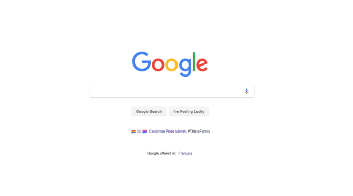

Good usability example 1: Google
“Google is always the one I say because it’s such a streamlined experience,” Lisa said. “The user wants to search for something and get results. [Google doesn’t] clutter the screen. It’s got one very simple box, you type into the box, and you press a search button. The screen is uncluttered and clean, and everyone uses Google. It’s so successful as a search engine, and I think that’s because it is so simple and the UI is so clean. It purely focuses on that use case of conducting a search.”
How does it measure against the IOS definition? It’s straightforward. The user only has one action they can take, so it’s easy for them to complete the task (effective). Results are pulled immediately (efficient), and Google uses complex algorithms to provide users with the most accurate information catered to the user as much as possible (satisfaction).
While there are a lot of wheels working behind the search engine to provide this information, the usability on the front-end is as stripped down to simple as possible.
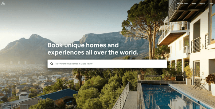
 Airbnb homepage.
Good usability example 2: Airbnb
“Airbnb uses very nice visual, large imagery. It’s very emotional. It makes you feel like you want to stay at that place,” Lisa said. “I know they employ a lot of UX people on their team as well, and I think that shows in their UI. It’s very easy to use. It’s got the key content on there, the right step, the user journey. It’s just very clean and very easy to use on all platforms as well,” Lisa said, adding that its usability does not waver, depending on whether a user is accessing it via desktop or mobile.
“Sometimes someone will have a great desktop experience and not so much a great mobile experience, but I think the Airbnb experience is really good across all platforms and their app as well is really good.”
Airbnb gets straight to the point. Where do you want to go? What do you want to do? When do you want to do it? Who are you bringing with you?
The user is asked one question to get things started, then a small number of questions that are specific and straight-forward (effective). Only the places and experiences available for the specified timeframe are quickly pulled up (efficient). Visually pleasing images, user-generated reviews and recommendations, easy guidelines, and the option to filter according to your needs make finding something easier (satisfaction).
Three things you need to know about usability
1. Usability isn’t trendy
Usability isn’t a trend. It’s a fundamental component of user experience design with a foundation that’s always the same.
“When it comes to visual design, it’s very trend-led, but usability is all about what’s right for your customers. It’s about making sure that whatever you’re designing, whether it’s your product, your website, an app, or some software, that it’s easy to use for the target audience,” Lisa said.
This doesn’t come from trend forecasts, but rather ongoing usability testing.
“Your users aren’t necessarily following trends, so if you can just keep on top of your users, or their needs and their knowledge and their skill set, that’s really the best thing to focus on. Don’t just do it once, because with digital it changes so fast that you need to keep learning about your users as their lives change. Keep conducting usability testing,” she added.
2. Usability and accessibility go hand in hand
“Accessibility and usability are strongly correlated. If you have high usability, you often have good accessibility as well. Usability is all about having good readability, for instance, and good contrast, and nice big buttons that you can press easily, clear CTAs that stand out on the page, clear buttons, and easy-to-find content. All those things make for good accessibility, so the two just fit together so perfectly and so seamlessly,” Lisa said.
By making things usable, you’re not only making them more accessible — you’re also opening your product up to a wider potential audience.
“More people can read it. It’s not like any less people can read it, or any less people can press the button. It’s always the fact that more people can press it and more people can read it if it’s bigger and bolder and has better contrast with the background color. It all has great payoffs for companies if they can make things usable and accessible,” Lisa said.
3. Usability happens behind the scenes
Usability is one of those things that users don’t necessarily notice until it’s not there.
“My job’s invisible, but I impact everyone’s lives on a daily basis,” Lisa said. “I used to work at Sony Ericsson, for example. People use their phones every day. If I could just make sending a text message a little bit easier for people, that would make their lives a little bit less frustrating. They could do it quicker, and they can focus on the text message rather than focusing on the software and the mobile phone that they’re using and trying to work out how to use it. They would never know that I did that, but I’m helping just to make their life a little bit easier.”
To Lisa, this is one of the things that she loves about working in usability: the impact it has on people’s lives every day, whether they know it or not.

Two tips for keeping things usable
If you’re just getting started in usability or are looking to improve, Lisa has two tips that will help you design more usable experiences.
1. Be aware of your biases as a designer
“Remember that you’re not the user, and remain objective. Keep testing with real users throughout the design process, because that will really help you to see your designs through their eyes, as opposed to through your own,” Lisa said.
“Sometimes designers will say, ‘Well, I am the user. I would buy this product.’ But the more you design something, the more you start to see it from the eyes of a designer and an expert user, and less from the eyes of someone who’s perhaps buying it for the first time or using it for the first time. Just be aware that you are biased. Everyone is if they work on software, so remain as objective as possible.”
2. Keep it simple. Keep it usable
“If you can just keep something really simple to use, it has good usability,” Lisa said.
“If you think about decluttering the user interface so that it’s simple to find what you want, if you think about the information hierarchy, making it really easy to navigate to the content that someone wants — keeping it simple keeps it usable.”