It’s incredibly important to create design systems empathetically. Empathy can solve many frustrating problems that may arise during the creation of a new UX process. In this article, I’ll first define design systems and empathy. I’ll also describe in depth some of the key takeaways from a case study on creating design systems with little empathy, the problems that arose, and how empathy helped solve them.
What are design systems?
What is a design system? And what makes it empathetic? When you hear about design systems, you may come across the phrases, “component library,” “pattern library,” or “style guide.” Don’t let that fool you — on their own, these are not a design systems, but they are all pieces of that same puzzle.
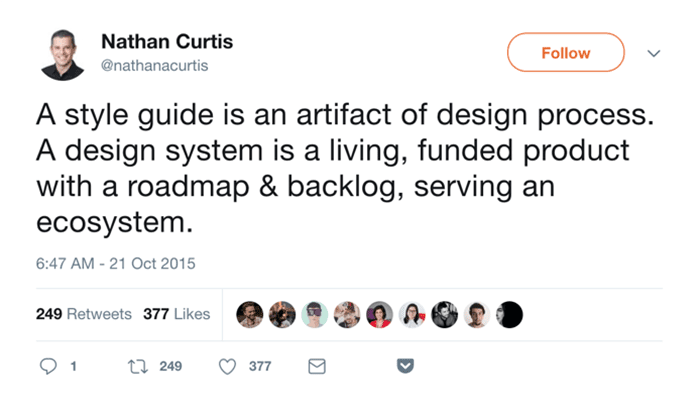
A design system is: a kit of reusable, interconnected parts, a set of cohesive, interconnected products, and a community of collaborative, interconnected people.
Nathan Curtis
Typically, a component library refers to a set of commonly used elements for use across an entire company. A pattern library refers to a set of design patterns for use across an entire company. And a style guide refers to static documentation that describes the design system itself, i.e. how products should look and feel, use cases for UI patterns, correct typographic scales, and more.
What is empathy?
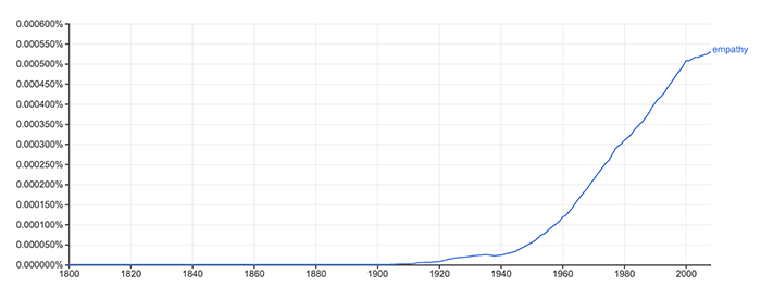
Empathy is the ability to understand and share the feelings of another. It comes from the two Greek words “em” and “pathos,” which mean “in feeling.” If we look at Google Books Ngram Viewer, we can see that the popularity of the term “empathy” has risen in the last 70+ years. It’s unsurprising as we all try to connect more in this digital age of deep divisions.

Putting empathy and design systems together
What does it mean to put empathy and design systems together? Well, it means being attentive to the needs of your users who use the apps built with the design system, coworkers who use the design system, or external stakeholders who use your design system if it’s open sourced.
When discussing UX process issues with coworkers in application development, you’ll often hear answers run the gamut. Everything from testing with users, clarifying requirements with product managers and designers, collaborating between multiple feature teams, or handing off empathic designs to engineers. Each of these is different, but note that each is related to empathy, whether that be for users or coworkers. So to help solve the UX process problems, inject a bit of empathy!
A case study
In my previous job, I took part in the inception of a design system. We were creating it because, in the midst of a company rebrand, it just made sense to start incorporating those new designs into a system. We also wanted to replace our existing style guide, which used an older CSS generation library called KSS.

We dedicated an entire frontend platform team to this project. They included three of the most senior front-end engineers, three new engineers hired out of boot camps, and up to 15 designers contributing at any point in time.
Additionally, this front-end platform team made the decision to move from Backbone to React as part of the design system process.
What we did well
File Generator: We used plop.js to help create a set of files with each new component added to the design system, which came with the benefit of consistency in the file system and folder structure.
Documentation: On the homepage of the design system, we described the atomic system used, how to contribute, and information on the component approach we took.
Planned approach: In order to contribute to the design system, you had to create a document with a standard set of information.
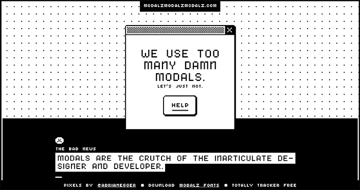
Accessibility: We used the `eslint-plugin-jsx-a11y` package to help automate some accessibility across the design system. We also paid special attention to the new modals, which can be accessibility nightmares, to ensure they were accessible as well.

What we did… not so well
Search: The search functionality of the design system was based on the component name alone. They often say that you don’t know what you don’t know, and this was certainly true of the design system. How could you search for a component if you didn’t know what its name was?
Naming things: Naming things is hard. Initially the design system was under a code name, Black Panda, which could be confusing to newcomers. Later the name was changed to the company’s design system, but was often referred to as CDS. Acronyms by their nature obfuscate what they represent. So we didn’t do much better in the name change.
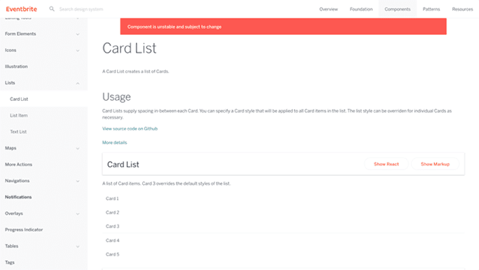
Deprecation: When components were deprecated, they just showed a banner that said, “Component is unstable and subject to change.” But what do “unstable” and “subject to change” mean? Should you just not use the component, or is it ok to move forward with it?

Another time, a feature team was the first to use a component called “Text Input,” not knowing that the “Input Field” was a new fangled component that the designers created to replace the former. The feature team was delayed many weeks because they ended up tasked with the new component creation.
Component confusion: We had components called Dropdown, Dropdown Menu, Select, and Select Field. It was difficult to tell what the differences between all of these were. Not only that, but the Select Field was a subcomponent of the Input Field. Again, naming things is hard.
Designer inclusion: Because we moved our system to React and a component based architecture, it was more difficult for designers to make minor changes. React has a steep learning curve, and the CSS folder architecture was difficult to navigate.
CSS `display` property conflicts: As part of the move into the future, the design system’s new grid system used Flexbox or `display: flex`. Unfortunately, we carried over our alignment classes, which used `display: inline-block`, a relic of the old style guide. These two would overwrite each other when used on the same component, causing weird layout issues.
Release process: Only the frontend platform team could release the design system and only once a week. This meant only three engineers out of over one hundred had the ability to do so. After that, the latest version design system needed to be “bumped” in our core repository. This caused delays for product teams as they waited for new components to be available for development work on new features.
All in all, we took many missteps on our way to a design system. How did we fix these issues, and could we have avoided them altogether?
Fixing the problems: Empathize it!
Having empathy for coworkers was the way forward.
Better communication
We started Frontend Guild meetings where we could discuss things such as our grid system versus alignment classes cascade issue or up and coming components, such as the Input Field.
We stopped using code names and acronyms, and purged the code base of both.
Clearer labeling
A plan was hatched to create a search page with small screenshots of the components themselves. That way, anyone could search the design system at a glance. We also planned for a search with keywords across the code base rather than just component names.
We changed the wording and user interface around deprecated components to make it clear and obvious when not to use a component in the design system.
Inclusion
Tools such as React Studio and Framer were introduced to help designers learn React. Both tools auto-generate JSX based on designs created in that software.
The release process started happening twice a week. Additionally, one engineer created a bot that tagged a new engineer each time to run the release process. That way, every engineer was empowered to do so in the future.
What should you do?
Ask yourself: do you need a design system? If you don’t, start small! Build one component at a time. Don’t build ahead of your needs, or you’ll end up with components that are completely unusable when put into practice via a new feature like the Text Input.
We had a team of six engineers and up to 15 designers just for the design system. Think about what resources you have before planning a full blown design system.
And most of all, use empathy when building a design system. Consider who will be using it, contributing to it, or marketing it. Engineers, designers, product managers, marketing, or external stakeholders?
Here are some resources to help you along the way: