The people and politics aspects of design systems are hard. How do you get buy-in from your boss and team to spend time working on the design system project? How do you ensure people will use the design system? Without widespread adoption and use, design systems are meaningless. This is especially challenging at scale in very large and complex organizations, where design and development functions are spread out among many teams and locations.
It can also be a very intimidating and daunting task to get started on a design system. You might even experience ‘design system imposter syndrome,’ feeling like your project isn’t a ‘real’ design system because it doesn’t include code yet, or because you don’t have a dedicated design systems team.
There are many ways to start design systems efforts, and no one right or wrong way to go about it. We talked to people about their experiences getting UX design systems off the ground in government, a public sector corporation, and a large technology company. Here are the approaches they took, and the lessons we can learn from their experiences.
Lesson 1: Context is king
When you’re getting started with your design system, consider the context you are operating in. Is it highly bureaucratic and hierarchical? Or more consensus based? Who holds the decision making power, and do you need to get them on board straight away? Who are the advocates that can unlock support for the design systems initiative?
When Edo Plantinga started dreaming of a Netherlands Government Design System, he knew a grassroots, bottom up approach would be crucial. There were several design systems across government, but the individual government organizations were not consistently applying them. “We actually tried to get a design system initiative off the ground a few years ago, but I think we were a bit too early at the time, and it didn’t really stick.”
Plantinga has been working with the Dutch government for several years, and has a strong network of UX and IT connections. Someone in his network pitched the idea of a government-wide design system. The Dutch government already had a style guide, but it wasn’t working consistently in practice. “We started with meetups, inviting people from all over government. Last year we did two informal sessions on design systems, with about 60 people showing up to each one.”
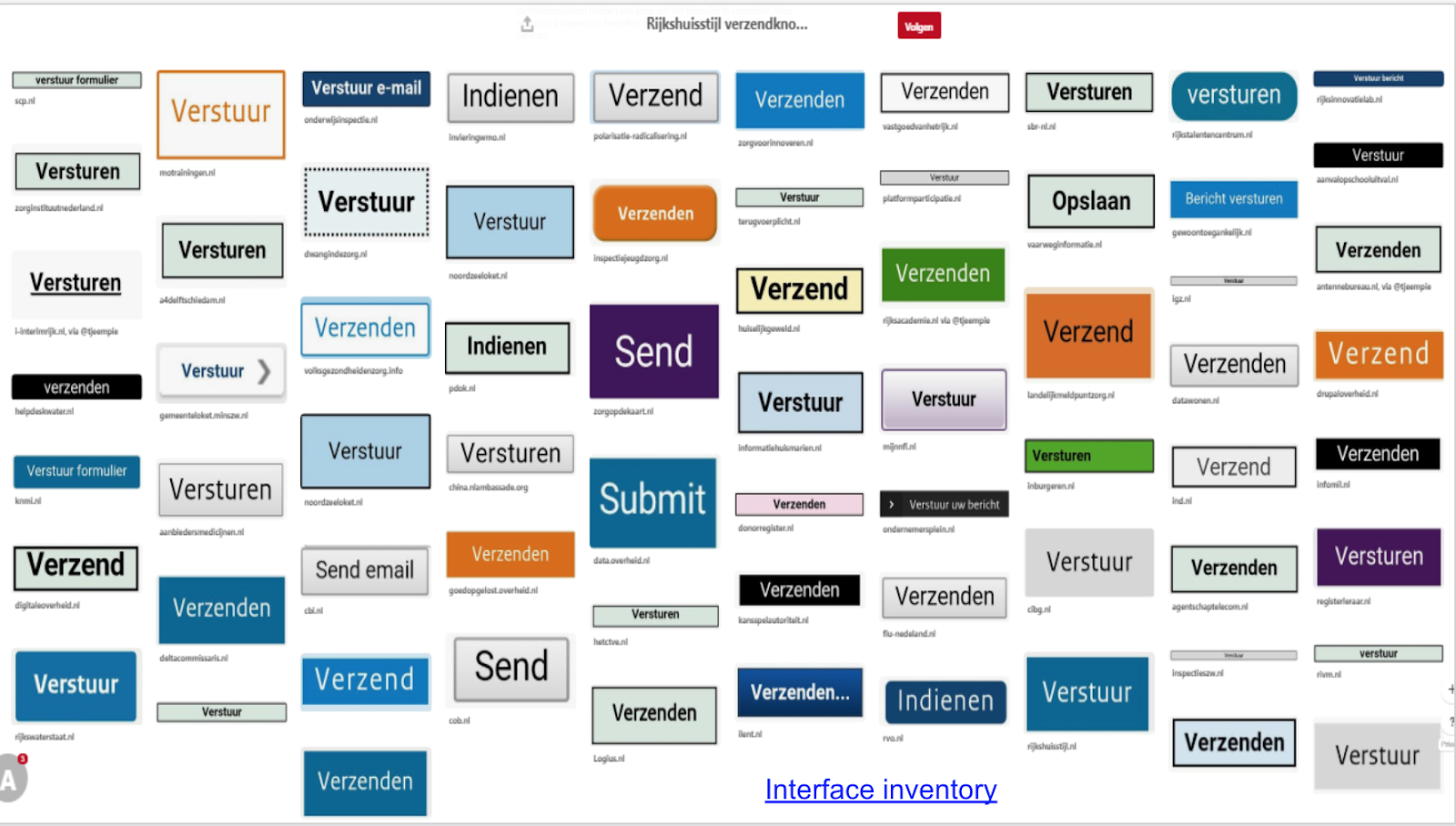
 An interface inventory showing the wide variety of buttons across Dutch government websites. Image by Victor Zuydweg.
At these sessions, people worked through structured processes to identify which features would be most important, and what challenges people wanted to solve with the design system. “Meetups can be chaotic, so we took all the inputs from the meetups, and put everything in one central place, weighed each feature, and used that as analytics. We also took a look at the existing design systems to see what we could recycle.”
Another thing the team did to drive buy-in was to get commitments regarding adoption of the design system from various relevant stakeholders. Collecting quotes from senior leaders showing their support of the initiative helped to build social proof that people had bought into the design system.
 Infographic by Andreea Mica.
This open, bottom-up, consensus building process has been time consuming, but it has also ensured that everyone is on board with the design system initiative. Even better, the team now has public-facing, written commitments stating that employees are going to use the system when it is available. Plantinga reflects that “The Netherlands is not a very hierarchical country, and so things cannot be done top-down. The consensus model is very Dutch, and considering this cultural context has been crucial to the success of this work.”
Lesson 2: Start where you are
Don’t worry too much about what makes a ‘real design system.’ If you don’t have a big team to work with or all of the resources to include development and code in your design system from the get go, you can still start with things like research and audits, UI kits, and creating documentation. What can you start with today? Who might your allies be? What is going to be most useful for the team? What do you have control over?
There’s a lot of arguments and rhetoric about how a design system is not really a design system unless it contains coded components and code repositories. Be that as it may, it can be very deflating for teams who are struggling to get resources and support to building code components.
For designers at Canada Post, Canada’s mail carrier, they didn’t let a lack of engineering and development resources at the time stop them from pushing their design system forward. Daria Shepelenko was part of the team at the outset. “As a design team we were facing huge demand. We wanted to systematize commonly used patterns in order to support teams to deliver their work more efficiently. When we started doing a comparison across our products, we realized that we lacked the desired level of consistency and cohesion among some of our public and internal-facing products.”
It was clear to product leads and stakeholders that the team faced challenges in securing resources and team time to dedicate to such a large project as a design system. So they did something really smart: they started where they were. “We started by unifying things for designers, since that’s what we had direct control over. We created a robust design file where we outlined all of the common design elements that designers could start using within their projects.”
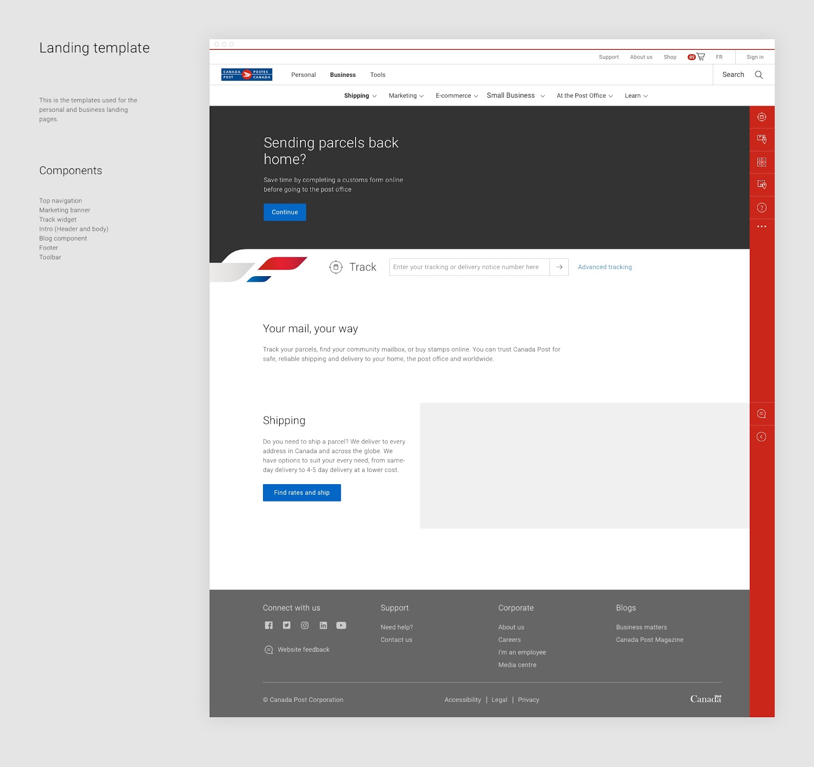 The Canada Post design kit includes templates and examples of the components that are used in each template. For example, this landing page template includes top navigation, a marketing banner, and a blog component among others. Image by Canada Post.
It wasn’t long before this design kit started gaining momentum. “A designer from one team started using it, and then another one started using it. It was a snowball effect.” The benefits of the design kit gained notice too: “It helped us to bring consistency across our products, and it helped us to ship things faster. This got interest from product owners, which then helped us to build traction with senior leadership.” Shepelenko also shared stories of the design kit getting noticed by stakeholders in design sprints, as curiosity was piqued as to how the team was able to build prototypes so quickly.
From there, the team got funding and resources to build a digital resource where the design system would live. While it started out as design and content-based system, building out development and coded components was next on the roadmap.
 The Canada Post Mercury design system now has a public facing website which acts as a centralized resource for the system. Development and coded components are on the roadmap for the system. Image by Canada Post.
Shepelenko has since moved on from her role at Canada Post and is now a UX manager at Shopify. While she acknowledges the importance of code repositories as a crucial aspect of design systems, she also has taken a really vital lesson from her time working on the Canada Post design system: “Even if you can’t have development from the start, there are still a lot of things that you can get started with as just a design team. You can still kick start the process of documentation, you can start building reusable design or UI kits to share with product designers, you can do research like UI audits and have conversations with people about the challenges they are facing.”
Lesson 3: Use what’s working
Be intentional about the starting point for the design patterns that you document. Keep in mind the tradeoffs of starting from a very specific product or user experience. Weigh the need for speed with the variety of use cases you want to cover from the get go. Be open to the need for your design system to evolve in the future. Ask yourself what products or applications are working really well? What can we abstract from? Where are there known successful patterns in our UX?
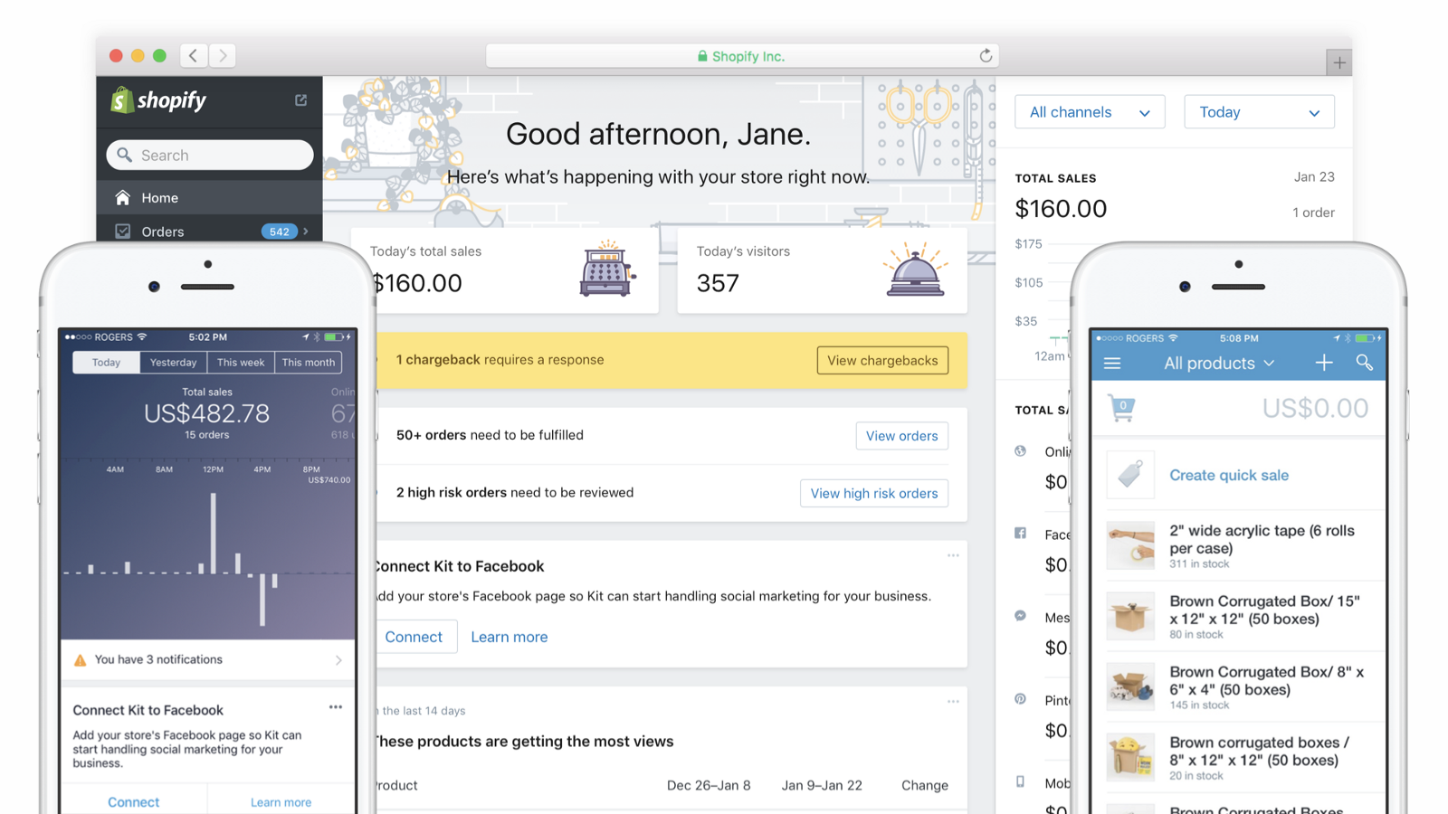 Shopify mobile, web and point of sale pre-Polaris. Image by Kyle Peatt.
The Shopify UX team had 10 weeks to build the first version of their Polaris design system from start to finish. This was an aggressive goal, as the company set out to document and align Shopify user experiences across all of their products. Moreover, the team was focused on ensuring that their multidisciplinary approach to building products shone through the design system. This meant including information on the function of each component, and the UX rationale behind them.
In order to undertake this mammoth task, the team started with the admin panel. The admin panel is the interface that merchants use to run their business on Shopify. As Yesenia Perez Cruz puts it, “There are lots of ways to get started with a design system. One of the ways is to take a product that is working well, and abstract that into a design system. So we took what was working really well about the core Shopify admin and went from there.”
 Shopify Polaris is a robust and often-cited example of a design system. Now on version 4, the first version of Polaris started with the core Shopify admin.
The advantage of this approach was that it enabled the team to create an incredibly detailed and well-documented design system in a very short timeframe. When Polaris launched in May 2017, it immediately made lots of Shopify development partners’ lives much easier.
 Shopify mobile, web and point of sale post-Polaris, showing a more unified and consistent look and feel. Image by Kyle Peatt.
However, the downside to this approach was that the design system was very specific to the user experience of the admin panel which it had been based on. “Other teams realized they could benefit from using Polaris, but their audience, context, and user flow might be different to the ‘back office’ experience of the admin panel,” said Yesenia. “For example, if I’m in a retail space under bright lighting the color palette doesn’t work, or I might need bigger buttons in order to be able to maintain eye contact with my customers.”
In order to evolve Polaris to match the evolving use cases and needs, the team has taken a meta approach. “What we’re going to be evolving Polaris into is a system of systems,” shared Perez Cruz. “So this means we will have an umbrella design language for Shopify. It will include experience principles, design language, and foundational components such as grids and layouts.”
This will allow teams to build their own tailored satellite systems, for example Polaris for retail or Polaris for marketing. “The goal is to allow teams to deviate meaningfully if they need something new or different than what is provided in the overarching Polaris system.” From starting with what’s working, the team has grown and continues to evolve a highly sophisticated and successful design system.
The first step is the hardest
As we can see from these stories, each design system has a unique origin story. There really is no right or wrong way to get started. Many successful, enduring, and mature design systems started somewhere, and you can come at a design systems project from many different angles.
The hardest part can be knowing where to start, or feeling that there are certain requirements that make something a ‘real’ design system. In this case, it’s useful to consider what is actually within your control and start there, and if it’s a UI library, so be it. It’s also worthwhile to consider your organizational culture and decision making structures as you figure out your first steps. Finally, you can start with documenting the UX and patterns that you already know are working to get the design system started.
In the end, necessity is often the mother of invention when it comes to design systems!
Continue to part five: Managing, Maintaining & Governing Design Systems for Success.
Thank you to all of the people who participated in research, interviews and surveys, and shared their deep knowledge and expertise. For more on design systems, download the Adobe and Idean e-book ‘Hack the Design System.’
Header illustration by Andreea Mica.