Accessibility in digital products is often
referred to as the practice of designing products that can be used by a wide
range of people, including individuals who have visual, motor, auditory,
speech, or cognitive disabilities.
In this article, I want to share some
simple steps on how to make your design more accessible. But before that, it’s
important to reveal a few common myths about accessibility.
Common myths about accessibility in design
Some designers think that accessibility design is all about improving usability for people with disabilities. That’s not true. Imagine you open a website on your mobile phone, and you see the tiny text on your screen. What makes things worse is that the text is displayed on the low-contrasting background, so the letters are barely visible. Even if you’re a person with a perfect vision, you will have trouble reading such text. That’s why improving accessibility is such an important task. Good accessibility will create a better user experience for all groups of users.
Another myth about
accessibility is that accessible design is expensive. That’s also not true.
When accessibility is baked in product design right from the start, it doesn’t
cost any extra money.
Guide for creating accessible web design
To address the need for accessible website design, the World Wide Web Consortium created accessibility standards, also known as the Web Content Accessibility Guidelines (WCAG). WCAG is based on five main principles:
- Perceivable
- Operable
- Understandable
- Robust
- Conformance
Each of these different principles has a
success rating of either A, AA, or AAA. An A rating is the minimum requirement
for having an accessible site.
Text
Line length
Line length has a direct impact on text
readability. Well-selected line length creates a rhythm that guides the
reader’s eye as they read the copy. The WCAG recommends keeping a line of
text’s character count below 80 characters.
Color contrast
The color contrast between a text’s foreground color and background color can make a huge impact on the legibility of your site. People who have low vision could find it difficult to read the low-contrasting text. It is critical to consider creating enough contrast between text and background.

 Low contrast text is something that can often break the usability of many products.
The color contrast is typically checked in
the form of a color ratio. The WCAG recommends that your text should have at
least a 4:5:1 contrast ratio to achieve an AA rating and a 7:1 contrast ratio
to achieve a AAA rating. The ratios become more forgiving as you make the font
larger and heavier (simply because larger/heavier font is easier to read at
lower contrast).
 Grey scale test
Here are a few typical UI elements that
suffer from bad color contrast:
- Placeholder labels. They usually are designed in gray low-contrast color.
- Button labels. Watch labels for ghost buttons. Ghost buttons are generally bordered by a very thin line, while the internal section consists of plain text.
- Icons. Icons or other critical interactive elements should also use the recommended contrast ratios.
You can use special tools for measuring color contrast ratio. One of them is WebAIM color contrast checker which helps you calculate the score for both regular and larger text sizes.
Images
Write meaningful alt text
Many web designers skip the alt-text on
images because they think that the image should speak for itself. However, the
image speaks only for those who can see it. Visually impaired users rely on
screen readers to get the meaning of the page. Screen readers tend to use alt-text
to ‘visualize’ the image to those users. That’s why if you want to design an
accessible website, you should always add meaningful alt-texts.
Avoid creating images with text
The text in images can become unmanageable.
It will be hard to quickly adjust the text size, font style, or any other
visual property of the text. Instead, it’s better to use text positioned over
the image using CSS style property.
Interaction Design
Write clear labels
Use appropriate labels for buttons and
other UI controls to accommodate users who experience a text-only version of
your app.
Don’t use color alone to convey the meaning
Designers often use red and green colors to
communicate the status of the operation. For example, when users provide
incorrect data in a web form, they see a border of a field colored in red.
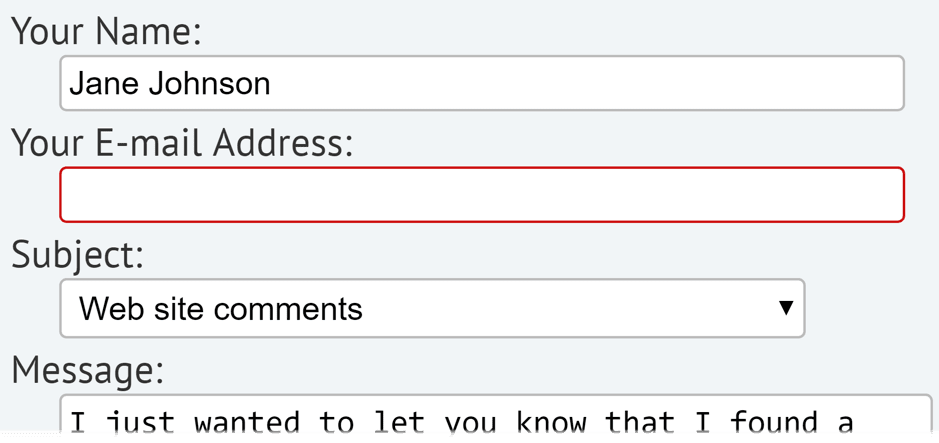 The red border will be invisible for color blind users.
This design decision will cause a lot of
problems for people with low vision or color blindness because they won’t see
the status update. That’s why when you need to communicate the meaning and
convey the status, don’t use color as the only visual cue. Add other visual
elements such as icons or labels.
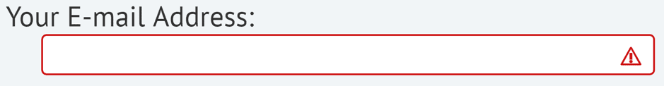 The form field displays an icon on error.
Also, be careful with elements like charts and graphs. Such elements often use color to distinguish the data. Trello found an interesting solution for this problem – they introduced visual patterns to distinguish different content. You can turn a Color-Blind Friendly mode and see that labels have textures.
 Labels in different colors, textures, and patterns.
Support keyboard navigation
Keyboard accessibility is one of the most
critical aspects of web accessibility. When you work on a website, you should
support keyboard navigation but also test your site only using a keyboard. Use
Tab to see whether the keyboard navigation is logical (check the order) and use
the Enter key to select an element (verify that all the interactive components
are predictable).
Be careful with the size of your
navigation. Tabbing through long menus may be demanding for some users with
motor disabilities.
Create a clear hierarchy using HTML
Type hierarchy for your site is very
important — good hierarchy makes it easy for users to comprehend information.
When designing a web page, you should start with <h1> for the top-level
headings and use <h2>,<h3> and <h4> for each subsequent
headings.
Why? Because screen readers navigate web
pages by heading structure hierarchically. The clear hierarchy will give people
who use screen readers an opportunity to listen to a list of all the headings
first and then jump the content by types of titles. Alternatively, they can
navigate directly to top-level headings such as an <h1>.
Design focused states
Have you noticed the blue outlines that
sometimes show up around the links on the websites? These outlines are called
focus indicators. Many designers remove focus indicators because the indicators
don’t match the site’s aesthetics. But by doing that they break UX for a
particular group of people.
Some people cannot use a mouse or trackpad
to navigate your site. People with motor disabilities navigate sites by tabbing
on the keyboard. And they rely on a focus state to understand where they are in
UI right now. Input fields, buttons, and other interactive elements on your
site should have clearly defined focus states.
Polish error-states
All error states in your product should be
designed in a way that provides contextual information that informs a user what
went wrong and what they can do to fix it.
Make form instructions visible all the time
It is especially important for web forms.
Hiding input field placeholders on input is one of the biggest mistakes when
designing a form. Remember that a person who interacts with your product should
never lose context. When you hide instructions, you increase the chance for
incorrect input.
Avoid flashing animation/banners
Flashing animation can be disturbing for
regular users, but for people with disabilities, they can be dangerous.
Flashing animation can cause motion sickness or even seizures. That’s why it’s
recommended to avoid using flashing animations in your design.
Beyond the rules
Making your design accessible requires a
lot of work, and this work should be done on a regular basis:
- Conduct an Accessibility Audit. It’s always a good idea to conduct an audit to understand how many accessibility issues you have right now. The audit shouldn’t be a long or painful process. You can use a tool like AXE Chrome Extension to find areas that require improvement.
- Invite people with disabilities to usability testing sessions. Seeing is believing. When you see how real users with disabilities interact with your product and what problems they face, it will motivate you to design better products for them.
Conclusion
By focusing on improving accessibility, you
make your design more inclusive. But accessibility is not just a one-person
mission. It’s a team mission. To create an accessible product, everyone must
work together and create with these guidelines in mind.
Recommended resources
- W3C: Web accessibility guidelines
- WebAIM: Articles and resources on web accessibility.
- AXE Google Chrome Extension: Extension for Chrome that allows you to test any site for accessibility violations
- NoCoffee Vision Simulator. NoCoffee can be helpful for understanding the problems faced by people with slight to extreme vision problems, such as low contrast sensitivity or color blindness.
- A11y: Easy accessibility audits powered by the Chrome Accessibility Tools
- Adobe’s website design articles