As the range of screen sizes has proliferated, designers have faced a unique challenge: How do you design a layout that is creative but also effective at any resolution or screen size? Block-based designs, which are easily implemented across screens, have become a common solution.
But while this approach solves the problem of designing for myriad screen sizes, it limits creativity, asking designers to create websites with template thinking, not design thinking. Thus, another challenge is born: How do you deliver a beautiful design customized to a client’s brand that is also capable of being implemented anytime, anywhere?
Answer: CSS Grid layout (Grid), which offers a foundation for the future of designer-developer interactions. For a designer, CSS Grid is a tool for communicating the client’s message in an impactful way. For developers, who have to deal with things like infinite screen sizes, page loading speed, code reusability, and so on, the CSS Grid gives them a rule that the website operates on, alleviating the need for constant involvement from the developer.
Let’s explore why the grid influences good art and design and how the CSS Grid layout can enable a better experience for designers, developers, and users.
What is a grid?
A grid is a network of lines that cross each other to form a series of squares or rectangles into columns. It has long been a tool of visual artists.

 Piet Mondrian’s classical painting “Composition with Large Red Plane, Yellow, Black, Gray, and Blue” re-created with CSS Grid. Image credit Jen Simmons.
In web design, the grid becomes a set of constraints that tie the elements together but also allow elements to dictate the grid. CSS Grid is an indispensable tool for web designers, as it helps them create genuinely responsive layouts.
 An example of a responsive grid layout. GIF credit Jo Franchetti.
The CSS Grid layout was introduced in 2011, supported by one browser as an experimental feature. It’s come a long way since then, with all major browsers jumping on board in 2017. Before that, pages were built using the table layout, which required some inelegant solutions to get the content to display in an accessible and interactive way. Later, a one-dimensional flexible box module (Flexbox) was created to help address the issue of a universal markup. To make it work, however, developers hacked, tweaked, made workarounds, and invented the CSS frameworks—none of which added to the viability of these methods.
In 2018, CSS Grid started the new age of layout. A grid is a set of intersecting horizontal and vertical lines; thus, it’s a two-dimensional layout that can be changed without affecting the markup. The grid provides an order for the elements rendered on a page, and, like Flexbox, a web design grid does not require elements to be placed in the order they are going to be displayed. CSS can distribute them in any order based on the priorities of the screen size.
 An example of a CSS Grid layout created using Flexbox. Image credit Mozilla.
 CSS Grid browser support chart. Image credit Caniuse.
Leveraging design in a CSS Grid layout
It’s not as if flexible, modern-looking websites don’t exist without a CSS Grid. Websites built with Flexbox do have one-dimensional flexibility that allows different elements on the site to resize depending on the screen size. However, there’s more to designing a website than simply positioning elements in a certain way. Design can meaningfully extend an element beyond its visual presentation. Layout affects perception.
Every composition a designer creates is based on a set of principles. The more sophisticated the principle, the stronger the artistic effect. If a layout can’t re-create a principle, that effect—and all its potential benefits for both user and brand—are lost. That’s why, for a designer, a flexible universal layout capability is a prerequisite.
 A visual representation of differing, sophisticated compositions in use. Image credit Lisa Charlotte Rost.
In the web’s early days, none of this mattered. The magic of published digital media distracted users from the complicated and less attractive backend look of the page. In other words, the early days of the internet did not require design to seem extraordinary—the fact of the form itself was astonishing enough. Websites did not fight for attention and, thus, did not need to consider the emotional impact of user interaction.
 Compare The Sydney Morning Herald website from 1997 to more sophisticated designs from decades earlier (like Corn Flakes below). Image credit ABC.
 This Corn Flakes package from the 1960s demonstrates more thoughtful design than original web pages because original web pages didn’t need to be well-designed. Image credit Guardian. Time, which has a way of putting everything in its place, eventually turned the internet into another battlefield for better design. It was common to see past design practices and layouts being incorporated online as designers were brought into creating digital spaces.
As time has gone on, a designer/artist grid has transformed into a tool to reach proportional accuracy online. The grid has long been a framework that artists have used for producing commercial fine art, and graphic designers have done the same, following the path of Josef Müller-Brockmann, a Swiss designer who defined the grid as “an organizational system that makes it easier to read the message.”
The Grid gap opportunity
A CSS Grid layout is the first real solution that helps address and fix layout problems between designers and developers. So why, in the years since CSS Grid has been actively promoted in the front-end community, is it still not a go-to technology? Sergey Popov, a mastermind behind moscowcss, says there are two reasons:
1 – Designers aren’t challenging developers with complex tasks
2 – Developers don’t see why they should apply grid on simple projects
Most websites are good to go with a simple table layout because they are designed according to marketing needs, on time-poor schedules, and in conditions of scarce technical variety. Unorthodox grids and complicated layouts have disappeared from design approaches to make way for constructor-like landing pages. Now, when development tools and browsers allow complex layouts, this gap is a wasted opportunity.
 Straw-dogs website made with Grid. Image credit Straw-dogs.
CSS Grid enables more than just a complicated layout. Grid allows UIs to be implemented easily and to be housed across different contexts. It can be used in simple three-column layouts, save on endless wrapping, and responsively change the structure of the layout.
 Boarding pass responsive layout with Grid. Image credit Sergey Popov.
CSS Grid gives web designers a superpower. Thanks to grids, designers can break constraints and craft attractive visual layouts. In his article “Art Directing For The Web With CSS Grid Template Areas,” web designer Andy Clarke demonstrates a few interesting examples of Grid-based layouts along with hands-on tips on how to implement them. Let’s explore some other examples of websites created with Grid-based layouts:
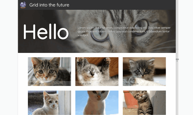
 A grid of five equally sized columns creates a nice visual rhythm and makes the user focus on important elements. Image credit Andy Clarke.
 This ecommerce website uses a grid to create a hierarchy for content and visual elements. Image credit Reserved.
 Baubau Haus, an online feed of design artworks, uses a grid to create order among elements on the page. Image credit Baubau Haus.
 Graphic artist Mike McQuade uses a grid to present information in a structured, logical way that builds visual impact. Image credit Mike McQuade.
Conclusion
Grid enables a synergy between design and developers. With it, a designer can compose a layout that is creative and brand-beautiful, and designers can turn that grid layout into a responsive layout—without sacrificing any of the designer’s aesthetics or the developer’s ambitions. CSS Grid empowers the two philosophies to come together for the benefit of a better final product.