Illustration by Kyle Webster
In today’s era of low attention spans, you must be innovative to create a truly memorable experience. For web designers, one of the most useful ways to achieve this goal is to utilize the parallax scrolling effect. Well-executed parallax scrolling allows you to create a dynamic web experience for your visitors and showcase content in easily digestible segments.
In this article, I will review parallax scrolling, provide practical tips on how to design great parallax effects, and share an excellent collection of parallax website homepage designs for inspiration.
What is parallax scrolling?
Parallax scrolling is a computer graphics technique used by web designers to create a faux-3D effect. As users scroll down a webpage, different layers of content or backgrounds move at different speeds, and this creates an optical illusion. Using parallax scrolling is not a new technique. In the early 1980s, game designers working on Super Mario Bros. used parallax graphics to create a sensation of depth.
Today, parallax scrolling has become more of a trend in the web design world—and for good reason. Scrolling is easier than clicking, and a well-designed parallax effect engages users to scroll for more information.
How to create parallax effect in Adobe XD. Video credit YouTube.How do I make a parallax website design?
There are a few different ways designers can create parallax website designs. The first is to dive into pure CSS to create it. If you want to follow this approach, you should use a container element and add a background image to this container. Then you should use the “background-attachment: fixed” CSS property to create the actual parallax effect. You can find a working example at W3Schools.
Another approach is to use website builders to add parallax scrolling. Website builders like Wix, Elementor, or Squarespace allow you to create a parallax effect with minimal effort.
Why should I use parallax graphics?
There are two main reasons why designers should try parallax graphics:
It helps tell a story
Parallax graphics are ideal for storytelling. Good design is all about communication—and when we design websites, we want to communicate with our visitors and tell a compelling story about our product, service, or brand. Parallax scrolling allows us to immerse our website visitors in unique online experiences. It’s even possible to create a one-page website where visitors can read an entire story about your product or brand without navigating to multiple pages.
It helps to improve user engagement
Parallax graphics can be used to improve user engagement. Reducing your website’s bounce rate is one of the goals to be conscientious of in web design. Bounce rate measures the percentage of site visitors who either hit the “back” button or close the tab after checking just one page of your website. High bounce rates hurt your search ranking, so any actions you can take to bring that rate down are worthwhile. A well-crafted parallax page gives the user the type of dynamic experience that tends to keep them on the page longer.
How can I incorporate scrolling parallax navigation into my website?
Now that you know what parallax web design is and how to add parallax effects to your website, it’s time to share some practical tips on how to incorporate it properly into your overall web experience. It’s vital to mention that parallax scrolling is a complex effect, and several problems can arise when a designer or product team aims to implement it. This could be a misunderstanding of how something should work or more specific problems such as bad timing for an animated effect. Thankfully, it’s possible to avoid most of these problems with proper designer-developer collaboration.
1. Measure loading time
Website page load speed is a critical factor in parallax website designs. Parallax scrolling is considered a heavy effect, as it usually relies on both CSS and JavaScript to perform its action. This means that it may make browser loading time longer than it should be. Slow loading times can hurt your search rank and lead to a loss in traffic. Thus, every time you want to introduce a parallax effect on your site, be sure to check performance after.
If you’re interested in learning more about front-end performance, I highly recommend reading Front-End Performance Checklist 2021 from Vitaly Friedman. The article contains many practical tips and tools on performance monitoring.
2. Use parallax scrolling sparingly
Do not think of parallax as purely decorative. Similar to any other technique you use, it should be incorporated in a way that adds real value to your visitors.
There a couple of things you should remember about parallax:
- Parallax graphics do not work for all types of content. Generally, parallax works well for relatively small pages such as landing pages or single-page websites. So, if you’re designing an online shopping experience, parallax might not be the best choice for you.
- Parallax graphics are primarily focused on first-time visitors. It’s important to understand your audience and the way they will interact with your website. If you expect to have returning visitors, parallax scrolling might also not be the best choice. No matter how impressive your design is for first-time visitors, the animation effects will look predictable for returning visitors, and some people will be annoyed by the animation—especially if the effects are time-consuming to view.
3. Design predictable scrolling
Scrolling is an inherently natural behavior for web visitors, and they have certain expectations of how it should work based on their previous experience. If your website tries to change this commonly accepted behavior, your visitors could become easily frustrated.
Scroll hijacking—when a site defines the speed at which users should consume content—is one of the techniques that should be avoided when creating parallax scrolling. When you hijack scrolling, you take control of your website away from users and let the system decide how they should consume content.
4. Try to minimize the parallax effects on mobile
Parallax rarely works well on mobile devices. While it’s possible to optimize parallax website designs for mobile viewports, it usually does not perform well on small screens. That’s why it’s better to either minimize or remove parallax scrolling for mobile users.
5. Consider accessibility
Parallax scrolling can cause a few major accessibility issues, including:
- When a web page’s background moves independently of text, the risk of overlaying two colors that are hard to discern increases. It’s always important to test your design to ensure that text is always easy to read and that there is proper color contrast.
- Parallax can easily create bad user experiences (UX) for people who suffer from motion sickness. If you want to create a good UX for all, it’s better to provide an option to turn off the animated effects on your websites.
Where can I find examples of awesome parallax websites?
In this section, you will find 10 great parallax website designs that can serve as design inspiration for your team. Each website is beautifully designed and tells a compelling story to its visitors:
1. Firewatch
Firewatch uses parallax at the top of its home page to create a genuine sense of depth. As you scroll down, you start to believe that you dive into details. A great thing about this site is that it does not hijack scroll, which means users can scroll the page at their normal speed.

 Firewatch uses parallax to create an engaging scrolling experience. Image credit Firewatch.
2. Every Last Drop
Every Last Drop is an excellent demonstration of the rule, “Show, don’t tell.” Instead of telling the user the importance of using water, the website shows how much water we consume daily. As you scroll down, you see scenes from your daily life together with information about water consumption.
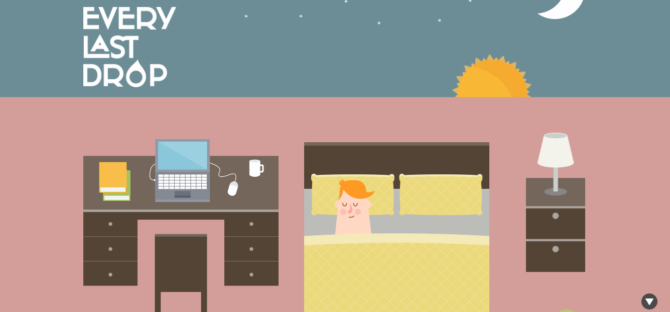 Every Last Drop is an excellent example of visual storytelling. Image credit Every Last Drop.
3. The Boat
The Boat is one of the most impressive examples of visual storytelling in our list of parallax website designs. This website takes visitors on a journey online. The entire story consists of six chapters, and as you scroll down, the parallax makes you feel the story. The illustrations are also paired with the text and audio to immerse you in the visual narrative.
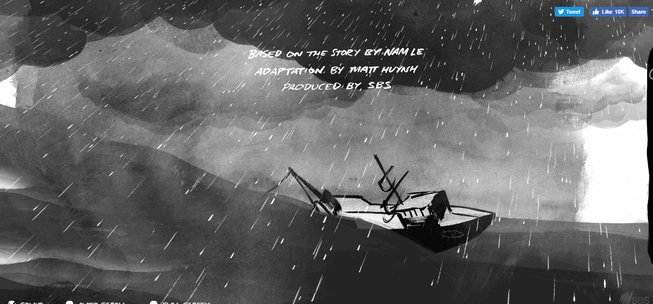 The Boat creates an unforgettable visual journey using parallax effect. Image credit The Boat.
4. BeerCamp
BeerCamp’s designers used parallax graphics to create a 3D website design. This website uses a zooming effect to captivate visitors around one central focal point. The site consists of five pages; each page is represented as a layer of content that zooms in as you scroll the page. Paired with bright colors and bold typography, this parallax effect creates a truly memorable experience for the site’s visitors.
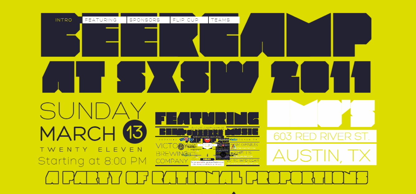 BeerCamp uses zoom-in parallax effect. Image credit BeerCamp.
5. Marcin Dmoch
Marcin Dmoch is an art director who decided to use a parallax effect for his web portfolio. The website is divided into three sections: About, Work, and Contacts. Parallax is used to connect these different sections, and each section is pinned and unpinned as the user scrolls the page.
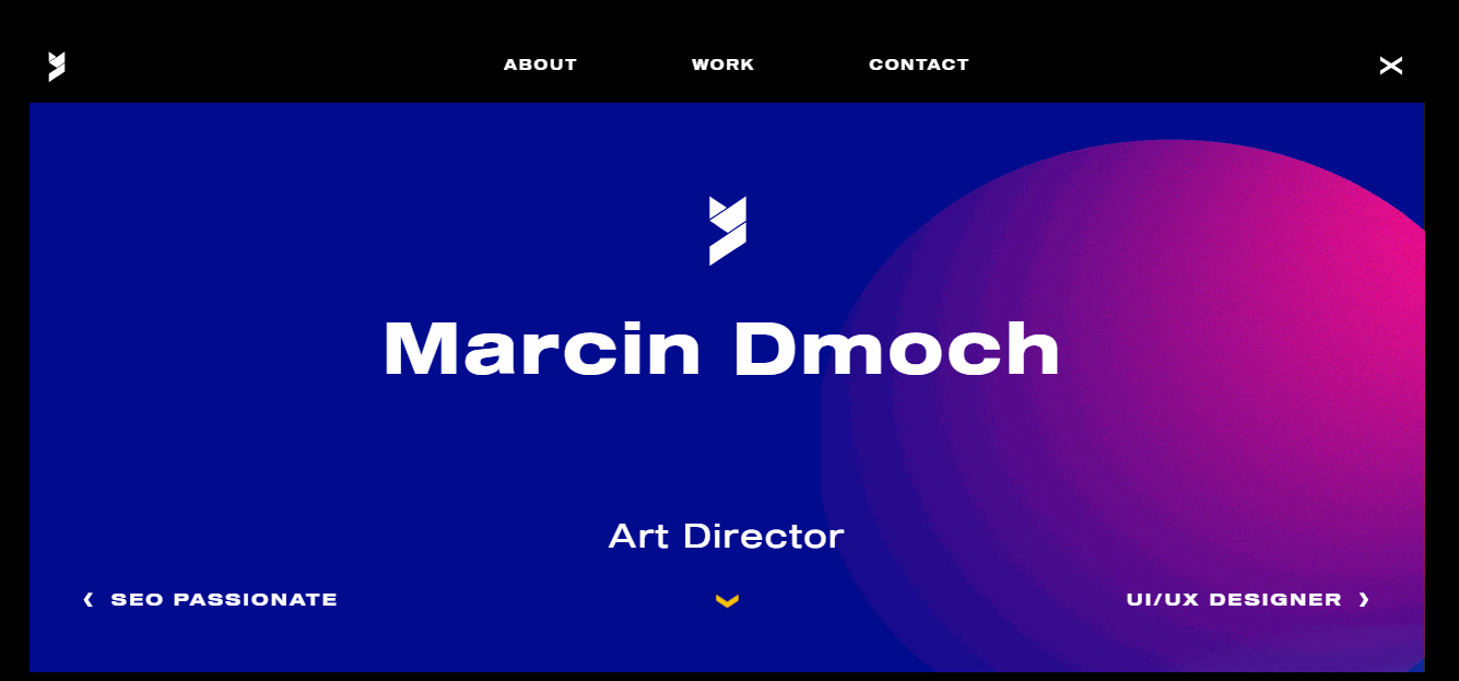 Marcin Dmoch uses parallax to visually separate different sections of his website. Image credit Marcin Dmoch.
6. Anton & Irene
The Anton & Irene website is an excellent example of pairing great aesthetics with excellent functionality. When you visit the site, you see the silhouettes of two people. As you start scrolling down, the silhouettes move away and give more room for valuable information.
 Anton & Irene pairs great aesthetics with excellent functionality. Image credit Anton & Irene.
7. Long Shot Features
Most of the examples we saw above have one thing in common: Their parallax effects were created using vertical scroll. But Long Shot Features follows an entirely different approach using a horizontal parallax scroll. As you scroll, the pages move from left to right, and visitors see beautiful transitions with a smooth, animated effect.
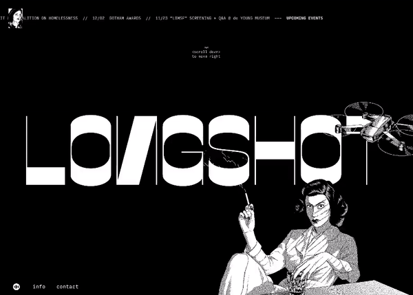
 Long Shot Features uses horizontal parallax effect. Image credit Long Shot Features.
8. Porschevolution
Porschevolution is a one-page website that shows the evolution of Porsche design since 1875. It gives visitors the unique ability to check out how Porsche’s designs transformed over time and where the carmaker’s designs are headed in the future. Page navigation is achieved via a smooth page sliding effect created using parallax.
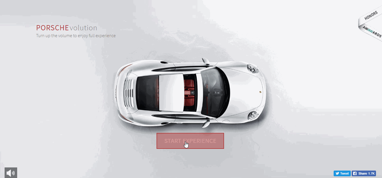 PorscheEvolution is an excellent example of storytelling. Image credit PorscheEvolution.
9. Feed Music
Feed Music has parallax website design that aims to create a truly immersive digital experience. A split-screen layout features images paired with contextual information. Designers used parallax to pin information details to the image, and as the user scrolls the page, they see new information blocks and the relevant visual image.
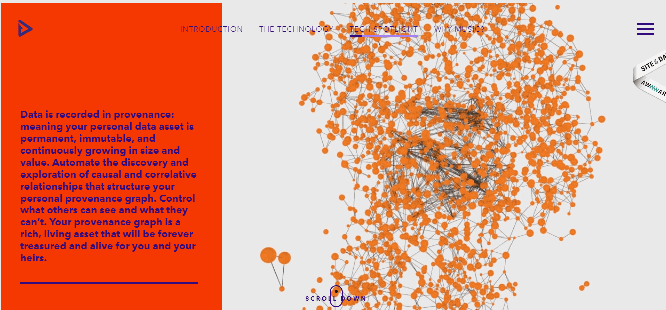 Feed Music triggers visual effects with vertical scrolling. Image credit Feed Music.
10. Melanie Daveid
Melanie Daveid’s website is another example of a one-page website that pairs creativity with functionality. As you scroll down the page, you see sections with detailed information about Melanie’s experience, her work, and her contact information. When you reach the bottom of the page, you will be delighted with a nice visual effect.
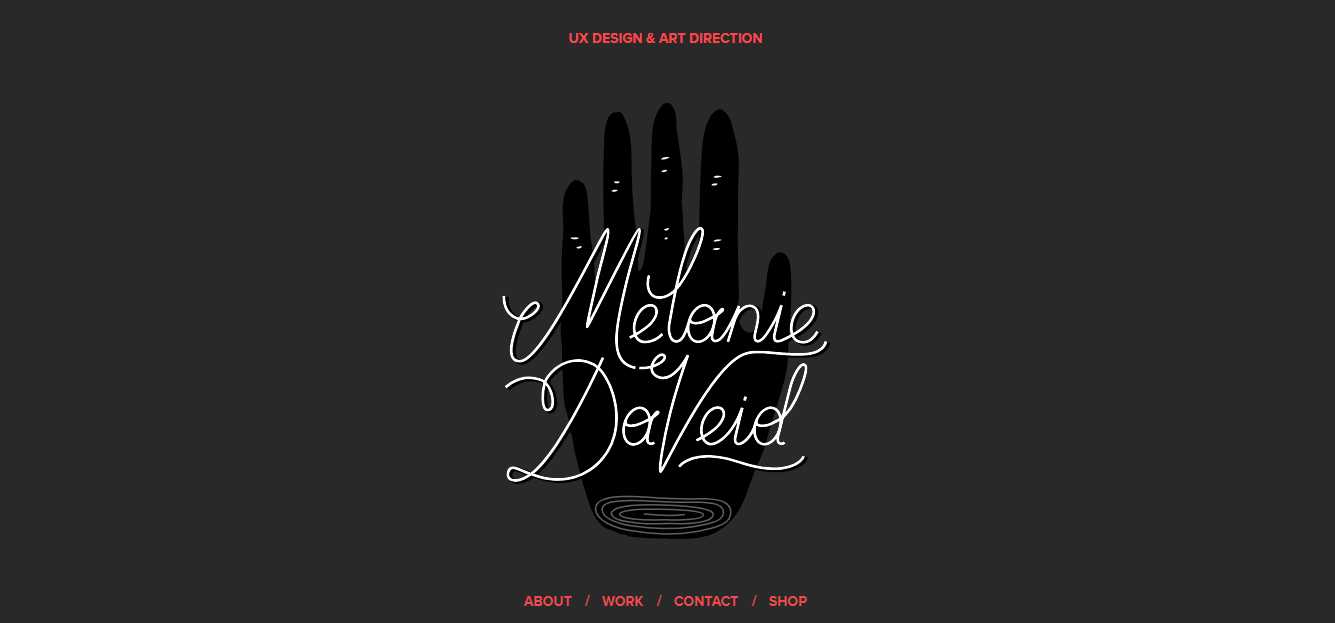 Melanie David uses parallax both for functional and decorative purposes. Image credit Melanie Daveid.
Engage visitors with parallax scrolling effects
Parallax scrolling gives web designers a unique opportunity to introduce a sense of depth into their design to keep visitors engaged. Well-crafted parallax website designs can easily help you stand out from the crowd and create a lasting impression for your visitors.