Keyboard shortcuts and inputs, which are now also supported by Adobe XD, present an alternative way to access web content. It’s very important to remember that for some people, specifically those with a motor impairment who are unable to use a mouse or trackpad, the keyboard is the primary method of navigating the web and interacting with user interfaces. What is simply a ‘shortcut’ for some is an essential tool for others.
For this article, we invited four accessibility and UX experts to provide a number of tips to help you implement the keyboard operation of UI widgets. With their advice, you’ll be able to create more inclusive experiences for keyboard users.
Follow accessibility standards
When designing keyboard interactions, it’s essential to ensure that the needs of people with disabilities are considered.
Michael Jordan, accessibility engineering lead at Adobe, suggests consulting the W3C WAI-ARIA 1.1 Authoring Practices, in particular a section entitled Developing a Keyboard Interface, which provides a helpful overview of what we need to think about when designing a keyboard interface with accessibility in mind.
Michael says the guideline makes an excellent point under 5.9.1.3 Choose Where to Add Shortcuts:
The first goal when designing a keyboard interface is simple, efficient, and intuitive operation with only basic keyboard navigation support. If basic operation of a keyboard interface is inefficient, attempting to compensate for fundamental design issues, such as suboptimal layout or command structure, by implementing keyboard shortcuts will not likely reduce user frustration. The practical implication of this is that, in most well-designed user interfaces, the percentage of functionality that needs to be accessible via a keyboard shortcut in order to create optimal usability is not very high. In many simple user interfaces, keyboard shortcuts can be entirely superfluous. And, in user interfaces with too many keyboard shortcuts, the excess shortcuts create cognitive load that make the most useful ones more difficult to remember.
David Sloan, UX research lead at The Paciello Group, agrees and says the W3C’s documents include a useful definition of expected keyboard behaviors. He also recommends checking out Heydon Pickering’s Inclusive Components site as a great place to understand how to provide keyboard support for a range of UI components.
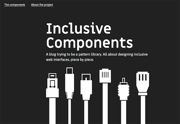
 Each post on Inclusive Components explores a common interface component and comes up with a better, more robust, and accessible version of it.
Keep it simple
Michael Jordan advises that we shouldn’t need much more than Tab/Shift+Tab to navigate between controls, with Arrow keys and perhaps Page Up/Page Down/Home/End for navigating within composite controls like TableViews, Grids, and Lists.
“In complex applications with lots of panels, like Adobe Acrobat or Adobe Connect, we may also use the F6 key for navigating between panels,” he explains, “but I tend to avoid special app-specific keys for navigation, like for example the use of J and K for navigating to the previous or next item in a feed. They create cognitive load, and can sometimes conflict with the navigation quick keys used by screen readers when navigating in browse/virtual cursor mode.”

 The top nav of the BBC News site showing the Sport link currently with keyboard focus.
Make users aware of the shortcuts
Designer, coach, and responsible innovation advocate Per Axbom says that shortcuts can be a fun and inclusive way to improve the options for interacting with your service. He warns, however, that just making people aware of the shortcuts available may be your biggest challenge.
“Always make it easy to bring up a cheat sheet with all available shortcuts,” Per suggests. “A common practice is to have the ”?”-key as a shortcut for this. If the user is logged in, you should also consider allowing them to change the shortcuts within the same area.”
Per also recommends considering a quick guided tour during onboarding when keyboard shortcuts are presented, with the option to change them.
“Don’t forget to also show shortcuts in menus and tooltips,” he cautions. “If people don’t know about them, they won’t be used.”
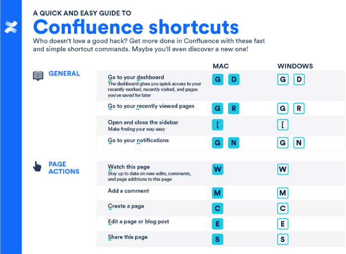
 Atlassian offers a quick shortcut guide for its shared workspace tool Confluence.
Avoid conflicts with browsers and screen readers
If you’re considering custom keyboard shortcuts, David Sloan recommends prototyping these with a range of screen reader/browser combinations to make sure they work as users expect.
“Screen reading software comes with a range of powerful keyboard commands, which users rely on,” he cautions. “So your application needs to work with them, not against them.”
Per Axbom agrees and highlights the importance of avoiding conflicts with browser actions and any tools the users may have active simultaneously.
“My best suggestion is single and two-letter shortcuts that do not require modifier keys,” he explains. “Two-letter shortcuts have the advantage that they are more likely to be unique as well as quick to type and can convey meaning. You could also apply a convention, for example the letter ‘g’ for ‘go to.’ You may then use ‘gh’ ‘gc’ and ‘ga’ for ‘go to homepage’ ‘go to contact page’ and ‘go to about page’ respectively. You can potentially combine this with the option of typing the full words ‘home’ ‘contact’ and ‘about’. There is no reason to limit yourself to one shortcut for each action, given that some may find either one easier to work with.
Letter shortcuts obviously won’t work when you need to type text into a form, so Per says you need to remember to also have a quick way to leave the editing mode, or alternatively allow a modifier key like Option (Alt) when inside forms.
Focus management
When creating visual designs, don’t forget to specify how controls will appear when they have keyboard focus.
“A clear visual indication of keyboard focus is an important usability aid for all keyboard users, especially those with low vision,” David Sloan points out. “It helps keep track of where the focus lies, and reduces the chance of inadvertent control activation.”
Tiffany Tse, developer advocacy lead at Shopify, agrees and stresses that it’s imperative that we consider how keyboard focus is handled. When someone is navigating with the tab key, we must preserve the meaning, an operability of web page content, which is known as focus management.
Keyboard trapping
Tiffany points to the most recent version of the Web Content Accessibility Guidelines (WCAG), which includes a chapter about avoiding keyboard trapping: If focus is moved to a component of the page via the keyboard, then that focus should be able to exit that component also using the keyboard.
“This doesn’t necessarily mean that trapping focus is a bad thing,” Tiffany explains, “as long as you make sure to give someone a means of exiting that focus.”
In the below example, when we tab to the ‘Add to Cart’ button and hit ‘Return’, the same actions should happen as when we click add to cart with a mouse: the drawer opens, and the next tab keypress sets the focus on the close button.
Tabbing to the ‘Add to Cart’ button and hitting ‘Return’ opens the drawer.
The focus is then trapped in the cart drawer. When we hit the tab key, we loop through the focusable elements over and over. We can choose to exit by selecting the close button, which provides us with a means of exiting the trap focus, using the same navigational tool we entered it with.
The focus is trapped in the cart drawer and we can loop through the focusable elements.Further reading
For more on keyboard best practices, also check out David Sloan’s and Sarah Horten’s two-part article on designing better keyboard experiences, and UI Copy: UX Guidelines for Command Names and Keyboard Shortcuts by the Nielsen Norman Group. For additional information, keep up-to-date by reading recent web design articles featuring the latest industry news.