Responsive web design has become the norm, but as there’s an ever-increasing plethora of screens out there, designing for them can be a major challenge.
Workflows often have to adapt as fast as the experiences we design, so what are the best practices for multi-screen design? How do we start? And how do we solve key problems?
We sat down with Talin Wadsworth, lead product designer for Adobe XD, Andy Vitale, UX director at SunTrust Bank, and Jecy Chang, UX designer at Microsoft Worldwide Learning, to find out.
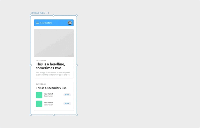
 In Adobe XD you can resize artboards to quickly test how your design will behave on a larger screen.
Does ‘mobile first’ always work?
When we consider multiple screens, the starting point should always be the people that are going to use the product.
“I start by thinking about who my customers are and how they will be experiencing the content of my website or app,” Talin explains.
“Everything we design is based on the understanding of how and where someone will use a particular feature, their needs, and desired outcomes,” Andy agrees. “Once these key tasks and behaviors are identified, workflows and usage data will determine what features should exist on which screens.”
Talin usually takes a “mobile-first” approach, or at least an approach that accounts for any constraints early on and allows him to save time in the long run. Andy adds that, in a perfect world, it would be great to always adopt a “mobile-first” strategy. Depending on the project, however, it could start with either mobile or desktop.
Some of the SunTrust features, for example, exist on the web-based application and might get rolled out to the mobile app later, while other features, like mobile check deposit, don’t live anywhere other than the mobile app.
“‘Mobile first works well if you don’t know the key features that you need to have on mobile and can expand upon them on the web/desktop version,” Andy advises. “When working on enterprise applications, sometimes it makes sense to start with the largest amount of data and features, build those out, and narrow down the scope and functionality for mobile usage.”
Jecy agrees: “Even though we follow the general guideline of mobile first, in most scenarios we have to put all the content into a larger canvas to layout the concept. Then we can trim down the less important content one-by-one to fit it into smaller screens, either by hiding it or by not showing it to the users at all.”
Jecy also starts by defining the target audience and the screen size the content will mostly be viewed in. She will then provide the design for three major breakpoints to the development team to give them an idea of the basic framework that’s needed.
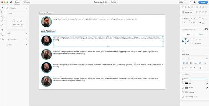
 Using Responsive Resize to scale mobile elements to a larger tablet/web view.
For features that will have to be built across multiple screens, Andy recommends finding commonalities for consistency.
“I’m not saying that everything needs to entirely consistent across devices,” he explains, “but things like the information architecture — understanding how to find certain features and functions — should be consistent. I always start with common elements and core functionality before focusing on the screen specific nuances, if there are any.”
After building a strong foundation for the content and navigation areas, Talin likes to quickly adapt his layout to the other target screen sizes.
“My first adjustments are always about hierarchy, layout, and navigation,” he points out. “At smaller sizes, you may need to collapse navigation options or chose a more vertical layout for your content. When your dimensions expand, you may be able to display more information. In most cases, this shift isn’t drastic, but a refactoring of your design layouts can benefit the user experience of your website or app.”
Talin then tweaks the sizes of individual elements as well as the styling, in particular the typography. He recommends Tim Brown’s latest book on Flexible Typesetting and explains that following the best practices for typesetting responsive designs can make your design clearer and more accessible.
To adjust designs for different screens, Andy also advises to create grids and break points. There will be a fair amount of iteration, he admits, but there are various tools you can use to save time.
Responsive resize in action.Save time with Responsive Resize and Repeat Grid
“Responsive Resize in Adobe XD is a great indicator for understanding how elements will scale to different sizes,” he suggests. “It’s especially useful for things like buttons, cards, navigation elements, and images. You still need to tweak it a bit, but Responsive Resize will do about 80 percent of the work for you.”
Andy also recommends paying attention to the settings: If an item such as a text box or an image is scaling in a way that you didn’t intend, you can manually set and adjust the anchoring or alignment for each elements.
Talin agrees and adds that Responsive Resize, combined with other features like the Assets Panel, enables him to quickly have the core of his design up and running across multiple screen sizes. It also ensures you remain flexible in making design changes on the fly and having them update seamlessly across layouts.
“I’ve found Responsive Resize is best used early and often in the design process,” Talin states. “Starting to define the rules of how your UI scales from the very beginning can help you maintain consistency and ensures your design can adapt across any screen size.”
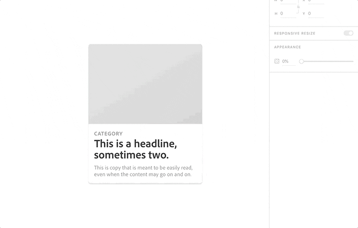
To get the most out of Responsive Resize, Talin recommends staying organized with groups, as they can help define relationships between objects on the canvas (as shown in the image below).
Repeat Grid, meanwhile, is a great way to stay consistent when designing with content at scale. It allows you to try out new ideas, experiment with your designs, and explore different color and layout options.
“Using it as the foundation for any content-heavy layouts, you can quickly expand from a single- to a multi-column layout, all while seamlessly reflowing your content,” Talin advises and suggests using it in combination with plugins like Google Sheets to stay in sync with your collaborators.
Jecy often uses Repeat Grid when designing lists, tables, and menus. As long as the elements, which will be displayed repeatedly, come with metadata, she uses Repeat Grid to design the basic layout and will then go in to change the text or images as needed. When the screen size changes, she usually changes the grid frame and modifies the spacing and font size to fit the screen size.

 Repeat Grid makes it simple to create multiple fields.
Test, test, and test again
Whatever you do, both Talin and Andy recommend extensively previewing and testing your designs. It’s the easiest and most effective way to identify key problems.
“Test your designs at every screen size and break point they’re intended to be used at to see how they look and function,” Andy advises. “Always check them yourself before sharing them with your internal team.”
Throughout the design process, Talin constantly tests any major changes or even just small adjustments, using XD’s Preview Window or the XD mobile app to preview designs directly on devices. “You won’t know how that 12px text size will look like on an iPhone X until you can test it directly,” he warns.
Once you’re happy with the result, put your designs in front of people.
“This will uncover basic errors, inconsistencies and anything that may have been missed due to designer bias or being too close to the details,” Andy explains.
Then open your designs up to the larger internal team to test.
“XD allows your teammates and cross-functional partners to comment on the screens,” Andy points out. “This is great, as many different people will be able to take a look and communicate any findings or observations to the designer before testing the designs with actual people who will be using the product. It will also identify anything that may have been missed in actually solving the problem — which is a much bigger issue than just the screens!”
So, as always, the answer is ‘it depends.’ Our process might change from project to project but at least we now have tools at our disposal that can save us a lot of time. They can help us tweak and adjust our designs and will do the majority of the work for us. This means we have more time to test our designs with real people, both internally and externally, and refine them accordingly. As a result we will have a better product that our users will love, no matter what device they’re on.