Design is a form of communication. Graphical user interfaces use dozens of individual elements to speak to their users. Colors, typography, shapes, pattern—all of these front-end styling options have a direct impact on how users will comprehend the product.
Design language is a communication tool that helps designers create visually harmonious and coherent designs and give their products a unique but consistent look and feel. Here’s an overview of the concept of design language, the rationale for creating one, and recommendations on how to do so properly.
Define design language
The term “design language” describes the overall visual design of a digital product. It creates a bridge between wireframing and visual design. The functional role of the design language system is to help users perceive and comprehend visible signs, but it also has a direct impact on the overall experience users have when they interact with a product.
Design language vs. design systems
Is a design language and a design system the same thing? The answer is no. Well-defined design systems are based on implementation details (tools and technologies), design language, and culture (values, principles, and practices). Design language is an integral part of a design system, which helps a team to understand not only how to use components and styles together to create a consistent user interface, but it also communicates why they need to use those components and styles in the first place.
So, when the team works on a visual design language, they should understand the big picture of a product or brand itself. It’s important to know the message you want to convey to users and how you want those users to comprehend the brand.
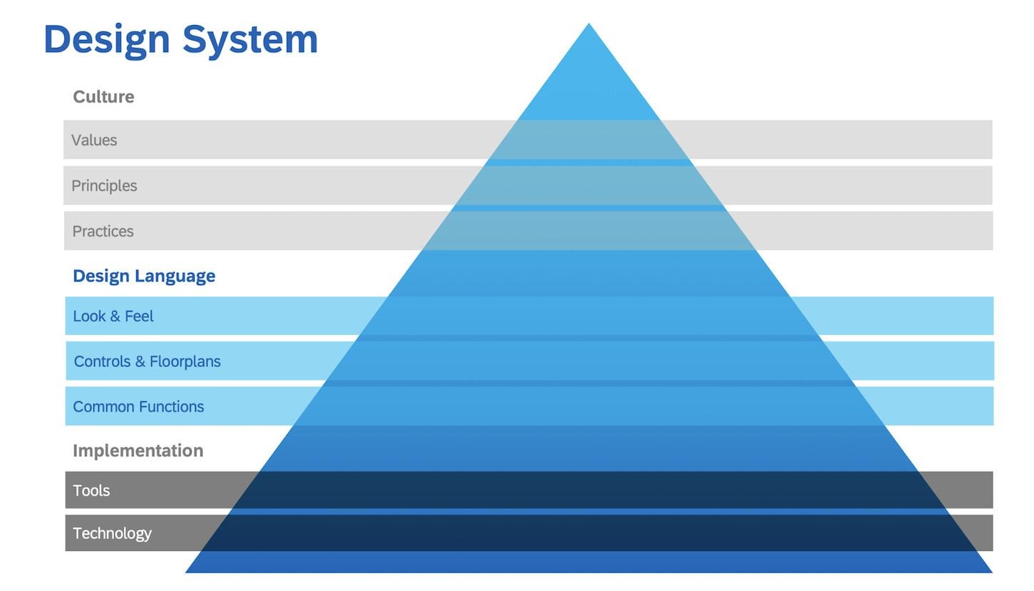
 The design system pyramid includes implementation tools and technology, design language, and culture. Image credit SAP.
Elements of a design language
Usually, design languages are not rigorously defined, but still, the languages share some common elements, including:
- A family of UI components and patterns. These reusable building blocks can be used to create user interfaces.
- Style guides. Information about the visual properties of design (e.g., colors, fonts, and whitespace), as well as instructions on how to use them in a design.
- Documentation of semantics. This helps define the meaning and intent behind the elements of design (e.g., colors, shapes, and fonts), and of naming conventions for individual styles and components.
Why create a design language system?
Consistency
Users have a more pleasurable experience when they interact with consistent designs as opposed to fragmented ones. Creating consistent content interfaces isn’t a huge issue for small teams and projects, but as they both grow, this becomes increasingly difficult to deliver. Product teams introduce design language to combat this issue and help projects progress and scale holistically.
Brand identity and authenticity
A brand is how customers perceive a company or product. Design language is one of the strongest ties a designer can use for effective branding because it helps make the design authentic—and authenticity makes a product stand out from the crowd. Unique visual design decisions create personality and memorability. Consider Google Doodles, an authentic design decision that has generated instant recognizability for the brand.
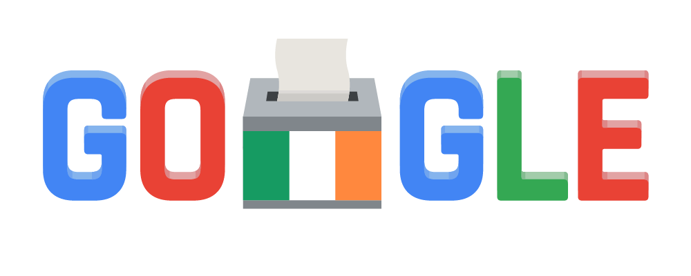 Google Doodles is a collection of illustrations that Google uses on a homepage for Google Search. Image credit Google.
Efficiency and cost
Having a visual design language in place enables product teams to quickly iterate on product designs without losing quality along the way. It sets up designers to use well-defined and reusable components, as well as clear rules to follow on applying styling to their design.
Steps to create and use a design language system
Like all great things, a great design language very rarely happens by accident. It’s the result of long and intensive work. The following five rules will help make the process of creating a visual language more efficient.
1: Conduct a UI audit
Design element duplication leads to fragmentation, and fragmentation leads to inconsistency. Identifying duplication helps a team to avoid the scenario in which team members build an element from scratch and, after a while, find out that a version of it already exists. That’s why the creation of visual design language should start with a UI audit.
You should conduct a UI audit of your product to get a clear understanding of what colors, fonts, and shapes are being used currently. This is a relatively simple procedure: Take screenshots of each component that comprises your product and put them into different categories. At the end of the UI audit, you should have a well-categorized collection of components, making the inconsistencies in your design evident.
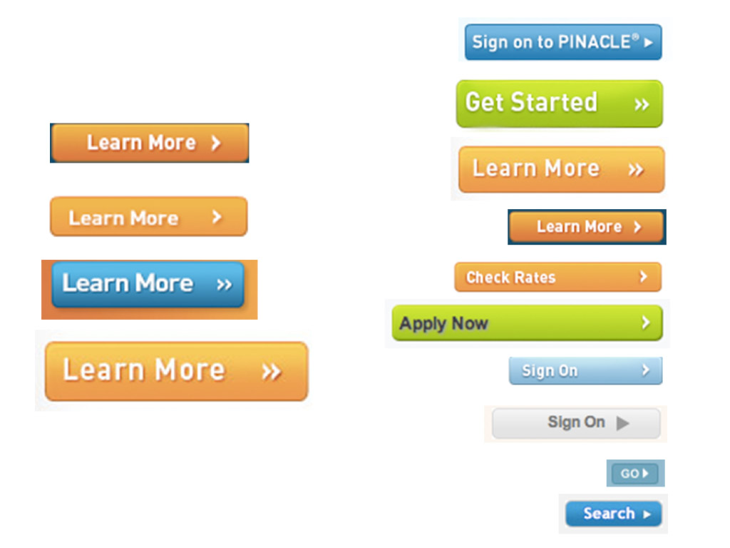 It’s easy to spot inconsistency when you have all variations of design in the same document. Image credit Brad Frost.
It’s also worth getting any brand guidelines from stakeholders. These will help you understand the general look and feel of the company’s branding.
2: Create a vocabulary for your design language
Just like spoken language starts with words and their meanings, design language begins with a dictionary that defines visual units and their meanings. This dictionary should clearly define reusable visual units. Your visual design language dictionary should include a pattern library (reusable building blocks that can be categorized and grouped) and a style guide.
Mapping elements of design with clear purpose and meaning can be challenging, but it’s possible to evaluate the meaning of each element through the prism of communication. The following sentence structure, suggested by designer Nate Baldwin, will help you to identify, define, and communicate the meaning of each unit:
The [design element] used in the [pattern/library] helps to communicate [purpose and meaning].
Use this technique whenever you evaluate a visual unit. For example, if you’re selecting a color for an error message in a sign-up form, you could say, “The striking red used in the sign-up form error message helps to communicate the importance of this message for users.”
3: Establish guiding design principles
How do you define good design? How do you know when something is ready to ship? When it comes time to evaluate the quality of a design, designers often rely on their own set of standards. But as a team grows, following such an approach can introduce a lot of chaos in the product design process because every designer will have their own subjective ideals.
That’s where design principles can save the day. Design principles define basic but mandatory guidelines that individual designers must follow when working on a particular product. They act as a reference that simplifies the decision-making process. (View Magera Moon’s article, “Creating Etsy’s Design Principles,” that covers this in detail.)
Working on design principles provides a perfect moment to think about how to convey personality or purpose in your design. For example, one of the design principles of Medium, a popular blogging platform, is Direction Over Choice. The Medium team provides the following description: “This principle was often referred to while we were designing the Medium editor. We purposely traded layout, type, and color choices for guidance and direction. Direction was more appropriate for the product because we wanted people to focus on writing and not get distracted by choice.”
4: Establish rules and stick to them
Just like any spoken language has rules that allow one human to communicate with another, a design language also has rules that enable product developers to communicate with their users.
The purpose of those rules is to create constraints for designers. The word “constraints” usually has a negative connotation—it sounds like a restriction to creativity—but rules allow designers to work more efficiently. By establishing clear rules, product teams prevent team members from creating bad UX. It’s possible to define two types of rules:
- Strict rules are precise rules that should be rigorously followed. For example: “Red with this hex code should be used only for error messages. Using this color in other parts of the UI is strongly prohibited.”
- Loose rules are recommended rules that designers can skip to create a better brand feel or the utility of the page. For example: “When possible, try to use brand colors for functional elements of your UI.”
Once a product team has developed an agreed upon set of rules for a design language, it’s vital to stick to them. The biggest misstep when building a visual design language is inconsistency, which happens when team members don’t follow guidelines. UX managers should introduce a procedure of a design review, during which designers validate the design in accordance with the rules.
5: Think of the visual language as a living organism
Spoken languages tend to change over time as cultural influences shape and impact them. Visual languages are absolutely the same. New trends also appear every day, and large companies like Google and Apple frequently update their design guidelines to make their products look fresh.
A visual language should not be a set of static rules set in stone, but, instead, an evolving ecosystem that grows together with a product. And this ecosystem should be easily adapted to changes. To curate a design language system, familiarize yourself with the current trends and try to introduce the most valuable changes in your language.
Conclusion
Creating a beautiful and accessible design language takes time. You probably won’t have a robust visual language right from the first iteration, and that’s perfectly fine. It’s essential to invest time in building a solid foundation for the language and ensure that it grows and matures together with your team.