You’ve already spent hours on user testing. You’ve sourced your ideal users, and put them through the paces of your perfectly-planned tests, most of all usability tests, keeping track of their comments and their actions using note-taking templates to keep everything consistent and easy-to-interpret. Perhaps you’ve even determined a system usability score. The results seem obvious – and changes to the product are perfectly clear in your mind. Are you ready to prototype these changes? Not so fast!
It can feel redundant to create a report after a well-executed usability test, especially if you’ve involved the rest of your team from the start. However, usability reports are a strong method for communicating your results to your team and your wider organization in a clear, professional way, in order to build support for your research efforts.
Most importantly, however, usability reports are documents that can back up your recommendations, and can help your organization become more efficient, as multiple people can access them. This also means the tests will not need to be repeated in the future.
So, with your test results in hand, how do you effectively create a usability report? Read on for our best practices.
How to analyze your data

 Use those spreadsheet skills! Image credit Vojtech Okenka.
If you have gathered quantitative data as part of your research, you can use your spreadsheet skills to compare and contrast your numbers, and build a cohesive narrative. You should look for ways to highlight similarities and differences in the data, both positive and negative.
You can also analyze your data based on the user profiles of your test subjects – their demographics, and any behavioral data you have about them from the research process.
Qualitative data is, in many ways, more difficult and time-consuming to analyze, because it requires deep engagement with the whole body of data that was collected. Some qualitative data can be quantified, through a method of analysis called “coding,” which is commonly used in academia but not as much in industry, despite its usefulness. Essentially, coding involves notating qualitative data sources with certain predetermined relevant tags (deductive coding) or tags that you generate after engaging with the material (inductive coding).
At the very least, you should make sure to include a series of remarkably (or remarkably common!) quotes from the users you spoke with, to round out your report.
What should a usability report include?
No matter what the outcomes of your research are, you can follow the same basic template to create your report. Having an awareness of what will need to be included in the report in advance of your testing can help speed up the process of generating a report post-sprint.
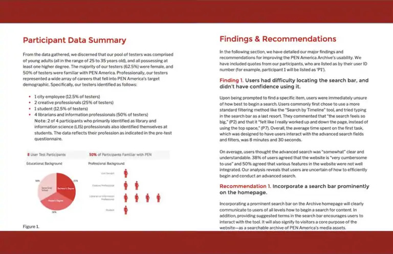 The Pratt Institute’s Usability Report on PEN America’s Freedom to Write is a beautiful example of a thorough, but readable report. Image credit Pratt Institute.
As a template for your usability report, you can use the following headings to divide the information into sections (as long as they are relevant to your particular research):
1. Background Summary
Here, you should outline any relevant context, such as why the research was conducted, a brief description of the state of the product, a description of your test subjects, and an overview of the findings from your research. It should be 1-3 paragraphs in length. Use plain language in the summary, so that it’s accessible to anyone in your organization or company who needs the information.
2. Goals
Your research goals should be placed here in list format, and shouldn’t be altered from the original research goals you laid out prior to the sprint.
3. Methodology
The objective of this section is to lay out the “how” of your research, in enough detail that another person could recreate the research if they needed or wanted to. Again, plain language should be used. Don’t forget to include how you reached out to users that participated in the research, and how you screened them. You can also use this section to provide an anonymous analysis of the participants.
4. Results
Using images, video, tables, and text, lay out the most significant results of your research. Back up each point with a blend of quantitative and qualitative results, including excerpts from any test recordings (with any defining user details removed). This will likely be the longest portion of the usability report.
It’s important to back up every statement with as much data as you can. For example, in sentiment analysis, you might indicate that “85 percent of participants displayed positive sentiment when engaging with a certain task,” and then go on to say that “95 percent of participants over the age of 45 were neutral when engaging with that same task.” You could then indicate, using numerical data, that “all users under the age of 45 displayed positive sentiment when engaging with the task” (if that was, indeed, the case).
It can be helpful to list both positive and negative results succinctly at the end of each section, to keep the report balanced and to help in unbiasing the report.
5. Bugs & issues
List any bugs and issues that test participants experienced during the test, that may have affected or skewed the results of the test. This list can be used as action items, to be fixed later, while still keeping the focus of the report on the main research goals.
6. Recommendations & action items
Here’s where your interpretation of the research results can really shine. Referencing section 4, “Results,” list your recommendations from most significant to least significant. For each recommendation, you should describe your reasoning in a few sentences, as well as the projected impact of the recommendation. Then, break down the recommendation into action items, so it is as clear as possible to outside readers what it will take to implement the recommendation.
It’s important to keep in mind that not all recommendations in any given report are likely to be implemented. There are always trade offs and compromises, so don’t get too attached to your recommendations.
7. Disclaimers
This section should be used to list any elements, aside from technical issues listed in section 5, “Bugs & issues,” that may have affected the results of the research. This can include anything from a test location change, to your own bias, to inconsistencies or flaws in your participant list. It’s best to be as transparent as possible in this section, to demonstrate to your readers the rigor of your research and your own self-awareness.
8. Additional information
Additional Information can include any material that didn’t fit into any of the previous sections, but could still be interesting to include. It is also helpful to include any information that came to light during the research that was unrelated to the research goals, but nonetheless helpful to take into account for the sake of future iterations of the project.
Helpful tools to assist with usability reports
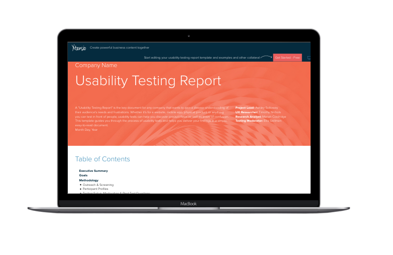 Xtensio provides a helpful usability report template. Image credit Xtensio.
As always in user experience research, the most helpful tool is preparation. A research sprint designed with the end report in mind will be a focused and efficient research sprint.
If you are generating your first usability report and need a bit of a boost, the tools provided by Xtensio can be very helpful. They provide a template and other resources to help you communicate your great work back to your team and to the organization or business at large.
Some usability testing tools also help generate your reports at the end – yet another reason to plan your research from beginning to end.