Mobile design can be a tricky subject, with many things to consider when creating a mobile app. To simplify the task, I’ve prepared some highly practical tips on what you should and what you shouldn’t do when designing mobile apps. Keep them in mind as you’re designing your app’s experience.
First, the do’s
1. Research before design
When you start a new project, it’s always tempting to jump straight to a drawing board and start designing mockups. But it’s better to avoid that temptation because you need to avoid the false-consensus effect (you are not your user). Do research first. Proper research will help you understand who your users are and what they really need. The goal is to create an experience that truly resonates with your target audience.
Practical recommendations:
- Conduct a competitive anlaysis. Find apps that are similar to the one you’re designing. Pay attention to which parts of the apps you like and which parts you don’t like, and why.
- Identify your users. Build user personas to understand better how users will interact with your app (which activities they perform and what content they expect).
For more recommendations on research, read our article A Comprehensive Guide to UX Research Methods.
2. Prioritize features
To make an app more attractive to users, many product designers try to add as many features as possible. Unfortunately, this rarely results in better user experience. Nothing is more confusing for first-time users than an app that has too much going on. The most successful apps available on the market are highly focused and present a limited set of features. Thus, limit your app’s feature set by prioritizing what’s important and trimming nice-to-have features.
Practical recommendation:
- Focus on refining the experience around your core objectives. Know what the core purpose of your app is — analyze which features of your app are used the most and put the most effort into making that experience intuitive.
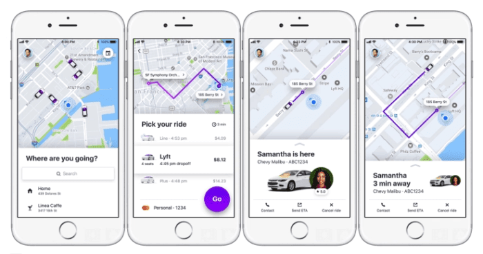
 Lyft’s designers constantly refine experience around core objectives. Features like seeing drivers that are nearby and your cost up front make it easier for a user to order a ride. Image credited to TechCrunch.
3. Cut out the clutter
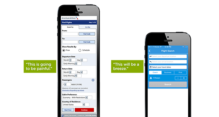
Cluttering a user interface overloads your user with too much information — every added button, image, and line of text makes the screen more complicated. Clutter is terrible on a desktop, but it’s way worse on mobile devices where users have limited screen space.
A famous saying by Antoine de Saint-Exupéry can be applied to mobile UX design: “Perfection is achieved when there is nothing left to take away.” It’s essential to get rid of anything in a mobile design that isn’t absolutely necessary because reducing clutter will improve comprehension.
Practical recommendations:
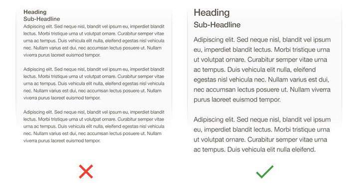
- Strive for minimalism. Focus on the content that is valuable for your users and remove unnecessary elements that do not support user tasks. Minimal use of decorative elements such as gradients and drop shadows will help you keep the interface light and airy.
- Prioritize one primary action per screen. Try to design each screen for one thing and one thing only, with no more than one call-to-action. This makes it both easier to learn and easier to use. A few clear screens are preferable to a single cluttered screen.
4. Make navigation self-evident
Helping users navigate should be a top priority for every mobile app. After all, even well-crafted features or the most compelling content is useless if people can’t find it.
Practical recommendations:
- Make sure that navigation feels familiar to users. People are happy when an app meets their expectations. To make this happen, use navigation patterns that are familiar to your target audience so that the navigation doesn’t require any explanation.
- Design good information architecture. Information architecture is about organization of information in a clear and logical way. Organize your information in a way that requires a minimum number of actions to reach the destination.
- Navigation shouldn’t draw focus away from the content. It should be implemented in a way that supports the structure of an app without calling attention to itself.
- Communicate current location. People should always know where they are in your app so they can navigate successfully.
- Strive for consistency. Don’t move navigation controls to a new location or hide them on different pages. This will confuse and disorient your users.
- Provide a clear path. Users should be guided to the content they’re looking for, quickly. The path through content should be logical (from the user point of view).
For more recommendations, read our article Basic Patterns of Mobile Navigation.
5. Design finger-friendly tap-targets
Smaller touch targets are a common source of problems for mobile users — mistaken taps often happen because of small touch controls. When you’re designing mobile interfaces, it’s best to make your targets big enough so they’re easy for users to tap. For more information about interactive elements, read the article Button Design Best Practices.
Practical recommendations:
- Provide ample touch targets for interactive elements. Create controls that measure at least 7–10 mm so they can be accurately tapped with a finger.

 A target that measures 10mm allows the user’s finger to fit snugly inside the target. Image by UXMag.
- Ensure that there is a right amount of spacing between tap targets.
6. Make text legible
Content is the reason why people use your app and language — housed in typography (font) and shown as text on your screen, it is a big part of content. Making text legible is a mandatory requirement for each mobile interface.
Practical recommendations:
- Choose a typeface that works well in multiple sizes and weights to maintain readability and usability in every size.A safe bet is to rely on the platform’s default font. Apple uses the San Francisco family of typefaces to provide consistent reading experiences across all platforms. Roboto and Noto are the standard typefaces on Google Android.
- Use legible font size. Text should be at least 11 points so users can read it at a typical viewing distance without zooming.
 Small font size causes causes eye strain. Image by Apple.
- Use sufficient color contrast for text. Insufficient contrast makes text blend in with the background. Strive for a minimum contrast ratio of 4.5:1 for body text and image text.
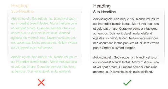 Text on the left doesn’t meet the color contrast ratio recommendations — it’s difficult to read against its background. Image by Apple.
7. Provide feedback on interactions
Each human-computer interaction is based on two fundamental elements — user input and computer reaction to it. To make the interaction predictable, it’s essential to provide some sort of feedback in response to every user action:
- Feedback acknowledges actions and helps users understand the results of operations. For example, when users tap on a button, lack of feedback can cause them to question whether an app has processed the action. An app that provides visual feedback eliminates this guesswork for the user.
- Feedback helps people know what an app is doing now. For example, when content is loading, a blank or static screen can make it seem like your app is frozen, resulting in confusion and frustration. A simple loading indicator such as infinite spinner can communicate the status of an operation.
Practical recommendations:
Based on the type of UI element or current state of the app, designers can use different forms of feedback. For example, interactive elements can be highlighted briefly when tapped, progress indicators can be used to communicate the status of long-running operations, and animated effects can help clarify the results of operations.
 Interactive elements change their style when tapped. Image by Ramotion.
8. Minimize the need for typing
Typing on a mobile device is a slow and error-prone process. It’s, therefore, always best to try to minimize the amount of typing required on a small device.
Practical recommendations:
- Ask only what you really need to know. Keep forms as short and simple as possible by removing any unnecessary fields.
 No one likes filling in forms, and the longer or more complicated a form seems the less likely users will start filling in the blanks. Image by Lukew.
- Make data entry as efficient as possible. When possible, present choices instead of input fields because it’s easier to choose from a list of predefined options than to type a response. Try to prefill fields with the most likely default values (providing good defaults minimizes decision making and speeds up the process).
For more recommendations, read our article Designing More Efficient Forms: Structure, Inputs, Labels And Actions.
9. Create a seamless experience
It’s wrong to consider mobile apps as stand-alone experiences. A typical user has several devices such as a desktop, mobile phone, and tablet and expects to have a seamless experience across all those devices when using your product.
Practical recommendation:
- Synchronize a user’s current progress. For example, when users browse items in an e-commerce app on mobile they might want to switch to the desktop version to complete a purchase. Users expect to continue the journey from where they stopped on mobile.
10. Always test your design
Even the most well-crafted UI and well-thought out UX will ultimately contain some unseen flaws when put into the real world. All too often a design that looks great on a designer’s large desktop screen doesn’t look nearly half as good when taken for a test on a real mobile device. That’s why it’s so important to test your app with real users on a variety of mobile devices to make sure it both looks and works great.
Practical recommendations:
- Ask real users to complete regular tasks in your app. Based on results of testing you’ll be able to see how well the design really performs.
- Constantly measure your app. Treat your app as a continuously evolving entity, using data from analytics and user feedback to improve the experience.
Now, the don’ts
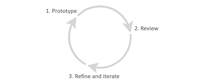
1. Don’t try to design the perfect experience from the first attempt
When you design a mobile app, it’s almost impossible to create a perfect design right from the first attempt. Even if your design satisfies the initial requirements, you might find a new set of requirements after user testing. Thus, it’s always better to follow an iterative design approach and test as early as possible.
Practical recommendations:
- Focus on prototyping and testing.Powerful prototyping techniques such as rapid prototyping can help designers to iterate fast. Based on insights gathered from testing sessions it’s possible to design better experiences for the users in each new iteration.

2. Don’t design in isolation
When you have a great idea about an app, it’s relatively easy to get caught up in it, and the more time you have invested in the idea, the more likely you are to develop confirmation bias. It’s not too rare to find a product team that has spent a lot of time (three to five years) building a product they think their customers want, only to discover they don’t want it at all. This happens because teams don’t take customer needs and wants into account. The absence of an actual feedback loop makes the outcome of the design process completely unpredictable.
Practical recommendations:
- Start by validating your hypothesis based on the user’s needs. Use the Design Sprints technique to help you move from idea to learning in just a few days, instead of it taking months or years.
3. Don’t ask for permissions right at the start
Quite often the first thing we see when launching a just-downloaded app is a dialog box with a permission request (e.g. “Allow app X to use your location?”) When an app asks for permissions right at the start users often deny such permissions requests. Why? Because at this point, the user doesn’t have any context to make a decision. They don’t know why you need those permissions.
To mitigate such behavior, it’s better to ask for permissions in context and communicate the value the access will provide. Users are more likely to grant permissions if asked during a relevant task. Request permissions at launch only when it’s absolutely necessary for the core app experience.
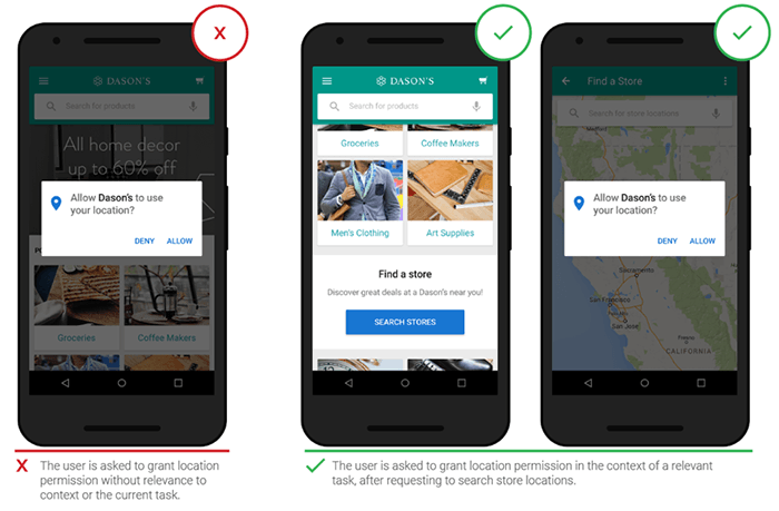
 Ask permissions in the context of the task. Users won’t be bothered by a permission request if it’s obvious why an app needs it. Image by Think With Google.
Practical recommendations:
- Ask only what your app clearly needs. Don’t ask for all possible types of permissions. It would be suspicious if an app requests permissions with no obvious need for them (e.g. an alarm clock app asking permissions for access to your list of contacts).
4. Don’t make users wait for content
A blank screen, shown when content is loading, can make it seem like your app is frozen, resulting in confusion and frustration. You should always strive to give the impression that your app is fast and responsive.
Practical recommendation:
- Use skeletons (aka temporary containers) to create a feeling of fast loading. Show the screen immediately and use placeholders to identify where content isn’t available yet. Replace these placeholders with actual content as soon as it loads.
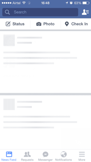
 Skeleton screen for News Feed in Facebook app. The users are given an idea of the structure of the page.
5. Don’t use jargon in the user interface
Every word in your app is part of a conversation with your users. Make this conversation comfortable for them by speaking the same language as your users. Use familiar, understandable words and phrases if you want your app to appeal to everyone.
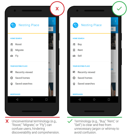
 Unknown terms or phrases will increase cognitive load for the user. Image by Think With Google.
Practical recommendation:
- Avoid acronyms, brand-specific terms, cultural-specific axioms, and technical terminology that people might not understand. In general, it’s better to use simple and direct language to maximize clarity.
6. Don’t use custom gestures as a primary way of interacting with an app
It’s absolutely normal to use gestures as a supporting mechanism for existing navigation (e.g. navigation shortcuts), but it’s better to avoid using gestures as a primary method of interaction with your app (e.g. as a replacement for main navigation). Unless your app is a game, people rarely appreciate being forced to learn different ways to do basic things.
Practical recommendation:
- Use standard gestures for shortcuts. People are familiar with the standard gestures, so no extra effort is needed to discover or remember them.
- Avoid using standard gestures to perform non-standard actions. Unless your app is a game, redefining the meaning of standard gestures leads to confusion and complexity.
7. Don’t replicate the web experience on apps
Users expect certain interaction patterns and interface elements in mobile apps. Mobile apps designed as web experiences feel awkward and unnecessary — not because they have issues with usability, but because it’s simply different from what users expect to see.
Practical recommendation:
- Avoid using underlined links in mobile apps. Underlined links are a natural part of the browser-page model, but they can’t be applied to mobile experiences because apps use buttons, not links.
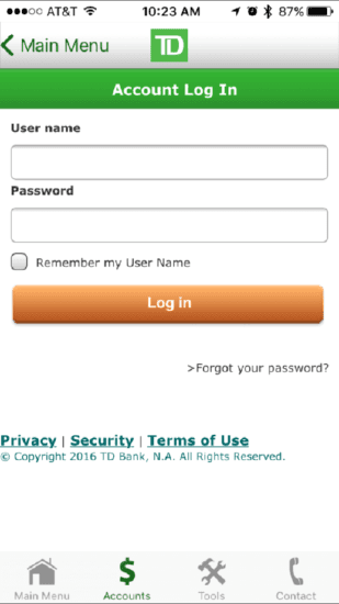
 Sign-in form from the TD Bank app for iOS. It feels like the product team designed a mobile website, not a mobile app — links are underlined, and there’s even a copyright notice below them.
8. Don’t create dead end pages
Designing a UX is designing for flow, and flow is, in most cases, about moving forward to accomplish a goal. You should avoid creating dead-end pages in your apps because they act as blockers for user flow — they create confusion and lead to additional (and often unnecessary) actions. Take this error-state screen from Spotify:
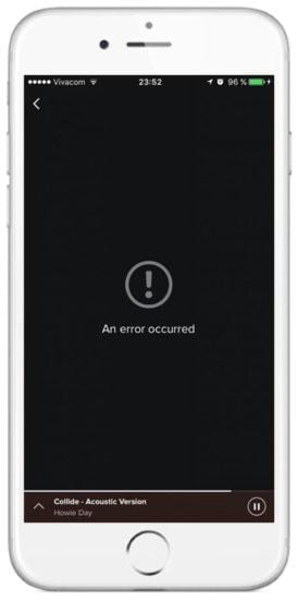
 It simply doesn’t help users understand the root cause of the problem and doesn’t answer the questions: “Why is this happening and what can I do about it?”
Practical recommendation:
- Nothing in your app should be a dead-end.Error states and empty states should provide instructions and actions to move forward.
9. Don’t take users to a browser
Users can be easily frustrated when an app takes them to the mobile web for more content or to complete a task. This increases abandonment and reduces conversion because users might simply not return to the app.
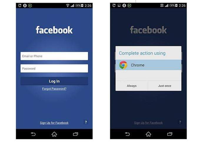
 Negative example. When a user taps on the “Forgot Password?” button in the Facebook app for Android, the app tries to invoke the smartphone’s browser.
Practical recommendation:
- Use an in-app browser. If your app lacks a specific feature or piece of content, try to use an in-app browser. Do not invoke the smartphone browser.
10. Don’t ask a user to rate your app during their first experience
Most app developers know ratings and reviews are important for success in mobile stores. Ratings and reviews help users make informed decisions when considering whether to try out an app. An app that has more positive ratings and reviews has a better chance of being downloaded.
In an attempt to collect valuable feedback many app developers make a common mistake: they force users to rate their app. Asking for a rating too soon or too frequently is annoying and decreases the amount of useful feedback you receive. Users don’t want to be interrupted for something useless while they’re in the middle of something important.
There’s nothing wrong with asking for a review, but it’s critical to give your users a great experience first. Thus, never ask for a rating on the first launch, during onboarding, or if users have only used the app a few times. To encourage well-considered feedback, give people time to form an opinion about your app before asking for a rating.
Practical recommendation:
- Don’t ask a user to rate an app when they perform a task. Don’t interrupt the user, especially when they’re performing a time-sensitive or stressful task. Look for logical pauses when a rating request makes the most sense.
- Allow ample time to form an opinion.Wait until users prove to be repeat users, and they’ll be more likely to rate your app and provide better informed feedback. You can trigger the rating request after a specific number of app openings or goals have been completed. Choose the perfect moment (e.g. after a positive interaction with an app, like after the completion of a significant task).
Conclusion
People expect a lot from mobile apps today, and the expectations are just getting higher. You need to work hard to meet these expectations and make your app useful, relevant, and valuable for your users. Improving the user experience isn’t a one-time task, it’s an ongoing experience.