The user interface (UI) is a critical part of any software product. When it’s done well, users don’t even notice it. When it’s done poorly, users can’t get past it to efficiently use a product. To increase the chances of success when creating user interfaces, most designers follow interface design principles. Interface design principles represent high-level concepts that are used to guide software design. In this article, I’ll share a few fundamental principles. These are based on Jakob Nielsen’s 10 Usability Heuristics for UI Design, Ben Shneiderman’s The Eight Golden Rules of Interface Design, and Bruce Tognazzini’s Principles of Interaction Design. Most of the principles are applicable to any interactive systems — traditional GUI environments (such as desktop and mobile apps, websites) and non-GUI interfaces (such as voice-based interaction systems).
The UI design principals are:
- Place users in control of the interface
- Make it comfortable to interact with a product
- Reduce cognitive load
- Make user interfaces consistent
1.
Place users in control of the interface
Good UIs instill a sense of
control in their users. Keeping users in control makes them comfortable; they
will learn quickly and gain a fast sense of mastery.
Make actions reversible – be forgiving
This
rule means that the user should always be able to quickly backtrack whatever
they are doing. This allows users to explore the product without the constant
fear of failure — when a user knows that errors can be easily undone, this
encourages exploration of unfamiliar options. On the contrary, if a user has to
be extremely careful with every action they take, it leads to a slower
exploration and nerve-racking experience that no one wants.
Perhaps
the most common GUIs where users have the
‘Undo/Redo’ option are text and graphics editors. While writing text or
creating graphics, ‘Undo’ lets users make changes and go back step-by-step
through changes that were made. ‘Redo’ lets users undo the undo, which means
that once they go back a few steps, they are able to move forward through their
changes again.
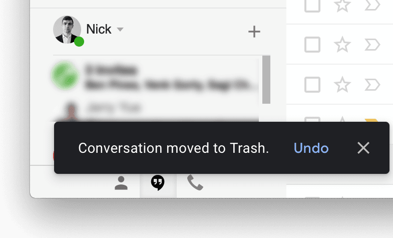
‘Undo’
can be extremely helpful when users choose system function by mistake. In this
case, the undo function serves as an ’emergency exit,’ allowing users to leave
the unwanted state. One good example of such emergency exits is Gmail’s notification
message with an undo option when users accidentally delete an email.

Create an easy-to-navigate interface
Navigation
should always be clear and self-evident. Users should be able to enjoy
exploring the interface of any software product. Even complex B2B products full
of features shouldn’t intimidate users so that they are afraid to press a
button. Good UI puts users in their
comfort
zone by providing some context of where they are, where they’ve been, and where
they can go next:
- Provide visual cues. Visual cues serve as reminders for users. Allow users to navigate easily through the interface by providing points of reference as they move through a product interface. Page titles, highlights for currently selected navigation options, and other visual aids give users an immediate view of where they are in the interface. A user should never be wondering, “Where am I?” or “How did I get to this screen?”
- Predictability. Users should be provided with cues that help them predict the result of an action. A user should never be wondering, “What do I need to press in order to do my task?” or “What is this button for?”
 A clear, visible workflow encourages task completion.
Image by Designmodo.Provide informative feedback – be acknowledging
Feedback
is typically associated with points of action — for every user action, the
system should show a meaningful, clear reaction. A system with feedback for
every action helps users achieve their goals without friction.
UI design should
consider the nature of interaction. For frequent actions, the response can be
modest. For example, when users interact with an interactive object (such as a
button), it’s essential to provide some indication that an action has been
acknowledged. This might be something as simple as a button changing color when
pressed (the change notifies the user of the interaction). The lack of such
feedback forces users to double-check to see if their intended actions have been
performed.
 Feedback acknowledges an action has taken place successfully.
GIF by Colin Garven.For
infrequent and significant actions, the response should be more substantial.
For example, when filling out a password field in the signup form, good UI might inform users of the
requirements for their password.
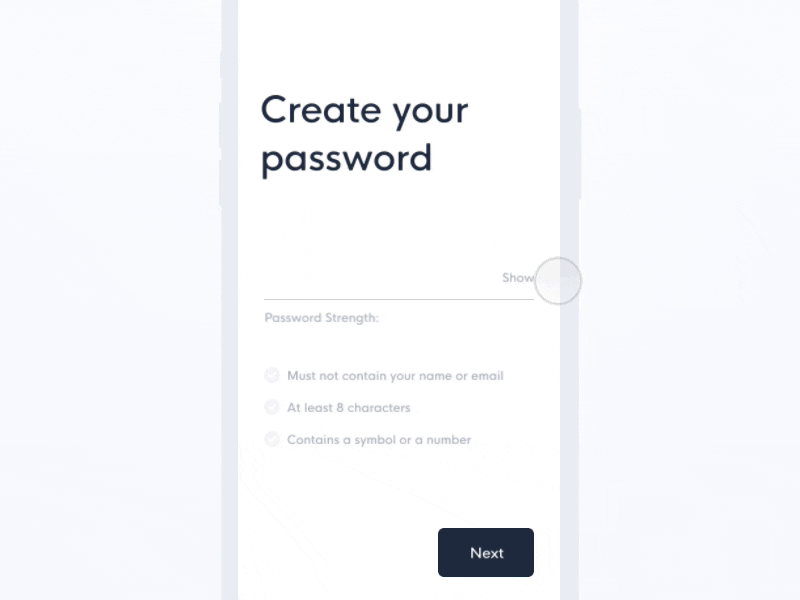 User sees a green checkmark when a password requirement is satisfied.
GIF by Emmanuel TorresShow the visibility of system status
Users
are much more forgiving when they have information about what is going on and
are given periodic feedback about the status of the process. Visibility of
system status is essential when users initiate an action that takes some time
for a computer to complete. Users don’t like to be left seeing nothing on the
device screen while the app is supposed to be doing something. The use of
progress indicators is one of the subtle aspects of UI design that has a tremendous impact on the
comfort and enjoyment of users.
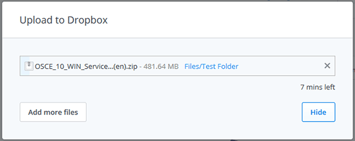
Good UI
can comfort users by showing progress while the system is completing a task.
Dropbox is indicating the status of a document upload: the current progress and
the amount of time left.
Accommodate users with different skill levels
Users
of different skill levels should be able to interact with a product at
different levels. Don’t sacrifice expert users for an easy-to-use interface for
novice or casual users. Instead, try to design for the needs of a diverse set
of users, so it doesn’t matter if your user is an expert or a newbie.
Adding
features like tutorials and explanations is extremely helpful for novice users
(just make sure that experienced users are able to skip this part).
Once
users are familiar with a product, they will look for shortcuts to speed up
commonly-used actions. You should provide fast paths for experienced users by
enabling them to use shortcuts.
2.
Make it comfortable for a user to interact with a product
Eliminate all elements that are not helping your users
Interfaces
shouldn’t contain information that is irrelevant or rarely needed. Irrelevant information introduces noise in UI —it competes with the
relevant information and diminishes its relative visibility. Simplify
interfaces by removing unnecessary elements or content that does not directly
support user tasks. Strive to design
UI
in a way that all information presented on the screen will be valuable and
relevant. Examine every element and evaluate it based on the value it delivers to users.
A good example of an app that follows the ‘less is more’ approach by avoiding overloading the interface with content or features is iA Writer.
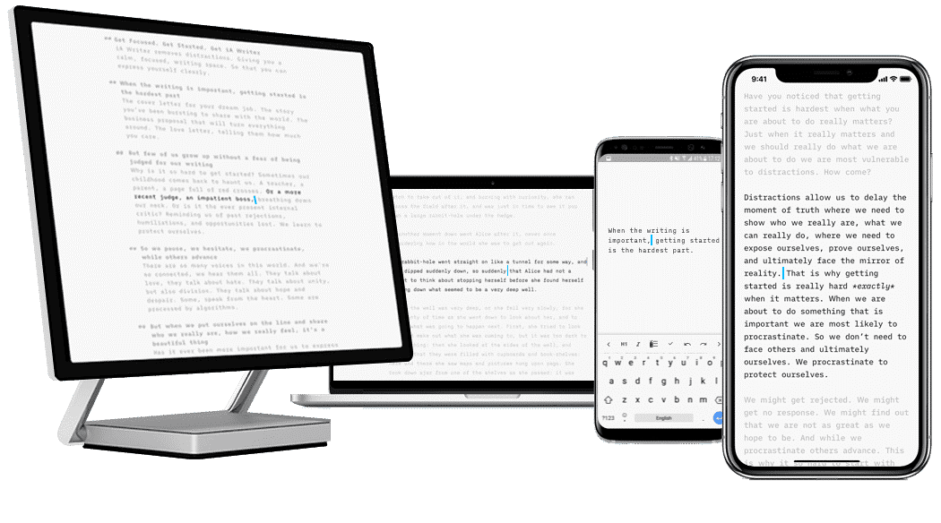 Image by iA Writer
The interface of iA Writer app is a clean typing sheet with no distractions. It allows users to focus on what they’re writing and hides everything else.
Don’t ask users for data they’ve already entered
Don’t
force users to have to repeat data they’ve previously entered. Users are easily
annoyed by tedious data-entry sequences, especially when they have provided all
the required information before. Good UI performs
a maximum of work while requiring a minimum amount of information from users.
Avoid jargon and system-oriented terms
When
designing a product, it’s important to use language that is easy to read and
understand. The system should speak the user’s language, with words, phrases,
and concepts familiar to the user, rather than jargon or system-oriented terms.
 Use everyday language, not systems or developer language.
Image by Think With GoogleApply Fitts’s Law to interactive elements
Fitts
Law states that the time to acquire a target is a function of the distance
to and size of the target. This means that it’s better to design large targets
for important functions (big buttons are easier to interact with).
 D is the distance from the cursor’s starting point; W is the width of the target (Fitts’s law).
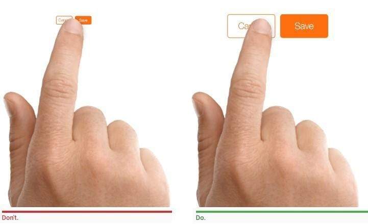 Image by Apple
It’s also important to remember that the time required to acquire multiple targets is the sum of the time to acquire each. Thus, when working on UI design, to increase the efficiency of an interaction, try to not only reduce distances and increase target sizes, but also reduce the total number of targets that users must interact with to complete a given task.
Design accessible interfaces
When
we design products it’s important to remember that a well-designed product is
accessible to users of all abilities, including those with low vision,
blindness, hearing impairments, cognitive impairments, or motor impairments. Good UI is accessible UI because improving your
product’s accessibility enhances the usability for all groups of users.
Color is one of the elements of design that has a strong impact on accessibility. People perceive color differently — some users can see a full range of colors, but many people can only make out a limited range of colors. Approximately 10 percent of men and one percent of women have some form of color blindness. When designing interfaces, it’s better to avoid using color as the only way to convey information. Anytime you want color to convey information in the interface, you should use other cues to convey the information to those who cannot see the colors.
Use real-world metaphors
Using metaphors in UI design allows users to create a connection between the real world and digital experiences. Real-world metaphors empower users by allowing them to transfer existing knowledge about how things should look and work. Metaphors are often used to make the unfamiliar familiar. Take the recycle bin on your desktop, which holds deleted files, as an example – it’s not a real trash bin, but it’s visually represented in a way that helps you understand the concept more easily.

Good metaphors generate a strong
connection to past experiences from the real world in users’ minds. The recycle
bin icon on Macs is similar to an actual bin, and it shows whether it has files
in it.
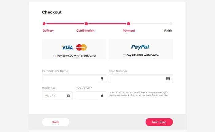
When choosing a metaphor for UI, select the one that will enable users to grasp the finest details of the conceptual model. For example, when asking for credit card details for payment processing, you can reference a real-world physical card as an example.
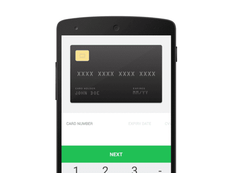 Image by Ramakrish
Engineer for errors
Errors are inadvertent in the user journey. Bad error handling paired with useless error messages can fill users with frustration and lead them to abandon your app. A well-crafted error message, on the other hand, can turn a moment of frustration into a moment of conversion. An effective error message is a combination of explicit error notification together with hints for solving the problem.
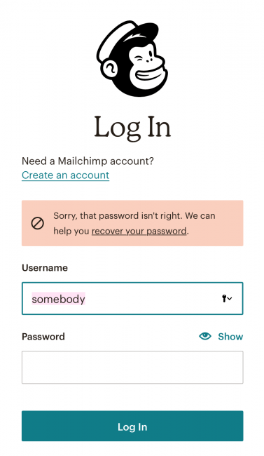 Good UI has precise, polite, and constructive error messages.
Even
better than writing good error messages is having UI design that prevents a problem from occurring
in the first place. Try to either eliminate error-prone conditions or check for
them and present users with a confirmation dialog before they commit to the
action. For example, Gmail prompts you when you forget to insert an attachment.
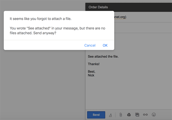
The best designs have excellent error
recovery while trying to prevent users from making those errors in the first
place. Error prevention in Gmail shows a pop-up if users forget to insert an
attachment after referencing one.
Protect a user’s work
Ensure
that users never lose their work. Users should not lose their work as a result
of an error on their side (i.e.
accidentally refresh a web page with a form that has user input), a system error,
problems with an internet connection, or any other reason other than those that
are completely unavoidable, like an unexpected power loss.
3. Reduce cognitive load
Cognitive
load is the amount of mental processing power required to use a product. It’s
better to avoid making users think/work too hard to use your product.
Chunking for sequences of information or actions
In
1956, psychologist George Miller introduced the world to the theory of
chunking. In his works, Miller says the human working memory can handle
seven-plus-or-minus two “chunks” of information while we’re processing
information.
This
rule can be used when organizing and grouping items together. For example, if
your UI forces users to enter telephone numbers without normal spacing it can
result in a lot of incorrectly-captured phone numbers. People cannot typically
scan clusters of ten or more digits to discover errors. That’s exactly why
phone numbers are broken up into smaller pieces.
 It’s easier to both scan and enter chunks of numbers instead of a whole number.
Reduce the number of actions required to complete a task
When
designing a user interface, strive to reduce the total number of actions
required from a user to achieve the goal. It’s worth remembering the three-click
rule, which suggests the user of a product should be able to find any
information with no more than three mouse clicks.
Recognition over recall
One
of the Jakob Nielsen’s 10 usability heuristics advises promoting recognition over recall
in UI design. Recognizing something
is much easier than recalling it because recognition involves more cues in our
brain (cues spread activation to related information in memory, and those cues
help us remember information).
Designers
can promote recognition in user interfaces by making information and
functionality visible and easily accessible. Visual aids, such as tooltips and
context-sensitive details, also help support users in recognizing information.
 Image by Google Hangouts
Promote visual clarity
Good
visual organization improves usability and legibility, allowing users to
quickly find the information they are looking for and use the interface more
efficiently.
When designing layouts:
- Avoid presenting too much information at one time on the screen. Construct a grid system design to avoid visual clutter.
- Remember the principle ‘form follows function.’ Make things look like they work.
- Apply the general principles of content organization such as grouping similar items together, numbering items, and using headings and prompt text.
4. Make user interfaces consistent
Consistency is an essential property of good UI—consistent design is intuitive design. Consistency is one of the strongest contributors to usability and learnability. The main idea of consistency is the idea of transferable knowledge — let users transfer their knowledge and skills from one part of an app’s UI to another, and from one app to another app.
Visual consistency (style)
Users should never question the integrity of a product. The same colors, fonts, and icons should be present throughout the product. Be sure to always reference your design system manager to ensure you don’t change visual styles within your product for no apparent reason. For example, a Submit button on one page of your site should look the same on any other page.
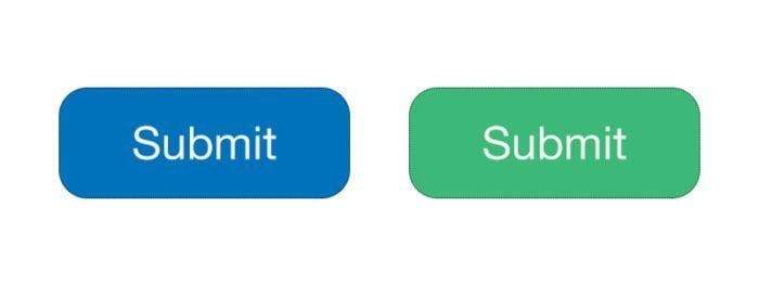
Avoid using different styles for elements
on different pages of the site. Users should not have to wonder whether a
transformed button like this example means the same thing.
Functional consistency (behavior)
Consistency of behavior means the object should work in the same way throughout the interface. The behavior of interface controls, such as buttons and menu items, should not change within a product. Users don’t want surprises or changes in familiar behavior — they become easily frustrated when things don’t work. This can inhibit learning and stop users from feeling confident about consistency in the interface. Do not confuse your user — keep actions consistent by following “The principle of least surprise,” to have the interface behave the way users expect it to.
Consistent with user expectations
People
have certain expectations about the apps/websites they use. Designing your
product in a way that contradicts a user’s expectations is one of the worst
things you can do to a user. It doesn’t matter what logical argument you
provide for how something should work or look. If users expect it to work/look
a different way, you will face a hard time changing those expectations. If your
approach offers no clear advantage, go with what your users expect.
- Follow platform conventions. Your product should be consistent with standards dictated by platform guidelines. Guidelines ensure that your users can understand individual interface elements in your design.
- Don’t reinvent patterns. For most design problems, proper solutions already exist. These solutions are called patterns. Popular patterns become conventions and the majority of users are familiar with them. Not taking this solution into account and continuing to design your own solution can lead to challenges for users. In most cases, breaking design conventions results in a frustrating user experience — you’ll face usability problems not necessarily because your solution will be wrong, but because users won’t be familiar with it.
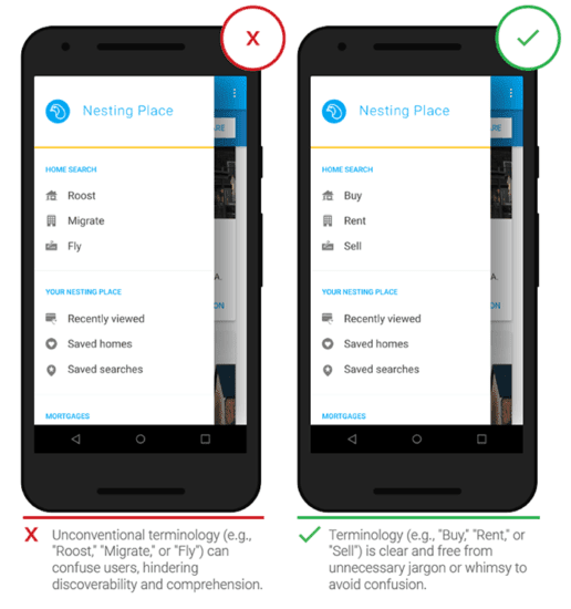
- Don’t try to reinvent terminology. Avoid using new terms when there are words available that users already know. Users spend most of their time in other apps and on other sites, so they have certain expectations about naming. Using different words might confuse them.
 Shopping cart is familiar terminology; shopping center is not and can confuse e-shoppers.
Conclusion
The goal for UI designers today is to produce user-friendly interfaces: interfaces that encourage exploration without fear of negative consequences. Without any doubt interfaces of the future will be more intuitive, enticing, predictable, and forgiving, but most principles of UI design listed in this article will surely be applicable to them, too.