Illustration by Erica Fasoli
At its core, digital design is the process of using different tools, technology, and user experience (UX) strategies to provide a solution to a visual communication problem. Solving simple UX problems with digital design could include creating text that’s readable and easy for any user to understand. More complex problems could include rearranging an entire user interface (UI) to increase user conversions.
No matter what type of digital design problem you encounter, it’s important to keep your business goals and the goals of the user in mind. For instance, using the UI rearrangement example above, we can easily interpret that the goal of the business is to increase conversions, while the goal of the user is to find out if your product or service is worthwhile with ease. As designers, we use a set of guiding principles to help us achieve these goals while simultaneously designing the best possible work.
Understanding these core principles of design and how to use them can help you create more consistent and usable designs without removing your own unique style from your work.
What are principles of design?
Principles of design are common rules used by designers to shape their work. Applied successfully, these principles give designers the power to create both well-functioning and aesthetically pleasing designs. A combination of excellent functionality and nice aesthetics leads to better UX for all.
What is the difference between the principles of design and the elements of design?
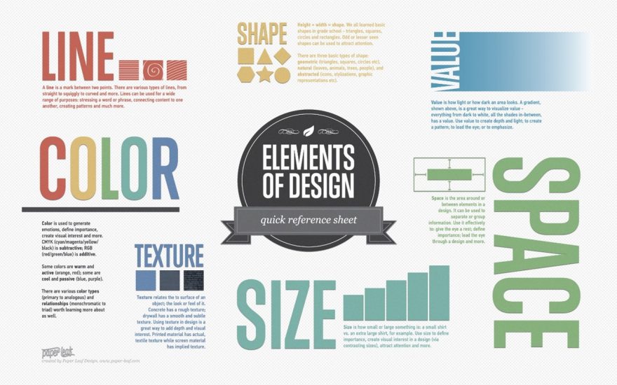
 Reference sheet depicting the elements of design, including line, color, texture, size, shape, value, and space. Image credit Paper Leaf.
The elements of design are the basic, raw building blocks used by designers to create a piece of work. Lines, shapes, colors, typography, texture, and space are the essential elements of design, and they exist in almost all prototyping tools. The principles of design, however, are the common rules harnessed by designers to give cohesion to their work.
The principles of design function in tandem with the elements of design, as they both help designers understand how they should create a well-crafted, user-friendly design. Design principles also help designers evaluate other works, which includes understanding the reasons why a designer made certain decisions in their creative process.
How does use of the principles of design factor into universal design practices?
According to the Center for Universal Design (CUD) at North Carolina State University, universal design is:
The design of products and environments to be usable by all people, to the greatest extent possible, without adaptation or specialized design.
The principles of design help designers achieve this goal, as the foundation of these principles promotes user-friendliness and inclusivity.
What are the primary 7 principles of design?
While there are a wide variety of approaches and philosophies you can use in your design process, there are seven essential core principles that guide them all.
1. Unity
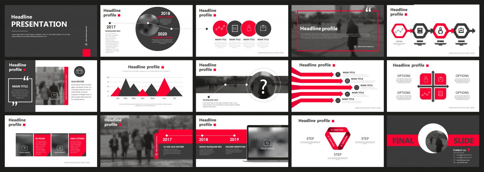
Designs are typically composed of many individual parts, and the principle of unity in graphic design states that no single aspect is more important than another. A design is considered unified when all parts work well with one another and share the same brand message. It’s rarely possible to achieve unity in design when designers work in isolation. In most cases, the final design feels like a combination of fragments rather than a whole experience. Only when a team practices design collaboration from the get-go is it possible to create a design that feels holistic.
2. Emphasis
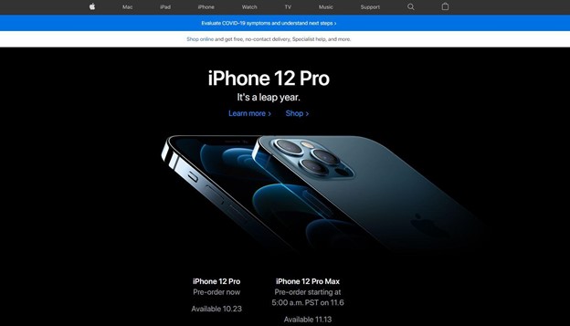
 Apple’s homepage emphasizes and features their latest and greatest product, the iPhone 12 Pro. Image credit Apple.
Designing with emphasis ensures that users understand what they are viewing and that they read the most important information first. For example, emphasizing a company’s main service in the title of their homepage ensures users viewing the website know exactly what they can buy from the company. Apple does a great job of this on their homepage. In the image above, you can see their latest product first, along with the most vital information about it. This is purposefully designed to focus a user’s attention on their newest product.
3. Hierarchy
The way that designers organize a website or app plays an important role in determining what the user takes away from their experience. Organization and proper visual hierarchy will create a familiar flow to your design that makes it easy to use. A great way to think of hierarchy is by using an importance rating system. This is when you arrange your design elements in order of importance, with the most important information at the top followed by the less-important information as the page flows downward.
Ideally, your design should incorporate a clear strategy for your hierarchy. If you’re designing websites or apps, it’s typically the same every time: Users scroll from top to bottom, so the top of the page should contain the most vital information. Leaning on the Apple homepage example image from earlier, the latest high-spec iPhone is at the top of the page, while older products are in later sections. Apple clearly wants to sell more of their newest phones, so the page is arranged to support that goal.
Hierarchy is a key principle of design because, without it, users can get confused. They may click out of your website without purchasing anything or stop using your app out of frustration. Creating designs with a clear hierarchy will ensure you don’t lose a potential customer.
4. Scale
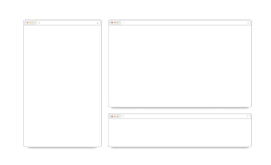
 Three internet browser windows in different sizes to show that they can be resized. Image credit Adobe.
Scale is the sizing and proportions of your design on the screen it’s displayed on. Properly scaling your design is a principle that some designers ignore, but it’s very important. This can mean scaling large images down to fit a certain screen size or scaling text up to fill a certain amount of space.
Whitespace, which is empty space that creates a border or spacing between elements, is a big part of scaling. Ensuring the information on a page fits without overcrowding—while still retaining your hierarchy and emphasis principles—brings everything together in unison.
You don’t want your elements filling the entire screen with no space around them, since that can feel cluttered to users. Instead, use padding and whitespace to make everything more readable, scrollable, and understandable—this is one of the biggest elements of human-computer interaction (HCI).
5. Contrast
Like objects in the physical world, every object in graphic design has its own weight. The heavier the object, the more attention it receives. It’s possible to add weight to a graphical object using size, shape, and contrast, but let’s take a closer look at how the contrast principle of design works.
Contrast is the difference between two elements on a screen. For example, black text on a white background creates visual contrast. Contrast also ties the other design principles together, since the emphasized element should contrast with all of the other elements on the page.
 Contrasting text immediately attracts users’ attention. Image credit voxy St.
6. Repetition
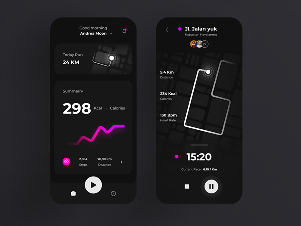
 15 different slides featuring visually similar designs to showcase repetition of design elements. Image credit Adobe.
Another important principle of design is repetition, which is when one or more design elements recur on a page or throughout an entire site. As you design more complex or larger projects, you will find that repeating certain elements creates familiarity and understanding. In the image above, you can see that each screen belongs together, even though there is a different design and purpose for each. Blending repeating colors, elements, icons, imagery, and styles is all a part of the repetition principle.
Not only will familiarity in a design generate a visually appealing end result, but it also creates trust with the user and helps establish the brand of the website or app. Repeated elements can range from an icon to colors and more. Applying this principle brings the entire design into a cohesive system.
Design tip: Within your design system, it’s important to create a design style guide to keep track of the colors, fonts, and logos that make up your project. Ideally, each project you design will have a style guide in place to ensure uniformity, especially if you’re working within a large team.
7. Rhythm
Rhythm is a term that most people associate with music, but it exists in almost everything around us—including paintings, products, and architecture. Rhythm can be used to create a large spectrum of emotions, ranging from relaxation to excitement. In graphic design, rhythm is achieved through the arrangement of elements and spacing between them. For example, it’s possible to create a rhythm by repeating certain elements throughout your website or app.
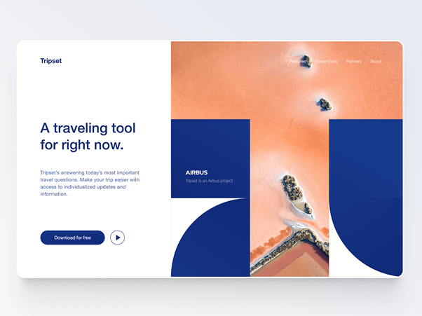
 The repetitive use of blue on this Airbus landing page creates a sense of continuity and invites users to scroll for more information. Image credit Gleb Kuznetsov.
When can you break the rules of design?
To create unique designs, you need to do something different and unique. But how do you do this if everyone is following the same design principles? Breaking the rules means walking a fine line, but in some instances, you can do so to achieve a particular goal.
For example, breaking the common rules of scale can be a good way to design something that leans on the creative side rather than the practical side. In the example below, it’s easy to see that some hierarchy and scale rules were broken. However, the final result looks appealing.
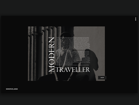
 Unusual text arrangement stands out and attracts the user’s attention. Image credit Zachery Nielson.
Harness the principles of design in your work
When you combine the seven key principles of design with your unique design style, you will find that they complement one another, as well as the existing principles and ideas in your design work. This combination creates a winning formula for you to step up your design skills and produce quality content. Just remember, sometimes it’s okay to break the rules.