Most designers dream of creating products that rise to the top of the App Store charts. But to do so, it’s vital to design them to meet high expectations for quality and functionality. Human Interface Guidelines (HIG) is a must-read resource for anyone who wants to master an ios app design. By reading HIG, you will gain in-depth information about this OS.
In
this article, I want to provide a summary of the essential design principles
and specific design recommendations from HIG for iOS designers.
Design principles
In
HIG, Apple defines the following five basic
principles of ios app design:
Consistency
A
consistent app uses consistent visual and functional language. In general,
elements with similar functions should look similar. Consistency creates a
sense of familiarity and simplifies the process of interaction with an app for
first-time users.
Feedback
Feedback
acknowledges actions and shows the results of any operations. Feedback is what
keeps people informed. iOS designers have multiple ways of providing feedback—
visual feedback on tapping, progress indication for activities that take some
time, and audio feedback for notifying users about certain operations.
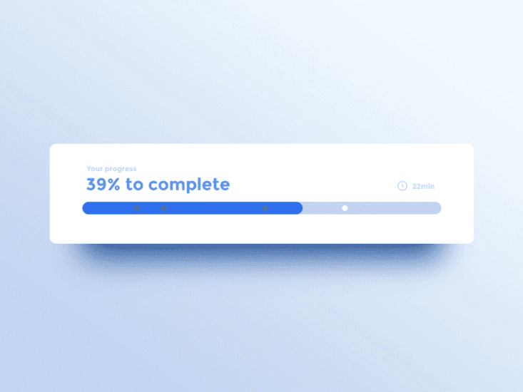
 Progress indicator shows current progress and remaining time. Image by Adrien Gervaix.
Metaphors
An interface metaphor is a UI visual that leverages knowledge users already have from real life. Metaphors allow users to learn more quickly because they can use the knowledge gained from the real-world when interacting with digital products. The most famous metaphor in human-computer interaction and UX design is Alan Kay’s “desktop metaphor”. The desktop metaphor moved us from typing command to direct manipulation with digitally rendered objects.
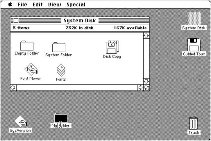
 The original 1984 Mac OS desktop that popularized the new graphical user interface.
Direct manipulation
Users
experience direct manipulation when they use gestures to interact with on
screen content. Direct manipulation helps users see immediate results of their
actions.
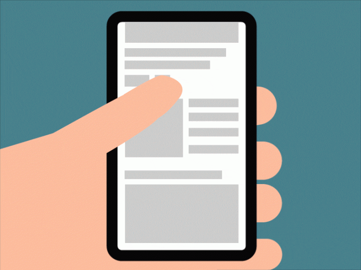 Scrolling interaction on mobile. Image by artrayd
User control
iOS
puts people, not the system, in control. Good iOS design prevents users from
making mistakes by suggesting a course of action, but it should never push
users in making certain decisions.
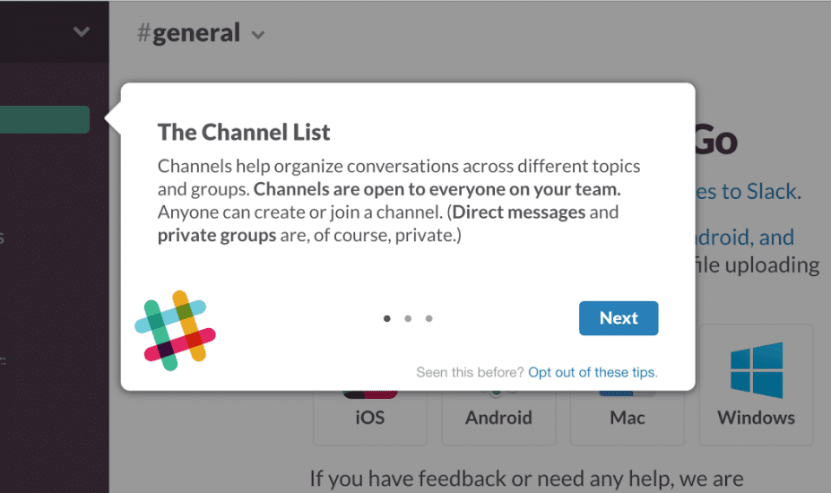
 Contextual tips in Slack
Interface essentials
iOS
app design guidelines define three key elements of app experience:
Bars
Bars
tell people where they are in the app (status bar), provide navigation (tab
bar), allow them to search for information (search bar), or take some actions
(toolbar).
Views
Views
contain the primary content people see in the app. Text, visuals, animations,
interactive objects – all those elements are located in views.
Controls
Controls
initiate actions (buttons) and convey status/information (progress indicators).
Design recommendations
iOS
is a large platform, and it’s impossible to provide all possible design
recommendations in a format of a single article, but still, it’s possible to
provide a few of the most important
recommendations that mobile designers should remember:
Don’t hide the notch
The
notch, sensor housing, is an element that prevents iOS screen from being
edge-to-edge. It might be tempting to hide the notch area with a black bar to
create a complete square screen, but it’s better not to do it. Why? There are a
couple of reasons for that:
- You make the screen look
smaller than it really is. The area of the notch
provides the sense of space for the content to be displayed. For
example, if you use a Google map in your app, it won’t suffer by being clipped
by the notch.
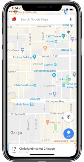
 Google Map on iPhone XS
- By hiding notch, you
make your app look inconsistent with other iOS apps.
Design using points not pixels
Pixels
are the smallest physical element that we can control on a digital display. The
more pixels can be fitted into a specific screen size, the higher the PPI
(pixels-per-inch), and the clearer the rendered content becomes. Points, on the
other hand, are a resolution-independent measurement. When the original iPhone
was introduced, both points and pixels were the same (320×480 pixels = 320×480
points), but the situation changed with the release of the first iPhone with a
retina screen. Depending on the screen pixel density, a point can contain
multiple pixels (e.g., 1 pt contains 2 x 2 pixels on a regular retina display).
When you are designing for modern iOS devices, you should think in points, but design in pixels. To make your app look good on every screen, you should prepare design assets in 3 different resolutions (1x, 2x, and 3x). Be sure to choose an app design software that includes the latest iOS templates to choose from. That will ensure this process goes much faster.
If possible, use single, system typeface
Typography
plays a vital role in any digital product, and iOS app design is not an
exception. When it comes to selecting a typeface for your app, it’s recommended
to use a system typeface of iOS. The system font of iOS is called San
Francisco. The fonts of San Francisco are optimized to give your text unmatched
legibility, clarity, and consistency.
It’s
important to know that when using a system font, you will have access to
dynamic type, which lets the font adjust based on the user’s preference.
Avoid clipping content by corners
All
recently released iPhones have one thing in common – they feature a display
with round corners and notch. Round corners and notch can clip the content.
When designing screen layouts, always use a safe area layout guide to push the
content to the point where it won’t be clipped. Generally, 16 points are enough
to make the proper margin. Also, the system includes predefined layout guides
that make it easy to apply standard margins around content, but you can always
define custom layout guides.
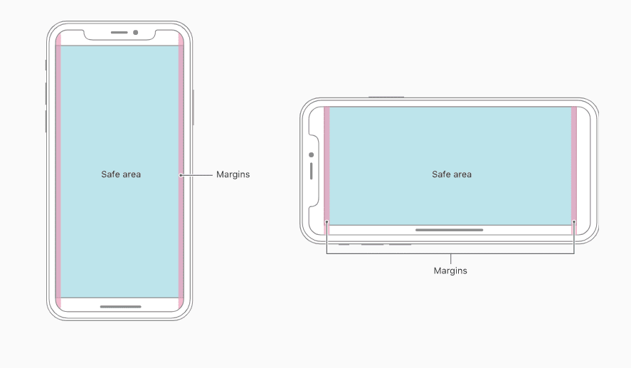
 Illustration of the safe area for iPhone X. Image by Apple.
Include status bar in as many places as you can
Mobile
design should be glanceable. Ideally, it shouldn’t take more than just a glance
to get all important information. Users rely on the status bar for important
information such as current time, signal, battery.
Use vibrant colors to bring out interactive elements
Vibrant
colors are a simple yet powerful way to direct the user’s attention to a
particular UI element. Vibrant color works equally well on the white and dark
background. But don’t go too overboard with vibrant colors in your UI. Ideally,
only 10% of your design should have vibrant colors.
 Using vibrant blue to highlight an active option.
Optimize for thumb
Tiny
touch targets located too close to each other can make the interaction really
painful for users. What can make things even worse, is when users have to
stretch their fingers in order to interact with them.
To create really comfortable user interactions, both the size and location of interactive elements should be in a thumb-friendly zone. When working on your iOS app design, aim to have a minimum tappable area of 44pt x 44pt for all controls. It will guarantee comfortable interactions for your users.
Make your navigation visible
The
latest iPhone models feature a relatively large screen, and it means that you
can use it to create a better navigation experience. Avoid using hidden
navigation patterns such as a hamburger menu and ‘use tab bar instead’ option.
Tab bar is always visible and won’t cause users to ask, “Where am I?” This
pattern is also located in the thumb-friendly zone, which makes the interaction
more comfortable for users.
Here
are a few tips for tab bar design:
- Add labels for icons. Clear labels will simplify the process of navigation for first-time users. Adding labels is especially important for less known icons.
- Use color to convey the status of the navigation option. The color will help users understand what option is active right now.
 The active option in tab bar is colored in contrasting color.
Use motion to convey hierarchy and facilitate understanding
Clarity
is an essential characteristic of a well-designed iOS app. Modern iOS apps can
be really complex and contain a dozen different screens. And when users
navigate from one screen to another, they need to understand how the screens
are related. Good motion language can help to create a connection between
screens and will help users understand the spatial transitions.
One
important thing to remember when working on animation in your app is that you
need to make it look consistent with system built-in animations. A consistent
animation will look familiar for users and will keep them engaged.
Minimize interruptions
Users
don’t like to be interrupted, especially when they are in the middle of
something important. That’s why it’s recommended to keep in-app alert dialogs
to a minimum and create a clear exit for every dialog.
Support Dark Mode in your app
In
iOS 13.0 and later, people can use a dark system-wide appearance called Dark
Mode. Dark Mode enhances visual ergonomics by
reducing eye strain when device is used at night or in dark environments.
In Dark Mode, iOS uses a darker color palette for all screens, views, menus,
and controls.
If
you want to support Dark Mode in your app,
you should test your design in both light and dark appearances. See how your
interface looks in both appearances and adjust your design as needed to
accommodate each one.
Always preview your design in an Emulator
Before sending your design to a real device, you should always preview it in an emulator. You can see and interact with your design using the XCode iPhone emulator.
Conclusion
The first iPhone was released more than a decade ago. If you compare the first iPhone with the iPhone 11, you will see the progress Apple made along the way. The same progress we have in the process of design & development for the iOS platform. Human Interface Guidelines and provide essential information about the requirements for the modern iOS app. And large iOS designers & developers communities on Stackowerflow will help you find an answer to specific questions.