Animation is often regarded as just decoration or a nice-to-have-added bit of delight in user interface (UI) design, but that’s really selling it short. Interface animation can be so much more than just decoration or delight when it’s used purposefully to enhance the overall user experience.
The best UI animations have both purpose and style — they have been purposefully placed in the interface for a user-centered reason, and they have been executed well visually. In this article, we’ll look at three ways animation can do this. They aren’t the only ways, but they are three of the most impactful ways animation can have a user experience (UX)-focused purpose in your digital interfaces. If you’re new to motion design, be sure to check out my 6 principles for designing animation.
Directing attention with animation
Let’s start with using animation to direct attention. Of all our design tools, you could say animation is the one that most often talks with its outside voice. When something moves, especially if it’s a big movement, it’s very hard for us not to look at it. This quality of motion is exploited well in things like animated banner ads. It’s very unlikely you would go to a site to see the ads, but by adding animation to these banners, the chances of their drawing your attention to where the banners are increases. This combination of using animation’s power to grab your attention paired with something that wasn’t important to you is a big part of what makes things like banner ads feel annoying.
However, if we change that pairing and use animation to draw attention to something that is important to our users, we have a winning combination. We can use the attention-grabbing power of motion to help users avoid things like change blindness or otherwise being distracted from the task at hand.
A shake to remind you to save
A great example of this is the CodePen save button animation. CodePen is an online tool where you can write and publish code-based experiments in the browser. But working in the browser means that if you don’t save your work, you could easily lose it. So if you’re working on a file and you haven’t done anything to save it, CodePen reminds you with a shaking-pulsing save button animation:
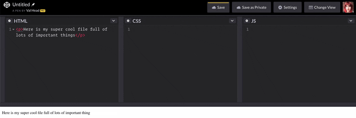
 CodePen’s reminder animation. Image by CodePen.
The animation itself is quite big and attention-grabbing in the UI. Used in another place, that amount of animation might be considered over the top. But here, when it’s paired with something important to you — not losing your work — it fits. It’s a large amount of motion relative to the visual space designed to attract your attention.
Ringing for attention
Stripe uses animation for a similar purpose in their dashboard area. If you have messages, the message bell will play a “ringing” animation next to a message count number when you have messages available:
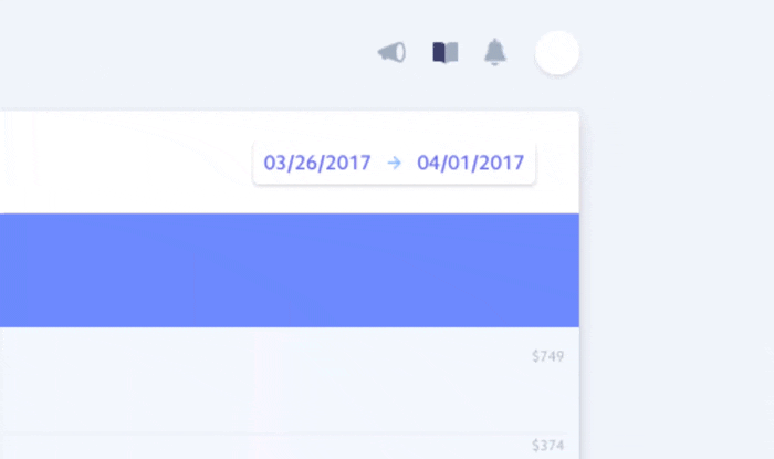
 An attention-getting animation from Stripe. Image by Stripe.
This is a pattern we see in other apps’ message notifications as well, and Stripe’s is a particularly nicely executed one. This ringing bell animation only repeats a couple of times, and then it stops — just enough to let you know it’s there, but not so much that it will constantly distract you from the task at hand. This fits well with the type of notification it is. A new message is likely important (in the case of this dashboard, it’s probably about a transaction or payment), but it may not be the most important thing to you at the moment you visited the dashboard.
Using animation for feedback
Designing good feedback in interfaces can be challenging, especially when you’re designing a product that involves complex tasks. Animation can be a very effective way of conveying feedback in both simple and complex flows.
Error Shakes
Adding animation as a layer of feedback for errors can be very effective, like the error animation used for Stripe Checkout. The shake animation is reminiscent of the OSX login error shake from a few years back, and echos the physical gesture of someone shaking their head. This reference to a physical gesture helps in conveying that something has gone wrong:
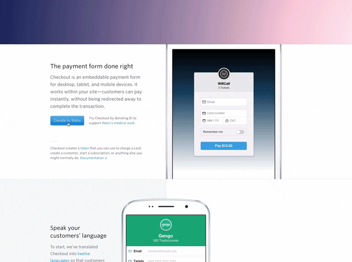
 Stripe’s shake animation. Image credit: Stripe.
Material Docs
Animation can also be used for feedback to guide or reassure users over more complex flows, like reorganizing Google Docs files for example. When you organize your documents, multiple instances of animated feedback guide you through the process and reinforce that you’re progressing through the actions as intended:
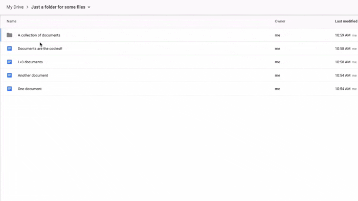
 Google’s document interactions.
First, when you select the documents you want to move, they swoop into a stack under your cursor and a number appears to remind you of how many you selected. As you move this stack of documents over your folders, the background color animates to indicate where items can or cannot be dropped. And, finally, when you drop your documents into a folder each document in the stack animates back on the z-axes into the folder, one at a time.
That’s a lot of animation happening over the course of that drag-and-drop interaction! The key to what makes it work is how the animation always moves with you, you’re never waiting for it to do its thing before you can move on. Throughout the whole process the animation is giving you the feedback you need, right when you need it, to be confident everything is going as you intend.
Reinforcing continuity with animation
With all the different screen sizes our interfaces have to appear on these days (especially the small ones!), it is not uncommon to have parts of the interface offscreen at any given time. With limited space, we often have to move things in and out of view depending on the current task or point of focus. Usually, as the one designing the interface, you have an idea of where all these interface objects are, even when they’re not in view (kind of like a mental map of where all the interface elements “live,” even when they are off screen). Surfacing this mental map to your users helps to make your product easier to use, and you can use UX animation tools to lower the cognitive load required for them to keep track of where everything is.
Sliding in to save cognitive load
One example of this is the navigation and add to cart functionality on Cotton Bureau’s site. Neither part of the interface is visible when you initially browse for your new favorite T-shirt, but when you click on the menu icon, the navigation slides in from the left. And when you add a shirt to your cart, the cart slides in from the right:
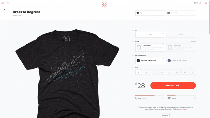 Using sliders on Cotton Bureau’s website. Image credit: Cotton Bureau.
Sliding elements in and out of view is a fairly common pattern, but let’s take a moment to break down what purpose the animation is serving here. It’s doing a lot of work to keep the user informed in just a few fractions of a second.
The fact that you see the navigation menu come in from the left (and then exit back to the left of the screen when you dismiss it) shows both where it came from, and where it “lives” in the interface when you can’t see it. The same goes for the cart details on the other side of the visible screen area.
The designers could have just had it appear instantly with a hard cut, but the fact that it’s seen transitioning into view provides all the information of where it came from, and eliminates all the potential cognitive overhead of wondering where this new thing came from and why. Without having to give a second thought, the user starts to develop a mental map of the interface with the navigation waiting in the wings just off screen to be called into view when needed. The animation happens very quickly, just fractions of a second, but yet it conveys a lot of useful information and reduces cognitive load.
Pixels in a bucket
Another example of using animation for continuity is the way Google Fonts connects the states of its color picker with animation. When you click the paint bucket icon to select a new background color, the four color options scale up and out from the paint bucket:
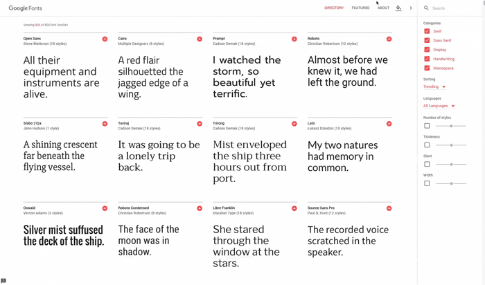
 Google Fonts color picker animation. Image by Google Fonts.
The motion of the animation suggests that the color swatches are actually coming out of the paint bucket, creating the metaphor that the swatches live inside the icon itself. Of course, we know that the icon is made of pixels and it can’t really hold anything inside of it, but the animation is enough to invoke the mental model of a real-life paint bucket with colors inside.
Purposeful doesn’t need to be complex
This would be a good time to point out that most of the animations we’ve looked at are not particularly complex. Many of them are only animating one or two properties. The effects don’t need to be visually complex to convey useful information about the interface. These purpose-based UI animations can be both powerful and uncomplicated.
I encourage you to look for places where these three purposes of animation (directing attention, continuity, and feedback) could be useful in your own work to support your UX efforts — and create an added layer of polish along the way.