Illustration buy Avalon Hu
Since the dawn of computers, developers and designers have dreamed of creating friendly human-computer interaction (HCI). These HCIs make for computer operations that are intuitive and easy to learn without prior practice or knowledge of specific computer languages.
Creating a graphical user interface (GUI), which allows users to directly interact with their devices and complete certain tasks by manipulating elements like icons and scroll bars, is one way designers make their digital devices more efficient and usable.
In this article, we will review the concept of a GUI, how it works, the GUI design process, and principles to follow when creating GUIs.
What is a graphical user interface?
Simply put, GUIs help your users do things within your device, platform, program, or app without needing to type commands or know the coding behind the action.
Some specific examples are:
- Moving a document into the “Trash” folder on your desktop
- Clicking on an icon to launch an application
- Moving files from one folder to another
To better understand the underlying idea of this type of interface, we need to dive into graphical user interface history. While there is no single creator of the GUI, the ideas have roots in Vannevar Bush’s work at MIT during World War II. Bush described the concept of a device called memex, in which people could store various types of information. He described memex as an “enlarged intimate supplement to one’s memory.” Bush’s ideas influenced computer scientist Ivan Sutherland, who created a system called Sketchpad. Sketchpad was a predecessor to GUI.
Ivan Sutherland Sketchpad demo. Video credit YouTube.The first working concept of graphical user interface design, however, is from the Xerox Palo Alto research laboratory in the 1970s. Check out the video below:
Xerox Alto GUI Demo. Video credit YouTube.This concept was based on a desktop metaphor—designers tried to simulate a desktop environment. The metaphor of a file and a folder is used to organize the content in a structured way. Later, Apple and Microsoft adopted this concept into their operating systems.
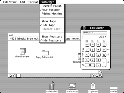
 Apple Lisa was the first computer from Apple that had a graphical user interface. Image credit Wired.
How does a graphical user interface work?
GUIs consist of graphical elements that users interact with. The most common paradigm of GUIs is the windows, icons, menus, and pointer (WIMP). The WIMP paradigm refers to virtual input devices controlled by a physical pointing device (a mouse), the content containers (windows), and graphical objects used to initiate some actions (icons and menus).
Most graphical user interfaces reference the model-view-controller (MVC) pattern. This pattern separates internal representations of information (model) from the manner in which users receive it (view). The controller acts as a medium between two parties.
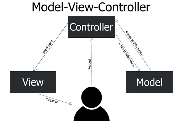
 The model-view-controller pattern in GUI design. Image credit mvps.
MVC allows for flexible structures, so you can redesign elements without any changes to the model. The view then becomes almost like a visual skin that designers can apply to the same business logic of the application.
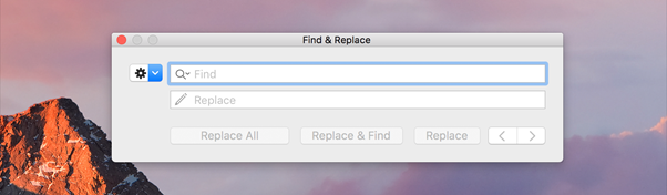
 The visual design of system dialog in MacOS can be changed in the next version of the OS without introducing any changes to the business logic (functionally). Image credit Apple.
Advantages and disadvantages of graphical user interfaces
In comparison with a command-line user interface, GUIs have many advantages:
- Lower learning curve. With a GUI, users don’t need to learn specific commands or have expert computer skills.
- Lower interaction cost. The user doesn’t have to type commands using a keyboard; they can navigate to the graphical object and click or tap on it to perform the action.
- Immediate feedback. Users manipulate objects in real-time and can see the results of their actions.
But there are also some disadvantages to this model:
- Easier to make errors. To make an error in a command-line interface, you need to type a command and execute it. To make an error in the GUI, all you need to do is to click the wrong button.
- Built-in limitations. Unlike with GUIs, the command-line interface offers more freedom and flexibility for experienced users, allowing them to execute some complex operations or tweak system confirmation.
GUI design process
It’s impossible to think about GUI design in isolation from a product that will use it. Thus, the design process below is just an extract from a general five stages of the design thinking process (Empathize, Define, Ideate, Prototype, and Test) that product design teams use.
Requirement gathering
Good UI design is about understanding your user’s needs. Designers need to think about the tasks the user will complete using a product (user needs), as well as when (user environment) and how (design ergonomics), and turn this information into functional requirements. At the end of this step, product designers should be able to answer the following questions:
- What will the user want the system to do?
- What features should the product support?
- How will the product fit into the user’s daily activities?
- Where will the user interact with the system?
Design information architecture
UX psychology plays a critical role in GUI design. Interactions with GUI should feel natural for users, and that only happens when features and content align with user mental models. That’s why after learning about requirements for the system, it’s important to structure content and functionality in a way that makes sense for the user.
One way to do this is by creating a hierarchy of pages to help users find information without much effort. For example, when users launch a document editing app, they expect to find all editing options in the top-level menu. Hiding or changing the position of key controls will make the interaction with a product more difficult for your users.
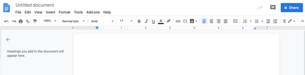
 Design information architecture at play: Google Docs features the most important actions in the top panel. Image credit Nick Babich.
Prototyping
In this step, we try to create a visual representation of a GUI. Product design is an iterative process and depending on the stage of product design, prototyping can be anything from low-fidelity clickable wireframes to a high-fidelity coded prototype that looks and works almost like a finished product.
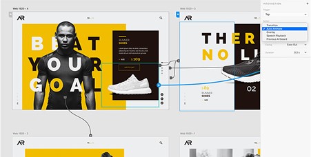
 Prototyping in Adobe XD. Image credit Adobe.
Testing
Product design is an iterative process and it’s nearly impossible to create a perfect solution right from the first attempt. Testing with people who represent your target audience will help you understand how well your product works for your users and what areas for improvement you have. Great design teams follow a build-measure-learn cycle until they’ve created a solution that is good enough for their users.
Principles to consider when designing GUIs
As we explained earlier, the goal of GUI design is to improve the communication between the human and the machine. We’ll dive into some of the generally accepted principles for graphical user interface design below.
Simplicity
“The best interface is no interface.”
Golden Krishna
This quote by Golden Krishna refers to the idea that the best interfaces are almost invisible to the user. Any attention devoted to the GUI design itself interferes with the primary task that the user has, which is achieving their goal in the shortest possible amount of time. That’s why it’s essential to remove all unnecessary elements and polish existing elements for maximum clarity.
Here are a few recommendations for creating an interface that’s as simple as possible:
- Make screens less crowded by removing all unnecessary details. Leave only elements that are the most important for user tasks.
- Make it easier for users to discover important elements or actions. Prominently feature important functions, and hide less frequently used functions.
Aesthetic-usability effect
People judge a book by its cover. This applies to many things in our world, including graphical user interfaces. We see this with the aesthetic-usability effect, which states that users are more tolerant of minor usability issues when they find an interface visually appealing. Good aesthetics can improve the user’s perception of the GUI, so it’s important to create a design that makes your users happy.
Consistency
The principle of consistency states that a system should look and work the same throughout. Inconsistency can make even the most beautiful GUI design completely unusable. Thus, it’s vital to design for visual (similar components should have similar look) and functional (similar components should have similar uses) consistency. A design system—including component libraries and style guides—can help with this.
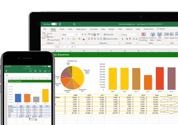
 Example of visual and functional consistency across Excel in both desktop and mobile uses. Image credit Microsoft.
Familiarity
Good user interface design should also focus on helping users achieve their goals. When it comes to GUI design, creating a familiar experience is a top priority.
Here’s what this means:
- Use affordances for individual elements to help users decode their meaning. Affordances are visual properties of objects that show users the actions they can take. Familiar affordances, such as shadows on buttons, help users understand what the element does just by looking at it.
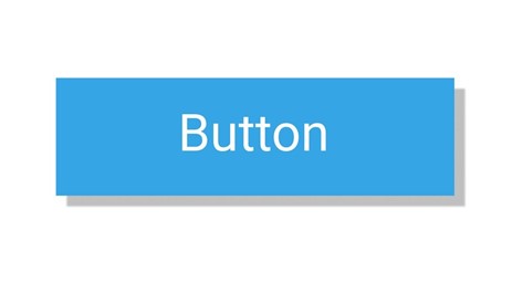
 A button with a shadow helps users understand the functional purpose of the element. Image credit Nick Babich.
- Follow platform conventions. When designers break conventions, they make it harder for users to interact with the product.
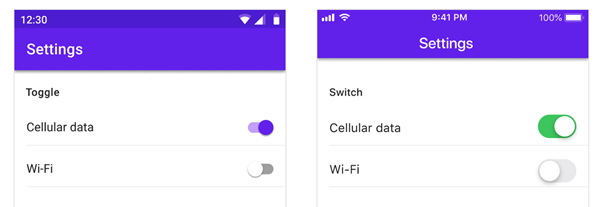
 Follow platform default visual styles for function elements: in this picture you can see default toggle switches in Android and iOS. Image credit Material Design.
Digestibility
When designing GUIs, it’s important to make the UI easily digestible. Try not to overload it with too much information, and make sure to optimize both content and functional elements for fast scanning.
Here are a few practical tips:
- Ensure that all text is legible and readable. Information should be easy to scan and easy to read.
- Create a proper visual hierarchy of elements. The arrangement and alignment of elements on a page should guide users to what they need first, second, and so on.
- Optimize both content and functional elements for fast visual scanning. The most common scanning patterns are F-shape and Z-shape.
Efficiency
Anticipating your user’s wants and needs with your GUI will help them achieve their goals faster and with less effort. Here’s what this looks like:
- Practice anticipatory design. Anticipate the natural progression of the task and provide relevant information and actions exactly when users need it.
- Minimize eye movements by aligning screen elements into groups.
- Minimize interaction cost (hand or finger movements). Fitts’ Law states that the time required for a user to move a pointer (mouse cursor or finger) to a target is a function of the distance to the target divided by the size of the target. Put controls in close proximity to the object that users want to control.

 Fitts’ Law states that the time required to move to a target area is a function of the ratio between the distance to the target and the width of the target. Image credit Foobar628 via Wikimedia.
Responsiveness and control
Responsiveness and control are two principles that help to keep a good pace in human-computer dialog. The system should always communicate what’s happening because it helps users maintain a sense of control.
Here are a few things to keep in mind:
- Offer good performance. Users want to perform actions quickly, without lag.
- Control the interaction. Allow users to interrupt or terminate actions, and allow support for “undo” operations.
- Provide appropriate feedback. The system you design should rapidly respond to the user’s requests with relevant feedback (visual, audio, or any other type). Feedback helps users understand that the system received their command. Without feedback, the user risks making the same operation multiple times (i.e. clicking on the same button twice).
Accessibility
It’s also vital to make GUI accessible to all types of users, including those with disabilities. You’ll need to take vision, hearing, and mobility issues into account for accessible HCI design.
Here are two essential resources for GUI designers that provide a set of requirements for accessibility:
Conclusion
The graphic user interface is one of the most important innovations in the history of personal computing. Today, GUIs provide a fundamental platform for human-computer interaction, and it’s nearly impossible to imagine how people could live without it. The principles of GUI design listed in this article will help you design simple and efficient interactions between humans and machines.