Today, it is estimated that more than 5 billion people have mobile devices, and over half of these devices are smartphones. Mobile landscape is changing rapidly, and users have high expectations about the mobile experience. Designers strive to create mobile app designs that not only meet users’ needs but also provide a delightful experience. In this article, we will cover the common screens that almost any mobile app has, as well as share some design tips for every screen. But before we dive into details about mobile screens, we will discuss the key difference of mobile UI design.
Mobile UI design specifics
As
you know, mobile experiences are highly focused due to their screen size. Since
you cannot put as much content on a mobile screen as on a desktop, both the
content and features we provide on mobile devices should always be prioritized
according to the needs of the target audience.
Splash screen
We all know the importance of the first impression in
interpersonal communication. A first impression is what a person thinks of you
when they first meet you. It takes just a glance for someone to evaluate you
when you meet for the first time. These first impressions set the tone for the
relationship that follows. The same rules apply for digital experiences.
The first screens that users see when they start using your
product create the first impression. And the very first screen that most apps
show to their users is a splash screen. The role of a splash screen is to
create a feeling that the app loads fast. Splash screens are usually
minimalistic and show only a logo and a product’s name. It’s recommended to
show splash screen no longer than 3-5 seconds otherwise the users will think
that loading takes too long.
 Logo splash screen by Gleb Kuznetsov
Onboarding screens
Onboarding is a human resource term borrowed by product
designers. The purpose of onboarding is to introduce first-time users to the
product and get them ‘up-and-running’ with it. In many mobile apps onboarding
screens are dedicated to getting users familiar with product features or
benefits of using a product. Some apps try to educate users on how to interact
with mobile UI—they wrap quick tutorials or contextual guidance into the onboarding
experience to familiarize users with common operations. No matter what type of
onboarding you choose to use, it’s important to remember that onboarding
shouldn’t feel like a roadblock for the first-time users. Make sure it feels
natural to the user and allow the users to skip onboarding if they want to
start using the app.
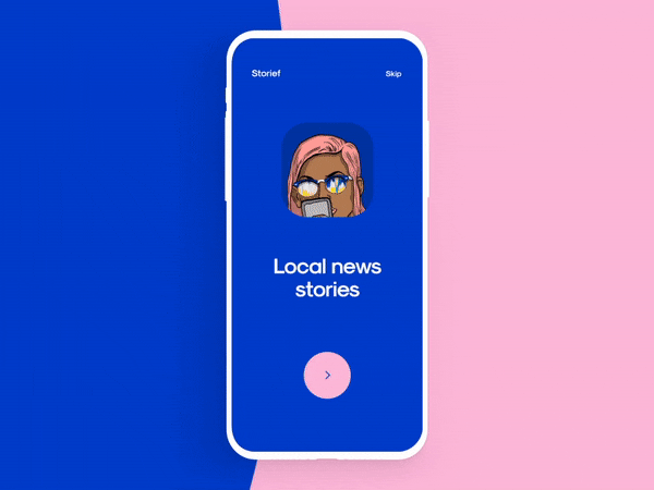 Animated onboarding experience by Cuberto
Home screen
Home screen is a screen that users see when they complete
onboarding. This screen acts as a starting point for the user journey. Home
screen design can vary dramatically depending on the purpose of the product,
but there are a few elements that almost any home screen has:
- Menu.
The home screen should help users navigate to the different parts of your
product. When it comes to designing a navigation experience, it’s better to use
existing navigation patterns. Mobile UI usually has either tab bar navigation
or a hamburger menu.
- Search
input field. The search field is a typical element of eCommerce apps. It acts
as a shortcut and allows users to search for a particular product.
- Relevant
content. Depending on the nature of a product, the home screen can have a feed
with items or any other types of content that will be valuable for users.
When it comes to designing a home screen, it’s essential to
consider the information density. The information on the home screen should be
highly prioritized. Don’t try to put everything you have on the home screen
otherwise the screen may look cluttered.
Empty states for “No content”
Content is what provides value for most apps. It’s the
primary reason why people are using them — for the content. Thus, it’s critical
to consider how to design places in the user journey where a user might not
have content yet. Such places are known as empty states, and empty states
shouldn’t look…well, empty.
An empty state is a natural point to inject some onboarding
to guide users along. Instead of leaving it blank, you should use it
efficiently — to educate and guide.
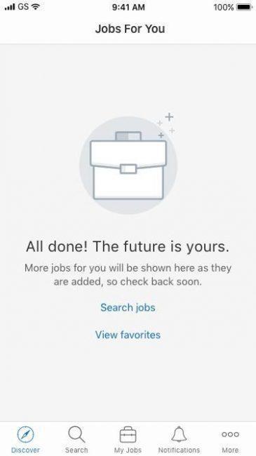 Symplicity Careers app empty state
Search results screen
Search is an essential element of
mobile UI. When it comes to designing search, it’s vital to remember a few
fundamental rules:
- Use
autocomplete to reduce the interaction cost. As users start typing something in
a search input field, your app should provide the most relevant suggestions to
eliminate the need to type the entire search query, but also to reduce the
probability of zero-search results (when no items found).
 Autocomplete in mobile UI. GIF by Louise Chang.
- Decide what will be a default order for the search
results. For example, if you design a search results page for an e-commerce
app, you need to decide whether the output should be sorted by best
match/price/delivery time.
- Allow users to filter search results. Filtering is
especially important for eCommerce apps where the user can have dozens of
different options in search results.
- Allow users to bookmark items. In eCommerce apps, users
might want to save a particular item in order to complete the purchase later.
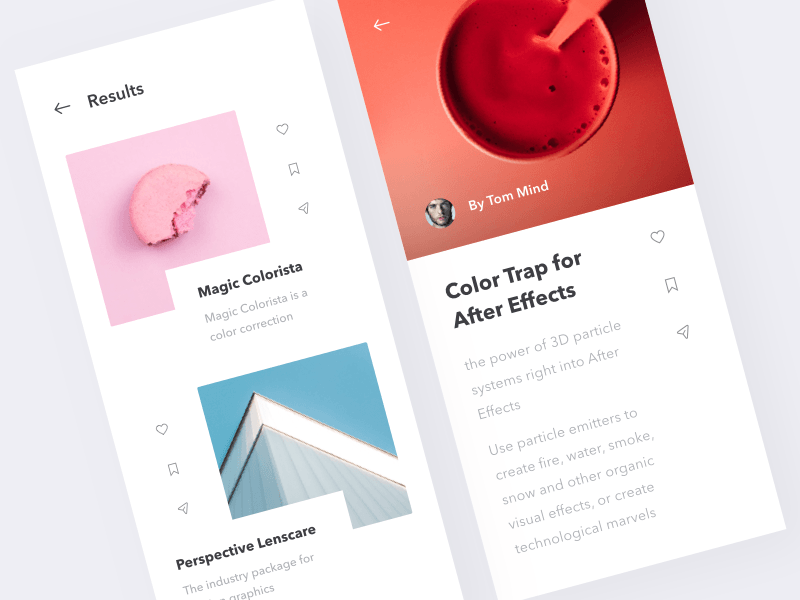 Image credit: Martin Berbesson
- Always consider the “No results” state. What screen
will your users see when the app does not have any matching results. “No
results” screen shouldn’t act as a dead end. Instead of showing a blank page
with a quick note “No results,” you should design a screen that guides users
and shows what they can do next.
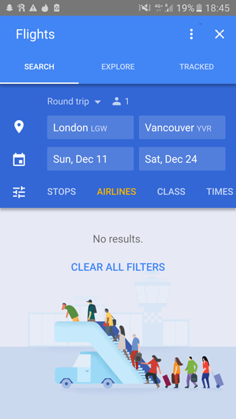 Screenshot of Google flights app
Profile screen
Many mobile apps ask users to create an account before
accessing the experience. Users have a special place in mobile apps where they
see and customize their account settings—profile screen. Here are a few things
to remember when designing profile screen:
- Allow users to change their personal information and
customize the preferences (i.e. customize the notifications they want to
receive).
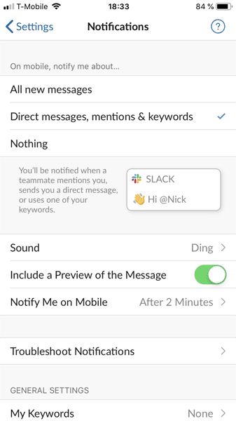 Screenshot of slack notification preferences.
- Allow users to sign out. ‘Sign out’ is one important feature that many mobile apps should introduce on profile screens. This feature allows a user to logout from the app and sign in using a different account.
 Facebook logout screen for mobile.
Product-specific mobile UI screens
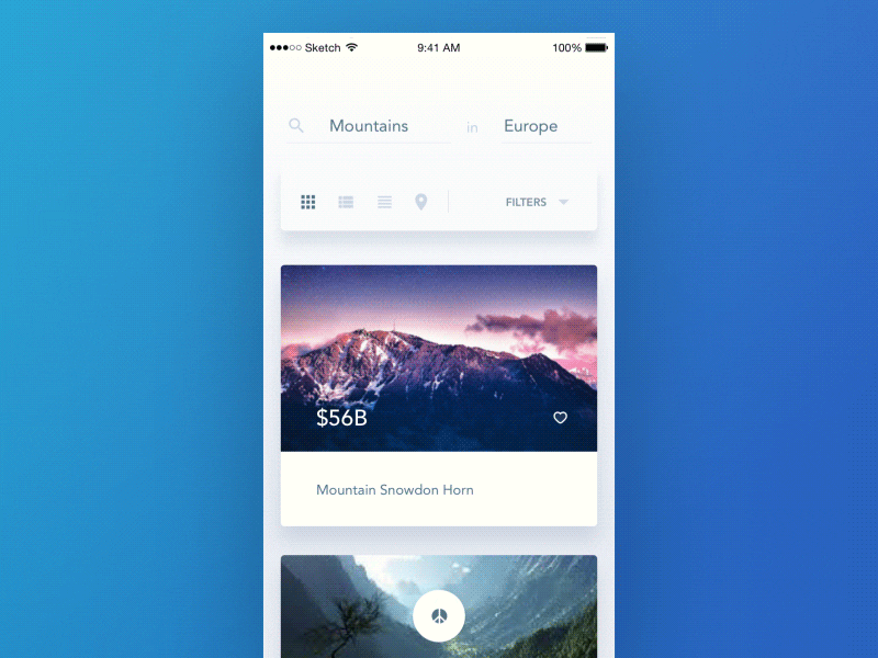
Ecommerce apps
Since the main objective of eCommerce apps is to sell
products to their users, such apps have four screens that are relevant to the
product purchase flow:
- Products
catalog screen. This screen provides a list of items the company offers for
sale. Depending on the nature of a product, the visual layout can be either a
list of a grid view. The list view works better for products like appliances
because the users want to read text description to make a decision while the
grid view works better for apparel where users rely on items visual appearance
when making a decision.
- Product
details screen. Product details screen contains essential information about the
item, offers photos or illustrations of a product and provides a call to action
button ‘Add to cart.’ The purpose of this screen is to help users decide
whether they want to buy this product or not. That’s why it’s vital to provide
enough details about the items to simplify the decision-making process.
- Cart
checkout. The checkout screen is a final screen that users see before they buy
the product. This screen must provide all information about the product and
final price (including product delivery) and the shipping details (the address
for the delivery as well as its cost).
- Purchase
confirmation screen. This screen acknowledges that the user ordered selected
items. It’s recommended to provide order number on this screen as well as
information about the delivery (i.e. the message like “Your items will arrive
on Sep 22, 2019 will help users understand when they should expect the parcel).
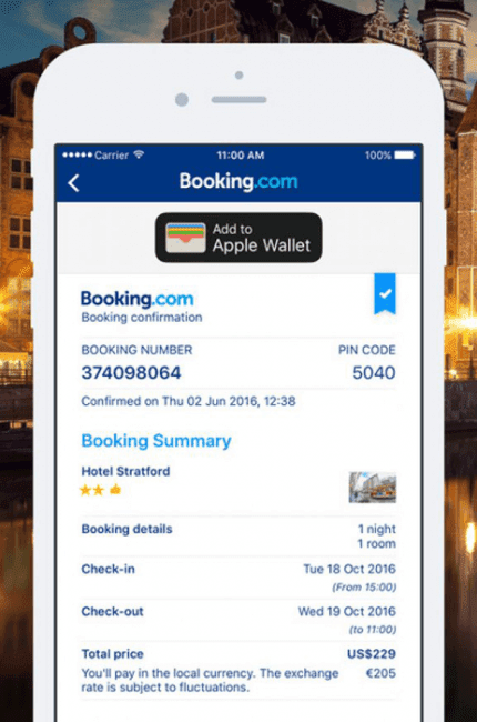 Confirmation screen on mobile
Social media apps
Since the primary purpose of social media apps is
communication, the app experience is built around delivering valuable
information to users in a timely manner:
- Feed. Feed is a constantly changing list of events. It’s an essential part of any social network app. Every item of the feed should be designed for quick scanning (remember, users don’t read, they scan!). The feed should be optimized for vertical scroll—users should feel comfortable when digesting the information.
 Gif of mobile feed scrolling
Mobile animation by Aurélien Salomon ➔- Friends/contacts. Friends/contact screen presents
user’s contacts in a list. Typically this list is sorted by the name in
alphabetical order, but some apps can prioritize the list by the frequency of
interaction (i.e. the frequent contacts go to the top of the list). Usually,
every item in this list has an avatar, name and short description. It’s worth
it to include search field on this screen to simplify the process of finding
relevant content.
Conclusion
When it comes to product design, it’s vital to consider all pages/screens
a part of the user journey. By doing that you will design screens that will be
aligned with user expectations and streamline the process of interaction with
your product.