We live the era of data; today we deal with data systems that are larger than anything that humans have ever created. We reach the volume of 34 gigabytes of content consumed by a single person per day, on average, and as technological progress continues that number will climb and climb.
In the world of short attention spans and constant information overload we need a simple way of comprehending large amounts of data. Data should be a ubiquitous resource that can be shaped to provide better consumption, and it’s possible to squeeze a lot of information into small space by presenting data in visual ways. By visualizing data, you can turn it into a format that can be both easily explored and consumed.
In this article, I’ll describe what data visualization is, how it can be used, and what you should take into account if you want to visualize your data.
What is Data Visualization?
Data visualization is a way of representing some form of collected data. Typically, such representations help people make decisions. At its core, data visualization is about visual encoding. We use visualization to extend our own cognition and perception.
A Brief History of Data Visualization
Data visualization has a long and exciting history and while it’s impossible to cover all aspects of its development in this article, it’s worth mentioning two big steps in showing information.
Maps
The first attempt to show data visually began with cartography — about 6000 years ago when the first map was created. A town map of the city of Konya is known as the oldest recorded example of data visualization.

 Konya Town Map, Turkey – the world’s oldest known map. 6200 BC. Image by Yorku.
Over time, maps evolved and became more and more detailed.
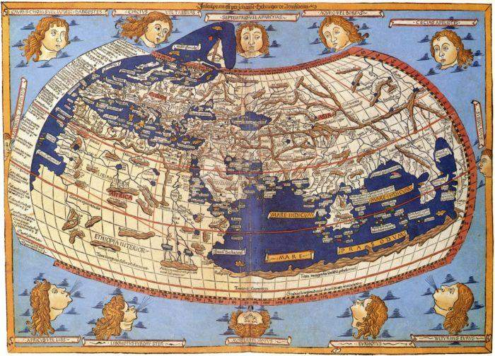
 A 15th-century reconstruction based on Ptolemy’s projections of the world.
Today maps are the most widely seen visualizations in the world.
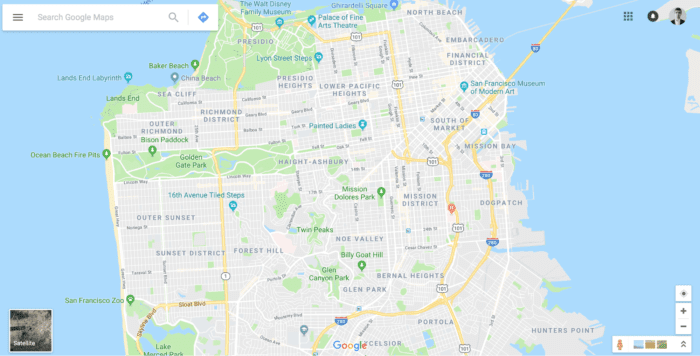
 Google Maps
Science
The history of data visualization is the history of science. Scientists use visual representations to record — and then analyze — different measurements.
Below you can see a work of Christoph Scheiner who was a contemporary of Galileo. Scheiner watched the sun with his telescope to track sunspots and visualized what he saw. The visualization became both a record of scientific observations and the data for future analysis.
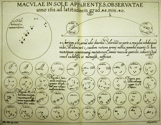
 Sunspots over time. Scheiner, 1626. Image by Cnx.
Why visual information is so important
Visualization increases speed of comprehension
Perhaps one of the best definitions of data visualization was coined by Alberto Cairo, the author of The Functional Art: An Introduction to Information Graphics and Visualization. He describes data visualization as a graphical representation that is intended to let people see what they cannot normally see. What he means by that is that visualization lets people see through the huge amounts of data and extract patterns from it. The human brain is exquisitely good at visual pattern recognition. The process of recognition happens subconsciously, and this natural property can be used by designers when they need to communicate a lot of information very quickly.
For example, suppose you have a significant amount of data such as a global temperature change starting from 1880 presented in a table. Tracking patterns and trends from a pile of numbers is hard. However, when the same data is presented in a visual format (e.g. a chart), it allows us to understand the trend at a glance.
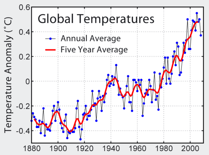
 Data visualization reveals the patterns underneath the data. Image by Ete.cet.edu.
Trigger an emotional response
Data visualization is a powerful tool not only for discovering patterns, but also for persuading people. Good visualization has the opportunity to engage readers and speak to them on a deep emotional level. When designers visualize data, they pull it out of abstract and make it real and tangible. Thus, if you want to change someone’s behavior, you should present information in a visual format.
Here are two examples of how data visualization can make the world a better place. The first example is the Poppy Field project, which is a reflection on human life lost in wars. Each poppy depicts a different conflict; the stem grows from the year when the war started and the poppy flowers in the year the war ended. Its size reveals the number of deaths while the variation of color represents the areas involved.
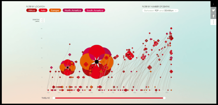
 Poppy Field is an interactive dataviz of the wars of the last century. Image by Poppyfield.
Next example is Plane Truth, which shows every single plane crash since 1993. You can see that human error factor caused a significant percentage of crashes, and this gives us the reason to develop new technologies that make the process of flying safe.
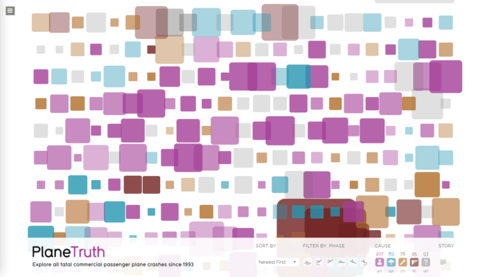 Plane Truth visualizes every single plane crash since 1993. Size represents casualty factor, and the color represents the cause. Image by Informationisbeautiful
Create more memorable experiences
We react to the design of a visualization just as much as we react to the information itself. Well-crafted visualizations can enhance a relationship with the viewer; custom bespoke graphics — handcrafted by a skilled visualization designer — not only draws a user’s attention, but it also provides the opportunity to stay in someone’s memory for a while.
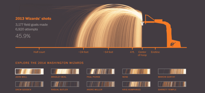
 This detailed data visualization demonstrates the Washington Wizards’ shooting success during the 2013 season. Image by Washington Wizards’ Shooting Stars.
Data visualization in digital products
Visualization to support primary content
Data visualization is becoming extremely popular in news media. Popular media resources such as the New York Times, Bloomberg News, and CNN are all using more and more visualization in their publications. Readers often assess the quality of their stories based on visualization that they see, and that’s why publications are constantly experimenting with data to find new ways of representing it.
This type of visualization is used as a compliment to the overall story. They are rarely used alone because they would mean very little without accompanying details.
 WSJ uses data visualization on a regular basis. National Unemployment chart. Image by WSJ.
Interesting fact: If you add a chart to any page, suddenly that page’s message becomes more persuasive (even if the chart has nothing to do with other content on a page).
Visualization that tells a story
Data visualization can be a powerful tool to tell stories to readers. Some of the most powerful stories published in popular media aren’t written stories, they are visualizations. That’s because a visualization can translate something that’s complicated into something that’s easy to understand.
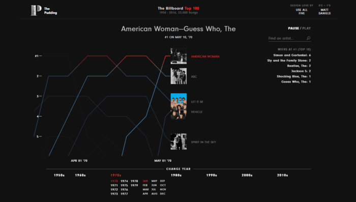
 How Music Evolved: Billboard’s Hot 100, 1958-2016. Image by Pudding.
Visual Analysis
Visual analysis allows broader — and more rapid — data exploration.
Dashboards
Dashboards are based on the idea that analyzing visual information is much easier than a pile of numbers. At its core, a dashboard is about simplifying data down to a presentation that supports decision-making. We usually observe data in a dashboard to make some discoveries from the data we see. For example, we might want to see dynamics to confirm our thoughts. Another important thing about dashboards is that they update the visualization automatically. In most cases, viewers won’t need to manually convert data each time a new chunk of data arrives.
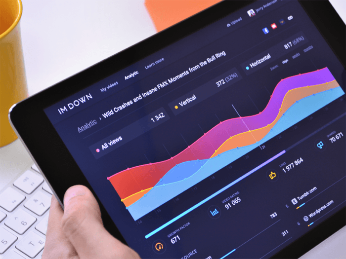
 Image by Ramotion
Data-driven maps
Using maps is a natural choice when you need to visualize geospatial data. Some companies make this type of visualization its landmark. One of them is Uber, which uses maps for a wide range of needs. Most of us are familiar with Uber’s interactive map that shows you where your driver is located and allows you to track their route.
But Uber goes further and puts a visual layer on top of its business logic. The company visualizes millions of geo-data points to monitor road conditions and advocates for policy change in cities around the world.
What to consider when visualizing data
Just like any aspect of your designs, visualizations need to be handled with care. A bad visualization can easily mislead people. Below are four core principles of data visualization that should be taken into account:
1. Know what you want to communicate
Before creating a visualization, think about what the visualization is for. What is the task that this visualization is supposed to enable?
2. Communicate the truth
Any good data visualization should be based on good data. Data is the prerequisite — before you even depict data using any kind of data visualization, you need to make sure that your data is right. Remember that even the best aesthetics cannot rescue failed content. Respect your audience and convey only reliable information to them.
Tips:
- Have answers to the following questions: “Where did the data come from?” and “How were the numbers calculated?”
- Double-check the data to make sure it’s clean and correctly organized.
3. Show just the right amount of data
A visualization should always include the right amount of relevant data. Quite often designers fall in a trap of either oversimplifying the message or making it too complicated. Both oversimplifying data and overwhelming people with information are bad for your design, so you need to find a proper balance. Since visualizations are about clarifying the message, sometimes you’ll want to decrease the amount of data. On the other hand, sometimes you’ll need to increase it.
4. Know your audience
It’s important to understand that the viewer — the person who’ll see your visualization — isn’t you. They will have their own assumptions, and as a designer you’ll need to account for that. Find the right type of visualization for your target audience. Test how people interpret the graphics, and how they read the visualization you show them.
Interesting fact: People tend to misinterpret visualizations very often. In 2014 Pew Research Center conducted a survey in which it asked a sample of 1,000 readers what they saw on the following chart. Only 63% of their readers were able to interpret a chart correctly. Considering that a scatter plot is quite a standard way of representing data, presenting data using a non-standard type of visualization will decrease the percentage of people who will be able to understand it.
Conclusion
We’re living in the golden age of data visualization. A lot of tools allow us to visualize data with the least possible amount of effort. All of this enhances exploration and innovation. At the same time, it’s important to understand that visualization isn’t just about creating graphics that are efficient at representing information. As designers, we need to think about creating visualizations that actually make people’s lives better. It’s our responsibility to help others learn something useful and better understand the world they live in.