Since 2006, non-profit organization charity: water has been on a mission to bring clean and safe drinking water to every person on the planet. To date, it has raised over $330 million to fund more than 29,000 projects in 26 countries that serve more than 8.4 million people with clean water. It’s a remarkable story that its founder and CEO, former New York City nightclub promoter Scott Harrison, has just written a book about. “Thirst” recounts the twists and turns that built charity: water into one of the most trusted and admired nonprofits in the world.
Using creative approaches to reinvent the way people think about donating money, charity: water is renowned for its unique user experience, the bold storytelling, and imaginative branding. We invited product design lead Alyson Nakamura, who focuses on the digital donor experience, to give us an exclusive look behind the scenes of charity: water’s evolving user experience.

What was charity: water’s UX like at the very beginning, in 2006?
In a word, scrappy. charity: water’s initial user experience was about supporting the brand and an audacious vision to reinvent charity. When our founder, Scott Harrison, started charity: water, he realized that people didn’t trust charities. They didn’t give because they didn’t know where their money was going and didn’t believe it was making a difference. So Scott promised donors that 100 percent of their money would go toward clean water projects and that we would prove it with photos and GPS coordinates.
Our original website was designed around just that. The giving experience was our 100% promise with a link to PayPal. We put more effort toward the reporting experience, which was a manually plotted map that could be downloaded as a KMZ file and viewed in the Google Earth app.
I like to tell people charity: water started with a “How Might We.” Our solutions at the start may not have been the most elegant experiences, but they were rooted in solving for real barriers to generosity, and they validated our approach before building the technology and product we have today.
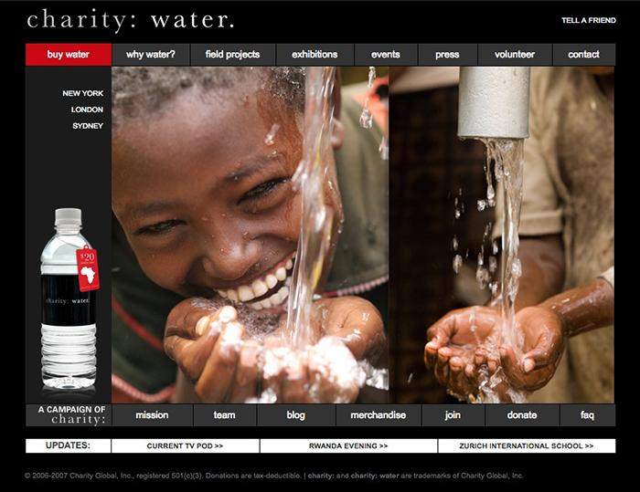
 The charity: water homepage in 2007.
How has the UX changed over the years?
The intent of our experience hasn’t changed much, if at all — we’re still working to deliver radically transparent experiences that dismantle barriers to generosity — but over the years, we’ve invested in tech and product development that has simplified the donor experience and given us a license to innovate on how we deliver on those promises.
In 2009, charity: water launched our online fundraising platform, mycharity: water. The first version of the platform was actually built by Angel investors and lifelong friends of the organization, Michael and Xochi Birch (they were the first family to join The Well, a small group of private donors that cover our operations costs in light of the 100% promise).
Around 2011, we built out an engineering team that allowed us to develop a more sophisticated and automated reporting product. A couple of years later we had boxed out enough margin to focus on things like an owned donation experience, mobile optimization, and UI systems.
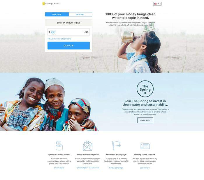
Today, we’re focused on developing our monthly giving product, The Spring, and scaling our donor experience for global markets.
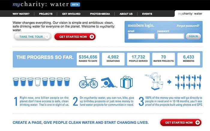
 The first version of fundraising platform mycharity: water in 2009.
Designing for donation usability
What are the main considerations in evolving the UX of the site?
The evolution of our donor experience is anchored by our vision to reinvent charity. We are primarily concerned with inspiring new levels of generosity among our donors by delivering product experiences that change the way they think about giving.
Functionally, we are focused on two questions when we make changes to or develop new donor experiences.
First, is it simple? We are inspired by the generosity we see in our donors, and do our best to get out of the way of that. That means upfront clarity and simplicity in utility.
Second, is it true? We hold our product to our organization value of “no lies.” We strive for every evolution of the user experience to be one of integrity. That might sound silly, but it comes down to the little things, like GDPR-compliant messaging. We’ve had engineers challenge language for not being straight enough with our donors. I love that. Everyone on our team takes part in making sure we put out an experience that is not only simple, but honest.
How do you specifically design the donor experience to inspire generosity and engagement?
We are passionate about storytelling. And not just at the top of the funnel. We have an incredible creative team capturing inspiring content throughout the year that champions hope and dignity over guilt. So whether it’s a donor’s first time giving to charity: water or a recurring donor’s one year anniversary in our monthly giving program, The Spring, there’s always a new story to tell. We design each donor experience to encounter the right stories in a context that makes sense with their gift.
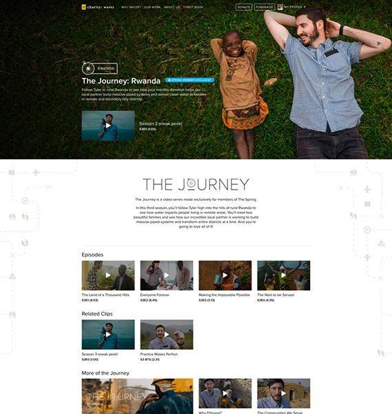
 The Journey is a video series about charity: water’s work in the field in Ethiopia.
And how do you design the voice of charity: water?
charity: water is a knowledgeable and trustworthy friend. We aim to be helpful and above board in every interaction, and we demonstrate our expertise where appropriate. In practical terms, we value simplicity and clarity within our UI toolkit and strive for design discipline when it comes to interface patterns. We’re more or less a single web app, so we don’t lean on our pattern library to reduce engineering effort (though it does); we lean into patterns for what excellent consistency communicates to our donors: reliability.
How do you research, prototype, and test the UX?
Understanding our donors has been foundational to charity: water since the beginning, and it shows in the way we invest our resources. We have a data scientist on the team and had a great researcher onboard who gave definition to the next generation of charity: water donors. Additionally, we use a host of tools to implement everything from basic A/B tests to remote usability. Many of our donors are not only passionate about ending the water crisis, but also true friends of the organization, which helps with recruiting for user interviews and donation usability tests. We’ve had participants share how blown away they are to get to volunteer in such a unique way, and they don’t hold back with their feedback.
The reality for us as a non-profit is that even with these tools, we aren’t able to learn as fast as we’d like to. We supplement our owned learnings with those from other organizations and products. Our industry is great because our competitors aren’t really competitors at all. We’re all looking to maximize generosity and design a better world, so we’re happy to share what we have and learn from others who are doing it differently and doing it well. That and some good ol’ fashioned intuition help us fill in the gaps, so we can keep moving forward.
What’s next for the charity: water’s UX?
When we talk about reinventing charity today, we’re eager to take the monthly giving subscription to the next level. Recurring giving has been around for a long time, typically existing as a checkbox on a donate form. But today’s subscription landscape has provided an opportunity to develop a meaningful giving experience that challenges monthly consumption, which we are working on doing with our program, The Spring.
This is the most product-centric UX evolution since we launched our fundraising platform, and it’s full of new “How Might We’s.” We’re figuring out how to communicate meaningful and measurable impact inside a monthly cadence and testing new methods of recognizing and re-inspiring donors. We’re really just getting started, but in a world of subscription boxes, services, and content, we hope to make subscription giving the best transaction among a person’s monthly expenses.
Read more UX evolutions for Netflix, Medium, Dropbox, Firefox, Etsy and Gmail.