In the third part of our UX Evolutions series, which explores how the user experience and user interfaces of famous on line services have evolved, we take a closer look at popular publishing platform Medium, developed by Twitter co-founder Evan Williams.
Since its launch in 2012, the site has been cultivating relationships with readers and focusing on optimizing the time they spend reading on the site. Naturally, the reading experience, which is customizable in many ways, is crucial for Medium.

We caught up with product designers Brad Artziniega and Benjamin Hersh, who gave us an exclusive insight into the UX of Medium, how the team designs the voice of the platform, and what lessons they have learned.
What was Medium’s user experience like at the very beginning?
Brad: Since the beginning of Medium in 2012, we’ve always believed our job is to help writers tell their stories and connect them with readers to share their ideas. From this we design user experiences, always making them in service of the stories being told.
Our care for storytelling defined the original user experience. We wanted to help writers tell their stories in a simple, expressive, and thoughtful creation environment. And we wanted to help readers be able to immerse themselves in these stories, free from distraction to focus on the writers’ ideas.
In 2012, our design was intentionally hard to notice. Our user experience was defined as much by the content and stories that were on the platform as it was by our typography and interaction paradigms. Our design served to elevate reading and writing, only making itself visible separate from the stories when needed.
The editor was designed to have writers directly interact with their text as opposed to having edit ribbons at the top of the page so as not to break the flow of writing. You could drop images whenever and wherever, and it would default to an aesthetically thoughtful image treatment, already proportioned and aligned for you, so you could keep creating. The story pages had chrome that disappeared once you started reading, allowing readers to give their full attention to the story. We enabled full viewport imagery to create moments of pause and immersion.
We spent time on details like these to create a user experience defined by smart, considerate, and focused interactions that helped writers tell their stories and readers connect with them.
How has the UX changed over the years?
Brad: Over the years, our design and experience has evolved around how our readers and writers use our platform. The core tenets and philosophy of our design are still the same. However, with growing functionality come growing constraints, so we’ve adapted the expression of these tenets to the increasing needs of our readers and writers. In some ways, our UX has changed over the years in that it has had to become more resilient.
We have more types of stories, more surfaces in which readers find these stories, more platforms on which readers read these stories, and so on. As such, we’ve had to simplify and strengthen our UX so that it can bend but not break as we evolve the product, experiment with new features, and reach more users with more needs.
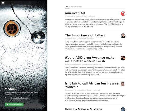
 The Medium homepage in 2013.
What are the main considerations in evolving the UX of Medium?
Benjamin: Good UX isn’t static. It moves with the people who use it.
Medium is fundamentally about sharing great stories, and each story is a unique interaction between the reader and the writer. Both are moving targets, and the dynamics between them have changed over time. Medium has been on a journey to find new and better ways to connect them.
Medium started as a walled garden, and grew into a community built on highlighting, responding, and a general ethos of active participation. This was a new take on what reading and writing online meant at the time — more elegant than a blog, and more socially connected than a magazine. It was great, but the world kept on moving.
We’ve seen big changes in the media landscape recently — the incentives of digital advertising eroding away at journalistic institutions, and a growing thirst among readers for thoughtful, well researched stories. Through the Membership Program (for readers) and the Partner Program (for writers), Medium is aligning the two.
On a product level, we’ve been focused on making a reading experience worth paying for. Finding a good read is hard, so we’re adding human curation and glossy editorial features. We’ve been experimenting with richer storytelling formats and exploring ways to elevate the text. The list goes on — it all comes down to making a simpler, more rewarding way to read.
How do you design the voice of Medium?
Benjamin: It’s an ongoing collaboration. We’re lucky enough to have many outstanding writers and creatives on the team, and there’s always chatter about the right way to communicate in context.
Medium’s editorial voice has become clearer as well. We’re reaching a point where our taste in stories conveys a sense of perspective and personality, and that emerges organically in the product. It’s best to let the stories do the talking.
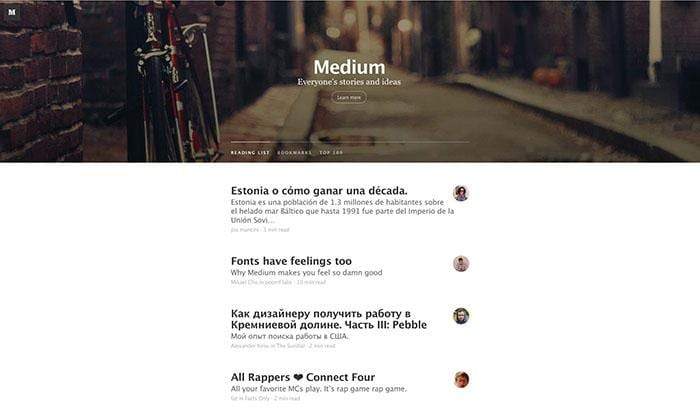
 The Medium homepage in 2014.
How do you prototype and test the user experience?
Benjamin: We focus on the people we design for. We typically start with user interviews or data analysis to inform our view, and look for testable hypotheses about how we can improve Medium for them. Sometimes we’ll prototype interactions in code or the design tool of the week for in-person usability tests. Many experiments focus on curation and personalization, so there isn’t always much UI to prototype. We A/B test regularly, and treat it as a tool to better understand our community as much as our features.
What UX mistakes have you made, and what have you learned from them?
Benjamin: One lesson we’ve learned a few times is the importance of polite design. Reading is a quiet activity that takes a lot of concentration. Every now and then Medium needs to nudge readers and bring something to their attention — for example, you might be reading your last free member preview for the month.
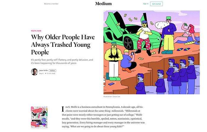
 A Medium story page in 2018.
It’s easy to run with a “loud” design because we want to be clear, but loudness and clarity are not the same. In many cases, people engage when we make the UI subtle and respectful of their attention.
What’s next for the Medium UX?
Benjamin: More fonts.
Read more UX evolutions for Netflix, Dropbox, Firefox, Etsy and Gmail.