Illustration by Simona Toader
From the moment we form our first letters, we’re taught that written communication to other humans follows a set structure. We craft what we want others to know in words, sentences, and paragraphs. Then, the person receiving our information takes the time to understand what we have written word for word. Words we are taught are something to be read.
When it comes to the vast majority of your digital content, the above couldn’t be any further from the truth. Almost nothing we learned early on in our lives about writing and reading will help us create digital experiences that others find useful, usable, or enjoyable. We have to scrap all that.
Digital content isn’t something you read, it’s something you do.
Let users’ tasks guide the way
Your users come to you to accomplish a specific task or set of tasks. When users engage with digital content that guides them effortlessly through the thing they came to do, they succeed in completing their task and might even enjoy themselves while they’re doing it. This spells great success for your site or app as users turn from prospects into loyal customers.
If digital content pays no attention to what real humans are actually trying to do, users will struggle and often fail to complete their task at all. This is, sadly, the typical case. In fact, this lack of attention to user tasks in digital content is a main reason so many sites and apps are the opposite of user friendly, helpful, and successful.
Types of common tasks
Almost all common tasks can be categorized as one of three types: immediate action, researching, or reading. Knowing these types and considering them carefully will help you decide how to approach your digital content in the best, most usable way.
1. Immediate action
Your users are trying to go as quickly as they can. They are scanning the screen at breakneck speed looking for the one word or phrase they need to keep moving and check this task off their list.
Immediate tasks are some of the most frequent and overlooked in the digital content world, and much to the detriment of many sites and apps. They are the powerhouse behind people being able to do the things you want them to do. Think of this: The beginning of a user’s journey with you online begins with the content that supports these tasks. “Find it” is the first thing someone is doing when they arrive – they are looking for the one word they know will lead to the thing they need.
These tasks are critical to turning a visitor into a new lead, customer, or partner. They are the tasks that let people “Buy” or “Join” or “Contact.” If you fail with content here, your users fail to do business with you online.
Digital content that successfully supports this task type will do these things:
- Be as short as humanly possible. Write the fewest number of words while still retaining clarity.
- Use familiar, plainspoken words. These are the ones that real people associate with the task.
- Appear in direct proximity and context to the action itself. No one has to look for what to do because it’s spelled out right in front of them.
- Present as an incorporated part of the thing someone needs to click or engage with. The words are the action.
I’m a mega-fan of Scott’s Cheap Flights, and they are doing this right:
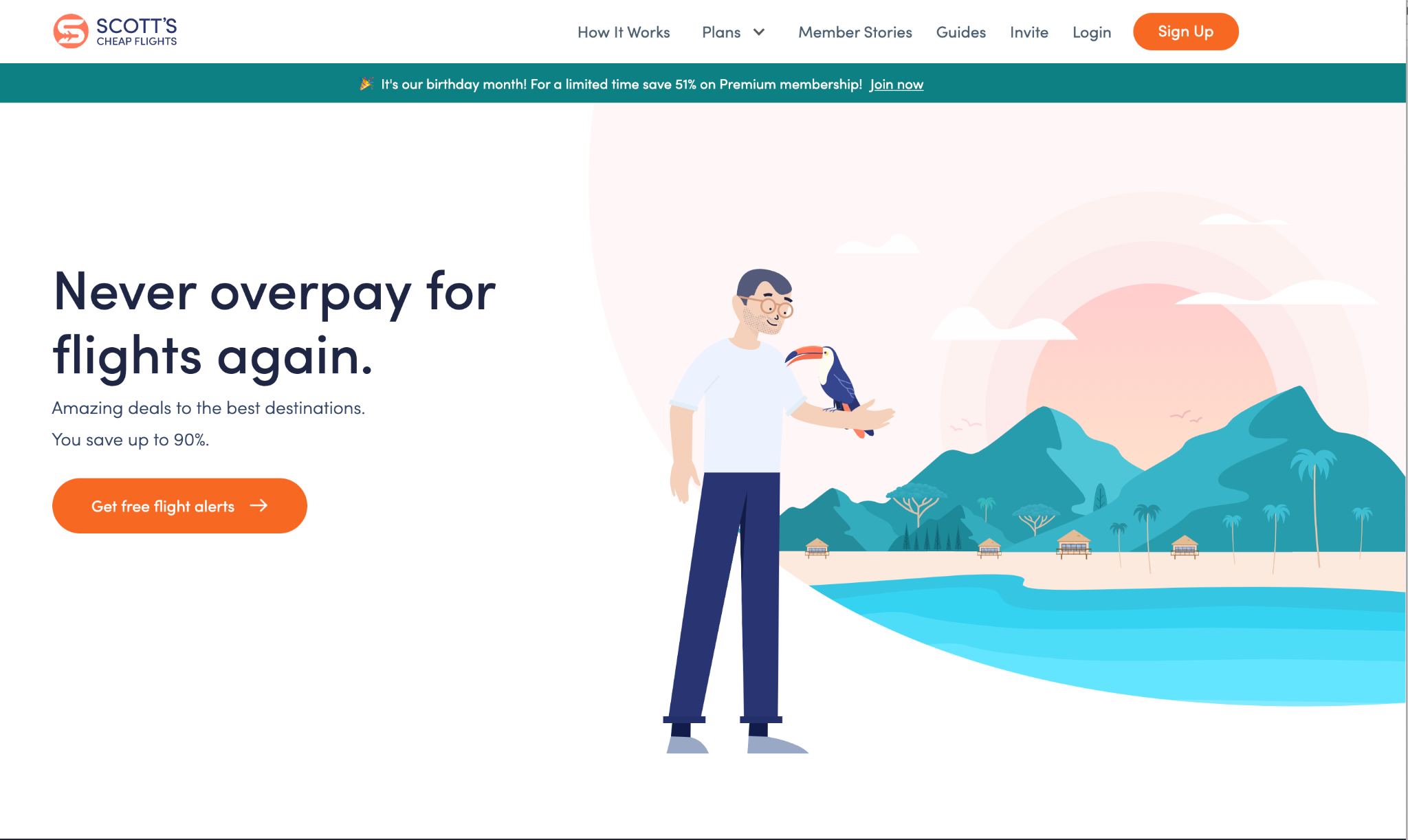
 Taking immediate action: I am scanning this screen in mere seconds to find the task I want to complete. Literally every option on this screen gives me immediate tasks to complete from getting alerts to jumping off for more information before I commit.
The home page for Scott’s Cheap Flights presents nothing but immediate tasks. Scott understands that no one is reading this screen – at all. Every piece of digital content has been crafted to reduce cognitive load, be short, concise, action-oriented, and part of the interaction itself – each word supports its task and nothing else.
Imagine if this screen was written in paragraphs or long sentences. You would be running for the hills before you ever even thought about taking action, let alone a flight.
2. Researching tasks
Your users are trying to get information that will inform a next step. Don’t be fooled with these researching tasks – you still cannot expect anyone to actually read anything word for word.
Research tasks are almost always a pathway to the next task. People are making a decision, one that is often answered by another immediate or reading task on your site or app. They are looking for the highlights, the key piece of information they’ll need before paying closer attention and diving deeper.
Present possibilities in digestible micro chunks. Research tasks still operate most successfully on limited words, but here you have a bit (and I do mean just a bit) more time to add context and reasons for people to take that deeper dive.
 Researching before a decision: On this screen, I am asking: Is this for me? A high-level overview shows me the key highlights at a glance. If I want to dive deeper, I can interact further. Or not if not.
Content supports research tasks successfully if:
- Words are still kept to a minimum and are easy to take in at a glance. The less reading required, the easier and better it is for users.
- It’s presented in bite-sized chunks. These should represent the most important information someone will need in order to make their decision.
- Additional tasks are supported in context. Users can easily take immediate action or learn more directly from their research task.
All of these principles are at work on the “How It Works” screen for Scott’s Cheap Flights above, which presents three digestible steps for their service. You could scan just the bolded heading text for each and never have to read another word to understand the process and the benefits. If you’re ready to do more, you can read the short descriptions beneath each step or continue on to get more information.
3. Reading tasks
Sometimes – just sometimes – reading is actually the reason someone has come to your site or app. These instances are rare. Before you start going to town with the sentences and the paragraphs, make sure that you’re actually dealing with an instance where the task itself is to read.
In these cases, digital content should still keep user experience in mind and support the people reading:
- Use headings and subheadings. If someone can read just the headings and subheadings and get the general idea of what you’ve written, you’re doing great.
- Pay attention to length. Yes, still. Gauge your audience’s mindset: Is this a fun read or a need-to-read read? The less fun and optional your content is, the more you should break it into manageable chunks.
- Keep the reading self-contained. Unless your name rhymes with Blickapedia, people are not looking for links they need to follow to understand the context of what you’re trying to tell them.
 Reading as a task: Even when I am reading an incredibly fun article about how to spend a week in Belize for under $1,000, I want my information delivered in manageable sections with the ability to jump around at will.
The above Scott’s Cheap Flights article allows me to read straight through, jump from section to section with clearly labeled headings, and or get the gist by reading headings only if that’s what I want to do. It’s like a UX choose-your-own-adventure. Do this – your users will love it.
In reality, most reading content is not about fun trips. It’s more likely you’re presenting content about something like, say, gallbladder removal. This means you need to give your users many more breaks in your content. For topics not associated with travel and leisure, contain yourself to no more than three lines under each heading or subheading. Believe me, it will feel like a lot to the people reading it.
The right words for your users’ tasks
Your users will almost certainly come across at least two and sometimes all three of these task types at some point in their experience with your site or app. This means that you’ll need to assess and shift the way you approach your content from screen to screen or even from interaction to interaction, depending on the type of task at hand.
Don’t listen to the people telling you that you need more copy. Instead, support your users and their tasks by carefully considering every piece of digital content as it relates to what people are trying to do. In a very real way, this one practice will make or break the success of your entire digital experience.