Drop-down menus, keyboards that slide up and lightboxes
are all examples of UI overlays. UI
overlay is a very powerful design solution that has many uses. The tasks that
users are trying to perform are becoming increasingly complex, and overlays can
really help to take off the pressure. Sometimes initiating an overlay is
unavoidable, and they’re especially great for error reporting, security
approvals, data capture, as well as supplemental interactions. They range from
the informative to the frustrating, however, so we wanted to dig a little bit
deeper and find out what best practices you should keep in mind when working
with modals and overlays.
First, let’s look at some of the dos and don’ts:
The dos
- Use modals for focus and things that are going to benefit the user.
- Use overlays to take the pressure of a complex user interface (UI) (e.g., advanced controls, complex choices with multi options, explanations and help text, support stuff needed quickly).
- Place keyboard focus on the first interactive element inside the modal and trap it within the modal’s content.
- Allow users to close modals (by clicking outside of them and with explicit ‘close’ buttons), unless action is required to move forward.
- Restore focus on the triggering interactive element when the modal is closed.
- Include documentation for overlay and modal components in your design system (as done by Australian health insurer nib: overlay and modal).
- Check out Google’s penalties for obtrusive interstitials.
The don’ts
- Don’t use modals unless their content requires 100 percent focus.
- Don’t cover up content that is contextually relevant to the modal/overlay being displayed.
- Don’t use overlays to just sell something.
- Don’t create a modal that only appears when you’re trying to leave.
- Don’t rely on a single way to close. The escape key and outside clicking need to work as well as an “X”.
- Don’t put modals inside of modals. Don’t focus too much on JavaScript and use lightweight CSS where possible instead.
- Don’t ignore accessibility guidelines.
Never disrupt the user journey
Contextual information in Duolingo, designed
to be a lot less obtrusive, gives the user key information about potentially
small things, and doesn’t get in the way but pulls focus.
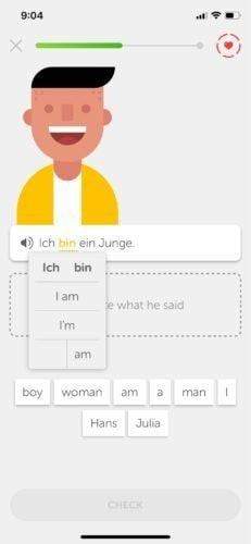
 Image by Duolingo
“Ensuring that overlays are not disruptive to a smooth and fluid user journey can come down to using the right interaction at the right time,” says Karl Randay, head of design at digital customer experience studio 383. “Understanding how people think when they’re following a process or trying to complete a task is crucial in knowing when and how to include overlays as a method of a potentially forced interaction. Make it clear what to expect when you click on something and what happens next in each interaction,” he says.
One way to set the right level of expectation
is by using simple, humanized language, Karl says. Reduce the language around a
complex task and use carefully crafted copy and button labels. Decide when to
use overlays as a subtle means of capturing user attention or when a
full-screen change is necessary.
Choose your overlay wisely
As a user navigates a digital product or
service, there can be a number of steps that they follow, events that they
trigger, and inputs that they complete. “Keeping someone’s focus on content and
interactions normally requires the use of a full screen change, dedicating the
full attention of the UI to the task at hand,” Karl says.
“In the event that something happens that
requires the user’s sudden attention, further user input is required, or
additional contextual information is needed, use modal and overlay panels
instead, which allow for additional functionality or messaging while still
keeping a sense of context for where the user is in the background.”
Choose the type of overlay wisely because it
can be a quick way to disrupt and provide a disjointed and unnatural experience
during what could otherwise be a fairly natural flow.
Explore the psychology behind user behavior
Periscope is a great example of conditional
user requirements. This is what happens when you gracefully design for failure.
All of these things need to be taken care of for the user to complete their
task.
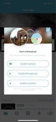 Image by Periscope
Using a bit of cognitive science and
understanding users’ habits is also a quick way to determine when and how to
utilize overlays.
“If a task and UI feel vaguely familiar or
relatively easy to understand, a user will move through it quicker,” Karl
suggests. “This is called cognitive fluency — familiar tasks require
considerably less mental effort. A user is more passive and kind of drives on
autopilot until they encounter something they didn’t expect or an error, at
which point they switch to conscious thinking and pretty much hit a brick
wall.”
When we’re on autopilot, we’re capable of
thinking of up to 11 million decisions per second. Contrastingly, our fully
conscious state sits at only 40 decisions per second. “So switching from
autopilot to the fully conscious state is the equivalent of the force it takes
to propel a well-strapped-in crash test dummy through the wall of a tank.”
Familiarity can be a good way of ensuring the user can quickly get to grips with what it is you’re saying to them. “This can involve everything from the position of the buttons, adopting styling and sizing — from the underlying UI and common design patterns to emulating more relatable objects during complex tasks — breaking up a credit card number into blocks of four, and designing the user interface around the physical object. It’s a simple way to use the heuristic real-world reference for something as an easier way to break apart the experience of having to fill-in a form — as nobody likes to do that.”
Overlays used for failure and error reporting
Use of the default iOS chrome in the Hodinkee
app gives users a choice of size, while still giving a sense of context for the
situation they’re choosing in.
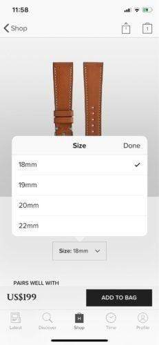 Image by Hodinkee
It’s not enough to just tell the user that
something is broken. It doesn’t help you understand what has happened or what
you can do to fix the problem and get back to what you were doing.
A classic example of not designing for
failure is the 404 error page, Karl explains. “Even the term 404 is an
engineering reference that has found its way into common language, thanks to
the overabundance of this technical cul-de-sac. You can use overlays and modal
windows to highlight a potential issue, but they need to be clear, and cut
through any technical terminology to clearly describe what’s happening.”
Also, present a range of options so that the
user can make the best decision to fix the situation and return to their
original path or journey. These don’t need to be exhaustive, but they do need
to take into account what might have been the intention of the user when their
journey stopped — so exercising common sense and ensuring there’s always a way
to close the dialog is really important.
Consider the impact
One thing to remember when designing for
overlays is the impact they are given in different situations.
“On mobile, there is considerably less screen
area, so any interstitial window is going to be much more noticeable than on
desktop,” Karl warns. “Ensure that anything important gets noticed, especially
while navigating visually complex screens.”
Karl recommends the use of semi-opaque
colored layers between the overlay and the underlying UI. Make sure that the
layer is opaque enough so that the overlay takes user focus, but not so opaque
that you totally break the visual connection with the underlying experience.
Overlays have received a lot of bad rap over
the last years, and a lot of it deservedly, but they can also benefit the users
and help provide focus for complex tasks. Use the principles and guidelines
covered above to make sure you’re helping your users and not frustrating them.
With thanks to Karl Randay for his help on this article, and to Eric
Eggert, Dylan Smith, Laurie Jones, Benjamin
Hollway, Daniel Filler, Joe Leech, Eric Bailey, and Scott Cole for
their suggestions of the dos and don’ts.