Text represents more than 90% of all
information on the web. Typography is a cornerstone of web experience. Even
right now, when you read this article, the words written in it are visible
simply because of typography.
Typography can be daunting to learn and
that’s why not all designers are ready to invest their time and energy to
master this skill. Some designers ignore typography because they think it isn’t
worth their time.
When it comes to typography design, it’s vital not only to make the text legible and readable but also to convey a certain mood. The compelling typography is key to the great UI design. And that’s a primary reason why every designer should master typography.
 Design by René Bieder
What’s typography?
Robert Bringhurst, in his book The Elements of Typographic Style, defines typography as the craft of endowing human language with a durable visual form. Typography involves creating a complete, reusable typeface that allows you to make language visible.
The role of typography in design
Communication plays a vital role in design.
In order to be successful, your products have to communicate their intent and
purpose clearly. Typography helps design to deliver information to people. Font
size, font width, font color, and line lengths — all elements of typography
work together to create a great user experience.
 Website typeface
Elements of typography
Before making specific design recommendations, it’s vital to learn the basics of typography.
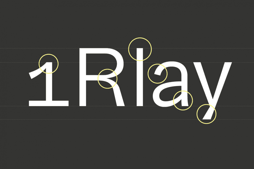
Typeface and font
Many designers use the terms ‘typeface’ and ‘font’ interchangeably. However, those are not the same thing. A typeface is a design of type, while font is a type in a particular size and weight. In short, a typeface is something like a family, and fonts are parts of it.
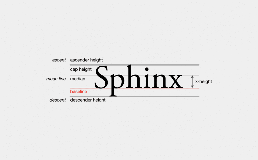
Mean line
The mean line marks the top and bottom of a character’s body.
Baseline
The baseline is the imaginary line upon
which a line of text rests.
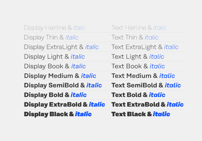
Font weight, height, and size
The weight of a particular font is the
thickness of its character. A typeface may come in many weights, from
ultra-light to extra-bold.
 Design by René Bieder
The height (or x-height) is the distance
between the baseline of a line of type and tops of the main body of lower-case
letters.
 Typography sizing chart
Ascender and Descender
An ascender is the part of a letter that
extends above the mean line of a font. In the example above, the letter ‘h’ has
an ascender. The descender is opposite to ascender. In the example above, the letter ‘p’ has a
descender.
Tracking
Tracking is the spacing between all the
characters of a font. Properly selected tracking can make the copy feel
pleasant to the eye.
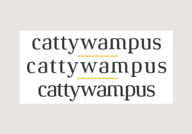 Image by fonts.com
Kerning
Kerning is the process of adjusting the
space between two type characters. Unlike tracking that apply for all
characters, kerning is applied for individual cases. For instance, a designer
decides to change the spacing between two specific letters to make it feel more
natural.
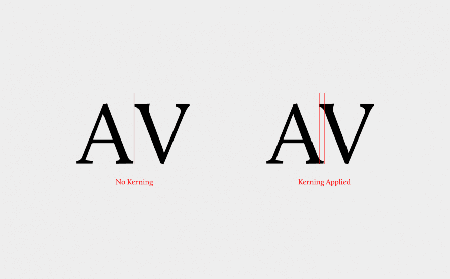 Apply kerning for individual use cases.
Leading
Leading (or line height) is spacing between two lines of text. Leading has a direct impact on legibility. Well-designed leading helps eye travel from one text line to another. The standard leading is 120% the point size of the font. But of course, it can vary according to the typeface needs
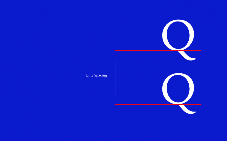 Leading impacts legibility
Negative space
Negative space is the area between individual elements in a design composition. In the context of typography, negative space is a space between blocks of text (such as different paragraphs or sections). Properly selected negative space can make the copy more readable.
 Different types of negative space. Design by René Bieder.
Typography design recommendations
Typography is a huge discipline, and it’s
impossible to summarize all typography design recommendations in one single
article. However, there are several things you can do to make sure the
typography is honoring the content and improving readability.
Be careful when pairing multiple fonts
While designing the typography, you may
want to combine different font families. For example, use one font family for
heading and another for body copy. Here are a few important things to keep in
mind when selecting font families:
- Avoid using more than three font families. Using more than three font families simultaneously can make your layout look busy. For beginners, it’s recommended to stay with one font family until you have achieved mastery of it.
- Start by selecting a typeface for your body text. The typeface you choose to use for body text will affect the decisions of any other typeface in your design. Select typeface for headlines only after you will be confident with a typeface for body text.
- Make sure that the selected fonts work well together. The font families you select should complement each other. Tools like FontPair or TypeWolf can simplify the process of finding the right font combination.
Create great visual hierarchy
Type hierarchy for your app/site is
critical and allows visitors/users to parse through information fast. Designers
should organize content according to the priority. The most important copy
should be the most prominent.
When designing a page, you should start
with an <h1>, and each subsequent type style should nest below the
<h1>. The priority can be created using font size, weight, and color.
Choose the proper font size
The size of your text has a significant
impact on the experience of reading something on a screen. Making text too
small is a common design pitfall. Tiny text can easily cause the reader to
strain. As a result, users will skip most of the information presented. It is
especially true for mobile, where tiny type on a small, bright screen can be a
headache for users. But too large of text can also cause problems. Large text
can be distracting and tends to call attention to itself.
That’s why you should always start with a comfortable font size for your body text. While it’s impossible to provide a one-fits-all solution for the font size, a general rule of thumb is:
- For desktops: Use 16 px font or higher for body text. It’s not too big, and it’s comfortable to read.
- For iOS devices: Use a text size that’s at least 11 points (it’s legible at a typical viewing distance without zooming).
- For Android: Minimal readable font size is 12 sp, but it is highly recommended to use at least 14 sp for the main text.
Choose typefaces that work well in various
sizes. It’s essential to make sure that the typeface you choose is legible on
smaller screens!
Watch line length
Line length is the horizontal distance of a
block of text. Having the right amount of characters on each line is key to the
comfortable reading of your text. Unfortunately, long lines are probably one of
the most common design problems on the web.
The WCAG recommends keeping a line of text’s character count below 80 characters. But in the typography world, the generally accepted, ideal line length for comfortable reading on a desktop is around 60 characters per line, including spaces (according to “Typographie” by E. Ruder). This line-length has a positive impact on reading rhythm: our mind is energized when jumping to the next line.
 Sample showing number of letters per line. Design by René Bieder.
Avoid blocks of text
Typography also influences the visual
perception of text. What is your first reaction when you see a large chunk of
text without any breaks? If you’re like me, you will avoid reading it at all costs.
Why? Because large blocks of text are difficult to read because it’s extremely
hard to remain focused on it. Use the power of whitespace and break the text
into paragraphs and chapters.
Avoid all caps
All caps text is a text with all the letters capitalized. All caps have a direct impact on readability. As mentioned by Miles Tinker, in his work, Legibility of Print, all-capital print greatly reduces the speed of scanning and reading in comparison with lower-case type. That’s why it’s recommended not to use all caps in text blocks longer than one line of text.
Don’t minimize spacing between lines
We’ve mentioned the importance of leading
above. Bad leading leads to text that looks crowded. By increasing the leading,
you increase the vertical white space between lines of text, generally
improving readability in exchange for screen real estate. As a rule of thumb,
leading should be about 30% more than the character height for good
readability.
 Without proper leading, text is dense and illegible.
Avoid using text as images
Avoid creating images with text. The text
becomes unmanageable—it becomes hard to quickly adjust the typographic system
because you need to change the images too. Instead, it’s better to use text
positioned over the image using CSS style property.
Conclusion
Typography is a skill that every designer
needs to master in the digital age. But mastering typography skills require
time. The best advice is to practice. You only really continue to learn
something through repetition. The more you try text styles on, the better idea
you will get of how it looks and works for your users.