Illustration by Matthew Carlson
For decades, designers have been honing their techniques on driving (and keeping) website traffic. One of their best strategies is to create content worth reading and sharing. Not only does that drive referral traffic to a site, it also brings in readers that are interested and engaged. But once you’ve attracted readers, how do you get them to hang around for a while?
This is where scannability comes into play. By making the most important and relevant information on your site easy to find, you’re creating a better user experience. In a world where market share is often decided by who makes customers happier than the competition, a great user experience can make or break your reputation and possibly your business.
So let’s break it down into some scannable sections: the basics of what scannability actually is; reasons why scannability of a website is important; some common scanning patterns; and, most importantly, what you can do to make your content more scannable and improve the user experience.
What is scannability? Why is it important?
Scannability is the ease with which a body of words can be read and understood by the target audience. For a definition that’s a bit more applicable to user experience design, UX matters defines scannability as “the aggregate effect of writing and formatting techniques that compensate for the fact that more people don’t read content” on the internet. Before we address the “no one reads” part, let’s talk about the other part of that definition: the writing.
The most important thing to consider is the content, the words themselves. Readers want you to get to the point quickly. Studies have shown that even well-educated domain experts don’t want long, drawn-out explanations and descriptions. Succinct, scannable content helps you make your point, deliver your message, and move on to the next thing.
Video credit Nielsen Norman Group
The main benefit of increasing a site’s scannability is that it helps you more effectively communicate the site’s value. In turn, visitors will be more likely to both remain on your site and become more engaged and involved with its content.
Why people scan instead of read
When you’re considering the human-computer interaction design for your site, there’s something very important to keep in mind: People don’t read on the internet. In the seminal study done by the Nielsen Norman Group, research showed that only 16% of people read webpages word-by-word; further, 79% of test users always scanned any new page they came across. Here’s why:
- Screen reading on a computer is harder on your eyes and is 1/4 slower than reading on paper.
- The internet is a medium where people feel driven to click, follow, and share. They feel like they need to be doing something, and reading isn’t it.
- There’s always something else to read or another site to visit. Attention spans are short, and for every site there are countless websites out there competing with it for the user’s attention.
- People don’t want to work hard for the information they seek. Much like the drive to visit another site, users are often trying to complete a task or find a fact in the midst of paying attention to a multitude of other things.
Common scanning patterns
Luckily for us, there are a few patterns that research has shown to be common among people scanning sites and pages on the internet. Knowing more about these trends and behaviors will help you start with an educated mindset as you approach designing more scannable content.
F-shaped
The F-shaped scanning pattern is the most common. Readers first scan from left to right at the top of a section or page. They then move down the page a bit and again scan from left to right. Finally, they scan the left side of the section or page from top to bottom.
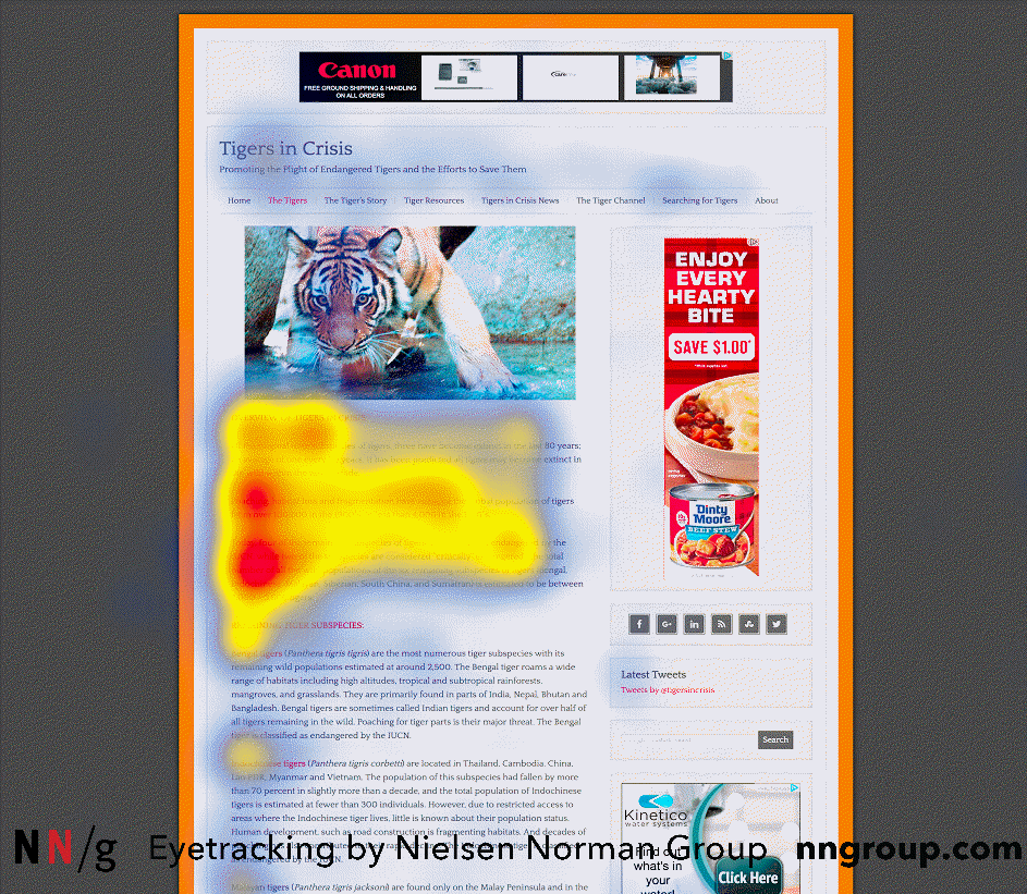
 The results of an eyetracking study show user focus in a capital F-shaped pattern. Image credit Neilsen Norman Group.
Spotted
The spotted scanning pattern may look more erratic at first, but the process makes sense. Readers’ eyes jump between words (or chunks of words) based on one of two factors: the word or words may be styled in a way that draws the readers’ attention, or the text might resemble something that is essential to the task the reader is trying to accomplish (like finding a specific date or address).
 The results of an eyetracking study show user focus on three hotspots while scanning a page. Image credit Neilsen Norman Group.
Layer cake
The layer cake scanning pattern shows that the readers’ attention is often focused on the headings and subheadings of a page first. Eyetracking research shows readers focus on these areas until they find the information they’re seeking. At that point, they read more closely and with a greater level of depth and interest.
This pattern looks like a set of horizontal stripes and blank spaces between them, resembling a layer cake (with cake on a level, then frosting, then cake, and so on).
Nielsen Norman Group
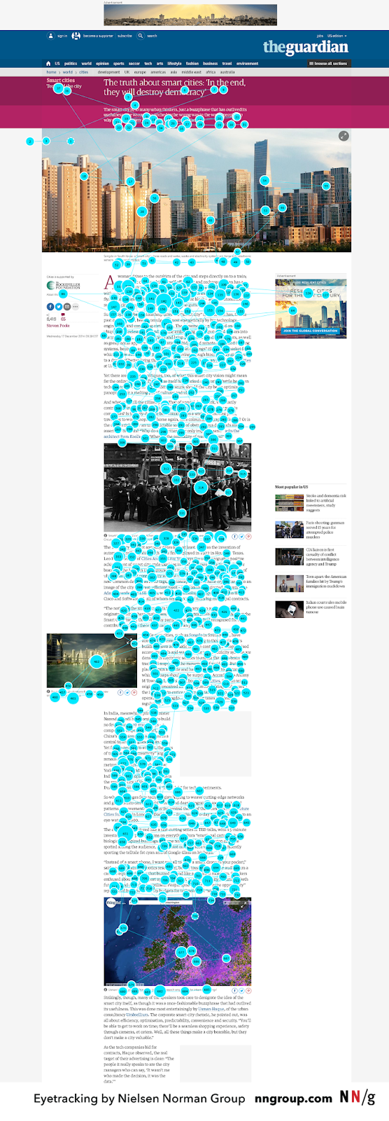
 The results of an eyetracking study show user focus scattered throughout a page. Image credit Nielsen Norman Group.
Committed
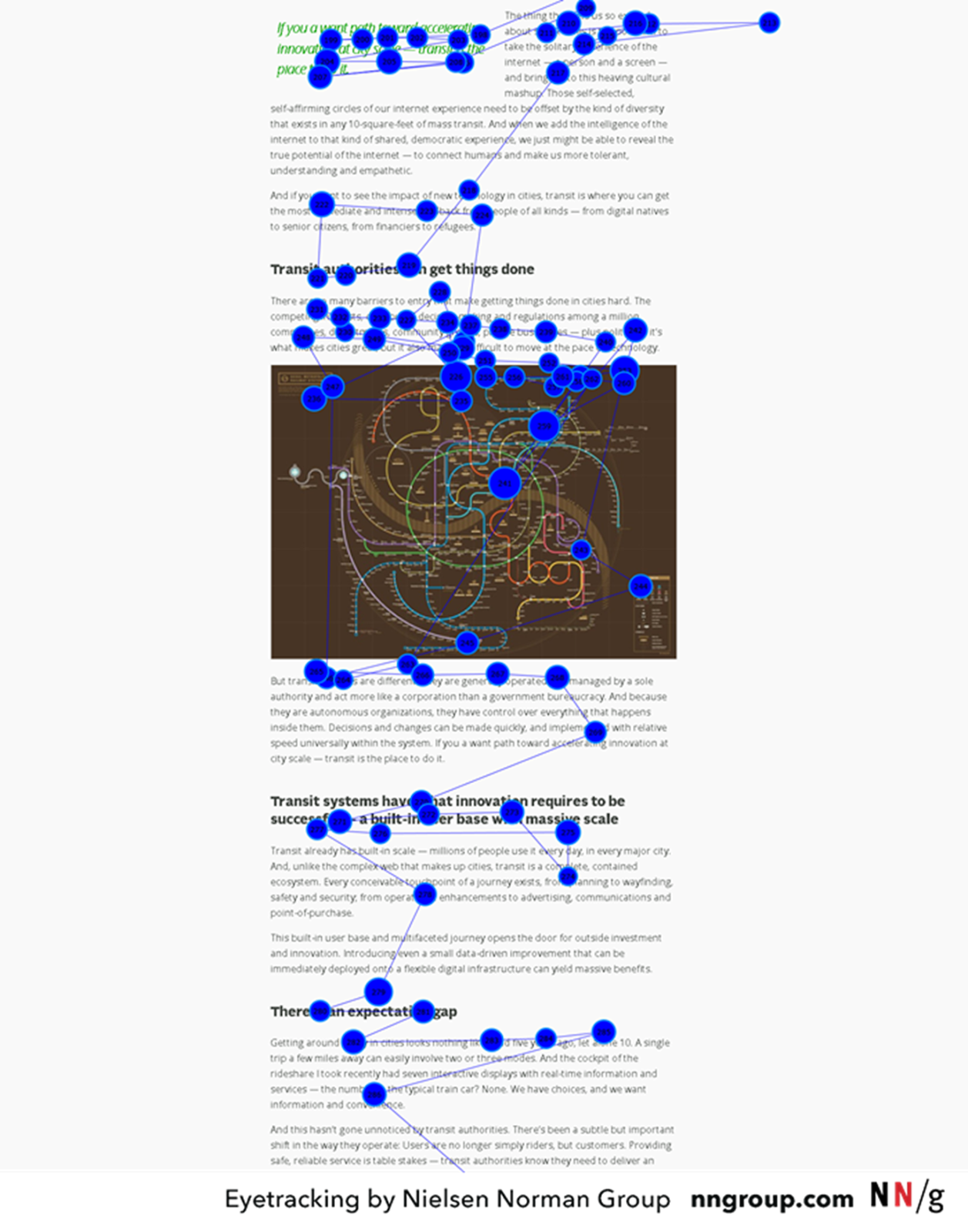
The commitment pattern is not so much scanning as it is reading every word on the page. While the vast majority of readers on the internet will scan your site, you will also get readers who are very engaged and interested in your content. These readers are motivated to learn. Readers are most motivated when they trust the source, are loyal to the brand, and believe they are in the right place to get the information they seek.
 The results of an eyetracking study show user focus that is thorough and all over the page. Image credit Nielsen Norman Group.
Other patterns may be present when the page content involves a large number of images or data that are displayed in a dense or unclear manner (e.g., the zigzag pattern and exhaustive review).
How to make content scannable
In general, most users expect to do certain tasks when they navigate to a website. They typically expect to:
- Perform some task within the user interface
- Learn how to do something
- Get advice or understand the facts about a particular topic
If users or readers can scan your page and find what they need to accomplish their tasks, you’ve designed a great user experience. Because the value of scannable text has been studied at length over the past few decades, we have an established list of UX best practices to consider when designing online content. Try to incorporate one or more of the following best practices in your design to increase your content’s scannability.
Write in a way that makes it easy to read
Start by breaking up long blocks of text into shorter, more scannable sections. Aim to cover one idea per paragraph. Any more than that and you risk losing a reader’s attention. If a reader isn’t engaged by the first few words in a paragraph, they won’t stick around to read any great ideas that show up further down.
Establish an understandable visual hierarchy
A visual hierarchy organizes, arranges, and styles a page’s content in a way that allows for easy scanning, recognition, and comprehension. The main goal behind a visual hierarchy is to let users understand the level of importance of each piece of content. By utilizing differences in text styling like bold, italics, and hyperlinks, you can draw your readers’ attention to the content you want to highlight (this is what makes the spotted scanning pattern most effective).
Other key factors to consider when contracting your visual hierarchy include:
- Size – Larger elements get more attention.
- Color – Bright colors stand out.
- Contrast – The difference draws curiosity; a reader’s focus is drawn toward the brighter element.
- Proximity – Elements that are close together are assumed to be related.
Make good use of negative space
Having enough white space is essential to helping a reader focus on the copy and images. If you jam too much content into a space that’s too small, the reader can get overwhelmed.
Without enough room to breathe, page elements aren’t properly seen, so users risk missing what they really came to find. Ensure that you have adequate breaks between your headers and your section content, between paragraphs, and before and after visual elements like images or videos.
Use images and videos
Visual elements help set the mood or convey the central message. They play a big role in establishing a visual hierarchy, and they make the text content easier to understand. People perceive visuals faster than words, which can help you get crucial information to the reader quicker.
Create bulleted and numbered lists
Lists are a great way to organize related data or information. In addition, the bullet points themselves serve as visual elements that attract the readers’ attention.
Better scannability means a better user experience
When readers come to your site, odds are that they’re not going to read every word on the landing page. The good news is that now you’re prepared to make the scannability of your website a design priority. Being aware of both content scanning patterns and the best practices for making your site more scannable places you at an advantage when it comes time to design a great user experience. A great experience leads to happier readers, and happier readers make for a successful business.