Illustration by Tracy Dai
Technology has made creating and designing websites increasingly accessible over the years. Companies like Squarespace and Wix empower users to create a live website within hours, with no coding required.
But with so much competition in the market, it’s more important than ever to focus on the user experience. If designed correctly, your website can make an impression on your visitors and encourage them to return again and again.
So, how are you going to make your website stand out among the crowd? While there are plenty of great web design examples out there, it can be tough to identify which sites are good and why. In this article, we’ll showcase some of the best designed websites of 2020, and we’ll highlight the common design trends behind them. Let’s get started!
5 top design trends of 2020
Each year, we see certain design trends come into the spotlight. They catch on like wildfire and leveraging them can contribute significantly to your success. Keeping up with the times not only speaks to your user, but also validates your brand. Below are the top 5 design trends we’ve seen in 2020.
1. Dark mode
With the introduction of dark mode on popular apps, many users have grown to love giving their eyes a rest. Dark mode allows users to view their screen in a color scheme that uses light-colored text, icons, and graphical user interface elements on a dark background. When incorporated into web design, dark mode gives your website an ultra-modern look. Consumers usually want the most up-to-date products and services, so your website should reflect these trends and preferences.
Dark mode is a great way to build contrast and make your design elements pop. The dark interface complements the bright elements, allowing your users to read your copy with ease as they navigate throughout the site. In addition to great contrast, dark mode is known for saving battery life on digital devices, which is always a nice extra gift for your users.

 Coffee website landing page in dark mode. Image credit akorn.creative.
 Landing page in dark mode with main image of a shirt and suit with a button saying, “Get Started.” Image credit Davenport Blazers.
2. Mixing photos with illustrations and graphics
Layering graphics on top of photos is a great way to mix illustration with realism in your design. This rule-breaking trend has dominated the market in 2020, seen in many industries from fashion to home cooking. This alternative, creative approach adds a certain amount of “cuteness” and delight to otherwise bland, common images.
You can also leverage this tactic to call out serious attributes, such as communicating complicated concepts like finance or technology. Whichever reason you choose, this is a great way to add some personality to your web design.

 Landing page incorporating photos and graphics to make a visually appealing initial impression. Image credit Zhenya Rynzhuk.
 Main page for company promoting airbags for cyclists. It incorporates real photography of bikers surrounded by graphics to make a visually appealing landing page. Image credit Igor Vensko.
3. Minimalism and white space
Minimalism is a classic design trend still popular among today’s best website designs of 2020. Its elegant, beautiful, and easy-to-understand appearance makes this technique highly usable, yielding a delightful user experience.
It’s also a trend that has evolved over time; in 2020, for example, we’re seeing even larger sections of white space. This helps guide the user’s eyes to the most important parts of the page, such as copy or a product image. With little to distract, a minimalistic approach keeps the user focused on the product and what’s important.

 Example of a web page with a minimal design and lots of white space, calling attention to the tagline. Image credit Whiteboard.
4. 3D everywhere!
3D designs have found their way into many mainstream experiences. From Nintendo to cartoons, we’ve evolved from flat experiences to something more 3D. It’s no surprise that this trend has found its way into design, as well.
A parallax website design 3D design to break the boundaries between digital space and reality. It adds depth and realism to your site and captivates the user in a unique way. And with the rise of VR, designing 3D elements is in much higher demand. It’s a great way to create an immersive experience on your site, encouraging your user to stay longer.

 Image of a 3D shoe giving a lifelike experience. Image credit Toke.
 Image of a 3D frame with items inside and Gucci logo written above it on the wall. Image credit GG Marmont.
5. Streamlined, minimum navigation
Another design trend is to incorporate streamlined, minimum navigation. Minimum navigation limits the amount of choices a user has to make, allowing them to focus on your product. With your information architecture minimal, you can create an experience with few distractions.
Another reason for this trend is due to the decrease in screen sizes over the years. From desktop to phone to present-day wearables, UI real estate is becoming smaller and smaller. Designers are challenged with fitting navigation into smart watches, a very popular form of wearable tech. With screens as small as 44mm, it’s no wonder minimum navigation is a popular design trend.

 Landing page showing very few options for navigation besides down or “Notify Me.” Image credit deandesign.
 Example of a website with limited navigation; the only call-to-action is an email sign-up. Image credit Clint English.
5 best designed websites of 2020
Now that we understand today’s design trends, let’s explore some good website design examples. These examples reflect the trends and show how powerful they can be. If you have ever wondered, “what does a good website look like?” then I am pleased to present to you the 5 best designed websites of 2020.
1. Harry’s
To mimic the clean shave it creates, Harry’s website has a trimmed-up design with plenty of white space, allowing the user to focus on what is important. The bright orange call-to-action (CTA) stands out and indicates exactly where the user should navigate next. The value proposition is front-and-center, making it very clear to the user.
There is also a minimal navigation approach, so the user won’t be as distracted. This minimal approach translates well in mobile design, as real estate is limited. Harry’s is a great example of a minimal and simple theme done well.

 Harry’s landing page incorporates white space, an upfront value proposition, minimal navigation, and a highly visible CTA. Image credit Harry’s.
2. Hoang Nguyen
Hoang Nguyen masters the perfect combo of 3D art with white space in his Awards-winning site, building an all-encompassing experience fueled by flowing, eye-catching art. With precise navigation and limited distractions, it’s clear what this site has to offer and leaves the user eager to click around and explore more.
Additionally, Hoang Nguyen’s website is a great example of exemplary sound design techniques. Adding sound to your website is a great way to bring your user experience to a new level.

 Landing page incorporating beautiful 3D imagery and lots of white space. Image credit Hoang Nguyen.
3. Orano
A tech company based in France, Orano creates a dark-mode experience, showcasing all the elements of good UX guidelines.The siteis a digital masterpiece that showcases the “smallest gamma camera in the world,” letting the user explore the product on an intimate level. It contains very little information architecture and the navigation is quite linear, leading the user through a precise yet effective user journey. The 3D images also establish a futuristic, technology-focused feel that mimics the topic at hand.

 Landing page with dark more being utilized in the design. Image credit Orano.
4. EmberHouse
The EmberHouse website takes the user down a visual journey, highlighting the company’s value proposition. Mixing graphics with text and other visuals, this website brings the topic of financial wealth to life. It’s a prime example of how these design trends can heighten the user experience around any topic!

 Example of a landing page with white space and graphics mixed with the text to heighten the user experience. Image credit EmberHouse.
5. Couro Azul
There are many great web design examples, however, this one takes the prize. This responsive design masterpiece showcases Couro Azul leather interiors for major markets, including aircraft, transportation, and railway. With their trim information architecture, dark-mode themes, 3D visuals, and captivating sound design, it is no surprise this made the best designed websites of 2020 list.
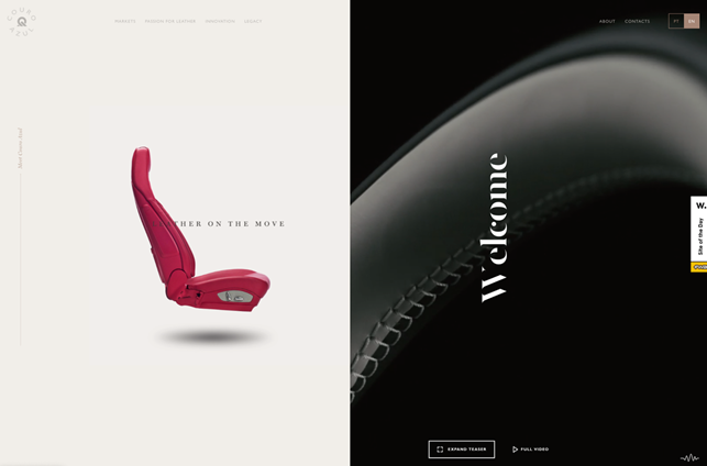
 Image of a 3D leather car seat on one side of the screen and a dark-mode style on the other with the word “Welcome.” Image credit Couro Azul.
Now it’s your turn
Now that you have learned the latest trends and seen them in action, it’s your turn to bring the ideas to life in your own designs. Taking the 2019 top layout trends and incorporating them with the design trends above will put you on the right path toward success. When in doubt, refer to these best designed websites of 2020 to get some inspiration for your next design!